Registrar's index cards on the platen glass - captured by the scanner
1948–1970s · Southern California, US; roadside commercial architecture
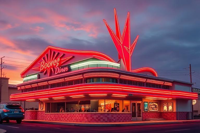
Googie architecture developed in post-war Southern California to catch the eye of motorists on the new freeways and car-oriented commercial strips. The name comes from Googie's Coffee Shop in West Hollywood (designed by John Lautner in 1949), a building that became emblematic of the style: dramatically upswept roof, expansive glass, angular geometry, and signage that competed with the California sunshine for attention.
Architects Douglas Honnold, John Lautner, and Wayne McAllister developed the key vocabulary: upswept rooflines that gesture toward the sky, boomerang and kidney shapes, starbursts and atomic motifs, generous use of glass and steel, and bold commercial signage. The aesthetic expressed the post-war optimism of a nation confident in technology and prosperity: every coffee shop and bowling alley could be a small space station.
Googie was dismissed by architectural critics of its time but has been extensively documented and appreciated since architectural historian Alan Hess's book Googie: Fifties Coffee Shop Architecture (1985). The aesthetic influences contemporary: Las Vegas casino and resort design, retro diners and burger joints (In-N-Out Burger preserves the signage tradition), and designers who reference the period's specific optimism. The Jetsons and Space Age Modernism are its direct visual descendants.
The visual DNA: what makes it recognisable
- Atomic and space age lettering: letterforms that look like rockets or orbits
- Starburst lettering: letters radiating from a central point
- Neon sign typography: the stretched, informal letterforms of commercial neon signage
- Bold italic condensed: forward-leaning type suggesting speed and momentum
- Diagonal and triangular forms: no right angles: everything at dramatic angles
- Upswept vertical elements: rooflines and sign pylons that reach toward the sky
- Boomerang and kidney shapes as primary organizing silhouettes
- Asymmetrical balance: visual energy from off-center dramatic elements
- Turquoise: #40B0B8, #30A8B0: the primary Googie color
- Coral orange: #E86030, #D05028
- Chrome silver: #C0C4C8: car-culture material
- Sunny yellow: #F0C820, #E8B810
- Starbursts and atomic orbital diagrams as decorative elements
- Boomerang and parabolic shapes in furniture and architecture
- Neon signage with dramatic pylon structures
- Rocket ships, satellites, and space travel imagery
8-channel console - dominant channels taped & circled by the registrar
Your aesthetic passport - share the fingerprint
4 color interpretations of this aesthetic
Join waitlist for access
Join the waitlist for full access
Join the waitlistGoogie: where the language earns its place
Googie is most effective when its visual decisions do useful work. Space Age optimism in roadside America - boomerang roofs, atomic starbursts, and neon signs celebrating the jet age, the atom, and the open road
The style gives styling, proportion, and image sequencing a clear point of view rather than treating them as decoration.
It can turn atmosphere, material, and spatial pacing into evidence of a distinct experience before a visitor arrives.
It helps a physical or editorial environment feel authored, which raises attention and perceived care.
They recognize the references, proportion, and restraint that make the language feel intentional.
They respond to visible judgment because it reduces the feeling of interchangeable product.
A coherent aesthetic gives them a usable standard for choosing images, objects, and collaborators.
The cost comes from consistent art direction, suitable locations or materials, and time to edit the details that would otherwise undermine the premise.
The challenge is conceptual. It takes visual literacy and a real point of view to avoid borrowing surface cues without their original logic.
Lighting, casting, type, color, material, and retouching must agree. A single weak choice can make the work feel like an imitation.
Googie creates its strongest advantage when it gives a brand a standard of judgment, not merely an attractive finish. It fails when recognizable cues are collected without a governing idea. The difference between average and exceptional execution is usually proportion: how much is shown, what is withheld, and whether every element belongs to the same world. The most capable teams pair an exacting art director with specialists who understand the medium, from photographer and stylist to set designer, editor, and typographer.
Should Googie be the strategic choice?
Surface imitation is easy. The language becomes generic when familiar cues replace proportion, specificity, and a coherent system.
Its visual ingredients appear regularly in contemporary work, but a rigorous execution remains distinguishable from a loose collection of references.
Its strongest principles depend on composition, material, and cultural literacy rather than a short-lived visual effect.
It asks for consistency across photography, typography, motion, environments, and the many details that make a brand feel believable.
Googie deserves serious consideration from brands and institutions that can articulate a real point of view and protect it through execution. It is less suitable for work that needs immediate instructional clarity, broad visual neutrality, or low-cost production flexibility. Its greatest advantage is differentiation through judgment: it can make a product, place, or editorial proposition feel authored rather than merely packaged. Average executions borrow recognizable signals, then lose coherence when type, casting, copy, or materials fail to agree. Exceptional executions understand the visual language as a system of choices, including what not to show. The largest mistake is treating the style as a finish applied after strategy. Adopt it only when the product and organization can carry the same standard of care the imagery proposes.
Join waitlist for access
Join the waitlist for editorial depth
Join the waitlistConnected across the creative knowledge graph