Halftone

Continuous tone broken into printed dots: newspaper screens, Ben-Day fields and CMYK rosettes, enlarged until the dot is the image

Compare Halftone with another style →See the Halftone typefaces →
Record027-HA
AestheticHalftone
ClassAnalog / Nostalgic
StatusINGESTING
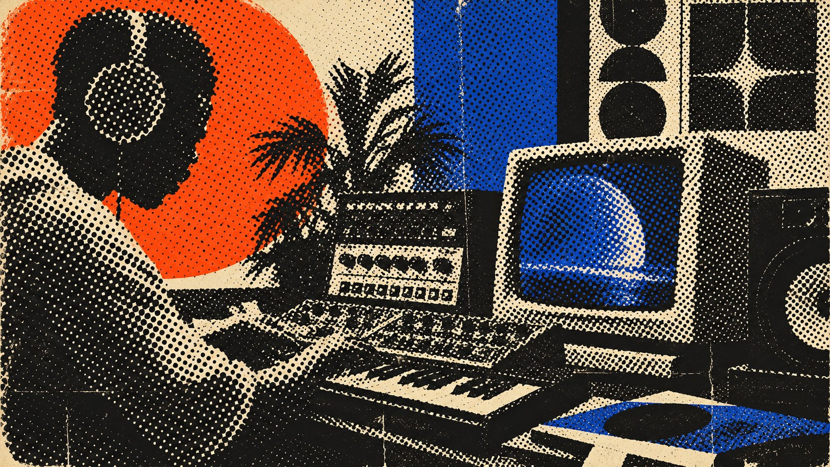
A music producer in headphones at a synthesiser under an orange sun, printed as a coarse halftone in black, orange and blue.
Archive plate · Halftone
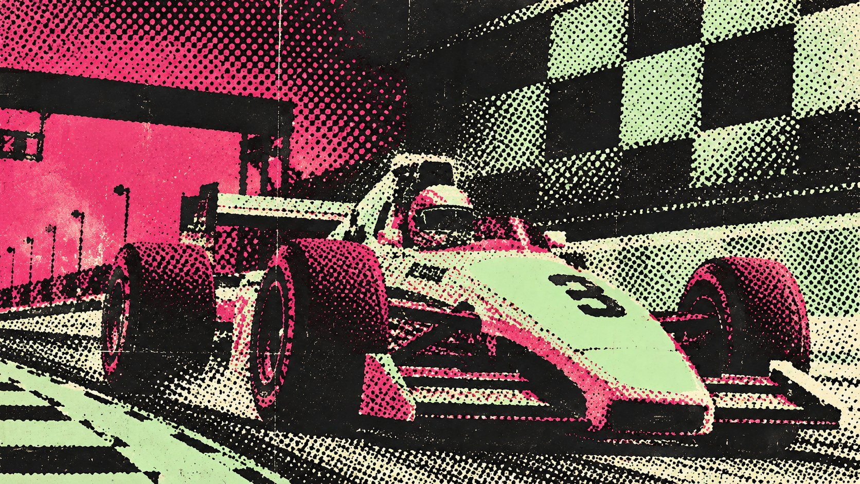
A single-seater race car at speed, printed as a coarse pink, mint and black halftone on newsprint.
Dossier sceneRacer · 1/4
01
The record

What it is, when it works, who it is for, and where it already exists.

How to use it

Record 027-HA - when it works, who it is for, what it looks like

FIELD 01

When to use it

  • Posters, sleeves and editorial covers that want to feel printed rather than rendered
  • Pop, comic and newspaper references handled with a real screen
  • Brands that need one-colour or two-colour print to carry photography
  • Motion and web graphics that want texture without a filter look
FIELD 02

Perfect for

  • Record labels and music posters
  • Magazines and independent publishing
  • Streetwear and merchandise
  • Food and drink packaging with a print heritage
FIELD 03

What it looks like

  • Stephen Horgan, 'A Scene in Shantytown', New York Daily Graphic, 1880
  • Frederic Ives's cross-line halftone screen, 1881 to 1882
  • Roy Lichtenstein, Whaam!, 1963
  • Sigmar Polke's raster paintings, 1960s

In the wild, Halftone aesthetic real-world examples

Where this aesthetic shows up in the real world · ↗ opens the source site

Omoro Style GuideEvery aesthetic, every field on this page, in one PDF.
Get the guide →
02
The anatomy

Where Halftone came from, what makes it recognisable, and the fingerprint it leaves.

History, Halftone aesthetic history

1880 to now · Newspaper photo-reproduction in New York, then comics, pop art and every printing press since

Before the halftone, a newspaper could print a photograph only by having an engraver copy it by hand. On 4 March 1880 the New York Daily Graphic printed "A Scene in Shantytown", made by Stephen Horgan by exposing the photograph through a screen so that every tone became a dot of a different size. Frederic Ives made the method commercial in 1881 and 1882 with a cross-line screen of two ruled glass plates, and by the 1890s the photograph had become an ordinary part of the printed page.

The same principle ran through comics. Benjamin Day's Ben-Day dots, from 1879, let printers add flat tints by laying evenly spaced dots rather than varying their size, and cheap colour printing turned them into the texture of the funny pages. Colour reproduction layered four screens of cyan, magenta, yellow and black at different angles so that the dots form rosettes instead of a moiré.

Artists made the dot the subject. Roy Lichtenstein painted Ben-Day dots by hand at enormous scale, as in Whaam! of 1963, and Sigmar Polke built paintings from enlarged raster screens in the same decade. Since then the halftone has run through punk flyers, record sleeves, streetwear and motion graphics, and every design tool now ships a filter for it, which is exactly why the good work is still made with a real screen and a real press.

A photograph broken into dots that the eye puts back together.

Omoro dossier · 027-HA

Visual markers, Halftone aesthetic visual markers

The visual DNA: what makes it recognisable

typography

See the fonts
  • Condensed newspaper grotesks and tabloid headlines
  • Comic lettering in speech balloons and caption boxes
  • Type in one flat ink, never screened itself

grid

  • One enlarged photograph dominating the page
  • Tabloid layouts with heavy rules and stacked headlines
  • Comic panels with flat tint fields
  • The dot enlarged until it becomes a pattern at arm's length

materials

  • Newsprint #EFE9DC and press black #1A1A1A as the ground and the dot
  • Process cyan #00AEEF, magenta #EC008C and yellow #FFF200 for the rosette
  • Uncoated newsprint, offset plates, screen-printed card and photocopies
  • Ink spread and slight misregistration left in

motifs

  • Enlarged dot screens
  • CMYK rosettes and deliberate moiré
  • Ben-Day tint fields
  • Hard-lit portraits and crowds broken into dots

Aesthetic profile

8-channel console with the fingerprint on its display. Save the card, or share the page

Aesthetic Profile
Halftone
1880 to now · Newspaper photo-reproduction in New York, then comics, pop art and every printing press since
Attribute console · 027-HA
leans analog, nostalgic, geometric
8 CH
FIG. 1
MaximalMinimalAnalogDigitalExpressiveRestrainedWarmCoolNostalgicFuturisticStructuredChaoticLightDarkGeometricOrganic
01Minimal
Maximal10%
02Analog
Digital60%
03Restrained
Expressive30%
04Cool
WarmEVEN
05Futuristic
Nostalgic60%
06Structured
Chaotic50%
07Dark
Light30%
08Organic
Geometric60%
AnalogNostalgicGeometric
Omoro · Attribute console · 027-HA
omoro.io/styles/halftone

Color Palettes, Halftone color palettes and hex codes

The definitive color scheme for this aesthetic

Halftone
#EFE9DC · #1A1A1A · #00AEEF · #EC008C · #FFF200
A tabloid front page under a loupe: press black and CMYK dots on newsprint
Omoro Palette Pack575 curated palettes across every aesthetic, 5 export formats.
Get the palettes →

Adjacent Palettes, styles related to Halftone

The colour of the styles sitting closest to this one

Pop Art
Risograph
Screen Printing
Printmaking
03
The direction

How to shoot it, how to prompt it, and how to board it.

Photo Direction

How to shoot this aesthetic

"Shoot for the screen: bold shapes and hard contrast that still read when the picture is broken into dots"

Shot list

  • A music producer in headphones at a synthesiser and monitors, hard side light, printed as a coarse halftone with an orange sun behind
  • A race car at speed, low and close, reproduced in two or three flat inks with a visible dot screen and a checkered backdrop
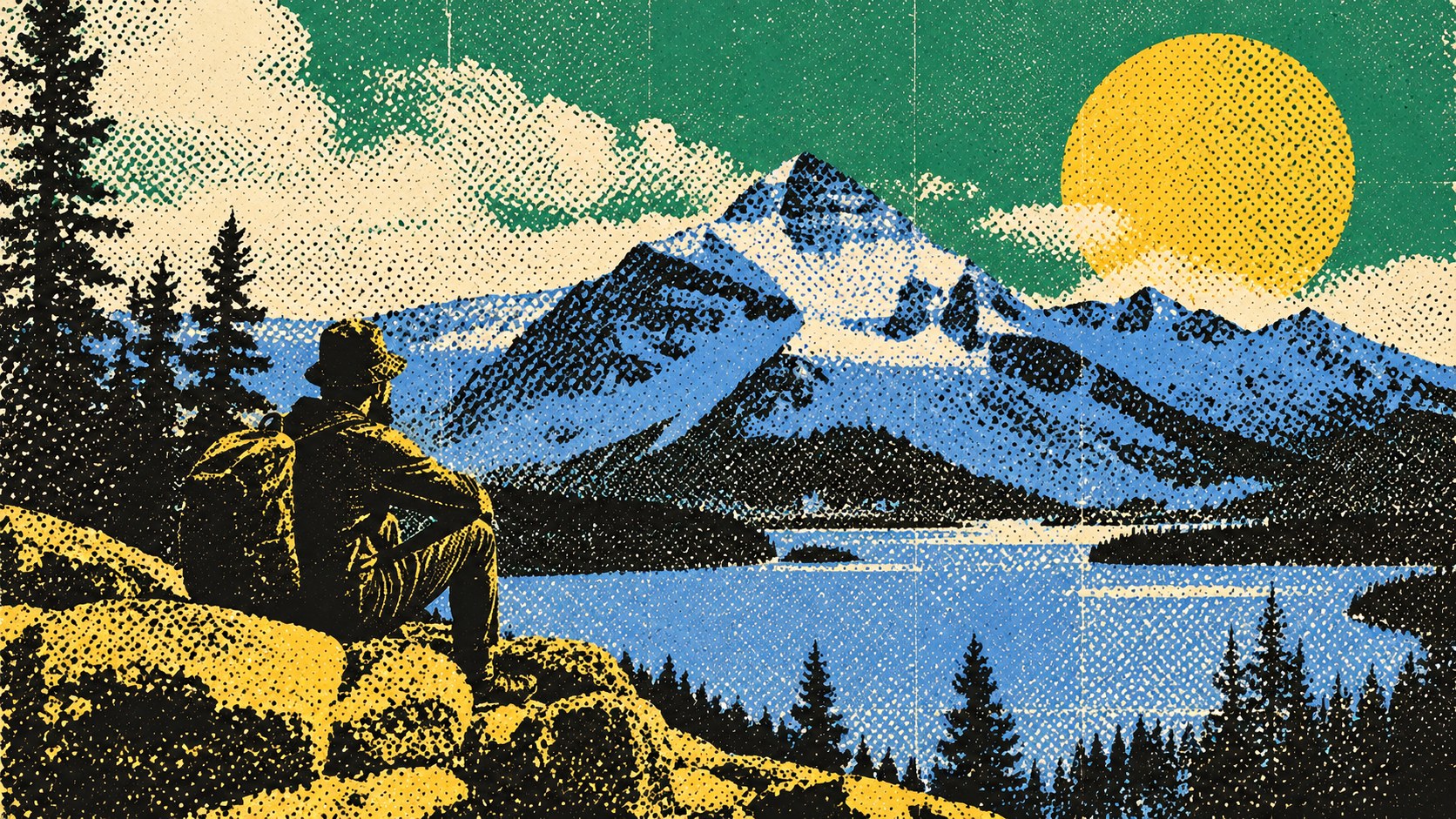
  • A hiker above a mountain lake, the sky and water reduced to flat halftone fields of green, blue and yellow

Lighting

Hard, directional light and deep shadows. Halftone rewards contrast and punishes flat light: mid-grey becomes an even field of dots and the picture disappears.

Omoro Director's Briefs196 photo shot-lists like this one, ready to shoot from.
Get the briefs →

Generative Prompt

Drop this into Studio to generate in this aesthetic

Halftone print aesthetic, a photograph or illustration reproduced as a visible dot screen, enlarged dots and CMYK rosettes, press black and process cyan, magenta and yellow on off-white newsprint, slight ink spread and misregistration, moiré where screens overlap, high-contrast subject, printed texture, no smooth gradients, no text

Paste as-is, or append your own subject

Mood Board

The record applied to your project. The record's kit is free; your brand, references and plates come with membership

Mood board
The Halftone board
8 frames · 4 selected
FIG. 4
NewsprintEFE9DCPress Black1A1A1AProcess Cyan00AEEFProcess MagentaEC008CProcess YellowFFF200
Brand and references
IdleBrand and references open with membership
With membership: the brand's own facts and colours in every prompt, references carried into every frame, and the plates generated.
01 · Hero application
02 · Material and finish
03 · Palette in context
04 · Photography direction
05 · Pattern plate
06 · Object
07 · Environment
08 · Digital presence
Demo kit free, the rest with membershipThe record as a demo kit, free. Name a project and it is written for that
Omoro · Mood board · 027-HA
04
The judgement

Whether to use it, what it costs to do properly, and where it stands right now.

Creative verdict, Halftone feasibility and strategic recommendation

Two written calls, seven meters, and when to walk away

Creative verdict
Should Halftone be the call?
7 meters
FIG. 2
Assessment

Pick a subject with strong shapes and big tonal contrast, then enlarge the dot until it is a pattern you can see at arm's length. Keep the screen angles honest (15, 45, 75 and 0 degrees for CMYK) so the rosette forms instead of a moiré. Print it or scan a print: a filter on a flat photo looks like a filter.

Verdict

Right when the work should feel printed, populist and a little loud: music, streetwear, independent publishing, food and drink with a print heritage. It rewards bold subjects and big dots. Choose the screen deliberately and print it for real where you can; the default filter is what everyone else is using.

Production cost
Low

A halftone filter, a riso or a screen-printer. The screen is cheap; the photograph under it is the investment.

Creative difficulty
Medium

Choosing the screen size, the angle and how far to enlarge the dot is the design decision.

Execution difficulty
Medium

Screens moiré when they are layered carelessly, and fine dots fill in on cheap paper.

Risk of misuse
Medium

A halftone filter over a weak photograph is still a weak photograph, now with dots.

Prevalence
Common

It runs through pop art, music posters, streetwear and comics, and every design tool ships a halftone effect.

Longevity
Timeless

Every printed photograph for a century was a halftone; the dot will not date.

Brand investment
Low

One screen treatment carries a whole campaign across print, merch and screen.

Avoid if
The photograph is weak or low contrast
Dots amplify the shapes that are there. A flat image becomes flat dots.
Fine detail has to survive at small sizes
A coarse screen eats small type and fine texture; at small sizes it turns to grey.
It will only ever be a one-click filter
Default halftone effects are instantly recognisable and read as a preset.
Omoro · Creative verdict · 027-HA

Editorial Depth

A Pro feature: origins, practitioners, and pitfalls

Editorial depth
The Halftone file
14 sections
FIG. 3
Context02Brands02Perception04Use04Index02
01Common MisconceptionThe principle beneath the surface
02Historical ContextOrigins, cultural moment, and reaction
03Brands That Accidentally Use This StyleNatural alignment, not category claims
04Brands That Perfectly Represent This StyleExceptional execution
05Psychological EffectHow visual decisions change perception
06Visual ChecklistInclude and avoid
07Creative FormulaThe visual system reduced to essentials
08Recognition SignalsHow to recognize it in two seconds
09When To Use This StyleContexts where the language performs
10Common Creative MistakesWhere imitation weakens the signal
11Best Brand ApplicationsIndustries with a natural advantage
12Creative Application AnalysisFit, feasibility, and production reality
13Related StylesClose languages and the key distinction
14Visual DNA SummaryThe sentence to remember
The editorial depth, with membershipOpening soon
Omoro · Editorial depth · 027-HA
05
The index

Neighbours, cross-references, blends, and the questions people ask.

Related concepts

Connected across the creative knowledge graph

Cultural relevance, Halftone cultural relevance today

Where it stands now, and what it costs you to use it

Halftone is the visual memory of the printed photograph, and it carries that populist, mass-produced energy into anything it touches: posters, sleeves, merch, editorial. Enlarged, the dot becomes both texture and argument, a reminder that the image was reproduced rather than taken.

The failure mode is the preset. Every tool has a one-click halftone, and at its defaults it is instantly recognisable. The work that lands chooses the screen, the angle and the scale for the viewing distance, and ideally goes through a real press or scanner.

Cross-references

Pop ArtThe movement that painted the dot and made it an image in its own rightRisographAnother print process whose grain and misregistration are the pointScreen PrintingThe press that makes enlarged dots cheap and physicalPrintmakingThe wider tradition of images made to be reproduced

Blend

Mix Halftone with any style in the library

Halftone×
50%50%
70% alike
Halftone referencePop Art referenceHalftone 50%Pop Art 50%

Merged palette

#EFE9DC

#000000

#1A1A1A

#FF0000

#00AEEF

Leads expressive, nostalgic, light

Typography · from Halftone

Oswald over Roboto

Materials

  • Newsprint #EFE9DC and press black #1A1A1A as the ground and the dot
  • Process cyan #00AEEF, magenta #EC008C and yellow #FFF200 for the rosette
  • Primary palette: red #CC0000, yellow #FFCC00, blue #0055A4, cyan #00AAFF

The calls this blend forces

These two disagree on 2 things, and a blend cannot average them: you pick a side. At this mix:

Structured or Chaotic? Halftone is structured, Pop Art is chaotic. This mix lands structured.

Analog or Digital? Halftone is analog, Pop Art is digital. This mix lands analog.

Use it

Halftone print aesthetic, a photograph or illustration reproduced as a visible dot screen, enlarged dots and CMYK rosettes, press black and process cyan, magenta and yellow on off-white newsprint, slight ink spread and misregistration, moiré where screens overlap, high-contrast subject, printed texture, no smooth gradients, no text (50%), infused with Pop Art with bold flat color fields and hard black outlines, Roy Lichtenstein Ben-Day dot technique or Warhol screenprint repetition, commercial and consumer imagery elevated to fine art, comic-book and advertising visual language, punchy saturated color contrast, color palette strictly #EFE9DC #000000 #1A1A1A #FF0000 #00AEEF, leaning structured over chaotic, analog over digital, overall character: expressive, nostalgic, light

One-click generation opens with the studio

About this aesthetic

What is halftone?

A way of printing continuous tone with dots. A photograph is exposed through a screen so that darker areas become larger dots and lighter areas smaller ones; at normal viewing distance the eye blends them back into a smooth image. Colour printing overlays four screens, cyan, magenta, yellow and black, at different angles.

What is the difference between halftone and Ben-Day dots?

Halftone dots change size to reproduce tone. Ben-Day dots, from 1879, are evenly spaced dots of one size used to lay a flat tint, which is why comics have them and why Lichtenstein painted them.

How do you avoid moiré in halftone?

Set each colour's screen at a different angle, traditionally 15, 45, 75 and 0 degrees for cyan, black, magenta and yellow, so the dots form a rosette. Moiré appears when two screens meet at similar angles or when a screen is scanned and re-screened.

Build with the halftone aesthetic

Every style in the library is broken down like this one: the palette, the typography, the materials and the lineage.

Explore the style library →