Registrar's index cards on the platen glass - captured by the scanner
Early 20th century–present · East Asian stencil traditions; industrialized in Britain and the United States; contemporary global practice
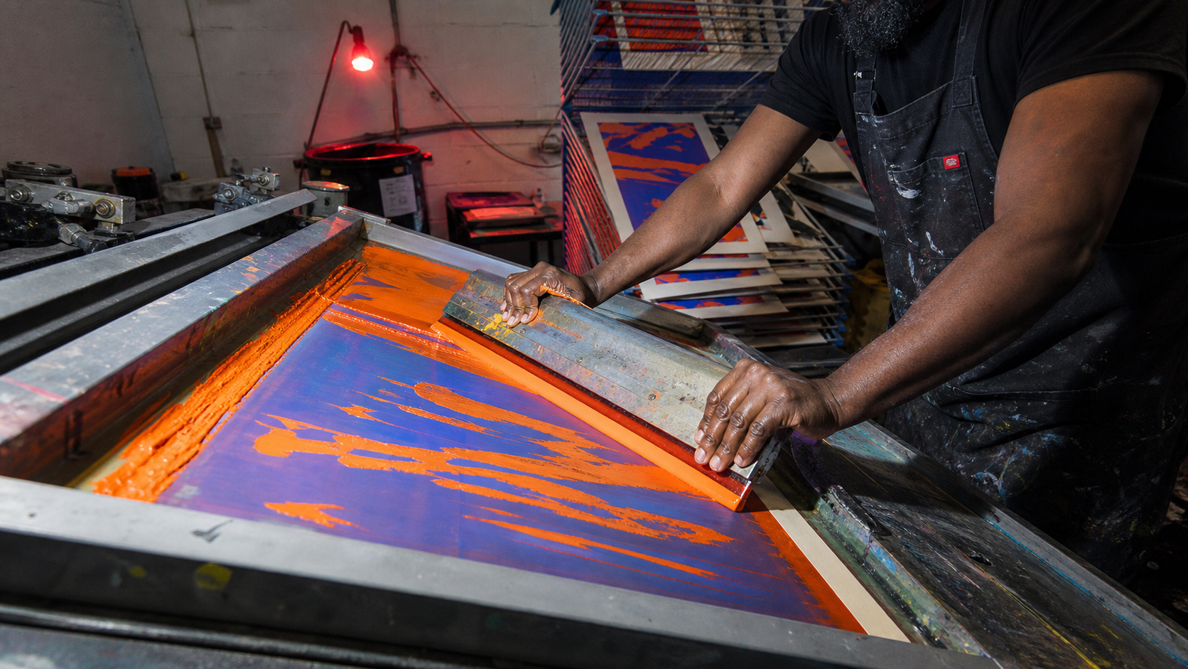
Screen printing, also called silkscreen or serigraphy, transfers ink through a fine mesh whose blocked areas form a stencil. Its ancestry reaches back to stencil printing in China and Japan, but the modern process emerged when woven mesh, commercial stencil films, and hinged frames made repeatable industrial printing possible in the early twentieth century. Unlike relief or intaglio, the screen does not carry an engraved image: it controls where a squeegee forces ink directly onto paper, fabric, metal, glass, or almost any flat surface.
The process moved between commerce, politics, music, and fine art with unusual freedom. The Works Progress Administration used screen printing for public posters in the 1930s. Sister Corita Kent transformed the medium into an exuberant language of type, advertising fragments, and social conscience. Andy Warhol used photographic screens, repetition, and deliberate variation to collapse the boundary between mass image and art object. Concert-poster workshops, activist collectives, and independent apparel studios then made the hand-pulled screen print a durable instrument of subculture.
Contemporary screen printing is defined less by nostalgia than by material intelligence. Designers work with dense spot colors unavailable in process printing, fluorescent and metallic inks, split fountains, transparent overprints, coarse halftones, and registration shifts that reveal the sequence of production. The best work designs for the process: each color earns its own screen, every overlap creates a third color, and the edition carries small differences that turn mechanical repetition into evidence of human pressure and timing.
The visual DNA: what makes it recognisable
- Condensed grotesks and oversized display type designed as solid printable shapes
- Hand-cut stencil lettering with bridges, blunt corners, and physical irregularity
- Type knocked out of dense ink fields or overprinted until colors optically mix
- Coarse halftone type and image treatments that expose the dot rather than hide it
- One compositional layer per ink color, planned as separations before printing
- Registration marks, crop marks, and tape edges treated as useful production evidence
- Poster-scale hierarchy: one dominant image or phrase readable across a room
- Repetition in editions, tiled garments, and serial image systems with controlled variation
- Carbon black #171717: dense and slightly raised on uncoated stock
- Safety orange #FF5A1F and fluorescent magenta #E92472: spot colors beyond ordinary CMYK
- Process cobalt #2450D8: a saturated cool counterweight for overprint
- Warm stock #F3E9D2: paper tooth remains visible beneath opaque and transparent ink
- Visible halftone dots translating photographs into printable tone
- Slight misregistration creating colored edges and kinetic vibration
- Transparent overprints where two physical inks produce a third color
- Mesh grain, squeegee streaks, pinholes, and ink variation retained as process signatures
8-channel console - dominant channels taped & circled by the registrar
Your aesthetic passport - share the fingerprint
The definitive color scheme for this aesthetic
How to shoot this aesthetic
Join waitlist for access
Join the waitlist for full access
Join the waitlistScreen Printing: where the language earns its place
Screen Printing is most effective when its visual decisions do useful work. A stencil-through-mesh process defined by dense flat ink, layered color, halftones, and the productive tension of registration
The style gives styling, proportion, and image sequencing a clear point of view rather than treating them as decoration.
It can turn atmosphere, material, and spatial pacing into evidence of a distinct experience before a visitor arrives.
It helps a physical or editorial environment feel authored, which raises attention and perceived care.
They recognize the references, proportion, and restraint that make the language feel intentional.
They respond to visible judgment because it reduces the feeling of interchangeable product.
A coherent aesthetic gives them a usable standard for choosing images, objects, and collaborators.
The cost comes from consistent art direction, suitable locations or materials, and time to edit the details that would otherwise undermine the premise.
The challenge is conceptual. It takes visual literacy and a real point of view to avoid borrowing surface cues without their original logic.
Lighting, casting, type, color, material, and retouching must agree. A single weak choice can make the work feel like an imitation.
Screen Printing creates its strongest advantage when it gives a brand a standard of judgment, not merely an attractive finish. It fails when recognizable cues are collected without a governing idea. The difference between average and exceptional execution is usually proportion: how much is shown, what is withheld, and whether every element belongs to the same world. The most capable teams pair an exacting art director with specialists who understand the medium, from photographer and stylist to set designer, editor, and typographer.
Should Screen Printing be the strategic choice?
Surface imitation is easy. The language becomes generic when familiar cues replace proportion, specificity, and a coherent system.
Its visual ingredients appear regularly in contemporary work, but a rigorous execution remains distinguishable from a loose collection of references.
Its strongest principles depend on composition, material, and cultural literacy rather than a short-lived visual effect.
It asks for consistency across photography, typography, motion, environments, and the many details that make a brand feel believable.
Screen Printing deserves serious consideration from brands and institutions that can articulate a real point of view and protect it through execution. It is less suitable for work that needs immediate instructional clarity, broad visual neutrality, or low-cost production flexibility. Its greatest advantage is differentiation through judgment: it can make a product, place, or editorial proposition feel authored rather than merely packaged. Average executions borrow recognizable signals, then lose coherence when type, casting, copy, or materials fail to agree. Exceptional executions understand the visual language as a system of choices, including what not to show. The largest mistake is treating the style as a finish applied after strategy. Adopt it only when the product and organization can carry the same standard of care the imagery proposes.
Join waitlist for access
Join the waitlist for editorial depth
Join the waitlistConnected across the creative knowledge graph