Registrar's index cards on the platen glass - captured by the scanner
1890-1910 · Belgium and France, with variants across Europe
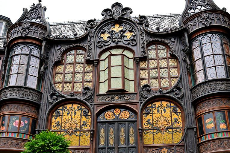
Art Nouveau erupted simultaneously across Europe in the 1890s under different names: Jugendstil in Germany, Stile Liberty in Italy, Modernisme in Catalonia, Secession in Austria. Victor Horta in Brussels fired the starting gun with the Hotel Tassel (1893), whose iron columns and staircases blossomed into organic curves that flowed from structure through railing through mosaic floor in a single continuous gesture. Hector Guimard's Paris Metro entrances (1900) made Art Nouveau the style of an entire city's infrastructure.
The movement's ambition was total design: building, interior, furniture, light fixtures, door handles, and tableware unified in a single organic language. Antoni Gaudi pushed this furthest in Barcelona. The Casa Batllo (1906), Casa Mila (1910), and the Sagrada Familia (begun 1882, still under construction) demonstrate an approach where structure, ornament, and natural form are inseparable. Gaudi's buildings do not have decoration applied to structure; the structure itself is decorative, deriving its geometry from catenary curves, hyperbolic paraboloids, and forms found in bones, shells, and trees.
Art Nouveau burned brightly and briefly. By 1910, the Viennese Secession (Josef Hoffmann, Adolf Loos) was already stripping away the ornament, preparing the ground for Modernism. The style's reliance on handcraft made it expensive and incompatible with industrialization. But its core insight, that modern buildings could draw on nature for structural and ornamental logic, persisted in organic architecture and returned in contemporary biomimetic design.
The visual DNA: what makes it recognisable
- Flowing, organic display faces: Arnold Bocklin, Eckmann, Art Nouveau faces
- Hand-drawn letterforms with whiplash curves and floral terminals
- Titles integrated into architectural decoration
- Jugendstil-influenced geometric alternatives: Behrens Antiqua
- Asymmetric facades with organic, flowing compositions
- Curved walls and windows following natural forms
- Interiors organized around central staircases as sculptural events
- Floor plans with rounded rooms and alcoves
- Wrought iron in organic curves: #3C3C3C, #4A4A4A
- Colored and opalescent glass: emerald, amber, peacock blue
- Ceramic tile and mosaic (trencadis in Gaudi's work): polychrome
- Carved stone with floral and organic relief: #D8CCA8, #C8BC98
- Whiplash curves and tendril forms in ironwork
- Floral and vegetal ornament derived from specific plants
- Dragonflies, peacocks, and other Art Nouveau fauna
- Stained glass skylights and windows with nature motifs
8-channel console - dominant channels taped & circled by the registrar
Your aesthetic passport - share the fingerprint
The style's primary materials, assembled bottom-up
Tap a stratum for material detail · Full catalog
Early Modern · 1890–1910 - tap any style to travel
Join waitlist for access
Join the waitlist for full access
Join the waitlistArt Nouveau: where the language earns its place
Art Nouveau is most effective when its visual decisions do useful work. Nature set loose in iron and glass - Art Nouveau dissolved the straight line into whiplash curves, tendrils, and organic ornament, from Victor Horta's Brussels townhouses to Hector Guimard's Paris Métro entrances and Gaudí's molten Catalan facades.
The style gives styling, proportion, and image sequencing a clear point of view rather than treating them as decoration.
It can turn atmosphere, material, and spatial pacing into evidence of a distinct experience before a visitor arrives.
It helps a physical or editorial environment feel authored, which raises attention and perceived care.
They recognize the references, proportion, and restraint that make the language feel intentional.
They respond to visible judgment because it reduces the feeling of interchangeable product.
A coherent aesthetic gives them a usable standard for choosing images, objects, and collaborators.
The cost comes from consistent art direction, suitable locations or materials, and time to edit the details that would otherwise undermine the premise.
The challenge is conceptual. It takes visual literacy and a real point of view to avoid borrowing surface cues without their original logic.
Lighting, casting, type, color, material, and retouching must agree. A single weak choice can make the work feel like an imitation.
Art Nouveau creates its strongest advantage when it gives a brand a standard of judgment, not merely an attractive finish. It fails when recognizable cues are collected without a governing idea. The difference between average and exceptional execution is usually proportion: how much is shown, what is withheld, and whether every element belongs to the same world. The most capable teams pair an exacting art director with specialists who understand the medium, from photographer and stylist to set designer, editor, and typographer.
Should Art Nouveau be the strategic choice?
Surface imitation is easy. The language becomes generic when familiar cues replace proportion, specificity, and a coherent system.
Its visual ingredients appear regularly in contemporary work, but a rigorous execution remains distinguishable from a loose collection of references.
Its strongest principles depend on composition, material, and cultural literacy rather than a short-lived visual effect.
It asks for consistency across photography, typography, motion, environments, and the many details that make a brand feel believable.
Art Nouveau deserves serious consideration from brands and institutions that can articulate a real point of view and protect it through execution. It is less suitable for work that needs immediate instructional clarity, broad visual neutrality, or low-cost production flexibility. Its greatest advantage is differentiation through judgment: it can make a product, place, or editorial proposition feel authored rather than merely packaged. Average executions borrow recognizable signals, then lose coherence when type, casting, copy, or materials fail to agree. Exceptional executions understand the visual language as a system of choices, including what not to show. The largest mistake is treating the style as a finish applied after strategy. Adopt it only when the product and organization can carry the same standard of care the imagery proposes.
Join waitlist for access
Join the waitlist for editorial depth
Join the waitlistConnected across the creative knowledge graph