Mood guide · Visual archive

Playfulness & Joy

What visual style conveys playfulness and joy?

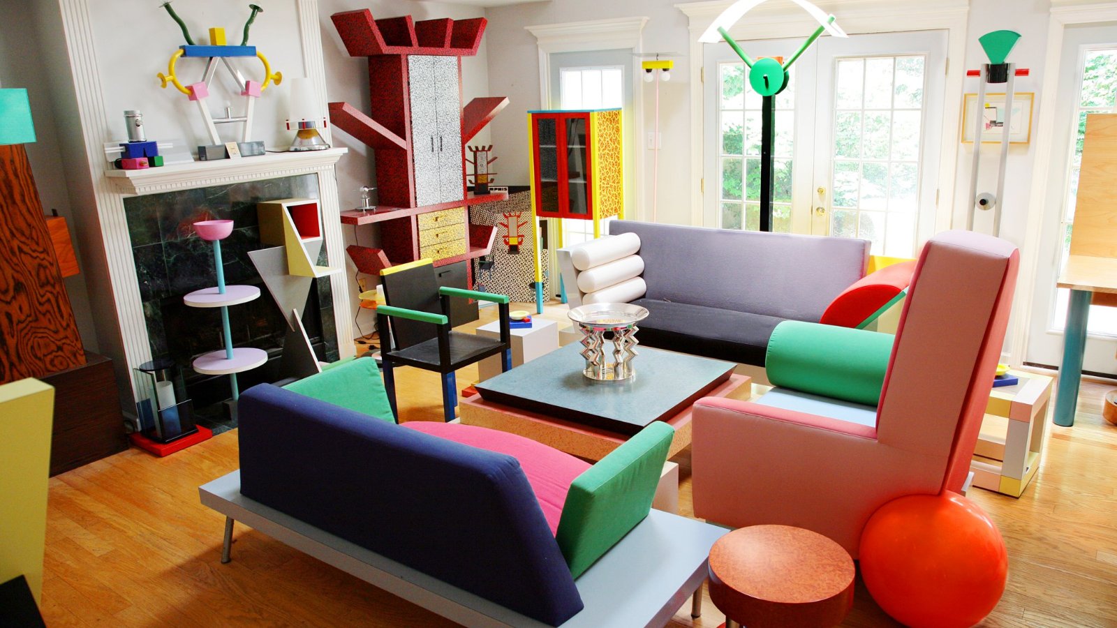
saturated joyround formsdeliberate fun

Playfulness is a system generous enough to let surprise in.

Visual DNA
Contrast4/5
Geometry3/5
Texture2/5
Warmth5/5
Movement4/5
Precision3/5
Psychological effect

Soft geometry and unexpected rhythm lower social distance. The viewer reads the work as an invitation to participate rather than a demand to perform.

Recognition signals
saturated joyround formsdeliberate fun
Common misread

Adding fun without a system. Randomness feels careless, not generous.
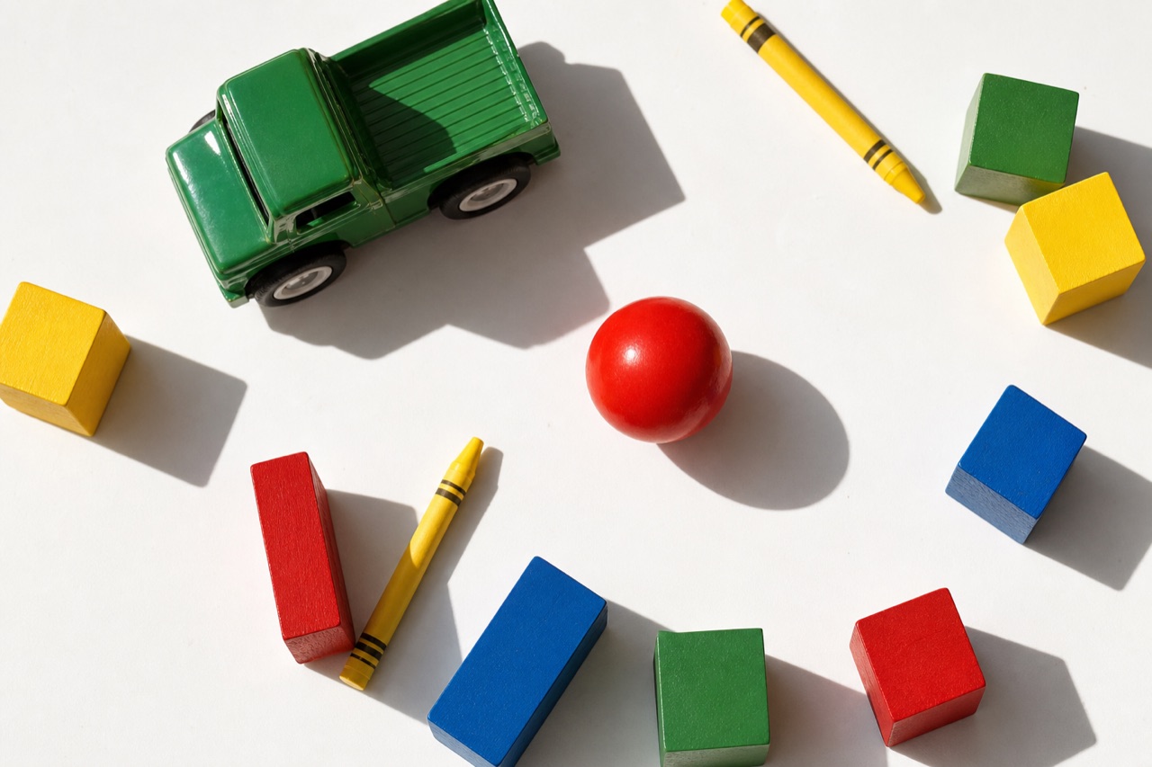
Playfulness & Joy editorial reference
Mood referencePlayfulness & Joy
Kidcore aesthetic - Playfulness & Joy visual reference
Kidcore
Memphis aesthetic - Playfulness & Joy visual reference
Memphis
Corporate Memphis aesthetic - Playfulness & Joy visual reference
Corporate Memphis
Visual referencesPlayfulness & Joy

Playfulness is not immaturity. It is a controlled suspension of the rules that make most visual systems feel efficient, adult, and resolved. Round forms lower the threshold for approach. Unexpected scale changes invite exploration. Color becomes an action rather than a finish. The work succeeds when the underlying system remains legible enough that the viewer feels permission, not chaos.

Why it works

Soft geometry and unexpected rhythm lower social distance. The viewer reads the work as an invitation to participate rather than a demand to perform.

Visual formula
Round forms+
Color as action+
Unexpected scale+
Legible rules
=Permission & delight
Visual styles that communicate this
Corporate Memphis
Creative decision support
Best for

Discovery-led products

Culture and entertainment

Approachable complex ideas

Works well with

Energy · Authenticity · Nostalgia

Opposite mood

Luxury & Prestige

Common mistake

Adding fun without a system. Randomness feels careless, not generous.
Creative Application Analysis

Playfulness & Joy: practical creative value

Playfulness & Joy is not a demographic shortcut. It is a perceptual register that changes how a viewer reads pace, care, risk, and relevance in a visual system.

Best industries
Food and beveragePlayfulness & Joy gives this context a sharper signal of care and judgment, especially when the work needs to feel authored rather than generic.
EntertainmentPlayfulness & Joy gives this context a sharper signal of care and judgment, especially when the work needs to feel authored rather than generic.
Consumer technologyMeasured detail and consistent interaction cues make a technical capability feel reliable before the viewer studies its specification.
Best audiences
Creative professionalsThey respond to a mood when it gives them a sharper language for making and evaluating choices.
Considered audiencesThey read cohesion as evidence that the work has been thought through, not assembled by default.
People seeking a specific experienceThe mood creates a clear expectation of what the product, place, or story will feel like before it is explained.
Best products
Discovery-led productsThe playfulness & joy register gives this application a more immediate and distinctive point of entry.
Culture and entertainmentThe playfulness & joy register gives this application a more immediate and distinctive point of entry.
Approachable complex ideasThe playfulness & joy register gives this application a more immediate and distinctive point of entry.
Best campaign types
Brand positioningA sustained mood provides a decision rule for art direction, writing, image selection, and physical touchpoints.
Editorial and social seriesRepeated visual signals make a sequence coherent without making every frame identical.
Experience or launch filmSound, pace, casting, lighting, and material can reinforce a single perceptual promise.
Creative feasibility
Production costLow

Illustration and color-driven. Rarely needs a heavy production budget.

Creative difficultyMedium

The concept is accessible. Color without a rhythm is the common failure.

Execution difficultyMedium

Needs a real organizing rule underneath the fun or it reads as random.

Overall creative assessment

Playfulness & Joy creates competitive advantage where experience matters as much as information. It works best when the product, service, or story already contains evidence that can support the feeling. The common failure is to apply the mood as a filter, then leave the structure, casting, copy, and pacing unchanged. Exceptional work uses it as a governing decision rule. It knows what to amplify, what to withhold, and where a small concrete detail can do more than a large stylistic gesture. The teams most likely to succeed are small, observant, and cross-disciplinary: an art director with a strong editor, photographer or filmmaker, stylist or spatial designer, and a client willing to protect the central idea through production.

Strategic Recommendation

When playfulness & joy should guide the work

Best for
Discovery-led productsPlayfulness & Joy gives this work a perceptual logic that can carry across image, copy, motion, and environment.
Culture and entertainmentPlayfulness & Joy gives this work a perceptual logic that can carry across image, copy, motion, and environment.
Approachable complex ideasPlayfulness & Joy gives this work a perceptual logic that can carry across image, copy, motion, and environment.
Avoid if
The moment requires solemnity or reassurancePlayfulness can read as dismissive in a context that calls for gravity.
There's no organizing rule behind the color choicesRandom color without rhythm reads as chaotic, not joyful.
Risk of misuseMedium

Forced fun reads as try-hard more often than it reads as actively damaging.

Contemporary prevalenceCommon

A frequent reach for consumer and youth-facing categories.

LongevityTrend

Specific playful visual codes cycle as design trends shift.

Brand investmentLow

Illustration and color-driven work, rarely a heavy production cost.

Creative verdict

Playfulness & Joy is worth adopting when a brand, product, or cultural project needs to make a specific experiential promise before it can be explained in words. It is not a substitute for clarity, proof, or a coherent product. The greatest advantage comes from using the mood as a decision rule: it tells the team how to light a scene, pace a film, select a material, edit a sentence, and decide what to leave out. Average work applies familiar cues and stops there. Exceptional work makes every choice support the same perceptual outcome, while retaining enough specificity that the audience can believe it. The biggest mistake is assuming that emotional recognition alone creates strategic value. Use playfulness & joy only when the operation behind the image can honor the experience the image promises.

When to use this visual mood
  • Consumer products where discovery is part of the value
  • Youth culture and entertainment where energy must feel social
  • Food, beverage, and retail moments that reward impulse
  • Education and learning experiences that benefit from invitation
  • Campaigns that need to make a serious product feel less intimidating
What to avoid
  • Random color without a rhythm or organizing rule
  • Childlike illustration used to avoid a clear point of view
  • Forced enthusiasm that makes the audience feel managed
  • Playfulness applied to moments that require solemnity or reassurance
  • Rounded forms without contrast, which become bland rather than generous
Industries and use cases
Food and beverageEntertainmentConsumer technologyEducationBeautyRetail
Mood relationships
Playfulness & JoyEnergyAuthenticityNostalgiaOpposite: Luxury & Prestige
Energy & ExcitementNostalgia & MemoryAuthenticity & Craft
About this mood
What visual style communicates playfulness & joy?

Playfulness is not immaturity. It is a controlled suspension of the rules that make most visual systems feel efficient, adult, and resolved. Round forms lower the threshold for approach. Unexpected scale changes invite exploration. Color becomes an action rather than a finish. The work succeeds when the underlying system remains legible enough that the viewer feels permission, not chaos.

Styles that carry it

  1. Kidcore
  2. Memphis
  3. Corporate Memphis
  4. Pop Art
  5. Bubbleglam
  6. Space Age Pop
When should I use a playfulness & joy aesthetic?

Deploy it for

  1. Consumer products where discovery is part of the value
  2. Youth culture and entertainment where energy must feel social
  3. Food, beverage, and retail moments that reward impulse
  4. Education and learning experiences that benefit from invitation
  5. Campaigns that need to make a serious product feel less intimidating
What industries use playfulness & joy visual design?

Where it performs

  1. Food and beverage
  2. Entertainment
  3. Consumer technology
  4. Education
  5. Beauty
  6. Retail
What should I avoid when designing for a playfulness & joy mood?

These undo the mood faster than anything else builds it.

Do not

  1. Random color without a rhythm or organizing rule
  2. Childlike illustration used to avoid a clear point of view
  3. Forced enthusiasm that makes the audience feel managed
  4. Playfulness applied to moments that require solemnity or reassurance
  5. Rounded forms without contrast, which become bland rather than generous

Omoro Studio · Creative System

Generate in the Playfulness register

Omoro reads your visual references and generates in your exact aesthetic. Drop in images that carry the right mood and it extracts the DNA automatically.

Join the waitlist