When to use it
- Identities that need to be unmistakable from a single mark
- Motion and kinetic work where the still frame already moves
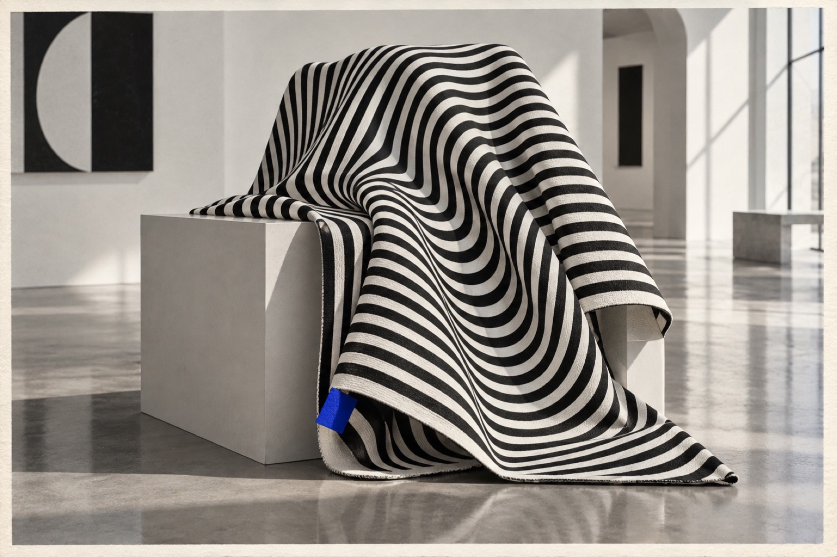
- Packaging and textiles that reward a second look
- Cover and poster design that has to hold a wall on its own
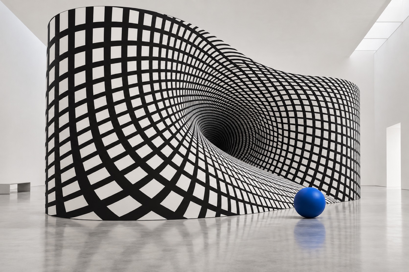
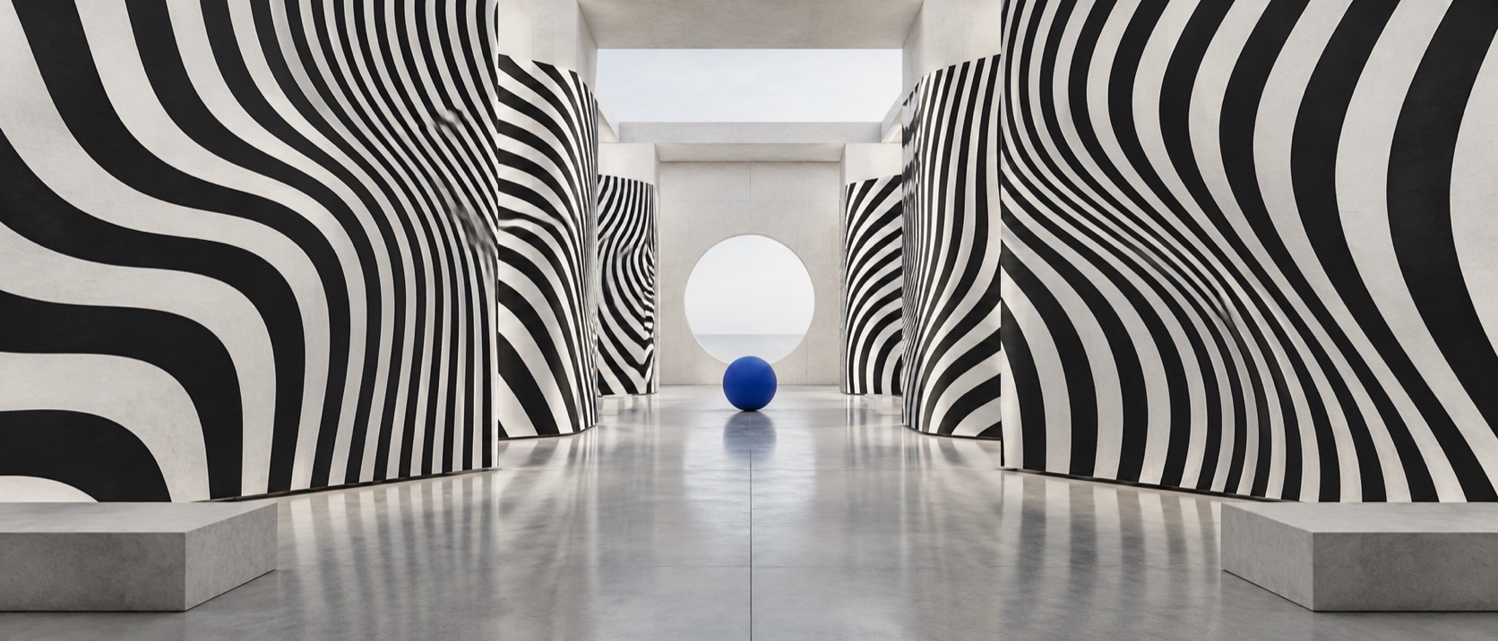
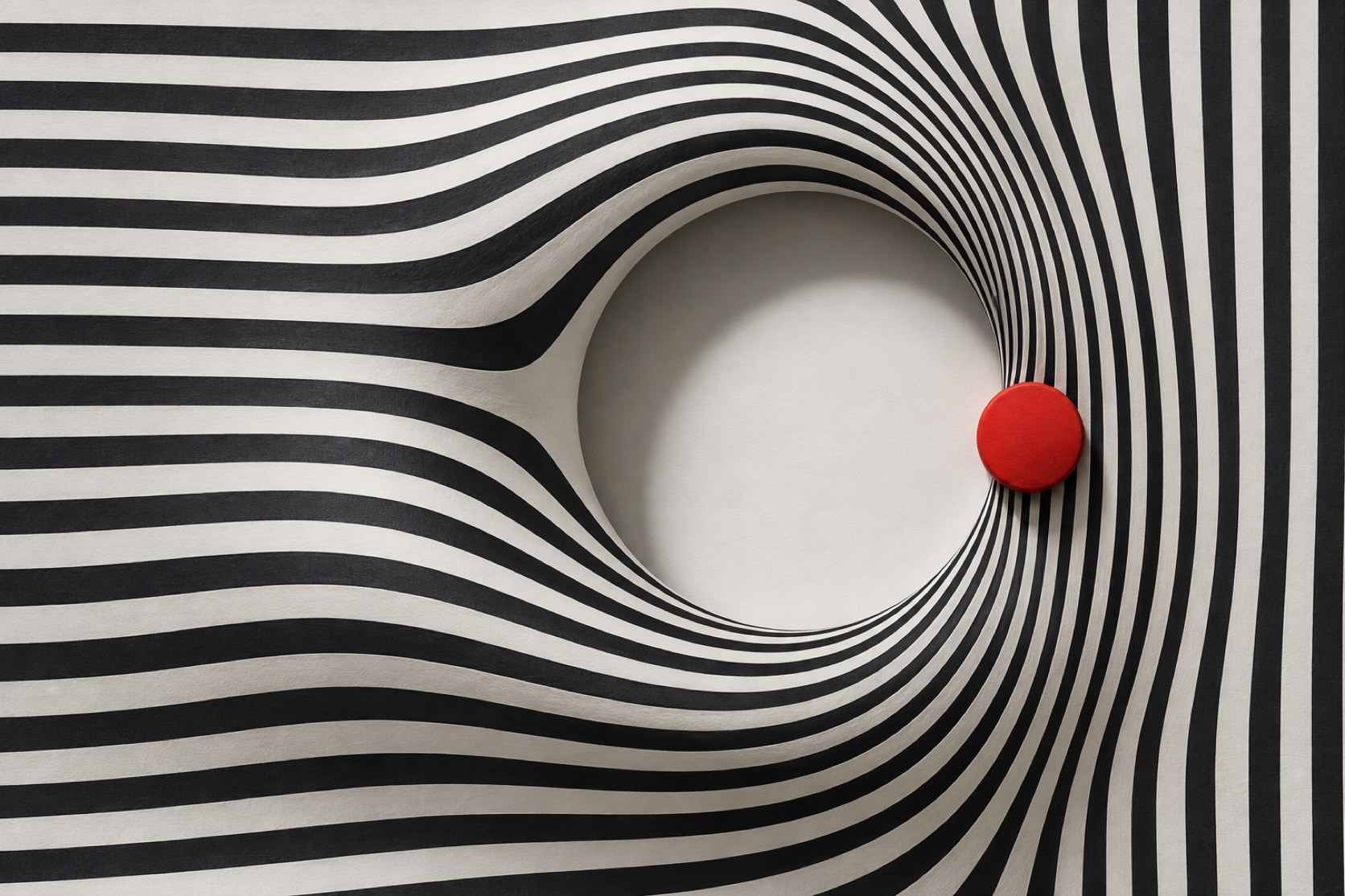
Black-and-white pattern engineered to move in the eye: warped grids, vibrating stripes and moire, with colour let in only to interrupt
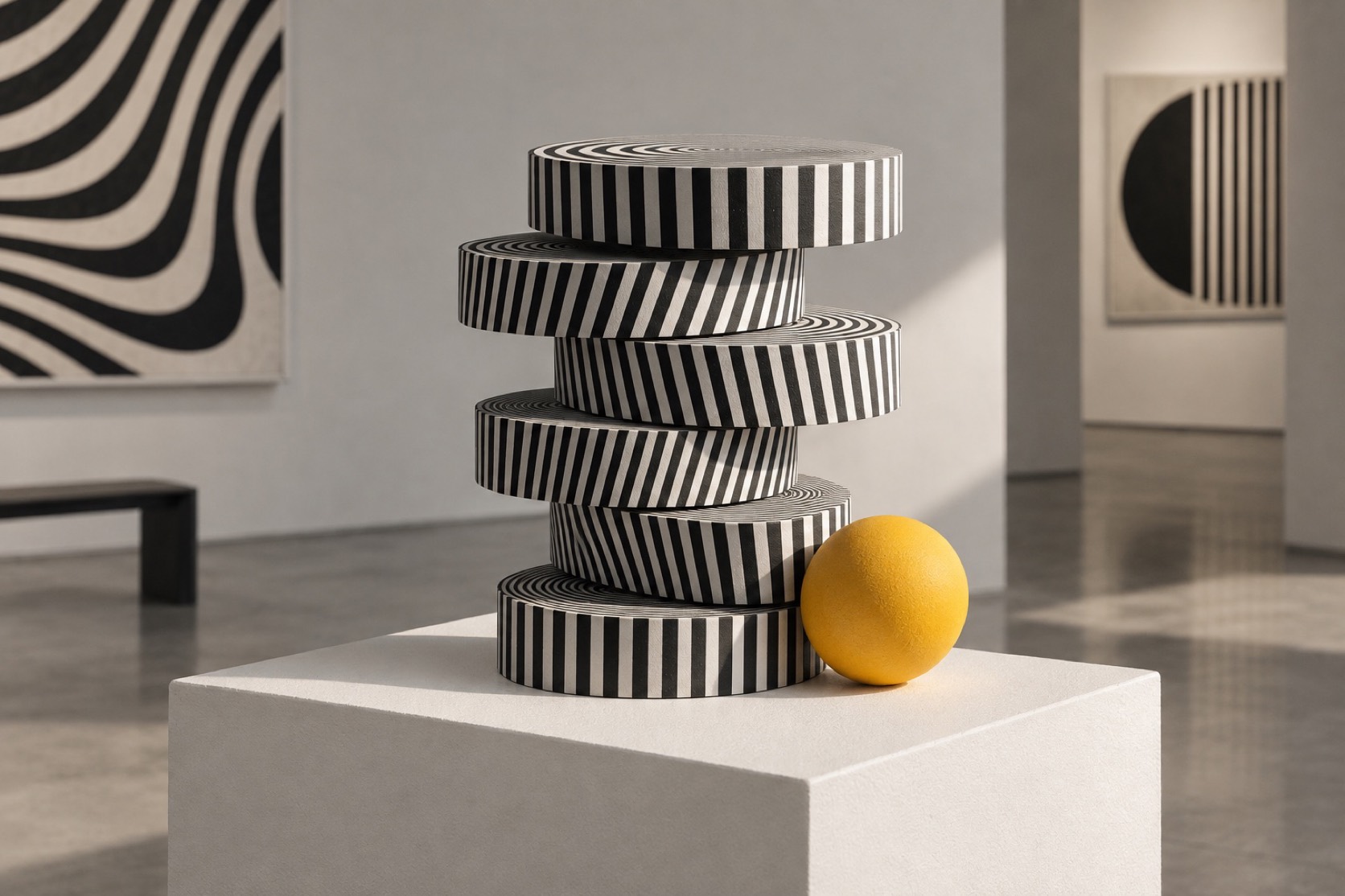
What it is, when it works, who it is for, and where it already exists.
Record 034-OA - when it works, who it is for, what it looks like
Where this aesthetic shows up in the real world · ↗ opens the source site
Where Op Art came from, what makes it recognisable, and the fingerprint it leaves.
1955-1970, revived continuously since · Paris, London and Buenos Aires, shown together in New York in 1965
Victor Vasarely painted Zebra in 1937, a pair of animals drawn only in bending stripes, and spent the next two decades working out what a flat surface could be made to do to a viewer. By the mid-1950s he had a vocabulary of grids, spheres pushed out of chequerboards and stripe fields that flickered, and a manifesto arguing that this was a democratic art because it worked on anyone with eyes. In Paris the GRAV group built rooms of moving light; in Buenos Aires Julio Le Parc and Jesus Rafael Soto hung acrylic rods and wires so that the pattern moved with the visitor. In London Bridget Riley painted Movement in Squares in 1961, a chequerboard compressed toward a vertical fold until it appeared to bend into the wall.
The Museum of Modern Art collected the tendency into an exhibition in 1965 and called it The Responsive Eye. The show was enormous and the press invented the name Op Art on the way in. Within months the patterns were on dresses, shop windows and record sleeves, and the artists who had spent years on the perceptual science watched their work become a fabric print. Riley objected publicly; the mismatch between the rigour of the painting and the speed of the fashion is part of the style's history and part of why it is so often misread as a novelty.
The method is exact and it is worth stating plainly. A pattern is drawn with hard edges and no gradient, then perturbed by a rule: a frequency changes, a grid warps, two sets of lines are overlaid so that a third pattern appears only in the eye. Colour is either absent or introduced as a single interruption, because two colours of similar value will vibrate against each other and take over. The surface stays flat and cool. Everything that looks like movement is the viewer's visual system failing to resolve the image, which is the point.
“Nothing on the surface moves. The eye does the animation.
The visual DNA: what makes it recognisable
8-channel console with the fingerprint on its display. Save the card, or share the page
The definitive color scheme for this aesthetic
How to shoot it, how to prompt it, and how to board it.
How to shoot this aesthetic
"Pattern engineered to move while the camera holds perfectly still"
Shot list
Lighting
Flat, even, shadowless light so nothing competes with the pattern. Softbox or overcast. The subject is contrast between black and white, and any gradient from lighting reads as a mistake.
Drop this into Studio to generate in this aesthetic
Op Art, 1960s perceptual abstraction, black and white pattern engineered to vibrate, warped grid, concentric and radial stripes, moire interference, spatial ambiguity, hard flat edges, mechanical precision, no gradient, no brush, one restrained colour interruption at most, cool and exact, not psychedelic
A Pro feature: a board generated from the record
A generated board, with membership
Opening soon
Whether to use it, what it costs to do properly, and where it stands right now.
Two written calls, seven meters, and when to walk away
Precision is the whole style. Draw the pattern hard-edged and flat, then disturb it by a single rule, because a field bent three ways at once reads as noise rather than as movement. Keep colour to one interruption. If it starts to feel psychedelic, reduce: fewer colours, harder edges, more white.
Right when a single mark has to be unmistakable and a still frame has to move, which is why it lives in identity and motion. The style was turned into fabric within months of its museum debut and Riley objected publicly; that mismatch between rigour and fashion is its whole history. It is cool and slightly hostile, and it works only when the surface is perfect.
Black ink on white and a rule. The effect is free once the rule is right.
The perturbation is the idea: warp, compress, overlay. Choose one.
Any soft edge, gradient or misregistration kills the vibration.
Too many colours or a soft edge and it collapses into a novelty print.
A recurring presence in identity, fashion and motion whenever pattern is the message.
Perception does not date. The 1965 paintings still move.
One rule generates a whole system, but the surface has to be flawless every time.
A Pro feature: origins, practitioners, and pitfalls
The editorial depth, with membership
Opening soon
Neighbours, cross-references, blends, and the questions people ask.
Connected across the creative knowledge graph
Where it stands now, and what it costs you to use it
Op Art sits behind a great deal of contemporary graphic and motion design: any identity that animates a still mark, any pattern system that rewards a second look, any interface that uses a subtle field behind stable type. It also lives in optics, science and instrument branding, where perception itself is the subject.
The style is precise and the failures are always the same: too many colours, soft edges, added gradients, or a drift into the psychedelic. The distinction matters. Psychedelia is warm, hand-drawn and celebratory; Op Art is cool, mechanical and slightly hostile, and it works only when the surface is flawless.
Mix Op Art with any of the library's 170+ styles
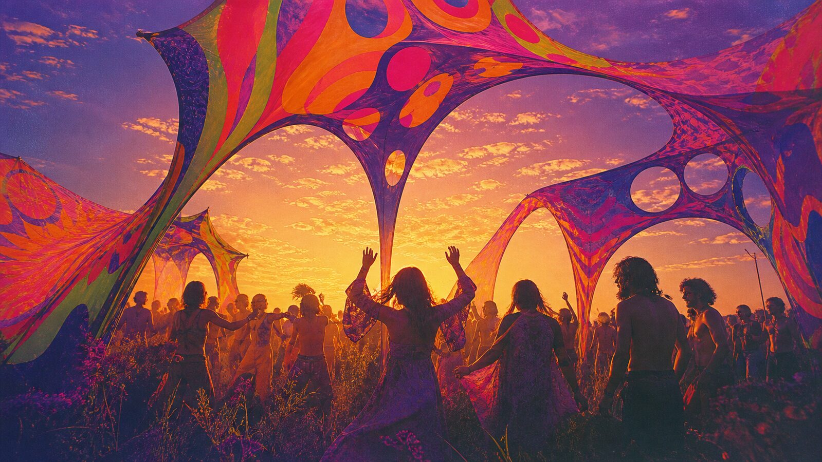 Op Art 50%Psychedelic 50%
Merged palette
#000000
#FF00FF
#FFFFFF
#FF7700
#6E6E6E
Leads expressive, maximal, nostalgic
Typography · from Op Art
Space Grotesk over Inter
Materials
The calls this blend forces
These two disagree on 2 things, and a blend cannot average them: you pick a side. At this mix:
Structured or Chaotic? Op Art is structured, Psychedelic is chaotic. This mix lands chaotic.
Geometric or Organic? Op Art is geometric, Psychedelic is organic. This mix lands geometric.
Use it
Op Art, 1960s perceptual abstraction, black and white pattern engineered to vibrate, warped grid, concentric and radial stripes, moire interference, spatial ambiguity, hard flat edges, mechanical precision, no gradient, no brush, one restrained colour interruption at most, cool and exact, not psychedelic (50%), infused with Psychedelic aesthetic with swirling kaleidoscopic patterns, Peter Max and Wes Wilson concert-poster lineage, electric neon color clashes, optical illusion spirals, 1967 Summer of Love mood, vibrant color halation and chromatic excess, color palette strictly #000000 #FF00FF #FFFFFF #FF7700 #6E6E6E, leaning structured over chaotic, geometric over organic, overall character: expressive, maximal, nostalgic
A 1960s movement in painting and design that uses hard-edged black-and-white pattern, warped grids, stripe fields and moire to produce the sensation of movement, vibration or depth on a flat surface. The image is still; the eye moves.
Op Art is cool, exact and mostly monochrome, built from rules applied to regular pattern. Psychedelic art is warm, hand-drawn, saturated and decorative. They share the idea of an image that moves and almost nothing else.
Victor Vasarely, Bridget Riley, Jesus Rafael Soto, Julio Le Parc, Carlos Cruz-Diez, Marina Apollonio, Richard Anuszkiewicz and the GRAV group in Paris.
Every style in the library is broken down like this one: the palette, the typography, the materials and the lineage.
Explore the style library →