When to use it
- Children and family products that want joy without a licensed character
- Indie games and app onboarding that should feel like a first level
- Toy, snack and playful consumer packaging
- Any brief where generosity and bounce are the tone
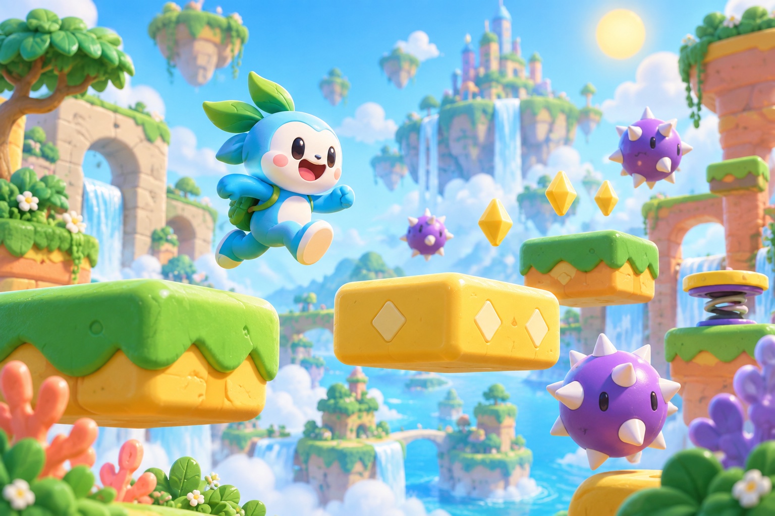
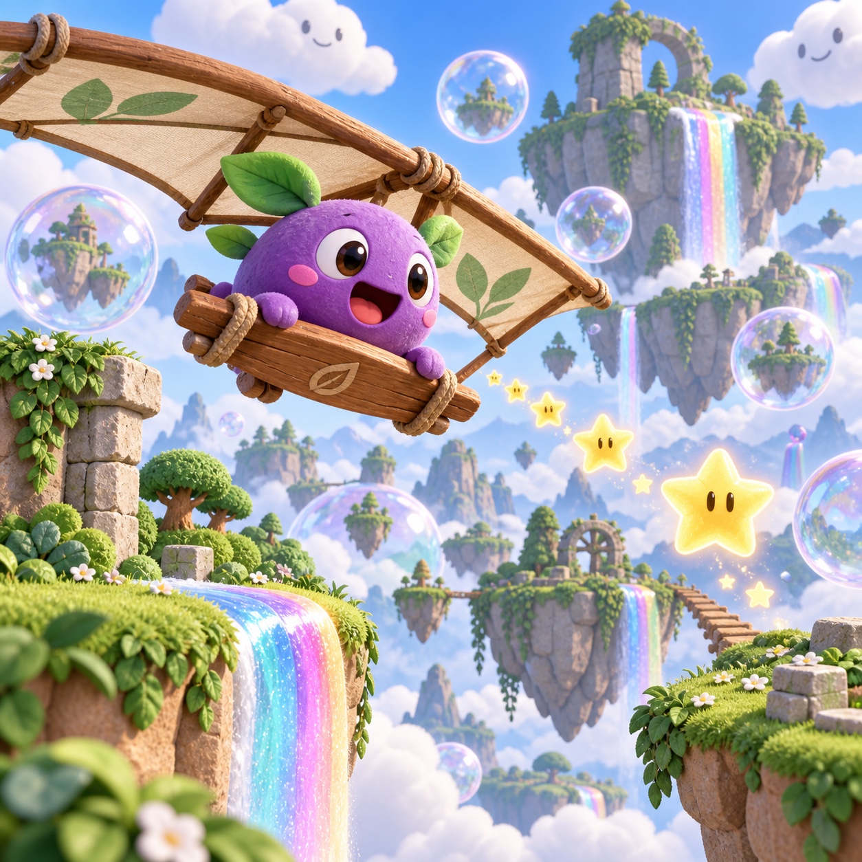
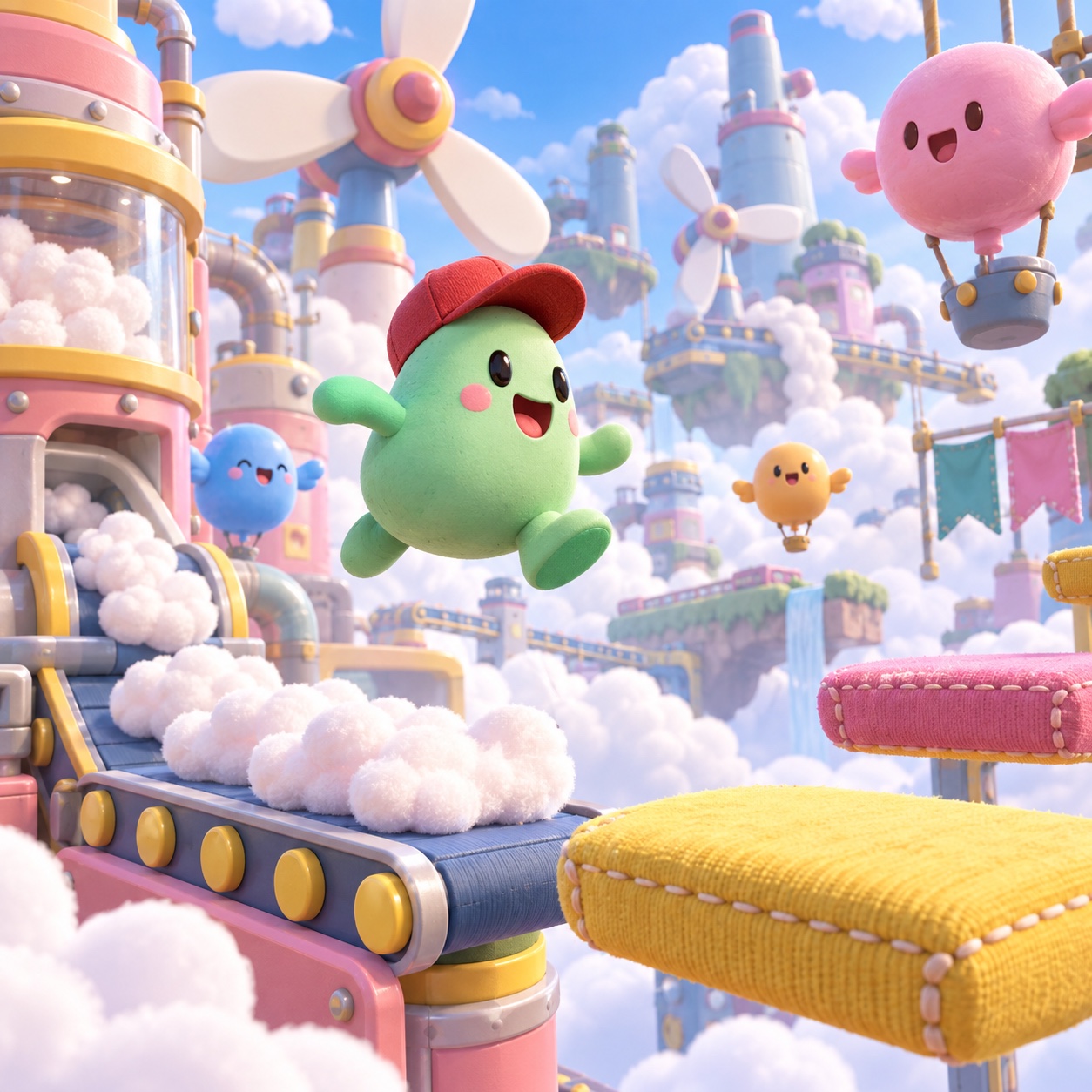
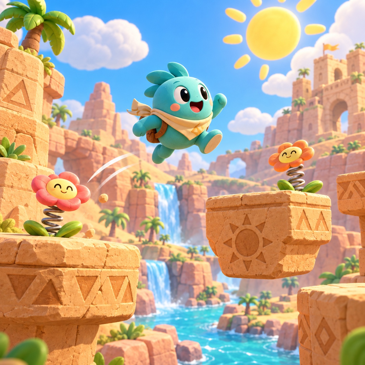
Chunky rounded shapes, candy colour, floating blocks, gems and an original three-shape hero: the world of a platform game rendered like a toy set, built for delight
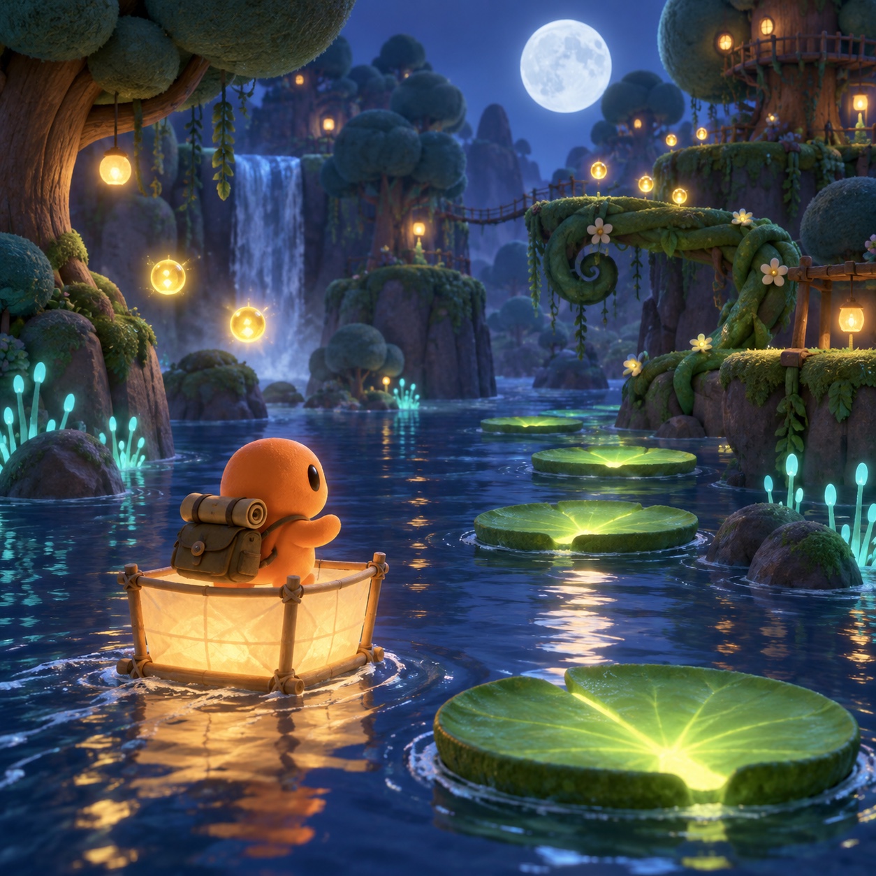
What it is, when it works, who it is for, and where it already exists.
Record 035-PP - when it works, who it is for, what it looks like
Where this aesthetic shows up in the real world · ↗ opens the source site
Where Playful Platformer came from, what makes it recognisable, and the fingerprint it leaves.
1985-present · Japanese and European platform games, then children's media and toy design everywhere
The platform game gave popular culture one of its most durable pictures: a small hero in side view, floating blocks, coins to collect, a flag at the end. Super Mario Bros. in 1985 fixed the grammar, Sonic the Hedgehog in 1991 added speed and checkerboard ground, and Rayman in 1995 showed the form could be painted rather than tiled. By the end of the decade the vocabulary was public property even as its characters remained fiercely private.
The look outgrew the games. Children's television, toy packaging, snack brands and app onboarding all reached for the same things: chunky rounded shapes, soft toy-like shading with one gentle shadow, a candy palette of sky, grass, coin, cherry and cream, and type that bounces on its baseline. It reads as joy before it reads as anything specific, which is why it travels so well.
The modern version is generous and self-aware. Independent games such as Celeste in 2018 kept the form and gave it feeling; brands use the level and the hero as a way to promise delight without irony. The rule that never changed is the hard one: the blocks and coins belong to everyone, the mascots belong to their owners, and a new hero has to be invented rather than borrowed.
“A level built like a toy set: big shapes, thick lines, and a hero you could invent in three circles.
The visual DNA: what makes it recognisable
8-channel console with the fingerprint on its display. Save the card, or share the page
The definitive color scheme for this aesthetic
How to shoot it, how to prompt it, and how to board it.
How to shoot this aesthetic
"Build the level as a toy set and photograph it like a morning"
Shot list
Lighting
Soft, even toy-set light with one gentle shadow, as if lit by a big window. No dramatic contrast; the colours do the work. A single sparkle highlight on anything glossy, and warm lanterns when the level is at night.
Drop this into Studio to generate in this aesthetic
Playful platform game world aesthetic rendered like a soft 3D toy set, chunky rounded shapes with soft shading and no hard outlines, floating blocks, gems and collectibles, checkerboard ground and cloud puffs, an original small hero drawn in three simple shapes, candy palette of sky blue, grass green, coin yellow, cherry red and cream, toy-like materials, painted wood, rubber, glossy plastic, joyful and generous, original characters only, no real game mascots, no logos, no readable text
A Pro feature: a board generated from the record
A generated board, with membership
Opening soon
Whether to use it, what it costs to do properly, and where it stands right now.
Two written calls, seven meters, and when to walk away
Build it like a toy set: big soft shapes, air between everything. Invent the hero in three shapes and never let a silhouette quote a real mascot. Keep the palette to the five and let one sparkle carry the gloss. If it looks like a licensed property, redraw the hero until it does not.
Right for children's products, indie games, playful consumer apps and toy-adjacent brands that want delight without irony. Wrong for anything that needs to feel grown-up. Invent the hero, keep the shapes big, and refuse every borrowed silhouette.
Big soft shapes and five colours. A single illustrator or a small toy-set render carries it.
The genre supplies blocks, coins and a flag; the character is where the invention has to happen.
Rounded and chunky is easy to render and hard to make charming. Proportion, softness and the bounce of the type decide it.
A rounded hero in primary colours is one detail away from a real mascot, and the genre's owners defend them.
The platformer vocabulary runs through children's media, app onboarding and toy packaging, usually unnamed.
Blocks, coins and a jumping hero have read the same way for forty years.
One hero, one level and five colours build a whole world; the risk is drawing too much of it.
A Pro feature: origins, practitioners, and pitfalls
The editorial depth, with membership
Opening soon
Neighbours, cross-references, blends, and the questions people ask.
Connected across the creative knowledge graph
Where it stands now, and what it costs you to use it
The platformer is the friendliest visual language a brand can borrow, and it is borrowed constantly: onboarding flows, children's products, snack packaging and playful consumer apps all use the level and the hero to promise delight. It works because the grammar is universal; almost everyone has jumped for a coin.
What it costs is seriousness, and what it risks is a lawsuit. A rounded hero in primary colours is one moustache away from someone else's property, and the owners of those properties are attentive. The current practice is to invent generously: a new silhouette, a new collectible, the same joy.
Mix Playful Platformer with any style in the library
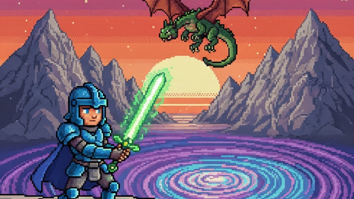 Playful Platformer 50%Pixel Art 50%
Merged palette
#5EC8F5
#1565C0
#4CBB4C
#FFC93C
#E53935
Leads digital, expressive, light
Typography · from Playful Platformer
Raleway over Merriweather
Materials
The calls this blend forces
These two disagree on one thing, and a blend cannot average them: you pick a side. At this mix:
Organic or Geometric? Playful Platformer is organic, Pixel Art is geometric. This mix lands geometric.
Use it
Playful platform game world aesthetic rendered like a soft 3D toy set, chunky rounded shapes with soft shading and no hard outlines, floating blocks, gems and collectibles, checkerboard ground and cloud puffs, an original small hero drawn in three simple shapes, candy palette of sky blue, grass green, coin yellow, cherry red and cream, toy-like materials, painted wood, rubber, glossy plastic, joyful and generous, original characters only, no real game mascots, no logos, no readable text (50%), infused with Pixel art aesthetic with chunky retro video game sprite style, strictly limited color palette of 16 to 32 colors, visible square pixel grid structure, Nintendo NES and SNES and Game Boy era graphic fidelity, dithering patterns for shading and form, crisp aliased edges with zero anti-aliasing, color palette strictly #5EC8F5 #1565C0 #4CBB4C #FFC93C #E53935, leaning organic over geometric, overall character: digital, expressive, light
The visual world of the platform game as a design language, rendered like a toy set: chunky rounded shapes with soft shading, floating blocks, gems and collectibles, a small original hero and type that bounces. It is generous and built for delight rather than realism.
Pixel art is a rendering method and can be sombre; this is a world and it is never sombre. Kidcore is a nostalgia for childhood objects; this is a game grammar that children and adults both read as play. The platformer's signature is the side view, the jump and the collectible.
No. The genre's vocabulary of blocks, coins and flags is shared, but its characters are among the most protected property in games. Invent the hero in three shapes and change the silhouette until it quotes nobody.
Every style in the library is broken down like this one: the palette, the typography, the materials and the lineage.
Explore the style library →