When to use it
- Imagery that should shimmer and reward a second, closer look
- Brands built on patience, craft or many small parts making a whole
- Data and community stories: many points, one picture
- Leisure, parks, gardens and summer subjects
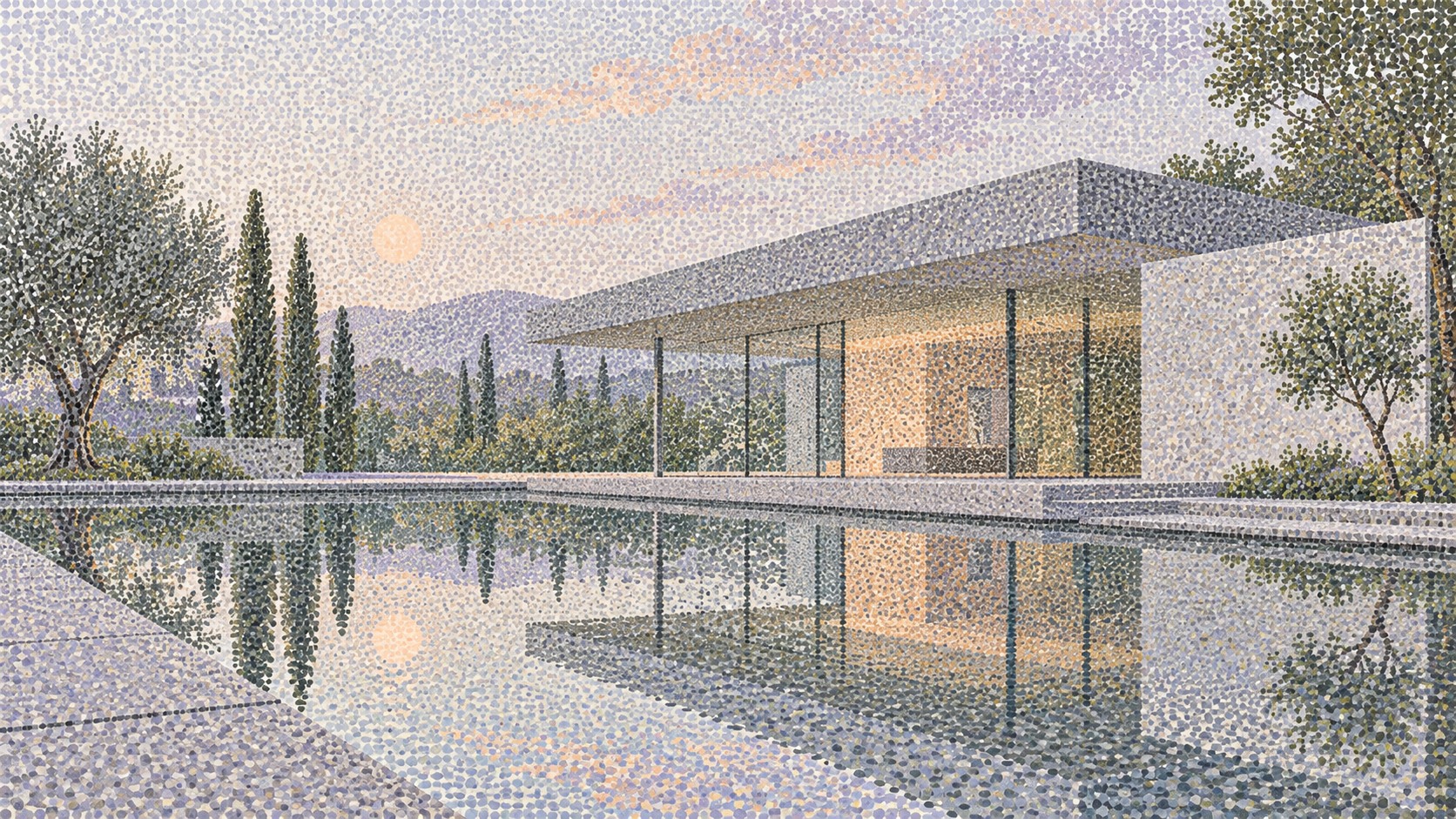
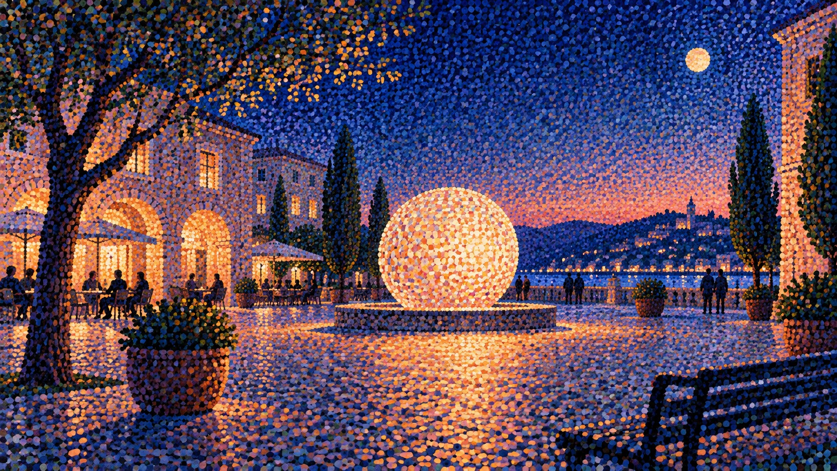
Pictures built from thousands of dots of pure colour, left unmixed so the eye blends them at a distance
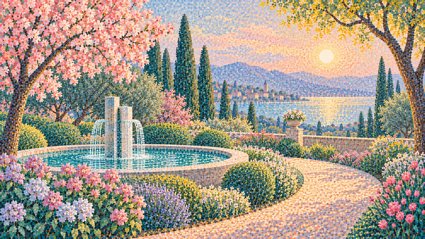
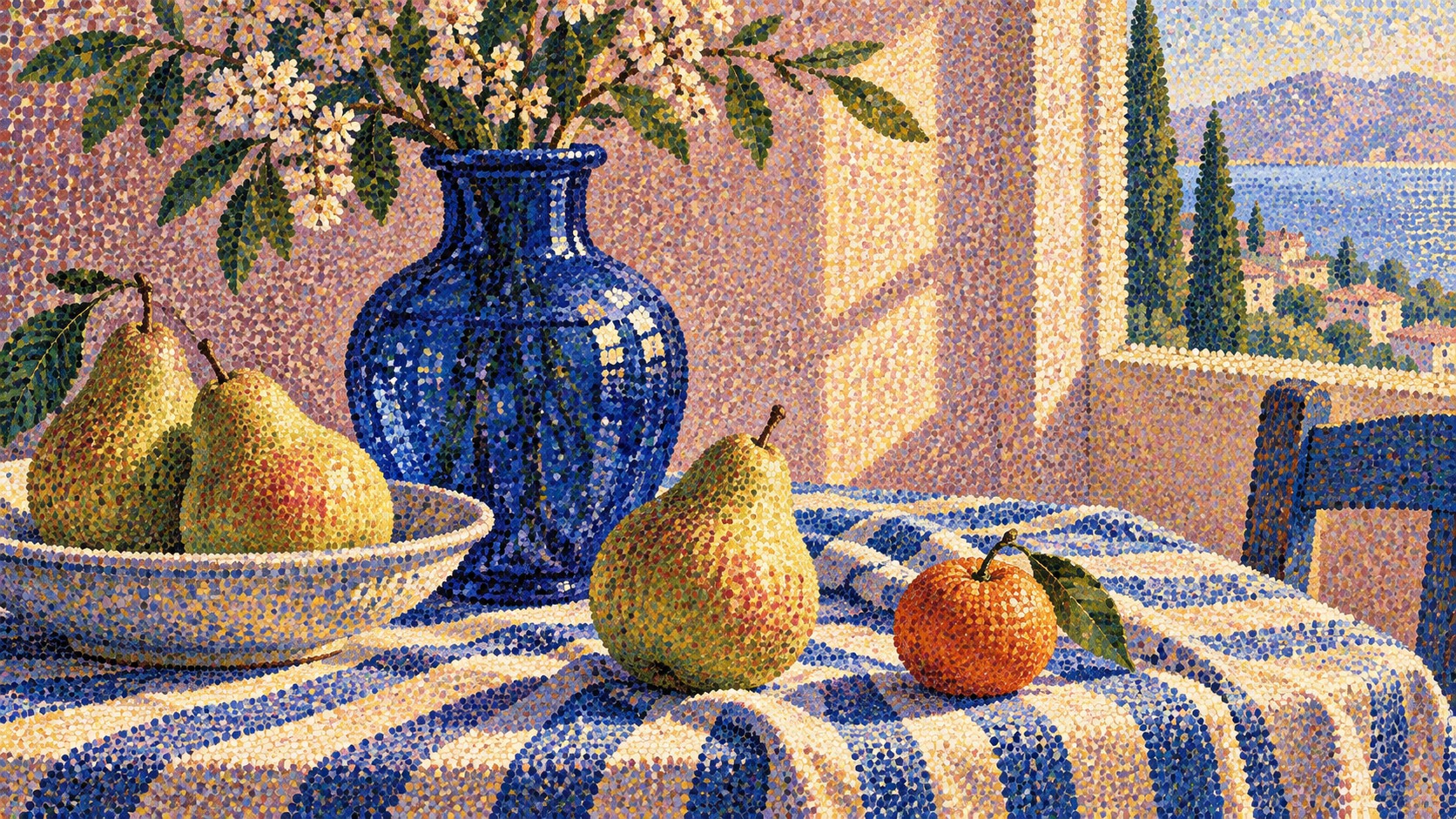
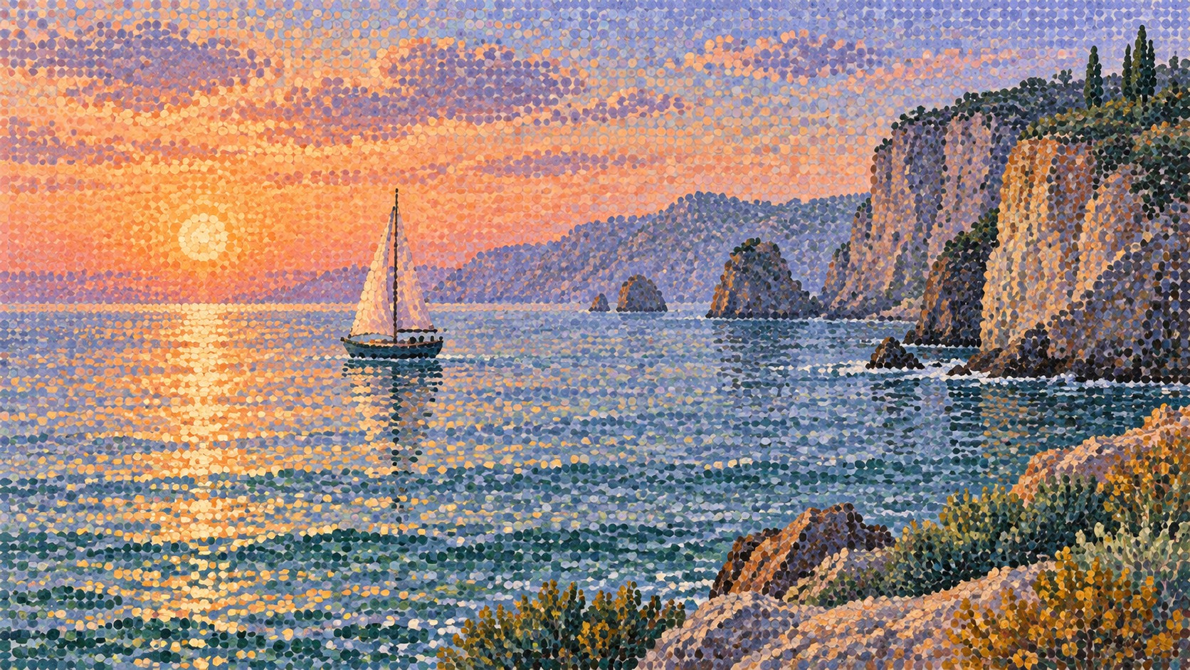
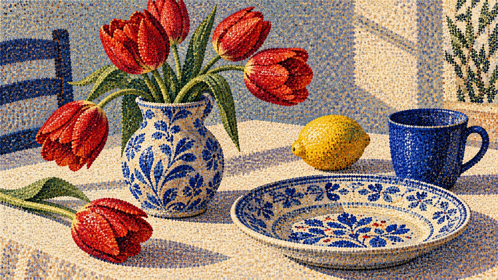
What it is, when it works, who it is for, and where it already exists.
Record 035-PO - when it works, who it is for, what it looks like
Where this aesthetic shows up in the real world · ↗ opens the source site
Where Pointillism came from, what makes it recognisable, and the fingerprint it leaves.
1884 to about 1910; the principle is still in every printed and screen image · Paris, from Georges Seurat and Paul Signac's application of colour science to Impressionism
Georges Seurat wanted to make Impressionism rigorous. He had read the chemist Michel-Eugène Chevreul, whose 1839 law of simultaneous contrast described how neighbouring colours change one another, and the American physicist Ogden Rood, whose Modern Chromatics of 1879 argued that colours mixed by the eye are more luminous than colours mixed on a palette. From 1884 he spent two years on a canvas seven feet high and ten feet wide, A Sunday Afternoon on the Island of La Grande Jatte, covering it in small touches of pure colour. It was shown at the last Impressionist exhibition in 1886 and caused an uproar.
The critic Félix Fénéon named the movement Neo-Impressionism that same year. Pointillism began as a sneer from other critics; Seurat himself preferred chromoluminarism, and his ally Paul Signac preferred divisionism, because the point was the division of colour, not the dot. Camille Pissarro converted for a few years. Seurat died in 1891 at thirty-one, and Signac became the movement's organiser and theorist, publishing From Eugène Delacroix to Neo-Impressionism in 1899 and widening the dot into a small mosaic-like block.
Its influence ran far beyond its dozen years. Vincent van Gogh borrowed the broken touch in Paris. Henri Matisse spent the summer of 1904 beside Signac in Saint-Tropez and painted Luxe, Calme et Volupté in dots, then pushed the colour further and arrived at Fauvism. The idea also turned out to be an engineering principle: halftone printing, four-colour process, colour television and the pixel grid all build images from separate units of colour that the eye combines, and artists from Roy Lichtenstein to Chuck Close have made that connection visible.
“Thousands of dots of pure colour, mixed by the eye instead of the brush.
The visual DNA: what makes it recognisable
8-channel console with the fingerprint on its display. Save the card, or share the page

The definitive color scheme for this aesthetic
The colour of the styles sitting closest to this one
How to shoot it, how to prompt it, and how to board it.
How to shoot this aesthetic
"Shoot it twice: once from across the room, once close enough to count the dots"
Shot list
Lighting
Even and neutral for the full view, so the colour is true: two soft sources at forty-five degrees. For details, one raking light from the side to show each dab of paint as a small raised mark.
Drop this into Studio to generate in this aesthetic
Pointillism, a painting built entirely from thousands of small separate round dots of pure unmixed oil colour placed side by side, no blended strokes, complementary colours next to each other so the surface shimmers, shadows made of blue and violet dots against orange and yellow light, the canvas ground visible between the dots, a calm sunlit leisure scene with still figures, river, grass and parasols, Seine blue, sunlit grass green, parasol orange, shadow violet and chalky light, a painted dotted border around the image, in the manner of 1880s Neo-Impressionism, no smooth gradients, no outlines, no readable text
The record applied to your project. The record's kit is free; your brand, references and plates come with membership
01 · Hero application02 · Material and finish03 · Palette in context04 · Photography directionWhether to use it, what it costs to do properly, and where it stands right now.
Two written calls, seven meters, and when to walk away
Plan the colour before placing a dot. Shadows are not grey: they are built from the complement of the light, blue and violet against orange and yellow, and that is what makes the surface vibrate. Keep dot size consistent within an area and let the ground show between them. A photo run through a dot filter gives itself away because it samples colour instead of separating it, so every dot is a muddy average.
Right when many small parts making one picture is the message: communities, data, craft, patience. It brings light and stillness to leisure and cultural subjects, and fails when a filter stands in for the colour thinking.
Materials are ordinary. The time is not: Seurat spent two years on one canvas.
The method is fixed; the composition and the colour plan are where the thinking goes.
Dot size, spacing and the choice of neighbouring colours all have to be right for the image to resolve.
It is hard to use offensively; the risk is a lazy filter that produces a dull, even texture.
Widely recognised from museums, seldom attempted in commercial work because of the labour.
Fixed in art history since 1886, and its principle underlies printing and screens.
Done properly, by hand or by a carefully built process, it is slow.
A Pro feature: origins, practitioners, and pitfalls
Neighbours, cross-references, blends, and the questions people ask.
Connected across the creative knowledge graph
Where it stands now, and what it costs you to use it
Pointillism is the moment painting met information theory half a century early. It says that an image is a set of discrete samples and that seeing is a process of reconstruction, which is how every printed page and screen now works. That makes it unusually useful as a metaphor: many small independent parts, each a single pure thing, combining into a picture none of them contains.
Its failure mode is the dot filter. Software that samples a photograph into circles produces dots of averaged, muddy colour. Seurat's dots are the opposite: each one is a pure hue, and the picture's colour exists only in the relationship between neighbours. Without the separation of colour there is no shimmer, just texture.
Mix Pointillism with any style in the library
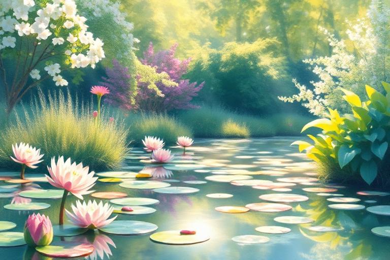 Pointillism 50%Impressionism 50%
Merged palette
#3D6FB4
#6B9E6B
#8DB255
#7BC8F6
#E58A3C
Leads analog, nostalgic, light
Typography · from Pointillism
Cormorant Garamond over Lora
Materials
The calls this blend forces
These two disagree on 3 things, and a blend cannot average them: you pick a side. At this mix:
Structured or Chaotic? Pointillism is structured, Impressionism is chaotic. This mix lands structured.
Restrained or Expressive? Pointillism is restrained, Impressionism is expressive. This mix lands expressive.
Geometric or Organic? Pointillism is geometric, Impressionism is organic. This mix lands organic.
Use it
Pointillism, a painting built entirely from thousands of small separate round dots of pure unmixed oil colour placed side by side, no blended strokes, complementary colours next to each other so the surface shimmers, shadows made of blue and violet dots against orange and yellow light, the canvas ground visible between the dots, a calm sunlit leisure scene with still figures, river, grass and parasols, Seine blue, sunlit grass green, parasol orange, shadow violet and chalky light, a painted dotted border around the image, in the manner of 1880s Neo-Impressionism, no smooth gradients, no outlines, no readable text (50%), infused with Impressionist painting with loose visible brushstrokes capturing fleeting light, Monet and Renoir en plein air technique, broken color application rather than blended tone, everyday leisure and landscape subject matter, soft atmospheric color harmony over hard outline, color palette strictly #3D6FB4 #6B9E6B #8DB255 #7BC8F6 #E58A3C, leaning structured over chaotic, restrained over expressive, geometric over organic, overall character: analog, nostalgic, light
A painting technique in which small, separate dots of pure colour are placed side by side so that they blend in the viewer's eye rather than on the palette. It was developed by Georges Seurat and Paul Signac in Paris in the mid-1880s as part of Neo-Impressionism.
Divisionism is the theory: separating colour into its components and letting the eye recombine them. Pointillism describes the technique of applying that colour as dots. Signac preferred the first term because the dot itself was never the point.
Because complementary colours, such as orange and blue, are placed next to each other unmixed. The eye cannot fully merge them, so the surface appears to vibrate, and shadows built from colour rather than grey stay luminous.
They share a principle. Halftone and four-colour printing, television and digital screens all build images from small separate units of colour that the eye blends. Pointillism applied that idea by hand decades before the technology existed.
Every style in the library is broken down like this one: the palette, the typography, the materials and the lineage.
Explore the style library →