Post-Internet

Image culture after the platforms: compression artefacts, screenshot logic, lo-fi 3D and retail display treated as material, with online and offline kept deliberately blurred

Compare Post-Internet with another style →See the Post-Internet typefaces →
Record035-PI
AestheticPost-Internet
ClassDigital / Futuristic
StatusINGESTING
Post-Internet aesthetic archive image
Archive plate · Post-Internet
Post-Internet aesthetic: Vitrine dossier scene
Dossier sceneVitrine · 1/4
01
The record

What it is, when it works, who it is for, and where it already exists.

How to use it

Record 035-PI - when it works, who it is for, what it looks like

FIELD 01

When to use it

  • Brands that live on platforms and want to say so with intelligence
  • Exhibitions, print and merch that fold the screen back into objects
  • Campaigns about attention, circulation and the life of images
  • Editorial and identity work for a knowing, online-native audience
FIELD 02

Perfect for

  • Galleries and publishers working with net-native artists
  • Streetwear and product drops that are photographed to be reposted
  • Music and media brands whose output is a feed
  • Agencies and studios describing contemporary culture to itself
FIELD 03

What it looks like

  • Artie Vierkant, Image Objects, from 2011
  • DIS magazine and its stock-image editorials, 2010s
  • Jon Rafman, Nine Eyes of Google Street View
  • Camille Henrot, Grosse Fatigue, 2013

In the wild, Post-Internet aesthetic real-world examples

Where this aesthetic shows up in the real world · ↗ opens the source site

Online magazine and editorialDIS magazine (opens in a new tab)2010
Omoro Style Guide170+ aesthetics, every field on this page, in one PDF.
Get the guide →
02
The anatomy

Where Post-Internet came from, what makes it recognisable, and the fingerprint it leaves.

History, Post-Internet aesthetic history

2008-present · New York, Berlin and London, coined and argued online

The term was in use by 2008, credited to Marisa Olson, and it was always a description of a condition rather than a medium. Net art of the 1990s made work that lived in the browser; post-internet artists assumed the browser had already changed how every object and image was seen, and made work for galleries, print and shops that behaved accordingly. Artie Vierkant's Image Objects from 2011 are the cleanest statement of the method: printed sculptures whose documentation was altered in software, so that the photograph and the object never agreed and neither was the original.

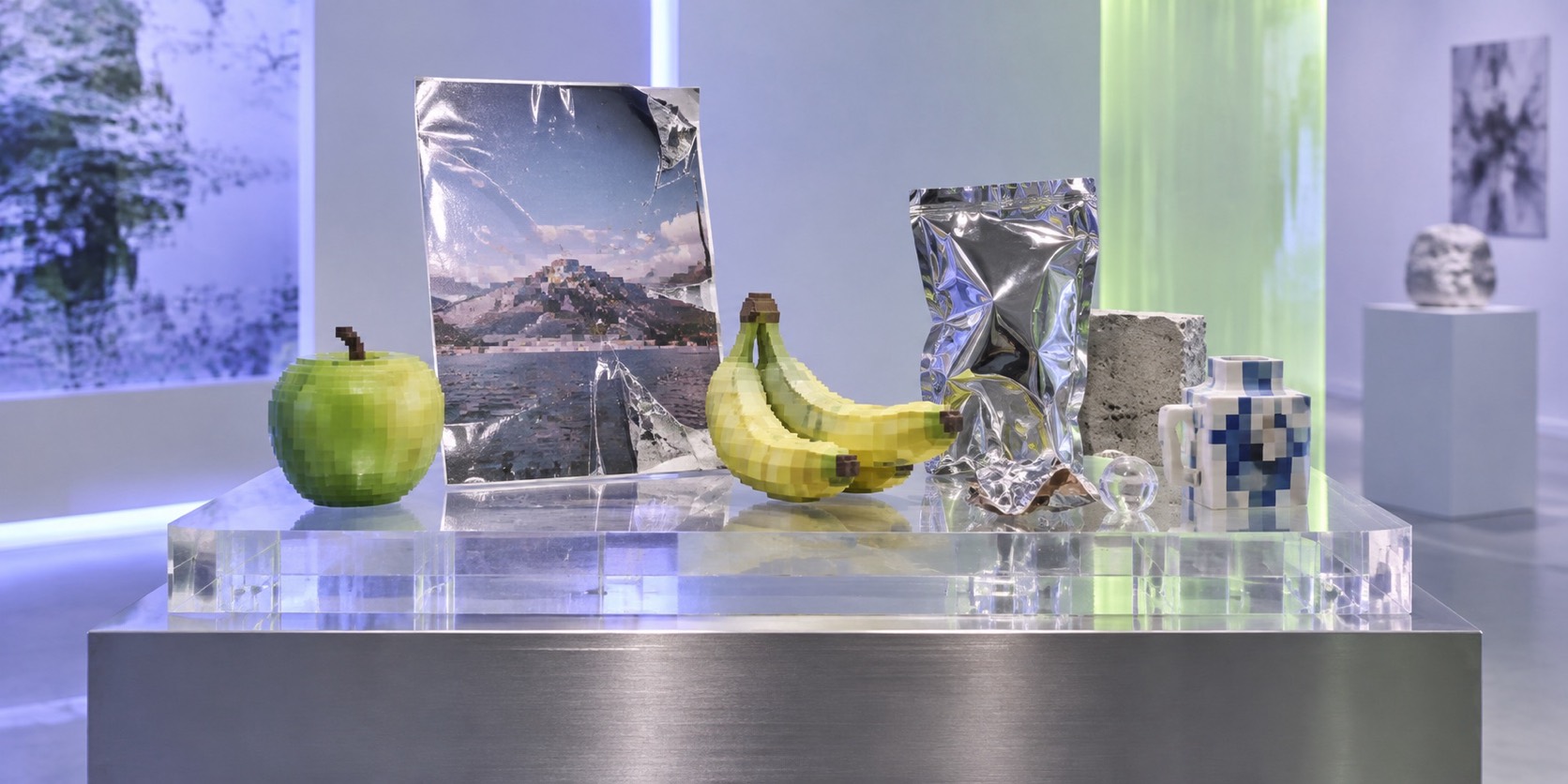
The visual language came from the platforms and from the stock and retail imagery that fed them. DIS magazine ran editorials shot in the register of catalogue photography and product listings. Jon Rafman collected images from Google Street View and presented them as found photography. Hito Steyerl's essay In Defense of the Poor Image, from 2009, gave the compressed, copied and degraded JPEG a politics: the low-resolution image was the one that actually circulated. Lo-fi 3D renders with default shading, acrylic display stands, shrink-wrap, watermarks and browser chrome all became legitimate material because they were the material of everyday looking.

By the mid-2010s the tendency had a name, a market and a backlash, and the artists mostly stopped using the word. The language stayed. It is the native register of a generation of designers who photograph products to be reposted, print screenshots on vinyl, and treat a lo-fi render as a finished surface. Its defining quality is a refusal to say which version of a thing is the real one: the object, the listing, the screenshot or the print. Done well it is intelligent about circulation; done lazily it collapses into Y2K nostalgia, cyberpunk or a mockup of an app.
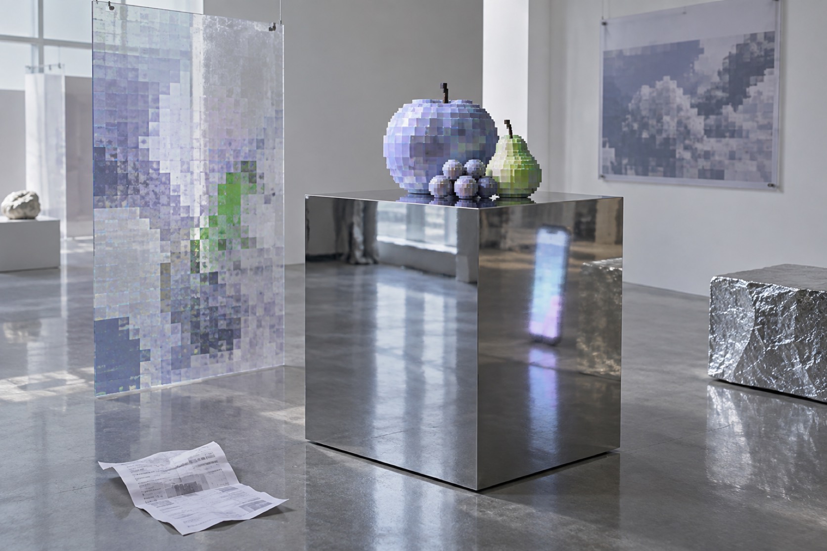
Not art about the internet. Art made in the condition the internet left everything in.

Omoro dossier · 035-PI

Visual markers, Post-Internet aesthetic visual markers

The visual DNA: what makes it recognisable

typography

See the fonts
  • System fonts left as found: Arial, Helvetica, Times at default sizes
  • Interface chrome, watermarks and captions kept in the image
  • Type that reads as a screenshot rather than as a layout

grid

  • Flat lays and product-listing framing on white
  • Browser and window logic: tiles, tabs, overlapping rectangles
  • Deliberate mismatch between an object and its documentation

materials

  • Hyperlink blue #5A7CFF, render grey #C9CDD3, retail white #F5F6F7
  • JPEG green #3DBE7A and notification red #FF3B30 as platform residue
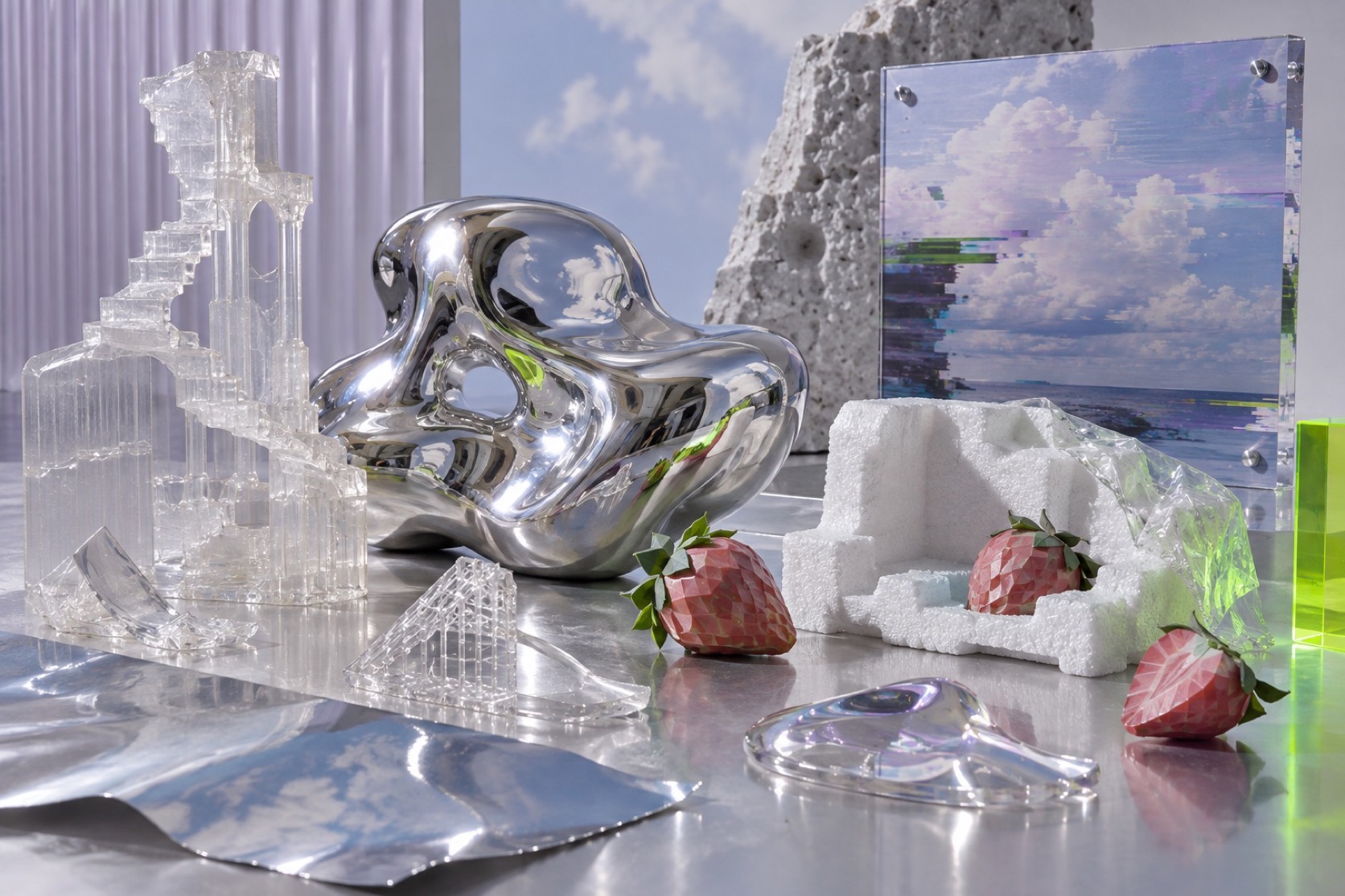
  • Printed vinyl, acrylic stands, shrink-wrap, LED panels, phone screens

motifs

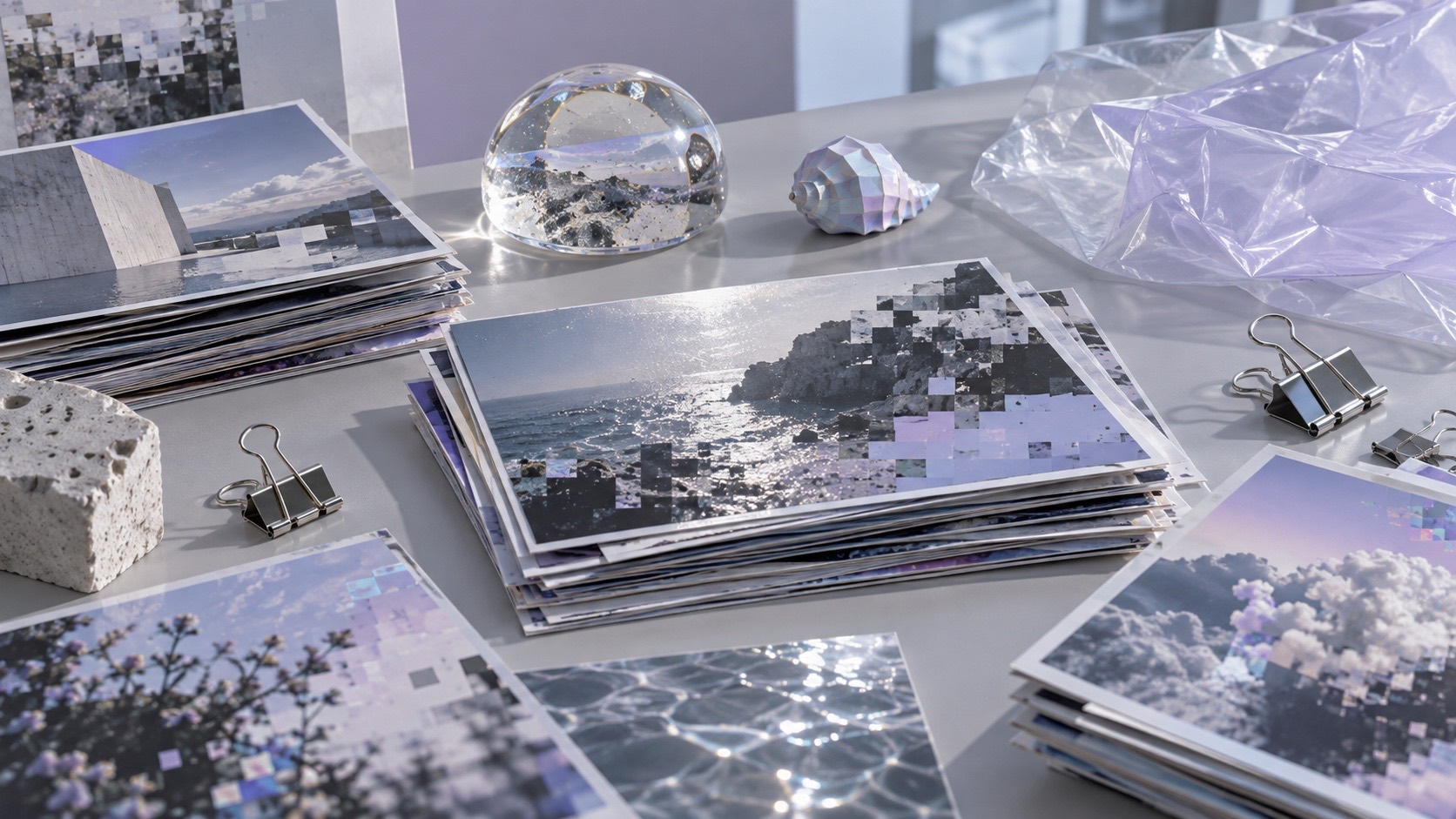
  • Compression blocking and low resolution shown at large scale
  • Default-shaded lo-fi 3D renders beside real objects
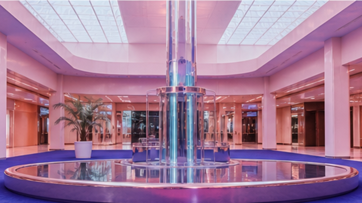
  • Retail display treated as installation
  • A photograph of a print of a screenshot: the image in circulation

Aesthetic profile

8-channel console with the fingerprint on its display. Save the card, or share the page

Aesthetic Profile
Post-Internet
2008-present · New York, Berlin and London, coined and argued online
Attribute console · 035-PI
leans digital, futuristic, light
8 CH
FIG. 1
MaximalMinimalDigitalAnalogExpressiveRestrainedCoolWarmFuturisticNostalgicChaoticStructuredLightDarkGeometricOrganic
01Minimal
Maximal30%
02Analog
Digital80%
03Restrained
Expressive20%
04Cool
Warm20%
05Futuristic
Nostalgic40%
06Structured
Chaotic30%
07Dark
Light40%
08Organic
Geometric20%
DigitalFuturisticLight
Omoro · Attribute console · 035-PI
omoro.io/styles/post-internet

Color Palettes, Post-Internet color palettes and hex codes

The definitive color scheme for this aesthetic

Post-Internet
#5A7CFF · #C9CDD3 · #F5F6F7 · #3DBE7A · #FF3B30
A screenshot printed on vinyl: hyperlink blue, render grey, retail white
Omoro Palette Pack575 curated palettes across every aesthetic, 5 export formats.
Get the palettes →
03
The direction

How to shoot it, how to prompt it, and how to board it.

Photo Direction

How to shoot this aesthetic

"A product listing photographed, printed, displayed and photographed again"

Shot list

  • Frontal shot of a plain object on a clear acrylic retail stand under LED strip light, styled exactly like an e-commerce listing, then the whole set visibly printed on vinyl and rephotographed with a fold in it
  • Medium shot of a person holding a phone whose screen shows the same scene they are standing in, the two versions slightly mismatched in colour
  • Close detail of a large-format print with visible JPEG compression blocking, a watermark left in, pinned to a white wall with a caption in a system font

Lighting

Retail and screen light: LED strips, monitor glow, flat even white. Slight colour mismatches between sources are welcome. Avoid warmth, avoid drama, avoid anything cinematic.

Omoro Director's Briefs174 photo shot-lists like this one, ready to shoot from.
Get the briefs →

Generative Prompt

Drop this into Studio to generate in this aesthetic

Post-Internet art and design, contemporary image culture after social platforms, compression artefacts and JPEG blocking, screenshot logic, lo-fi default-shaded 3D renders, retail display stands and shrink-wrap, browser chrome fragments, printed vinyl, ambiguous online and offline space, knowing and flat, not Y2K, not cyberpunk, not an app mockup

Paste as-is, or append your own subject

Mood Board

A Pro feature: a board generated from the record

A generated board, with membership

Opening soon

04
The judgement

Whether to use it, what it costs to do properly, and where it stands right now.

Creative verdict, Post-Internet feasibility and strategic recommendation

Two written calls, seven meters, and when to walk away

Creative verdict
Should Post-Internet be the call?
7 meters
FIG. 2
Assessment

Build the circulation into the frame. A photograph of a print of a screenshot says what the style is about; a clean product shot does not, so every image needs at least one loop. Keep it flat and knowing rather than glitchy. The moment it could be a tech advert, a Y2K throwback or an app mockup, it has drifted off the subject.

Verdict

Right when the brand lives on platforms and wants to say so with intelligence rather than pretend otherwise. Its defining move is refusing to say which version of a thing is real: the object, the listing, the screenshot or the print. The moment it becomes a period style or a product demo it loses the one thing it has to say.

Production cost
Low

Stock imagery, a phone, a printer and an acrylic stand.

Creative difficulty
High

The intelligence is in the loop between object and image. Without it, it is a product shot.

Execution difficulty
Medium

Compression and mismatch have to look deliberate, not like a mistake.

Risk of misuse
High

Drifts into Y2K nostalgia, cyberpunk or a literal app mockup the moment the idea goes.

Prevalence
Common

The native register of brands whose product is a feed, whether or not they name it.

Longevity
Enduring

It describes the present condition of images, which is not going anywhere.

Brand investment
Low

Stock, screenshots and a printer; the spend is intelligence, not production.

Avoid if
The audience will read it as a tech advert
Retail light and stock framing without the circulation loop is just a product shot.
The brand wants to look timeless
The style is about the present condition of images and dates precisely to it.
Omoro · Creative verdict · 035-PI

Editorial Depth

A Pro feature: origins, practitioners, and pitfalls

Common Misconception
Historical Context
Brands That Accidentally Use This Style
Brands That Perfectly Represent This Style
Psychological Effect

The editorial depth, with membership

Opening soon

05
The index

Neighbours, cross-references, blends, and the questions people ask.

Related concepts

Connected across the creative knowledge graph

Cultural relevance, Post-Internet cultural relevance today

Where it stands now, and what it costs you to use it

Post-internet is the honest description of how most images now live, which makes it the native language of brands that exist to be reposted: streetwear drops, music releases, galleries with online-native artists, media companies whose product is a feed. It is intelligent about attention and circulation in a way earlier digital aesthetics were not.

The line it has to hold is between knowing and nostalgic. Y2K borrows the look of an old internet; cyberpunk imagines a future one; an app mockup is a picture of software. Post-internet is about the present condition of images, and the moment it becomes a period style or a product demo it loses the one thing it has to say.

Cross-references

VaporwaveThe nostalgic, ironic cousin; post-internet is present tense and straight-facedGlitchShares the compression artefact, used as evidence rather than as effectNeo 3DThe polished render post-internet keeps deliberately unfinishedEditorial InterfaceInterface as editorial surface, taken one step further into the object

Blend

Mix Post-Internet with any of the library's 170+ styles

Post-Internet×
50%50%
73% alike
Post-Internet referenceVaporwave referencePost-Internet 50%Vaporwave 50%

Merged palette

#5A7CFF

#1A1A2E

#C9CDD3

#B967FF

#F5F6F7

Leads digital, maximal, expressive

Typography · from Post-Internet

Space Grotesk over Inter

Materials

  • Hyperlink blue #5A7CFF, render grey #C9CDD3, retail white #F5F6F7
  • JPEG green #3DBE7A and notification red #FF3B30 as platform residue
  • Pastel lavender (#C3A6E0), mint (#A0E4CB), salmon (#F4A688), electric teal (#00FFFF)

The calls this blend forces

These two disagree on one thing, and a blend cannot average them: you pick a side. At this mix:

Futuristic or Nostalgic? Post-Internet is futuristic, Vaporwave is nostalgic. This mix lands nostalgic.

Use it

Post-Internet art and design, contemporary image culture after social platforms, compression artefacts and JPEG blocking, screenshot logic, lo-fi default-shaded 3D renders, retail display stands and shrink-wrap, browser chrome fragments, printed vinyl, ambiguous online and offline space, knowing and flat, not Y2K, not cyberpunk, not an app mockup (50%), infused with Vaporwave aesthetic with glitched Greco-Roman statuary, VHS chromatic aberration, dreamy pastel-and-neon color mood, ironic consumerist nostalgia, color palette strictly #5A7CFF #1A1A2E #C9CDD3 #B967FF #F5F6F7, leaning futuristic over nostalgic, overall character: digital, maximal, expressive

One-click generation opens with the studio

About this aesthetic

What is post-internet art?

Work made on the assumption that the internet has already changed how all objects and images are seen. It treats compression artefacts, screenshots, lo-fi 3D, stock and retail imagery as material, and moves freely between the gallery, the print and the feed.

How is post-internet different from net art?

Net art of the 1990s lived in the browser and was about the network as a medium. Post-internet assumes the network as a condition and makes objects, prints and photographs that behave as if they will be circulated, copied and degraded.

Who are the key post-internet artists?

Artie Vierkant, Jon Rafman, Camille Henrot, Hito Steyerl as its theorist, the DIS collective, Cory Arcangel, Petra Cortright, Oliver Laric and Ed Atkins.

Build with the post-internet aesthetic

Every style in the library is broken down like this one: the palette, the typography, the materials and the lineage.

Explore the style library →