Quirky Illustrations

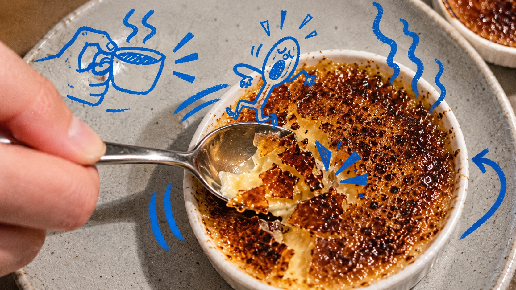
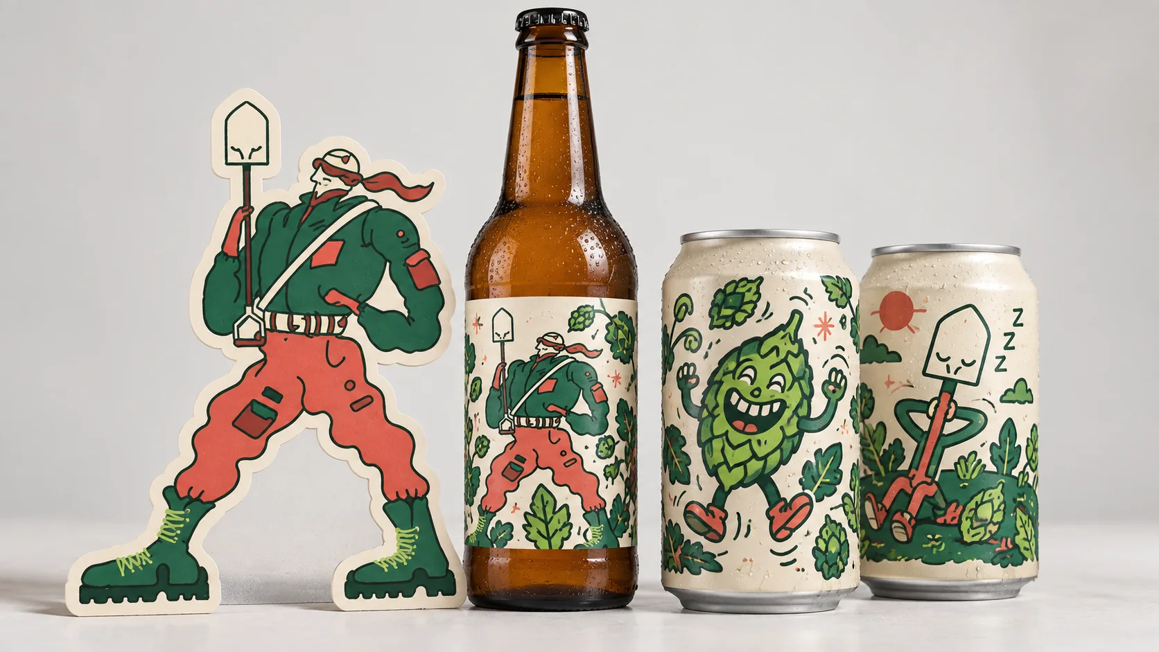
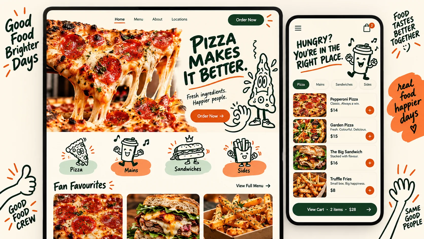
Hand-drawn characters and doodles with humour and personality, used as a brand's voice across cups, labels, stickers and signs
Compare Quirky Illustrations with another style →See the Quirky Illustrations typefaces →On the timeline · 1890s
Record036-QI
AestheticQuirky Illustrations
ClassExpressive / Organic
StatusINGESTING
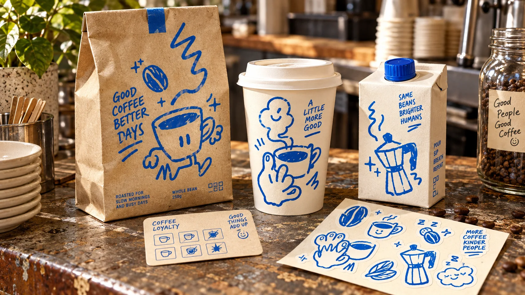
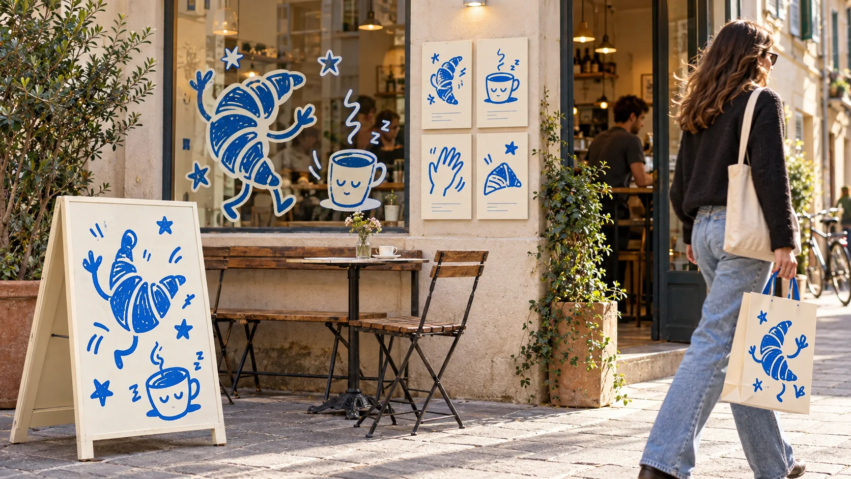
Coffee bags, cups, cartons and stickers carry loose cobalt hand-drawn characters.
Archive plate · Quirky Illustrations
A café storefront applies dancing croissants and sleepy cup doodles across its sign, window and shopping bag.
Dossier sceneStreet · 1/4
01
The record

What it is, when it works, who it is for, and where it already exists.

How to use it

Record 036-QI - when it works, who it is for, what it looks like

FIELD 01

When to use it

  • Cafés, bakeries, pizza shops and independent food brands
  • Craft beer, soda and drinks labels
  • Consumer apps and startups that want to feel friendly rather than corporate
  • Merch, stickers and social content that people collect and share
FIELD 02

Perfect for

  • Coffee shops and restaurants
  • Breweries and drinks brands
  • Wellness and snack brands
  • Consumer tech and community products
FIELD 03

What it looks like

  • Bibendum, the Michelin Man, drawn by O'Galop in 1898
  • Jim Flora's mid-century record covers for RCA Victor and Columbia
  • Mailchimp's 2018 identity by Collins, full of odd, hand-drawn scenes
  • Coconut Cult's packaging: flamingos, clouds and cult-like hands

In the wild, Quirky Illustrations aesthetic real-world examples

Where this aesthetic shows up in the real world · ↗ opens the source site

Advertising mascotBibendum, the Michelin Man, by O'Galop1898
Advertising mascotMr. Peanut, Planters1916
Album artJim Flora, record covers for RCA Victor and Columbia
Brand identityMailchimp identity by Collins2018
PackagingCoconut Cult packaging
Omoro Style GuideEvery aesthetic, every field on this page, in one PDF.
$8Get the guide →
02
The anatomy

Where Quirky Illustrations came from, what makes it recognisable, and the fingerprint it leaves.

History, Quirky Illustrations aesthetic history

1890s–present · Advertising mascots, cartoon animation and independent branding

Brands have been drawing characters to speak for them for well over a century. The Michelin Man, Bibendum, was drawn by the illustrator O'Galop in 1898, and Planters introduced Mr. Peanut in 1916. The rubber-limbed cartoons of 1920s and 1930s animation gave these characters their bouncy energy.

In the middle of the century illustrators such as Jim Flora made record covers for RCA Victor and Columbia full of odd, jittery figures, proving that strangeness and humour could sell. Children's books, comics and later Japanese character culture kept the tradition alive.

In the 2010s and 2020s the look became the default voice of independent food and drink: coffee shops, pizza places and craft breweries built identities from wobbly characters, sticker sets and hand-lettered marks. Larger brands followed, as when Collins filled Mailchimp's 2018 identity with odd, hand-drawn scenes, to feel less corporate.

Not everything has to be polished.

Omoro dossier · 036-QI

Visual markers, Quirky Illustrations aesthetic visual markers

The visual DNA: what makes it recognisable

typography

See the fonts
  • Hand-lettered wordmarks
  • Bouncy, chunky display type
  • Friendly rounded sans for body text
  • Speech bubbles and labels

grid

  • A character interacting with the logo or a numeral
  • Sticker sets scattered over photography
  • Illustration overlaid on real product photos
  • A mascot repeated across every touchpoint

materials

  • Takeaway cups, bags and boxes
  • Beer, soda and snack labels
  • Sticker sheets and merch
  • A-frame signs and menus

motifs

  • Everyday objects with faces and legs
  • Cheeky mascots and sidekicks
  • Wobbly, imperfect outlines
  • Doodled motion lines, stars and sparkles

Aesthetic profile

8-channel console with the fingerprint on its display. Save the card, or share the page

Aesthetic Profile
Quirky Illustrations
1890s–present · Advertising mascots, cartoon animation and independent branding
Attribute console · 036-QI
leans expressive, organic, warm
8 CH
FIG. 1
MaximalMinimalAnalogDigitalExpressiveRestrainedWarmCoolNostalgicFuturisticChaoticStructuredLightDarkOrganicGeometric
01Minimal
Maximal20%
02Analog
Digital50%
03Restrained
Expressive80%
04Cool
Warm60%
05Futuristic
Nostalgic50%
06Structured
Chaotic40%
07Dark
Light40%
08Organic
Geometric70%
ExpressiveOrganicWarm
Omoro · Attribute console · 036-QI
omoro.io/styles/quirky-illustration

Color Palettes, Quirky Illustrations color palettes and hex codes

The definitive color scheme for this aesthetic

Quirky Illustrations
#F3E9D2 · #2F6B45 · #D2452F · #2D6FD6 · #1A1714
Cream card, green and red ink, and a coffee cup that waves back
Omoro Palette Pack575 curated palettes across every aesthetic, 5 export formats.
$8Get the palettes →

Adjacent Palettes, styles related to Quirky Illustrations

The colour of the styles sitting closest to this one

Rubber Hose
Hand-drawn Doodles
Naïve Design
Sticker Collage
03
The direction

How to shoot it, how to prompt it, and how to board it.

Photo Direction

How to shoot this aesthetic

"Put the characters into the real world"

Shot list

  • The illustrated cup or bag in a hand, on the street or on a staircase
  • A sticker sheet on a café table beside a real drink
  • An A-frame sign on the pavement outside the shop

Lighting

Natural, slightly warm light with a casual, snapshot feel. Too polished and the drawings look stuck on.

Omoro Director's Briefs151 photo shot-lists like this one, ready to shoot from.
$8Get the briefs →

Generative Prompt

Drop this into Studio to generate in this aesthetic

Quirky hand-drawn brand illustration: cartoon characters with personality, a coffee cup with legs, a waving pizza slice, a cheeky mascot, wobbly imperfect lines, flat fills in cream, forest green and tomato red, sticker die-cut outlines, hand-lettered wordmark, humour and warmth

Paste as-is, or append your own subject

Use as skill

The whole record as a portable skill for Claude, ChatGPT, Gemini, image and video models, or a human brief

The whole record, compiled into a skill another system can work inside: lineage, axes, palettes, type, materials, photography, verdicts and a critique checklist. Nothing is generated; it is the dossier, restructured.

Mood Board

The record applied to your project. The record's kit is free; your brand, references and plates come with membership

Mood board
The Quirky Illustrations board
8 frames · 4 selected
FIG. 4
Cream CardF3E9D2Forest Ink2F6B45Tomato RedD2452FBiro Blue2D6FD6Outline Black1A1714
Brand and references
IdleBrand and references open with membership
With membership: the brand's own facts and colours in every prompt, references carried into every frame, and the plates generated.
01 · Hero application
02 · Material and finish
03 · Palette in context
04 · Photography direction
05 · Pattern plate
06 · Object
07 · Environment
08 · Digital presence
Demo kit free, the rest with membershipThe record as a demo kit, free. Name a project and it is written for that
Omoro · Mood board · 036-QI
04
The judgement

Whether to use it, what it costs to do properly, and where it stands right now.

Creative verdict, Quirky Illustrations feasibility and strategic recommendation

Two written calls, seven meters, and when to walk away

Creative verdict
Should Quirky Illustrations be the call?
7 meters
FIG. 2
Assessment

Start with two or three characters and a strict line weight and palette. Give each character a personality and a job. Test the drawings on real objects such as cups, bags and labels, not just on white. Imperfection should look deliberate, not sloppy.

Verdict

Right for food, drink, wellness and consumer products that want to feel human and funny. Invest in a small cast of characters with real personalities rather than one-off doodles, and give them jobs across cups, bags, labels and screens.

Production cost
Medium

A good illustrator and a character set take time; the payoff lasts years.

Creative difficulty
High

The humour and personality must feel genuine, not borrowed.

Execution difficulty
Medium

Keeping many hand-drawn assets consistent needs clear rules.

Risk of misuse
Medium

Forced humour or characters with no point of view feel childish and generic.

Prevalence
Common

The go-to identity for independent cafés, breweries and consumer apps.

Longevity
Enduring

Mascots and characters have sold products for over a century; the current drawing style will change, the idea will not.

Brand investment
Medium

Needs an illustrator and a character system that can grow across many touchpoints.

Avoid if
The brand is about luxury or exclusivity
Cartoon humour lowers the price perception that premium brands depend on.
There is no budget to keep drawing
Characters need new poses and scenes to stay alive; a single mascot drawn once goes stale quickly.
Omoro · Creative verdict · 036-QI

Editorial Depth

A Pro feature: origins, practitioners, and pitfalls

Editorial depth
The Quirky Illustrations file
14 sections
FIG. 3
Context02Brands02Perception04Use04Index02
01Common MisconceptionThe principle beneath the surface
02Historical ContextOrigins, cultural moment, and reaction
03Brands That Accidentally Use This StyleNatural alignment, not category claims
04Brands That Perfectly Represent This StyleExceptional execution
05Psychological EffectHow visual decisions change perception
06Visual ChecklistInclude and avoid
07Creative FormulaThe visual system reduced to essentials
08Recognition SignalsHow to recognize it in two seconds
09When To Use This StyleContexts where the language performs
10Common Creative MistakesWhere imitation weakens the signal
11Best Brand ApplicationsIndustries with a natural advantage
12Creative Application AnalysisFit, feasibility, and production reality
13Related StylesClose languages and the key distinction
14Visual DNA SummaryThe sentence to remember
The editorial depth, with membershipOpening soon
Omoro · Editorial depth · 036-QI
05
The index

Neighbours, cross-references, blends, and the questions people ask.

Related concepts

Connected across the creative knowledge graph

Cultural relevance, Quirky Illustrations cultural relevance today

Where it stands now, and what it costs you to use it

Quirky illustration is one of the clearest pushes against polished, generic branding, especially in food, drink and consumer apps.

A character gives a brand a voice people remember and share. Customers collect the stickers, photograph the cups and post the mascot, which spreads the brand at no extra cost.

Cross-references

Rubber HoseThe 1930s cartoon ancestor with bendy limbs and pie-cut eyesHand-drawn DoodlesLooser sketchbook marks without the recurring charactersNaïve DesignThe restrained, abstract cousin: one glyph and a lot of space

Blend

Mix Quirky Illustrations with any style in the library
Quirky Illustrations×
50%50%
97% alike
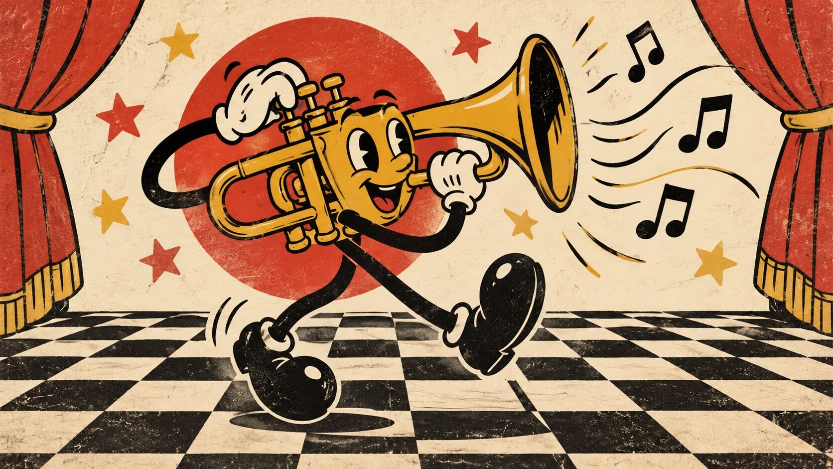
Quirky Illustrations referenceRubber Hose referenceQuirky Illustrations 50%Rubber Hose 50%

Merged palette

#F3E9D2

#212121

#2F6B45

#F57F17

#D2452F

Leads expressive, nostalgic, organic

Typography · from Quirky Illustrations

Raleway over Merriweather

Materials

  • Takeaway cups, bags and boxes
  • Beer, soda and snack labels
  • Ink black: #1A1510: the color of cel animation ink, slightly warm

Use it

Quirky hand-drawn brand illustration: cartoon characters with personality, a coffee cup with legs, a waving pizza slice, a cheeky mascot, wobbly imperfect lines, flat fills in cream, forest green and tomato red, sticker die-cut outlines, hand-lettered wordmark, humour and warmth (50%), infused with Rubber hose animation aesthetic with 1930s Fleischer Studios and early Disney style, boneless limbs of uniform thickness that curve fluidly, pie-cut eyes and round button noses, white gloves and bulbous rounded bodies, high contrast black and cream or limited color palette, Betty Boop and early Mickey Mouse character design language, jazz-age swinging energy, color palette strictly #F3E9D2 #212121 #2F6B45 #F57F17 #D2452F, overall character: expressive, nostalgic, organic

One-click generation opens with the studio

About this aesthetic

How do you keep quirky illustration consistent?

Fix a small set of rules: one line weight, a limited palette, a few recurring characters and how their faces and hands are drawn. Imperfection should be a style, not an accident, so the tenth drawing still looks like it belongs with the first.

Is quirky illustration right for a serious business?

It can work in small doses, such as empty states, onboarding and merch, even for serious products. Avoid it where it could undermine trust in high-stakes moments, such as payments, medical results or legal notices.

Build with the quirky illustrations aesthetic

Every style in the library is broken down like this one: the palette, the typography, the materials and the lineage.

Explore the style library →