Rebus

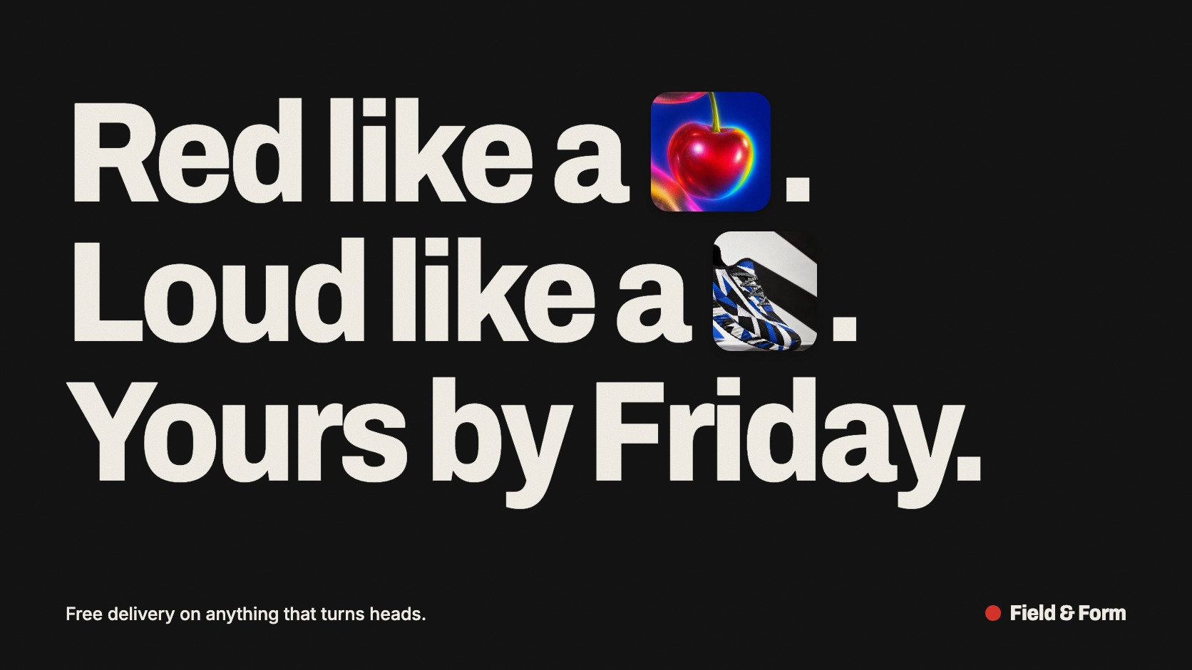
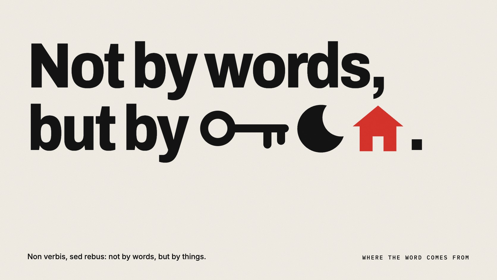
A sentence where pictures stand in for words: big plain headline type with an object dropped into the line where the noun should be

Compare Rebus with another style →See the Rebus typefaces →
Record037-RE
AestheticRebus
ClassLight / Expressive
StatusINGESTING
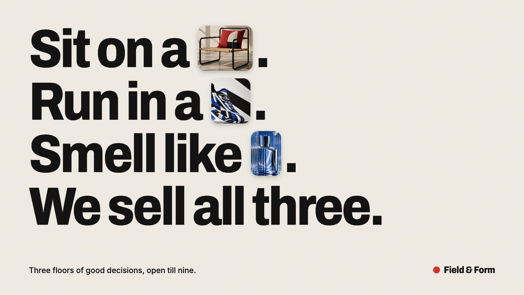
A poster headline reading: Sit on a, Run in a, Smell like, We sell all three, with photographs of a chair, a sneaker and a perfume bottle in place of the nouns.
Archive plate · Rebus
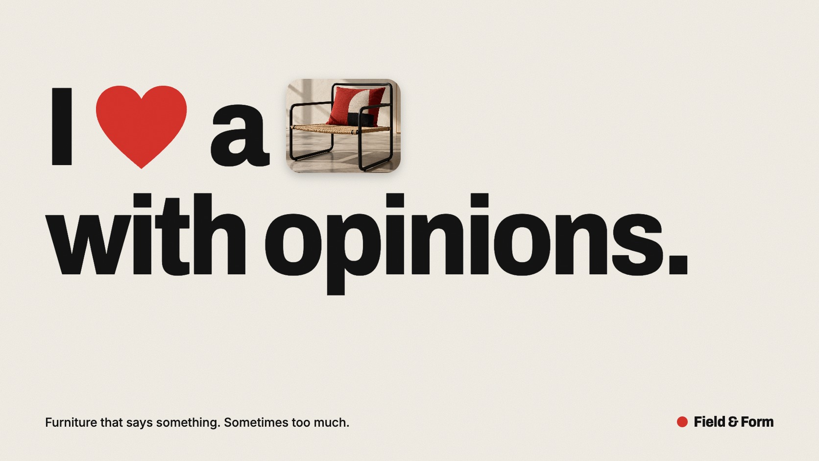
A headline reading I, a red heart, a, a photograph of a chair, with opinions, in heavy black type on off-white.
Dossier scenePoster · 1/5
01
The record

What it is, when it works, who it is for, and where it already exists.

How to use it

Record 037-RE - when it works, who it is for, what it looks like

FIELD 01

When to use it

  • Headlines that should be read twice and remembered once
  • Brands with products people recognise on sight: food, furniture, fashion
  • Out-of-home and social posts that have one second to earn attention
  • Explaining what a service does by showing the things it touches
FIELD 02

Perfect for

  • Food, drink and restaurant brands
  • Furniture, homeware and retail
  • Platforms and tools selling to small businesses
  • Campaigns, posters and social series
FIELD 03

What it looks like

  • The name of King Narmer spelled with a catfish and a chisel, c. 3100 BC
  • Leonardo da Vinci's sheet of picture-writing puzzles, c. 1487 to 1490
  • Milton Glaser, I ♥ NY, 1976
  • Paul Rand's Eye-Bee-M poster for IBM, 1981

In the wild, Rebus aesthetic real-world examples

Where this aesthetic shows up in the real world · ↗ opens the source site

Omoro Style GuideEvery aesthetic, every field on this page, in one PDF.
Get the guide →
02
The anatomy

Where Rebus came from, what makes it recognisable, and the fingerprint it leaves.

History, Rebus aesthetic history

c. 3100 BC to now; the current image-in-headline form from the 2020s · The rebus principle of early writing, revived as a game in Renaissance Europe and as a device in modern graphic design

The rebus is older than the alphabet. Early writing systems in Egypt and Mesopotamia needed a way to record names and abstract words that could not be drawn, and they solved it by borrowing the sound of things that could. On the Narmer Palette, carved around 3100 BC, the king's name is written with a catfish, nar, and a chisel, mer. Scholars call this the rebus principle, and it is the step that turned pictures into writing.

The word itself is Latin: non verbis, sed rebus, not by words but by things. In late medieval France, the clerks of Picardy were known for satirical picture riddles, and by the sixteenth century the rebus was a fashionable game across Europe. Leonardo da Vinci filled a sheet with dozens of them around 1487 to 1490. Families punned on their own names in heraldry, and printers did the same in their marks. Later centuries put rebuses into children's hieroglyphic Bibles, puzzle letters and, from 1958, the American television game show Concentration.

Modern graphic design made it a professional tool. Milton Glaser's I ♥ NY, drawn in 1976, is a four-character rebus and one of the most copied marks ever made. In 1981 Paul Rand redrew the IBM logo as an eye, a bee and the letter M for an in-house poster, showing that even a corporate identity could be played with. Emoji brought the habit to everyone's thumbs, and in the 2020s a recognisable layout style emerged from it: a plain, heavy headline with cut-out photographs dropped into the sentence in place of the nouns.

A sentence where pictures stand in for words, and the reader finishes the thought.

Omoro dossier · 037-RE

Visual markers, Rebus aesthetic visual markers

The visual DNA: what makes it recognisable

typography

See the fonts
  • A heavy grotesque or a confident serif, set very large
  • Sentence case with natural line breaks, tight leading
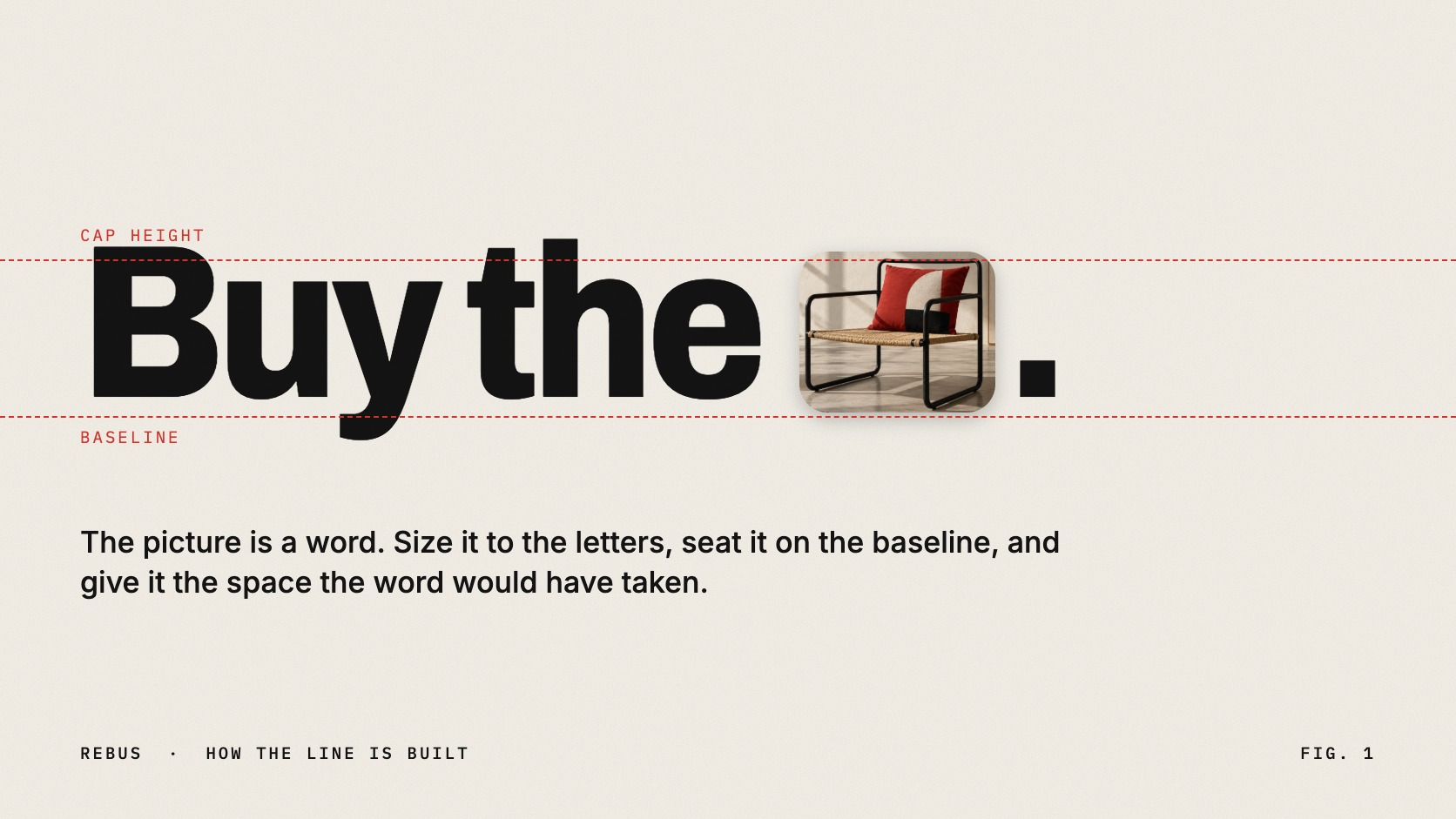
  • Images sized to the letters and seated on the baseline
  • One small line of copy and a logo, kept well away from the headline

grid

  • A single sentence filling most of the format
  • Flush-left, ragged-right text block with wide margins
  • One image per line at most, given the space of the word it replaces
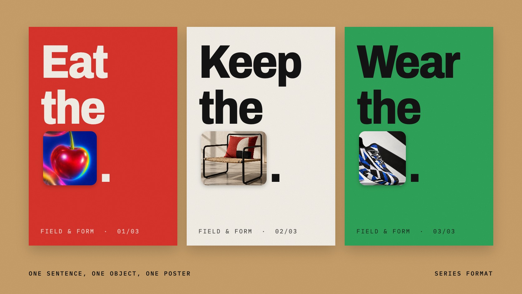
  • Series formats: the same layout, a new sentence and object each time

materials

  • Paper white #F4F1EA ground and headline black #141414 type
  • Colour carried by the objects: pepper red #D8342B, sticker green #2FA45A, parcel tan #C9A06B
  • Clean cut-out photography with a soft contact shadow
  • Stickers, labels, barcodes, emoji and pictograms as alternative word-images

motifs

  • A noun replaced by the thing itself
  • Food, furniture, parcels and everyday products
  • The brand's own logo used as the last word
  • A sentence that reads as speech, not as a slogan

Aesthetic profile

8-channel console with the fingerprint on its display. Save the card, or share the page

Aesthetic Profile
Rebus
c. 3100 BC to now; the current image-in-headline form from the 2020s · The rebus principle of early writing, revived as a game in Renaissance Europe and as a device in modern graphic design
Attribute console · 037-RE
leans light, expressive, digital
8 CH
FIG. 1
MinimalMaximalDigitalAnalogExpressiveRestrainedWarmCoolNostalgicFuturisticStructuredChaoticLightDarkGeometricOrganic
01Minimal
Maximal20%
02Analog
Digital30%
03Restrained
Expressive40%
04Cool
Warm20%
05Futuristic
NostalgicEVEN
06Structured
Chaotic30%
07Dark
Light70%
08Organic
Geometric30%
LightExpressiveDigital
Omoro · Attribute console · 037-RE
omoro.io/styles/rebus

Color Palettes, Rebus color palettes and hex codes

The definitive color scheme for this aesthetic

Rebus
#F4F1EA · #141414 · #D8342B · #2FA45A · #C9A06B
A poster on a white wall: black headline, off-white paper, and three objects bringing all the colour
Omoro Palette Pack575 curated palettes across every aesthetic, 5 export formats.
Get the palettes →

Adjacent Palettes, styles related to Rebus

The colour of the styles sitting closest to this one

Font Mixing
Sticker Collage
Neo Swiss
Dada
03
The direction

How to shoot it, how to prompt it, and how to board it.

Photo Direction

How to shoot this aesthetic

"Shoot the objects as words: flat, clean, the same light, ready to cut out"

Shot list

  • Each object alone on white, evenly lit, shot square on for a clean cut-out
  • The same object at three angles so the designer can pick the one that reads fastest
  • The finished poster pasted on a wall or billboard, shot straight and wide

Lighting

Soft, even product light from above and in front, with a gentle shadow directly beneath. Every object in a sentence must share the same light direction and the same shadow, or the line looks assembled from stock.

Omoro Director's Briefs224 photo shot-lists like this one, ready to shoot from.
Get the briefs →

Generative Prompt

Drop this into Studio to generate in this aesthetic

Rebus design, a poster with one short sentence set very large in a heavy black grotesque sans serif in sentence case on an off-white paper ground, several nouns in the sentence replaced by small clean cut-out photographs of the objects themselves, a chilli pepper, a bucket of fried chicken, a wooden bench, sized to the height of the letters and sitting on the baseline in place of the word, soft contact shadows under the objects, tight leading, generous margins, one small line of body copy and a small logo at the foot, witty and confident, no decorative background, no more than one image per line, no illustration style mixing

Paste as-is, or append your own subject

Mood Board

The record applied to your project. The record's kit is free; your brand, references and plates come with membership

Mood board
The Rebus board
8 frames · 4 selected
FIG. 4
Paper WhiteF4F1EAHeadline Black141414Pepper RedD8342BSticker Green2FA45AParcel TanC9A06B
Brand and references
IdleBrand and references open with membership
With membership: the brand's own facts and colours in every prompt, references carried into every frame, and the plates generated.
01 · Hero application
02 · Material and finish
03 · Palette in context
04 · Photography direction
05 · Pattern plate
06 · Object
07 · Environment
08 · Digital presence
Demo kit free, the rest with membershipThe record as a demo kit, free. Name a project and it is written for that
Omoro · Mood board · 037-RE
04
The judgement

Whether to use it, what it costs to do properly, and where it stands right now.

Creative verdict, Rebus feasibility and strategic recommendation

Two written calls, seven meters, and when to walk away

Creative verdict
Should Rebus be the call?
7 meters
FIG. 2
Assessment

Write the sentence before choosing a picture. Swap only the words a picture can say instantly: concrete nouns, never verbs or ideas, and no more than one image per line. Size each image to the line it sits in and leave it the same space a word would take. If the reader has to stop and decode, it has failed: the pleasure is a half-second delay, not a riddle.

Verdict

Right when the brand's things are recognisable and its voice is conversational. It makes a viewer complete the sentence, which is the cheapest engagement there is, and fails when the writing is not good enough to carry the trick.

Production cost
Low

One typeface, a plain ground and a handful of cut-out photographs.

Creative difficulty
High

The line has to work as writing first. A weak sentence with pictures in it is still a weak sentence.

Execution difficulty
Medium

Sizing, spacing and baseline alignment of image to type decide whether it reads or stumbles.

Risk of misuse
Medium

Too many images, or images for abstract words, turn a headline into a puzzle nobody finishes.

Prevalence
Emerging

Image-in-headline layouts have spread quickly through brand campaigns and social design in the 2020s.

Longevity
Timeless

The rebus principle is five thousand years old and returns in every era of advertising.

Brand investment
Low

It is a copywriting idea with cheap production: good cut-outs and one typeface.

Avoid if
The message is abstract
There is no picture for trust, strategy or innovation, and a forced one reads as clip art.
It has to work across many languages
A rebus depends on word order and on the sound or name of the object, which rarely survive translation.
Accessibility is critical and alt text cannot be guaranteed
An image standing in for a word is invisible to a screen reader unless it is written back in.
Omoro · Creative verdict · 037-RE

Editorial Depth

A Pro feature: origins, practitioners, and pitfalls

Editorial depth
The Rebus file
14 sections
FIG. 3
Context02Brands02Perception04Use04Index02
01Common MisconceptionThe principle beneath the surface
02Historical ContextOrigins, cultural moment, and reaction
03Brands That Accidentally Use This StyleNatural alignment, not category claims
04Brands That Perfectly Represent This StyleExceptional execution
05Psychological EffectHow visual decisions change perception
06Visual ChecklistInclude and avoid
07Creative FormulaThe visual system reduced to essentials
08Recognition SignalsHow to recognize it in two seconds
09When To Use This StyleContexts where the language performs
10Common Creative MistakesWhere imitation weakens the signal
11Best Brand ApplicationsIndustries with a natural advantage
12Creative Application AnalysisFit, feasibility, and production reality
13Related StylesClose languages and the key distinction
14Visual DNA SummaryThe sentence to remember
The editorial depth, with membershipOpening soon
Omoro · Editorial depth · 037-RE
05
The index

Neighbours, cross-references, blends, and the questions people ask.

Related concepts

Connected across the creative knowledge graph

Cultural relevance, Rebus cultural relevance today

Where it stands now, and what it costs you to use it

A rebus works because it makes the reader do a small piece of the writing. Supplying the missing word takes a fraction of a second, and that tiny act of completion produces both attention and a sense of being in on the joke. It also lets a brand show its product inside its own sentence without a separate product shot, which is why food, furniture and retail reach for it, and why it suits posters and social posts that have one second to land.

Its failure mode is the riddle. The moment a reader has to stop and work out what a picture is meant to say, the line has lost them. Good rebuses swap only concrete, instantly recognisable nouns, use one image per line, and would still be a good sentence if every picture were typed back in. There is also an accessibility cost: an image standing in for a word has to be written back in as alt text, or the sentence is broken for anyone using a screen reader.

Cross-references

Font MixingThe other way to make a headline the whole designSticker CollageShares the cut-outs and labels, without the sentenceNeo SwissThe plain, confident type it is usually set inDadaWhere word and image first traded places as a joke

Blend

Mix Rebus with any style in the library

Rebus×
50%50%
61% alike
Rebus referenceFont Mixing referenceRebus 50%Font Mixing 50%

Merged palette

#F4F1EA

#37474F

#141414

#5C6BC0

#D8342B

Leads expressive, light, geometric

Typography · from Rebus

Raleway over Merriweather

Materials

  • Paper white #F4F1EA ground and headline black #141414 type
  • Colour carried by the objects: pepper red #D8342B, sticker green #2FA45A, parcel tan #C9A06B
  • Black and white as the primary palette (color would compete with typographic complexity)

The calls this blend forces

These two disagree on one thing, and a blend cannot average them: you pick a side. At this mix:

Structured or Chaotic? Rebus is structured, Font Mixing is chaotic. This mix lands chaotic.

Use it

Rebus design, a poster with one short sentence set very large in a heavy black grotesque sans serif in sentence case on an off-white paper ground, several nouns in the sentence replaced by small clean cut-out photographs of the objects themselves, a chilli pepper, a bucket of fried chicken, a wooden bench, sized to the height of the letters and sitting on the baseline in place of the word, soft contact shadows under the objects, tight leading, generous margins, one small line of body copy and a small logo at the foot, witty and confident, no decorative background, no more than one image per line, no illustration style mixing (50%), infused with Font mixing design with intentional sophisticated clashing of contrasting typefaces, serif headline paired with monospace subhead and script accent, editorial multi-font layering in tradition of Herb Lubalin and Roger Black, type contrast as primary design tool, color palette strictly #F4F1EA #37474F #141414 #5C6BC0 #D8342B, leaning structured over chaotic, overall character: expressive, light, geometric

One-click generation opens with the studio

About this aesthetic

What is rebus design?

A style of layout in which pictures, symbols or objects replace some of the words in a sentence. In contemporary graphic design it usually means a large, plain headline with cut-out photographs dropped into the line where certain nouns would be.

Where does the rebus come from?

From the beginnings of writing. Egyptian and Mesopotamian scribes used pictures of things to stand for the sounds of other words, which scholars call the rebus principle. The name comes from the Latin phrase non verbis, sed rebus, not by words but by things, and the rebus was a popular puzzle in Renaissance Europe.

What are famous examples of a rebus in design?

Milton Glaser's I ♥ NY logo from 1976 and Paul Rand's Eye-Bee-M poster for IBM from 1981 are the best known. Emoji used in place of words follow the same principle, as do many current brand campaigns that set product photographs inside their headlines.

How do I make a rebus headline that reads well?

Write a strong sentence first. Replace only concrete nouns that a photograph can say instantly, keep to one image per line, size each image to the height of the letters and give it the space the word would have taken. Then add the replaced words back as alt text so the sentence stays complete for screen readers.

Build with the rebus aesthetic

Every style in the library is broken down like this one: the palette, the typography, the materials and the lineage.

Explore the style library →