Neo Swiss

Swiss grid logic rebuilt for screens and motion: oversized grotesks, visible grids, cut-out photography and one loud accent

Compare Neo Swiss with another style →See the Neo Swiss typefaces →
Record033-NS
AestheticNeo Swiss
ClassGeometric / Digital
StatusINGESTING
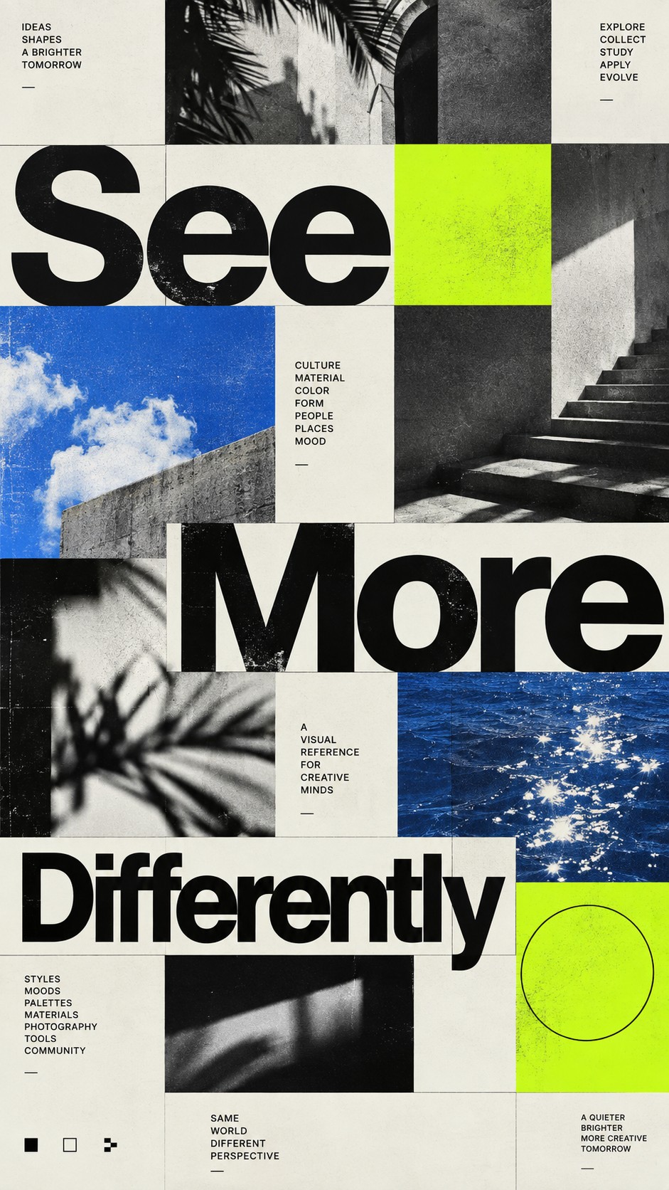
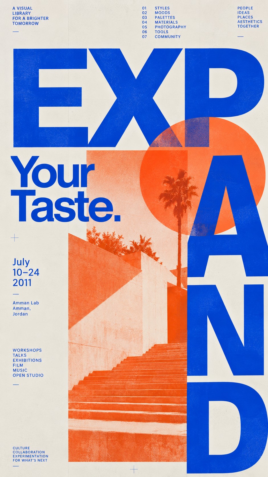
A poster with EXPAND in giant blue letters cropped by the frame, an orange circle and a sunlit stair with a palm, and Your Taste in blue.
Archive plate · Neo Swiss
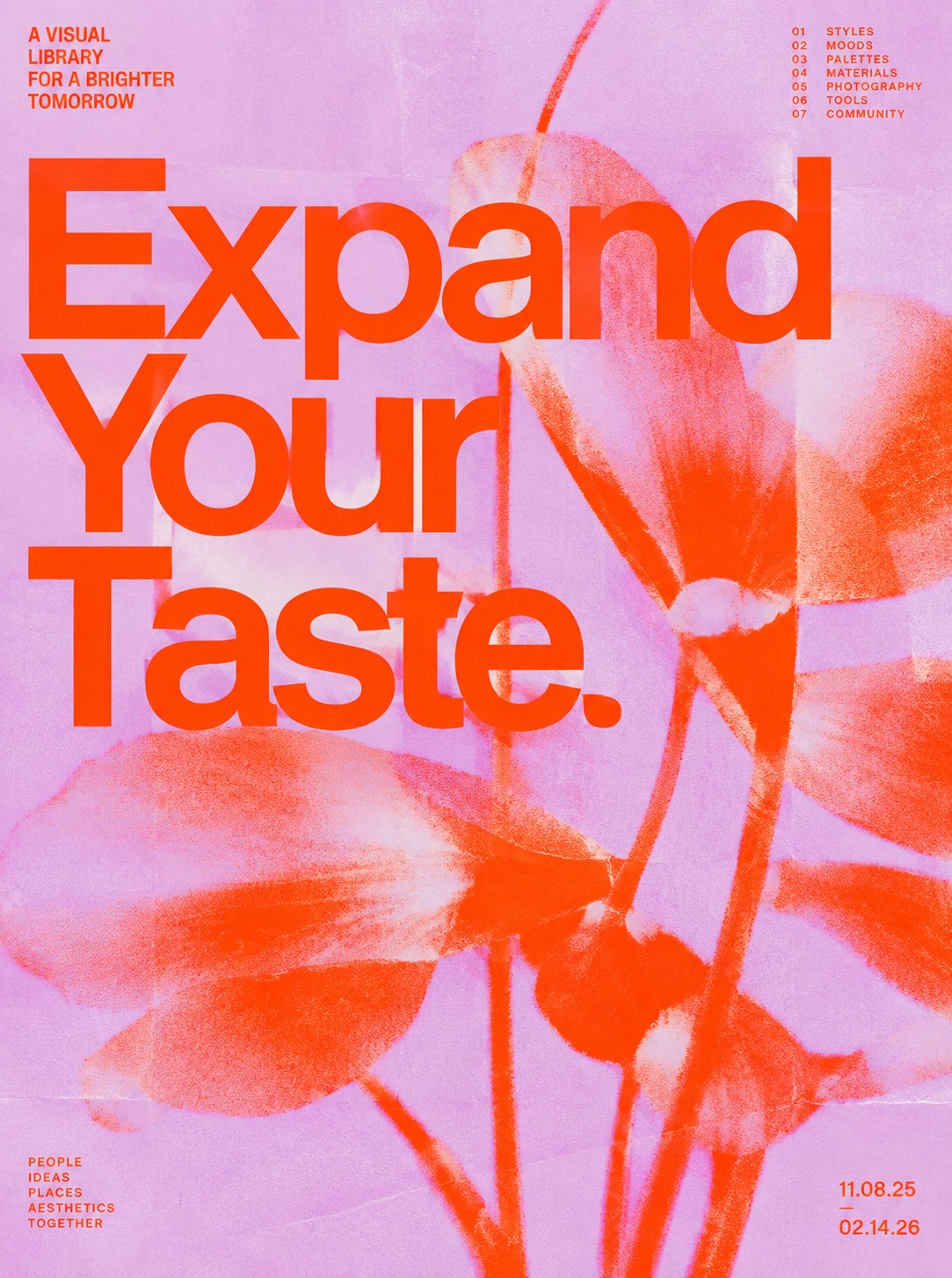
A poster reading Expand Your Taste in huge orange grotesk over a pink photograph of a flowering branch, with small type columns at the edges.
Dossier sceneExpand Your Taste · 1/3
01
The record

What it is, when it works, who it is for, and where it already exists.

How to use it

Record 033-NS - when it works, who it is for, what it looks like

FIELD 01

When to use it

  • Cultural institutions, museums and festivals that need a flexible, recognisable system
  • Tech and product brands that want clarity with more personality than a template
  • Responsive websites and motion identities where the grid has to adapt live
  • Posters and campaigns built from type first and image second
FIELD 02

Perfect for

  • Museums, galleries and cultural programmes
  • Design studios and type foundries
  • Tech and product companies
  • Music festivals and publishers
FIELD 03

What it looks like

  • Experimental Jetset, the Responsive W identity for the Whitney Museum, 2013
  • Neo Neo's identity for NOF, a wink at classic Swiss style, 2019
  • Contemporary Swiss type foundries such as Grilli Type and Dinamo
  • The new generation of Swiss designers profiled by Fast Company, 2016

In the wild, Neo Swiss aesthetic real-world examples

Where this aesthetic shows up in the real world · ↗ opens the source site

Omoro Style GuideEvery aesthetic, every field on this page, in one PDF.
Get the guide →
02
The anatomy

Where Neo Swiss came from, what makes it recognisable, and the fingerprint it leaves.

History, Neo Swiss aesthetic history

2010s to now · Contemporary Swiss and European studios and foundries rebuilding the International Typographic Style for screens

The International Typographic Style took shape in Zurich and Basel in the 1950s and made the grid, the sans serif and objective photography into a system that could work in any language. By the early twenty-first century that system had become the default of corporate and tech design, and a generation of designers set out to make it feel alive again rather than neutral.

Neo Swiss keeps the grid and the grotesk and changes the temperature. Type is set enormous and tight and cropped by the edge of the frame; the grid is made visible and then broken on purpose; photography is cut out and laid flat against colour; one accent, often signal red or electric blue, does the shouting. Experimental Jetset's Responsive W identity for the Whitney Museum in 2013, a single line that stretches to fit any format, showed how a Swiss idea could become a responsive one, and contemporary Swiss foundries such as Grilli Type and Dinamo supplied the grotesks.

By 2016 Fast Company was describing a new generation of Swiss designers subverting the tradition, and studios such as Neo Neo in Geneva were designing identities, like their 2019 work for NOF, that wink openly at the classic style. On screens the approach maps naturally onto responsive grids, variable fonts and motion, which is why it now runs through museum identities, foundry sites, festivals and product brands.

Swiss rigour with the neutrality dropped.

Omoro dossier · 033-NS

Visual markers, Neo Swiss aesthetic visual markers

The visual DNA: what makes it recognisable

typography

See the fonts
  • Oversized neo-grotesks set tight and cropped at the edge
  • One family in two or three weights
  • Small, precise captions set against huge headlines

grid

  • A visible modular grid that the layout then breaks once, on purpose
  • Asymmetric compositions with large areas of empty space
  • Cut-out photography aligned to columns
  • Responsive layouts where type and image reflow by rule

materials

  • Paper white #F4F4F0 and grotesk black #111111 as the base
  • Signal red #FF3B1F or electric blue #1F3BFF as the single accent
  • Neon accent #C8FF2E used sparingly for interaction or motion
  • Responsive websites, variable fonts, motion systems and posters

motifs

  • Giant headlines cropped by the frame
  • Visible grid lines and column rules
  • Cut-out figures and objects on flat colour
  • Kinetic type that stretches, slides and reflows

Aesthetic profile

8-channel console with the fingerprint on its display. Save the card, or share the page

Aesthetic Profile
Neo Swiss
2010s to now · Contemporary Swiss and European studios and foundries rebuilding the International Typographic Style for screens
Attribute console · 033-NS
leans geometric, digital, light
8 CH
FIG. 1
MinimalMaximalDigitalAnalogExpressiveRestrainedCoolWarmFuturisticNostalgicStructuredChaoticLightDarkGeometricOrganic
01Minimal
Maximal10%
02Analog
Digital60%
03Restrained
Expressive30%
04Cool
Warm20%
05Futuristic
Nostalgic20%
06Structured
Chaotic40%
07Dark
Light60%
08Organic
Geometric80%
GeometricDigitalLight
Omoro · Attribute console · 033-NS
omoro.io/styles/neo-swiss

Color Palettes, Neo Swiss color palettes and hex codes

The definitive color scheme for this aesthetic

Neo Swiss
#F4F4F0 · #111111 · #FF3B1F · #1F3BFF · #C8FF2E
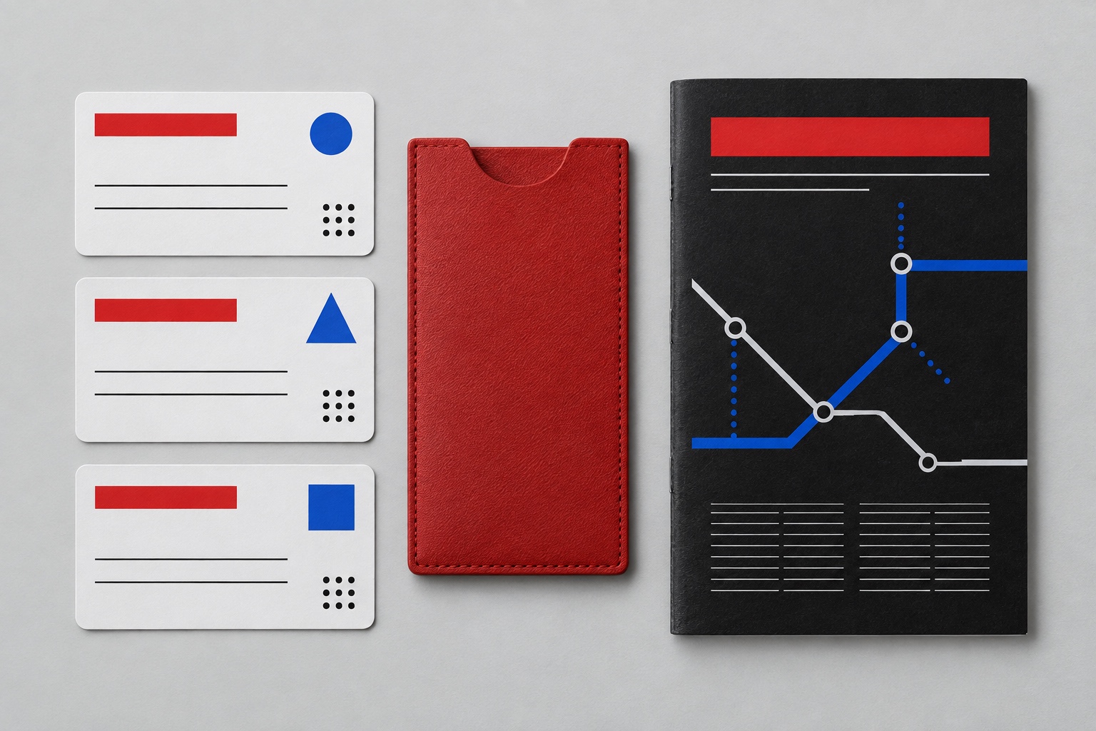
A Swiss poster rebuilt for a phone: black grotesk on white, one red block, one blue link
Omoro Palette Pack575 curated palettes across every aesthetic, 5 export formats.
Get the palettes →

Adjacent Palettes, styles related to Neo Swiss

The colour of the styles sitting closest to this one

Swiss / International
Editorial Interface
Neubrutalism
Motion Design
03
The direction

How to shoot it, how to prompt it, and how to board it.

Photo Direction

How to shoot this aesthetic

"Shoot clean cut-outs on flat colour so the photograph can sit inside a grid of huge type"

Shot list

  • A sunlit stair and a palm shot straight on in hard light, cut into a column beside giant cropped letters and one orange circle
  • A flowering branch photographed against a flat pink ground, printed as an orange duotone behind an oversized headline
  • Black-and-white fragments of architecture and sea, framed square to sit in a grid with neon-green blocks

Lighting

Clean, even studio light with one crisp shadow, or hard daylight on flat surfaces. The photograph has to cut out cleanly and sit flat next to type.

Omoro Director's Briefs196 photo shot-lists like this one, ready to shoot from.
Get the briefs →

Generative Prompt

Drop this into Studio to generate in this aesthetic

Neo Swiss graphic design, contemporary International Typographic Style, oversized neo-grotesk letterforms set tight and cropped at the edge, a visible modular grid, asymmetric layout, crisp cut-out photography, paper-white ground with black type and one loud accent colour such as signal red or electric blue, flat colour fields, precise and confident, no ornament, no gradients

Paste as-is, or append your own subject

Mood Board

The record applied to your project. The record's kit is free; your brand, references and plates come with membership

Mood board
The Neo Swiss board
8 frames · 4 selected
FIG. 4
Paper WhiteF4F4F0Grotesk Black111111Signal RedFF3B1FElectric Blue1F3BFFNeon AccentC8FF2E
Brand and references
IdleBrand and references open with membership
With membership: the brand's own facts and colours in every prompt, references carried into every frame, and the plates generated.
01 · Hero application
02 · Material and finish
03 · Palette in context
04 · Photography direction
05 · Pattern plate
06 · Object
07 · Environment
08 · Digital presence
Demo kit free, the rest with membershipThe record as a demo kit, free. Name a project and it is written for that
Omoro · Mood board · 033-NS
04
The judgement

Whether to use it, what it costs to do properly, and where it stands right now.

Creative verdict, Neo Swiss feasibility and strategic recommendation

Two written calls, seven meters, and when to walk away

Creative verdict
Should Neo Swiss be the call?
7 meters
FIG. 2
Assessment

Set the grid first and make it visible, then break it once, on purpose, with the biggest word on the page. Use one grotesk family in two or three weights and one accent colour for emphasis and interaction. If every element is centred and polite, it has turned back into a template.

Verdict

Right when a brand needs clarity with a voice: museums, festivals, studios, foundries and product companies that want to look sure of themselves. It keeps the Swiss discipline and drops the neutrality. Make the grid visible, break it deliberately, and let one accent colour do the talking.

Production cost
Low

A good grotesk family, a grid and a camera. The system is the investment, not the tools.

Creative difficulty
Medium

The grammar is well documented; deciding where to break the grid is the design.

Execution difficulty
High

Tight type at huge sizes, responsive grids and motion all have to be engineered, not just laid out.

Risk of misuse
Medium

Without a real grid and a real reason to break it, it collapses into generic tech minimalism.

Prevalence
Common

It runs through museum identities, design studios, foundry sites and a large share of tech branding.

Longevity
Enduring

It rests on Swiss grid logic that has held for seventy years; the accent colours and motion will date first.

Brand investment
Medium

A grid system, a type family and a motion rulebook scale across every surface once they exist.

Avoid if
The brand needs warmth, craft or nostalgia
It is precise and graphic by design; hand-made warmth reads as a mistake inside the grid.
There is no one to maintain the grid
The system only works when every layout respects it; one-off pages drift into generic minimalism.
The copy is long and dense
Oversized type needs short headlines; long copy forces the scale down and the style disappears.
Omoro · Creative verdict · 033-NS

Editorial Depth

A Pro feature: origins, practitioners, and pitfalls

Editorial depth
The Neo Swiss file
14 sections
FIG. 3
Context02Brands02Perception04Use04Index02
01Common MisconceptionThe principle beneath the surface
02Historical ContextOrigins, cultural moment, and reaction
03Brands That Accidentally Use This StyleNatural alignment, not category claims
04Brands That Perfectly Represent This StyleExceptional execution
05Psychological EffectHow visual decisions change perception
06Visual ChecklistInclude and avoid
07Creative FormulaThe visual system reduced to essentials
08Recognition SignalsHow to recognize it in two seconds
09When To Use This StyleContexts where the language performs
10Common Creative MistakesWhere imitation weakens the signal
11Best Brand ApplicationsIndustries with a natural advantage
12Creative Application AnalysisFit, feasibility, and production reality
13Related StylesClose languages and the key distinction
14Visual DNA SummaryThe sentence to remember
The editorial depth, with membershipOpening soon
Omoro · Editorial depth · 033-NS
05
The index

Neighbours, cross-references, blends, and the questions people ask.

Related concepts

Connected across the creative knowledge graph

Cultural relevance, Neo Swiss cultural relevance today

Where it stands now, and what it costs you to use it

Neo Swiss is how cultural institutions, studios and product brands look sure of themselves now. It keeps the credibility of the Swiss grid and adds scale, motion and a single loud colour, which makes it work across responsive sites, posters and animated identities.

The failure mode is polite minimalism: a grid nobody can see and nothing that breaks it. The work that lands makes the structure visible, breaks it once with the biggest word on the page, and lets one accent colour carry the voice.

Cross-references

Swiss / InternationalThe International Typographic Style it rebuildsEditorial InterfaceThe magazine logic that shares its grids and hierarchy on screenNeubrutalismThe louder, rawer cousin that breaks the grid harderMotion DesignWhere its type learns to move

Blend

Mix Neo Swiss with any style in the library

Neo Swiss×
50%50%
78% alike
Neo Swiss referenceSwiss / International referenceNeo Swiss 50%Swiss / International 50%

Merged palette

#F4F4F0

#000000

#333333

#FF3B1F

#666666

Leads geometric, structured, light

Typography · from Neo Swiss

Cormorant Garamond over Lora

Materials

  • Paper white #F4F4F0 and grotesk black #111111 as the base
  • Signal red #FF3B1F or electric blue #1F3BFF as the single accent
  • Flat unmodulated color: no gradients, no shadows

The calls this blend forces

These two disagree on one thing, and a blend cannot average them: you pick a side. At this mix:

Expressive or Restrained? Neo Swiss is expressive, Swiss / International is restrained. This mix lands restrained.

Use it

Neo Swiss graphic design, contemporary International Typographic Style, oversized neo-grotesk letterforms set tight and cropped at the edge, a visible modular grid, asymmetric layout, crisp cut-out photography, paper-white ground with black type and one loud accent colour such as signal red or electric blue, flat colour fields, precise and confident, no ornament, no gradients (50%), infused with Swiss International Typographic Style with strict grid system, Helvetica or Akzidenz Grotesk typography, asymmetric layouts, functional clarity, objective visual communication, color palette strictly #F4F4F0 #000000 #333333 #FF3B1F #666666, leaning expressive over restrained, overall character: geometric, structured, light

One-click generation opens with the studio

About this aesthetic

What is Neo Swiss design?

A contemporary take on the International Typographic Style: grids, grotesk type and objective photography, rebuilt for screens with oversized type, visible grids that are broken on purpose, cut-out photography, motion and a single loud accent colour.

How is Neo Swiss different from Swiss style?

Classic Swiss style aimed at neutrality and universal clarity. Neo Swiss keeps the grid and the grotesk but drops the neutrality: bigger type, deliberate rule-breaking, brighter accents and responsive, animated systems.

Which typefaces suit Neo Swiss?

Contemporary neo-grotesks with a range of weights and good tight setting, including the families from Swiss foundries such as Grilli Type and Dinamo, alongside classics like Helvetica and Akzidenz-Grotesk.

Build with the neo swiss aesthetic

Every style in the library is broken down like this one: the palette, the typography, the materials and the lineage.

Explore the style library →