Energy is a decision made at full volume.
Strong contrast makes the eye move quickly. Collision, scale shifts, and saturated color create a physiological sense of acceleration, provided a clear hierarchy gives that motion somewhere to land.
Making everything loud. Without a focal point, intensity becomes noise rather than momentum.

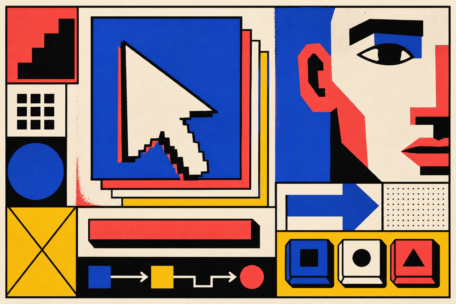
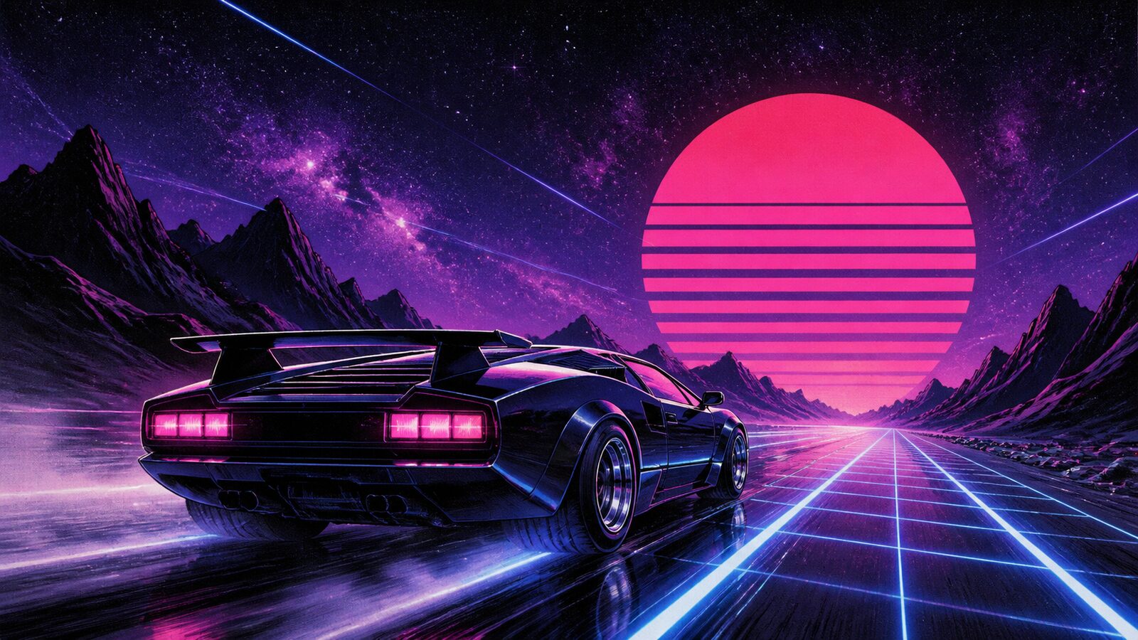
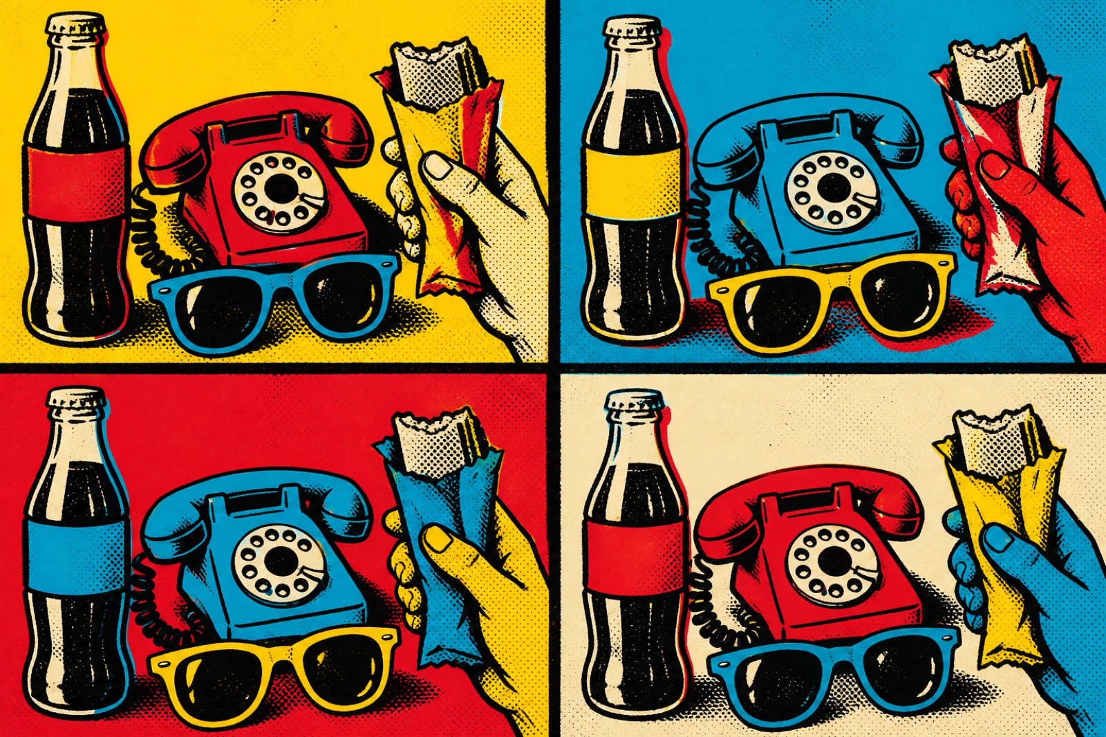
Pop art and neubrutalism share a refusal to be subtle. The color is loud. The composition is deliberate and unapologetic. These aesthetics emerged from a desire to be impossible to ignore, whether Andy Warhol democratizing commercial imagery or brutalist web design rejecting the invisible grid. Energy aesthetics work because they make a decision and commit to it completely. The mistake is hedging: trying to be bold and safe at the same time produces something that is neither. High contrast only lands when the palette is controlled. Maximalism only reads as intentional when there is a clear organizing logic underneath all the noise.
Strong contrast makes the eye move quickly. Collision, scale shifts, and saturated color create a physiological sense of acceleration, provided a clear hierarchy gives that motion somewhere to land.
Launch moments
Youth and culture campaigns
Performance-led products
Playfulness · Rebellion · Innovation
Calm & Wellbeing
Making everything loud. Without a focal point, intensity becomes noise rather than momentum.
Energy & Excitement: practical creative value
Energy & Excitement is not a demographic shortcut. It is a perceptual register that changes how a viewer reads pace, care, risk, and relevance in a visual system.
Real photography or motion budget for the contrast to land, not just a color swap.
Bold is easy to attempt. Bold with real hierarchy underneath is not.
Contrast without an organizing logic reads as noise, not energy.
Energy & Excitement creates competitive advantage where experience matters as much as information. It works best when the product, service, or story already contains evidence that can support the feeling. The common failure is to apply the mood as a filter, then leave the structure, casting, copy, and pacing unchanged. Exceptional work uses it as a governing decision rule. It knows what to amplify, what to withhold, and where a small concrete detail can do more than a large stylistic gesture. The teams most likely to succeed are small, observant, and cross-disciplinary: an art director with a strong editor, photographer or filmmaker, stylist or spatial designer, and a client willing to protect the central idea through production.
When energy & excitement should guide the work
Loud is easy to attempt. Loud with real hierarchy underneath is what most versions miss.
A default reach for youth and performance categories competing for attention.
Specific high-contrast, saturated codes cycle as fast as any visual trend does.
Needs real photography or motion budget, but not the sustained cost luxury or romance demand.
Energy & Excitement is worth adopting when a brand, product, or cultural project needs to make a specific experiential promise before it can be explained in words. It is not a substitute for clarity, proof, or a coherent product. The greatest advantage comes from using the mood as a decision rule: it tells the team how to light a scene, pace a film, select a material, edit a sentence, and decide what to leave out. Average work applies familiar cues and stops there. Exceptional work makes every choice support the same perceptual outcome, while retaining enough specificity that the audience can believe it. The biggest mistake is assuming that emotional recognition alone creates strategic value. Use energy & excitement only when the operation behind the image can honor the experience the image promises.
- Product launches that need to cut through in a saturated feed
- Youth-facing campaigns where energy and immediacy are the point
- Sports, fitness, and performance brands where effort is the value
- Music and festival identity where the visual needs to match the volume
- Pop-up retail and experiential marketing that needs to stop people physically
- Direct-to-consumer brands competing on personality rather than price
- Gaming and esports where high stimulation is the baseline expectation
- Saturated color without contrast: everything loud means nothing stands out
- Dynamic composition that has no clear focal point or hierarchy
- Energy aesthetics applied to categories that require trust: finance, healthcare, legal
- Maximalism without a restraining logic, clutter reads as incompetence not abundance
- High stimulation in long-form formats where the reader needs to settle in