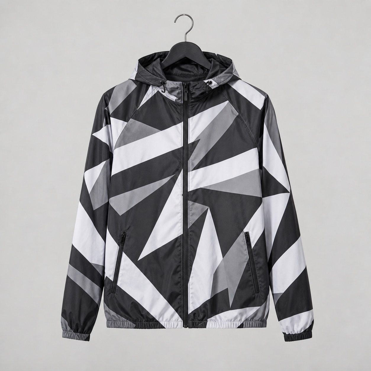
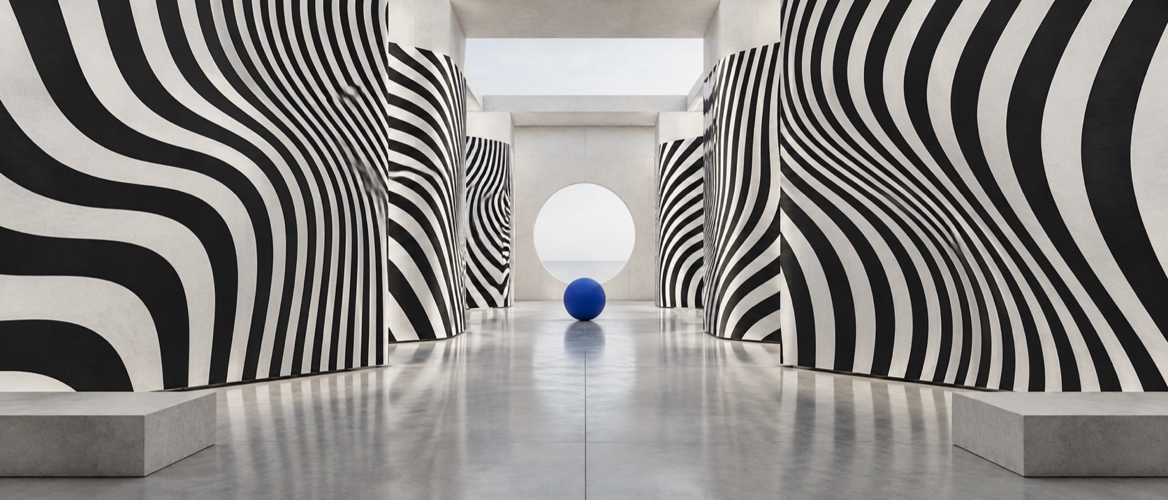
Dazzle Camouflage

Clashing stripes and curves painted across a form to break its outline, the 1917 ship camouflage now used by sportswear, packaging and anything that wants to look fast

Compare Dazzle Camouflage with another style →See the Dazzle Camouflage typefaces →
Record023-DC
AestheticDazzle Camouflage
ClassGeometric / Expressive
StatusINGESTING
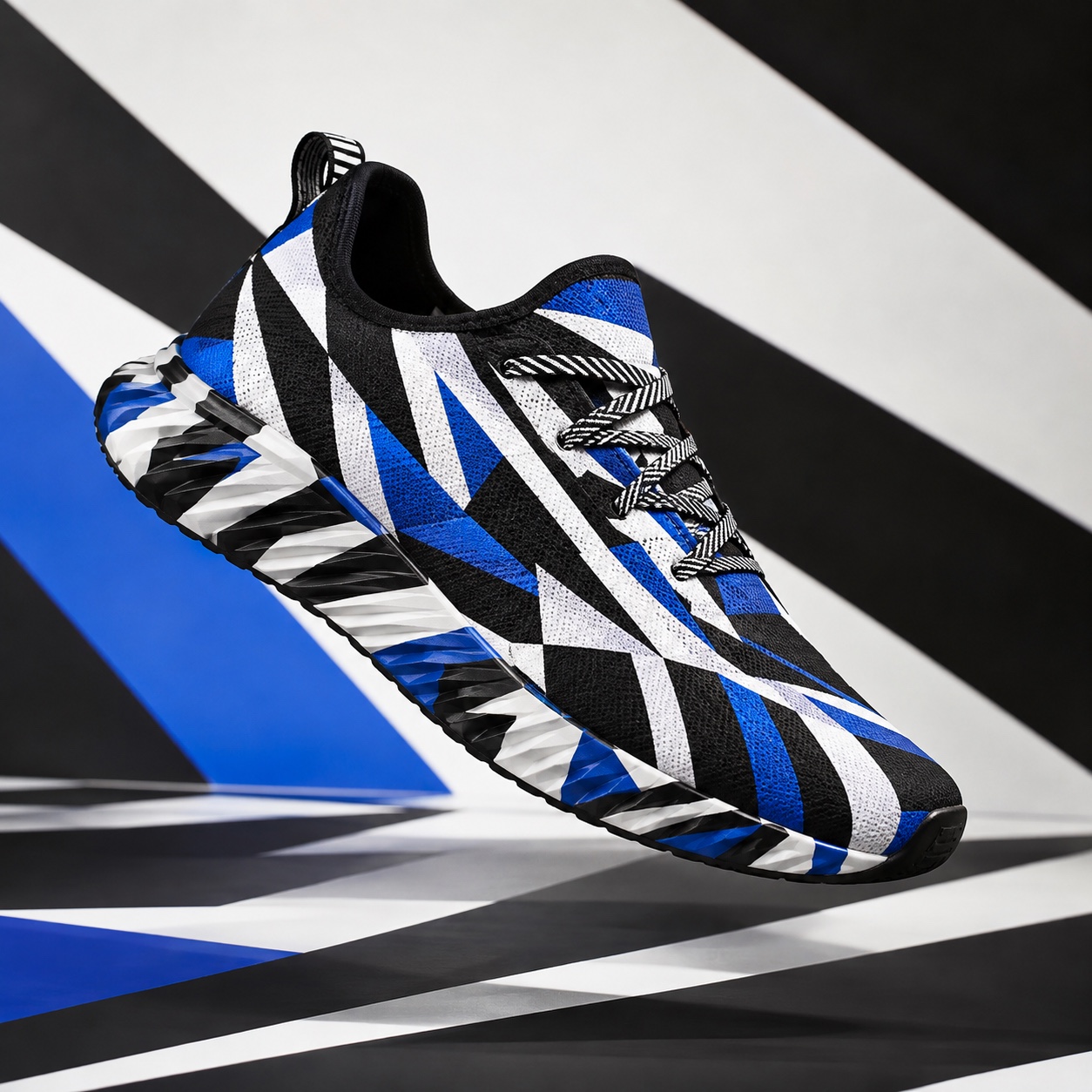
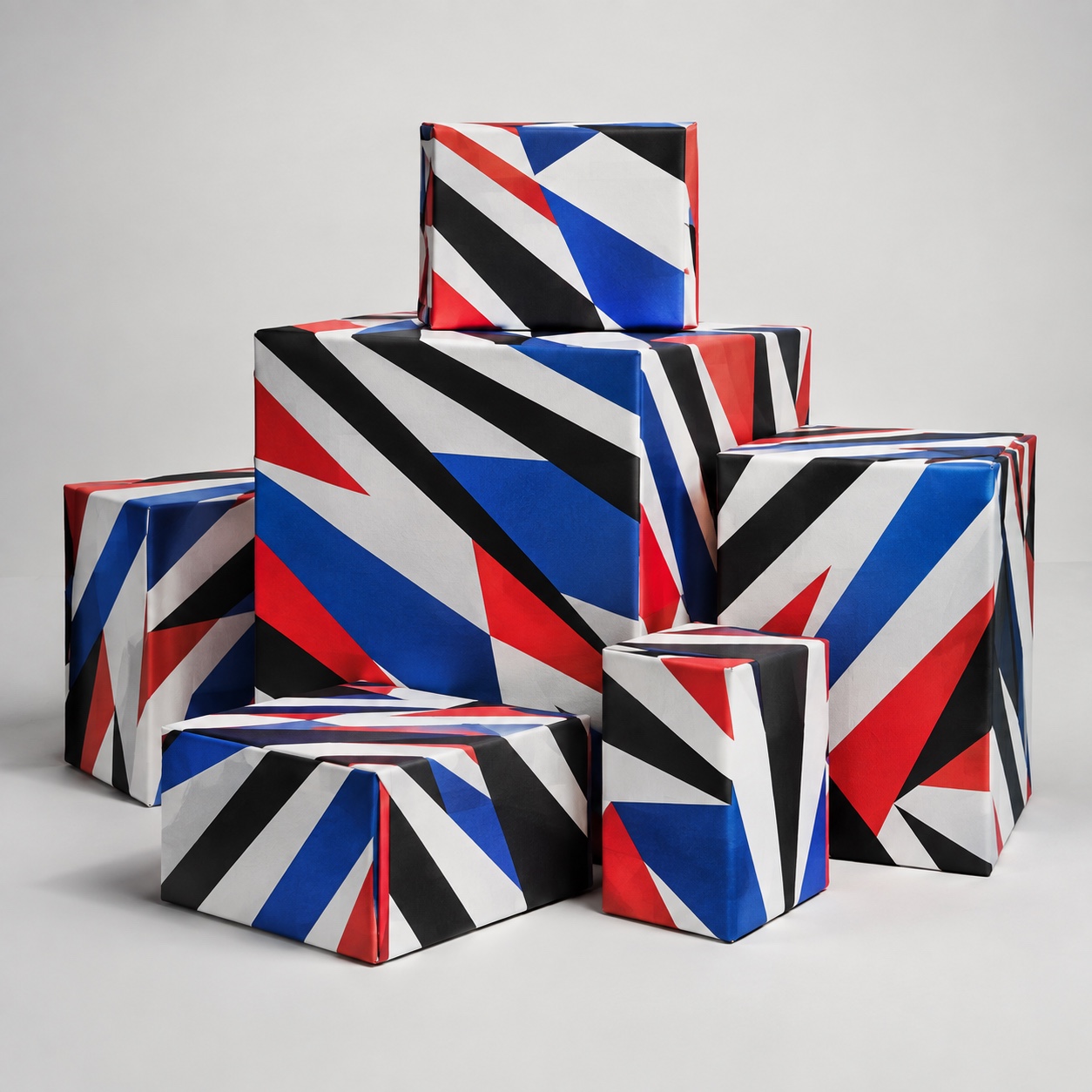
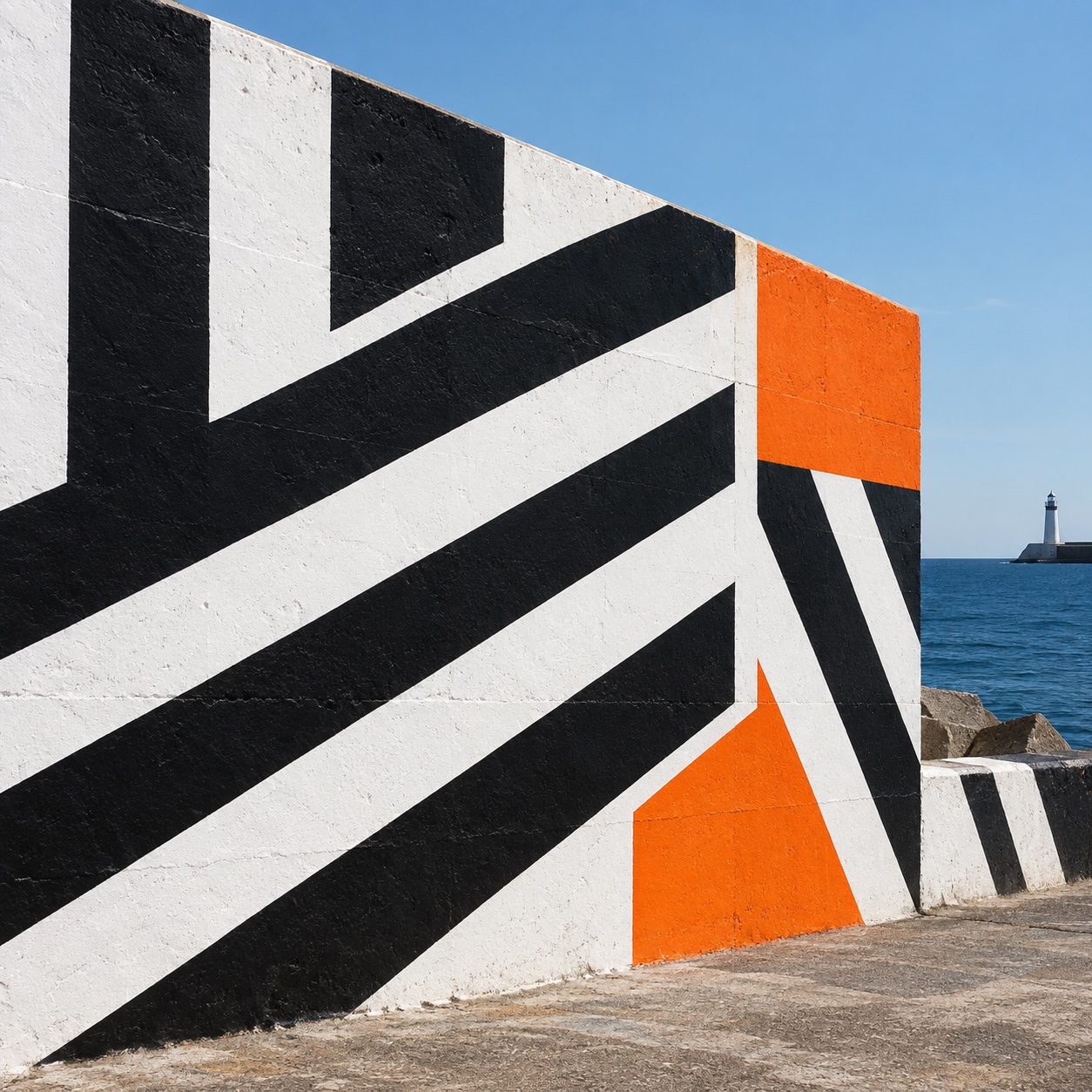
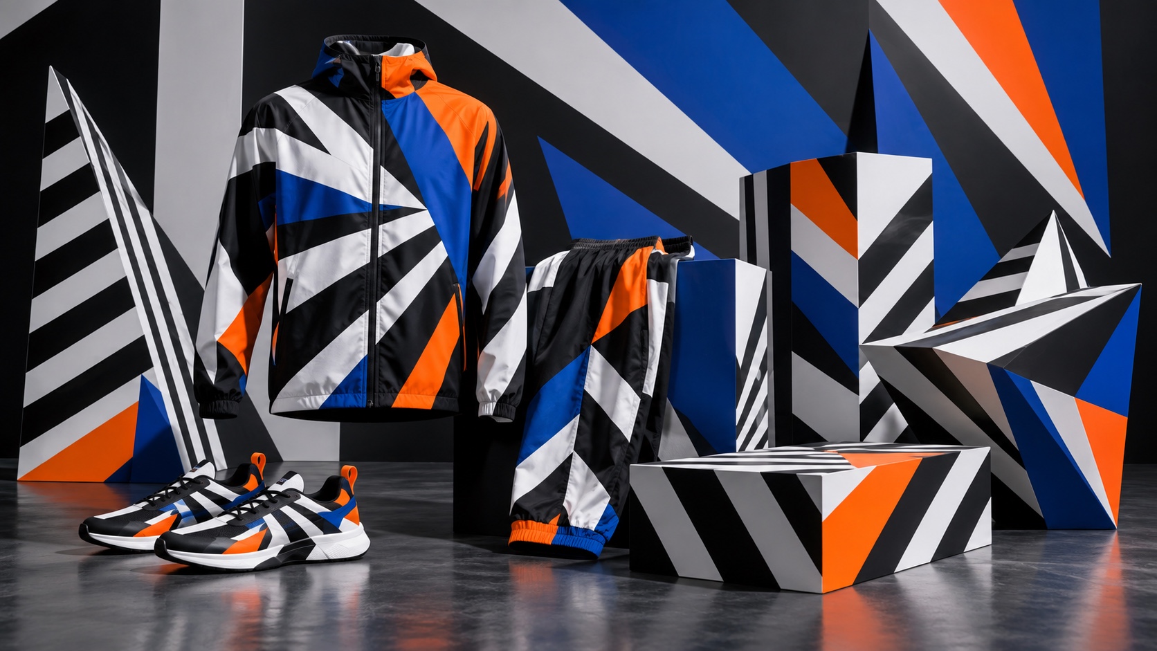
Sportswear, boxes and sneakers in black, white, orange and blue dazzle stripes against a striped wall.
Archive plate · Dazzle Camouflage
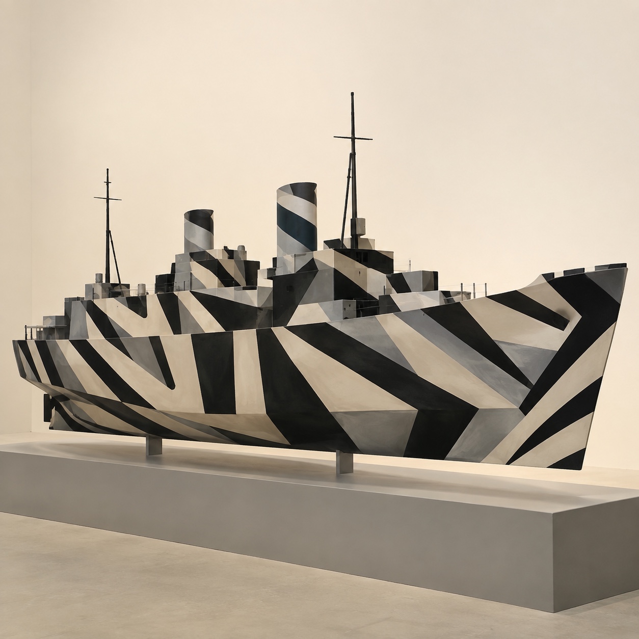
A model ship painted in black, white and grey dazzle bands on a plinth in a plain gallery.
Dossier sceneShip · 1/5
01
The record

What it is, when it works, who it is for, and where it already exists.

How to use it

Record 023-DC - when it works, who it is for, what it looks like

FIELD 01

When to use it

  • Sportswear, cycling and running brands that want speed on a flat surface
  • Packaging and cans that have to stand out on a shelf
  • Cars, boats, bikes and buildings wrapped as one graphic
  • Music and festival identities that need a pattern with a story
FIELD 02

Perfect for

  • Sportswear and sneaker labels
  • Drinks and snack packaging
  • Vehicle and product wraps
  • Music, festivals and events
FIELD 03

What it looks like

  • Norman Wilkinson's dazzle section at the Royal Academy Schools, 1917
  • Edward Wadsworth supervising the painting of ships at Liverpool, 1918
  • Wadsworth's woodcut Dazzle-ships in Drydock at Liverpool, 1919
  • Peter Blake's dazzled Mersey ferry Snowdrop for 14-18 NOW, 2015

In the wild, Dazzle Camouflage aesthetic real-world examples

Where this aesthetic shows up in the real world · ↗ opens the source site

Omoro Style GuideEvery aesthetic, every field on this page, in one PDF.
Get the guide →
02
The anatomy

Where Dazzle Camouflage came from, what makes it recognisable, and the fingerprint it leaves.

History, Dazzle Camouflage aesthetic history

1917-1919; revived from the 1980s · The Royal Academy Schools, London, and the docks of Liverpool

Dazzle was invented to confuse, not to hide. In 1917, with German U-boats sinking British shipping, the marine painter Norman Wilkinson proposed that a ship could not be made invisible at sea but could be made hard to read: stripes and curves in clashing tones, painted across the hull so that a submarine's rangefinder could not tell its speed, heading or where the bow ended. The Admiralty gave him a section at the Royal Academy Schools in London, where designs were tested on models and then handed to teams at the ports.

The painters were modernists. Edward Wadsworth, a leading Vorticist, supervised the dazzling of ships at Bristol and Liverpool from 1918, and his black-and-white woodcuts of the docks, Dazzle-ships in Drydock at Liverpool among them, turned the scheme into art; the kinship between Vorticism's broken planes and the ships is plain. Thousands of vessels were painted on both sides of the Atlantic, each in a unique scheme, and whether it worked was never settled. It ended with the war.

The pattern outlived the purpose. It surfaced in 1980s graphics and record sleeves, in car wraps that hide prototypes from photographers, and in the striped kits of cycling and running, where a body that looks fast is the point. In 2014 and 2015 the 14-18 NOW commissions had artists dazzle real ships again, Peter Blake's Mersey ferry Snowdrop among them, and the look moved back into fashion and packaging as a bold, geometric pattern with a story attached. The current version keeps the rule: bands that cut across the form, never along it.

Stripes that argue with the shape they are painted on.

Omoro dossier · 023-DC

Visual markers, Dazzle Camouflage aesthetic visual markers

The visual DNA: what makes it recognisable

typography

See the fonts
  • Condensed grotesk capitals sliced by the stripes
  • Stencil lettering as on a hull
  • Type that continues a band rather than sitting on it
  • Short words; the pattern is the message

grid

  • Bands that run against the object's edges and corners
  • Curves and diagonals that contradict the real outline
  • Two or three tones per scheme, with hard edges
  • Asymmetry: no two sides alike

materials

  • Black #18181B and white #E8E8E7 as the core
  • Signal blue #1B5CCE, signal red #CF2126 and safety orange #F1630D as the one loud band
  • Hull paint, printed nylon and jersey, corrugated card, foil and vinyl

motifs

  • Diagonal bands that break at the corner
  • False bows and curves painted on flat sides
  • Chevrons and zigzags in interfering rhythms
  • A form that reads as two shapes at once

Aesthetic profile

8-channel console with the fingerprint on its display. Save the card, or share the page

Aesthetic Profile
Dazzle Camouflage
1917-1919; revived from the 1980s · The Royal Academy Schools, London, and the docks of Liverpool
Attribute console · 023-DC
leans geometric, expressive, chaotic
8 CH
FIG. 1
MaximalMinimalAnalogDigitalExpressiveRestrainedCoolWarmNostalgicFuturisticChaoticStructuredLightDarkGeometricOrganic
01Minimal
Maximal40%
02Analog
Digital40%
03Restrained
Expressive80%
04Cool
Warm20%
05Futuristic
Nostalgic30%
06Structured
Chaotic50%
07Dark
Light20%
08Organic
Geometric90%
GeometricExpressiveChaotic
Omoro · Attribute console · 023-DC
omoro.io/styles/dazzle-camouflage

Color Palettes, Dazzle Camouflage color palettes and hex codes

The definitive color scheme for this aesthetic

Dazzle Camouflage
#18181B · #E8E8E7 · #1B5CCE · #CF2126 · #F1630D
A hull in drydock: black and white bands, a signal blue curve, a red chevron and one orange panel
Omoro Palette Pack575 curated palettes across every aesthetic, 5 export formats.
Get the palettes →

Adjacent Palettes, styles related to Dazzle Camouflage

The colour of the styles sitting closest to this one

Op Art
Cubism
Supergraphics
Technical Sportswear
03
The direction

How to shoot it, how to prompt it, and how to board it.

Photo Direction

How to shoot this aesthetic

"Shoot the pattern on a form, at an angle, so the bands visibly argue with the shape"

Shot list

  • A runner in a dazzle-striped kit mid-stride against a plain wall, the stripes breaking the body's outline
  • A dazzle-wrapped car or boat shot three-quarter on so the false edges read
  • A row of cans in clashing dazzle schemes on a plain shelf

Lighting

Hard, clear light with crisp shadows: bright sun or a single hard key. The edges of the bands must stay sharp, so no haze or soft fill; colour flat and full.

Omoro Director's Briefs212 photo shot-lists like this one, ready to shoot from.
Get the briefs →

Generative Prompt

Drop this into Studio to generate in this aesthetic

Dazzle camouflage aesthetic, 1917 naval dazzle painting applied to a modern object, bold black and white bands with battleship grey, signal blue and a stripe of dazzle pink, diagonal stripes and curves that cut across the form and break its outline, hard edges, asymmetric on each side, flat matte paint, hard clear light, disruptive and graphic, no parallel stripes, no readable text

Paste as-is, or append your own subject

Mood Board

The record applied to your project. The record's kit is free; your brand, references and plates come with membership

Mood board
The Dazzle Camouflage board
8 frames · 4 selected
FIG. 4
Hull Black18181BHull WhiteE8E8E7Signal Blue1B5CCESignal RedCF2126Safety OrangeF1630D
Brand and references
IdleBrand and references open with membership
With membership: the brand's own facts and colours in every prompt, references carried into every frame, and the plates generated.
01 · Hero application
02 · Material and finish
03 · Palette in context
04 · Photography direction
05 · Pattern plate
06 · Object
07 · Environment
08 · Digital presence
Demo kit free, the rest with membershipThe record as a demo kit, free. Name a project and it is written for that
Omoro · Mood board · 023-DC
04
The judgement

Whether to use it, what it costs to do properly, and where it stands right now.

Creative verdict, Dazzle Camouflage feasibility and strategic recommendation

Two written calls, seven meters, and when to walk away

Creative verdict
Should Dazzle Camouflage be the call?
7 meters
FIG. 2
Assessment

Design on the object, not on a rectangle: draw the bands against its edges and corners so they break the outline. Two or three tones, hard edges, and two sides that do not match. Parallel stripes running along the form are a jersey; the pattern has to argue with the shape.

Verdict

Right when the brand wants to look fast, bold and clever at once: sportswear, drinks, vehicles, festivals and launches. It rewards asymmetry and hard edges, and fails as a polite stripe.

Production cost
Low

Paint, vinyl or a print file; the pattern needs nothing expensive.

Creative difficulty
Medium

The rule is simple; making the bands contradict a specific form takes drawing.

Execution difficulty
Medium

Hard edges at scale need masking, and a scheme designed flat often fails on the real object.

Risk of misuse
Medium

Applied as neat stripes it becomes generic sportswear; the disruption is what makes it dazzle.

Prevalence
Common

Cycling and running kit, drinks cans, wraps and event graphics use it regularly.

Longevity
Enduring

A century old and revived every decade or two; the graphic logic does not date.

Brand investment
Low

One scheme, painted or printed, covers a product, a vehicle or a campaign.

Avoid if
The brand needs calm, luxury or trust
The pattern is built to unsettle the eye; it reads as loud before anything else.
The design will be applied flat, as a repeat
Dazzle works against a form; as wallpaper it is just stripes.
Legibility of small type matters on the surface
The bands cut through everything, including words.
Omoro · Creative verdict · 023-DC

Editorial Depth

A Pro feature: origins, practitioners, and pitfalls

Editorial depth
The Dazzle Camouflage file
14 sections
FIG. 3
Context02Brands02Perception04Use04Index02
01Common MisconceptionThe principle beneath the surface
02Historical ContextOrigins, cultural moment, and reaction
03Brands That Accidentally Use This StyleNatural alignment, not category claims
04Brands That Perfectly Represent This StyleExceptional execution
05Psychological EffectHow visual decisions change perception
06Visual ChecklistInclude and avoid
07Creative FormulaThe visual system reduced to essentials
08Recognition SignalsHow to recognize it in two seconds
09When To Use This StyleContexts where the language performs
10Common Creative MistakesWhere imitation weakens the signal
11Best Brand ApplicationsIndustries with a natural advantage
12Creative Application AnalysisFit, feasibility, and production reality
13Related StylesClose languages and the key distinction
14Visual DNA SummaryThe sentence to remember
The editorial depth, with membershipOpening soon
Omoro · Editorial depth · 023-DC
05
The index

Neighbours, cross-references, blends, and the questions people ask.

Related concepts

Connected across the creative knowledge graph

Cultural relevance, Dazzle Camouflage cultural relevance today

Where it stands now, and what it costs you to use it

Dazzle is the pattern a brand reaches for when it wants energy and a graphic system in one move. Cycling and running kit, drinks cans, event identities and product wraps use it because a striped surface that contradicts the object looks fast and photographs from any angle.

Its failure mode is the stripe. Even bands running along the object are a jersey, not dazzle; the point is disruption, with curves and diagonals that cut across the real outline. The work that lands keeps two or three tones, hard edges and asymmetry, and lets the pattern argue with the shape.

Cross-references

Op ArtThe later art of making the eye misjudge a surfaceCubismThe broken planes the Vorticists brought to the docksSupergraphicsThe other way paint at scale reshapes a formTechnical SportswearWhere the pattern lives now

Blend

Mix Dazzle Camouflage with any style in the library

Dazzle Camouflage×
50%50%
68% alike
Dazzle Camouflage referenceOp Art referenceDazzle Camouflage 50%Op Art 50%

Merged palette

#18181B

#000000

#E8E8E7

#FFFFFF

#1B5CCE

Leads geometric, expressive, maximal

Typography · from Dazzle Camouflage

Bebas Neue over Roboto

Materials

  • Black #18181B and white #E8E8E7 as the core
  • Signal blue #1B5CCE, signal red #CF2126 and safety orange #F1630D as the one loud band
  • Absolute black #000000 on paper white #FFFFFF

The calls this blend forces

These two disagree on one thing, and a blend cannot average them: you pick a side. At this mix:

Chaotic or Structured? Dazzle Camouflage is chaotic, Op Art is structured. This mix lands structured.

Use it

Dazzle camouflage aesthetic, 1917 naval dazzle painting applied to a modern object, bold black and white bands with battleship grey, signal blue and a stripe of dazzle pink, diagonal stripes and curves that cut across the form and break its outline, hard edges, asymmetric on each side, flat matte paint, hard clear light, disruptive and graphic, no parallel stripes, no readable text (50%), infused with Op Art, 1960s perceptual abstraction, black and white pattern engineered to vibrate, warped grid, concentric and radial stripes, moire interference, spatial ambiguity, hard flat edges, mechanical precision, no gradient, no brush, one restrained colour interruption at most, cool and exact, not psychedelic, color palette strictly #18181B #000000 #E8E8E7 #FFFFFF #1B5CCE, leaning chaotic over structured, overall character: geometric, expressive, maximal

One-click generation opens with the studio

About this aesthetic

What is dazzle camouflage?

Ship camouflage devised by the painter Norman Wilkinson in 1917: bold, clashing stripes and curves painted across a hull so that an enemy could not read its speed or heading. Thousands of Allied ships were painted in unique schemes before the war ended, and the pattern has returned in graphics, sportswear and packaging ever since.

Did it work?

Nobody ever proved it. Records were inconclusive and the schemes were dropped after 1918, but crews liked them and the designs were unforgettable, which is why they have had a longer life as pattern than as camouflage.

How is it different from stripes or op art?

Stripes follow a surface; dazzle cuts across it, with diagonals and curves placed to contradict the real outline. Op art, decades later, makes a flat surface appear to move; dazzle makes a solid form hard to measure. Both play with the eye, but dazzle is applied to an object and asymmetrical by design.

How do you use it well?

Draw the bands against the object's edges and corners, use two or three tones with hard edges, keep the two sides different, and let a curve or a false edge contradict the real shape. Stripes running neatly along a form are not dazzle.

Build with the dazzle camouflage aesthetic

Every style in the library is broken down like this one: the palette, the typography, the materials and the lineage.

Explore the style library →