Futurism

Speed painted as repeated form and force lines, machinery and the city in motion, with type that is set off like an engine

Compare Futurism with another style →See the Futurism typefaces →
Record025-FU
AestheticFuturism
ClassExpressive / Maximal
StatusINGESTING
Futurism aesthetic archive image
Archive plate · Futurism
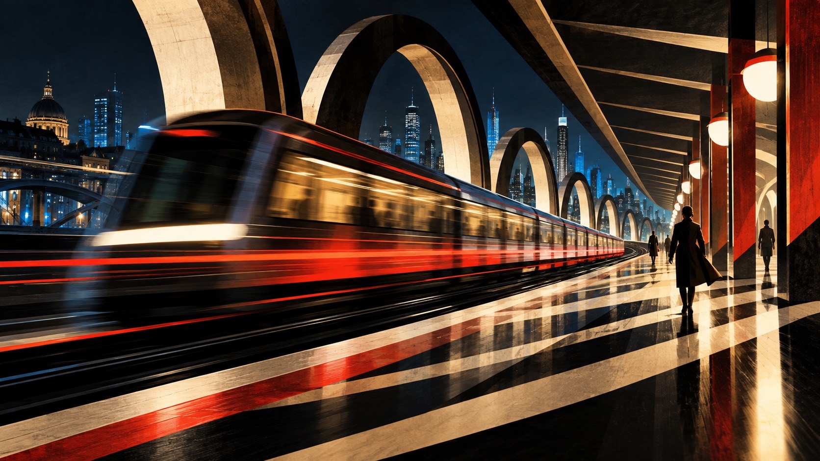
Futurism aesthetic: City dossier scene
Dossier sceneCity · 1/4
01
The record

What it is, when it works, who it is for, and where it already exists.

How to use it

Record 025-FU - when it works, who it is for, what it looks like

FIELD 01

When to use it

  • Motion identities where the still frame has to imply velocity
  • Automotive, transit and industrial brands with something to accelerate
  • Event and sport communication that needs force on the page
  • Type-led posters where the words are the picture
FIELD 02

Perfect for

  • Motorsport, cycling and transit organisations
  • Engineering, tooling and machinery brands
  • Festivals, launches and anything with a countdown
  • Music and media with a loud, forward-moving voice
FIELD 03

What it looks like

  • Umberto Boccioni, Unique Forms of Continuity in Space, 1913
  • Giacomo Balla, Dynamism of a Dog on a Leash, 1912
  • Filippo Tommaso Marinetti, Zang Tumb Tumb, 1914
  • Fortunato Depero, Bolted Book, 1927

In the wild, Futurism aesthetic real-world examples

Where this aesthetic shows up in the real world · ↗ opens the source site

Omoro Style Guide170+ aesthetics, every field on this page, in one PDF.
Get the guide →
02
The anatomy

Where Futurism came from, what makes it recognisable, and the fingerprint it leaves.

History, Futurism aesthetic history

1909-1920s · Milan, Turin and Rome, announced in a Paris newspaper

Futurism was declared before it was made. Filippo Tommaso Marinetti published his manifesto on the front page of Le Figaro in February 1909, announcing that a racing car was more beautiful than the Winged Victory of Samothrace and that the movement would glorify speed, machinery, youth and violence. The painters arrived a year later: Umberto Boccioni, Giacomo Balla, Carlo Carra, Luigi Russolo and Gino Severini signed their own manifesto and set out to paint not objects but their motion. Balla painted a dachshund with twenty legs and a leash drawn as a blur; Boccioni sculpted a striding figure whose body was the wake it left in the air.

The graphic language came from the printed word. Marinetti's parole in liberta, words in freedom, blew up the page: type at every size, set on diagonals, onomatopoeia standing in for artillery, no syntax and no lines. Zang Tumb Tumb, from 1914, is a battle rendered as typography. Fortunato Depero carried the method into advertising and objects, designing for Campari and binding his 1927 monograph with two industrial bolts. The visual kit is consistent across all of it: force lines, repeated and offset edges, sharp facets, the diagonal as the line of energy, and a palette of engine colours, orange, steel blue and black, with chrome white and a shot of electric yellow.

The movement's history is inseparable from its politics. Marinetti was a founder of the Fascist movement and Futurism became, for a time, something close to an official style. Many of its painters died in the war it had celebrated. The graphic method outlived all of that and turned up, stripped of its manifesto, in Art Deco streamlining, in Soviet and Dutch typography, in motorsport livery and in every motion identity that makes a still frame imply velocity. What transfers is the mechanics of speed on a surface. What does not transfer, and should not, is the manifesto.
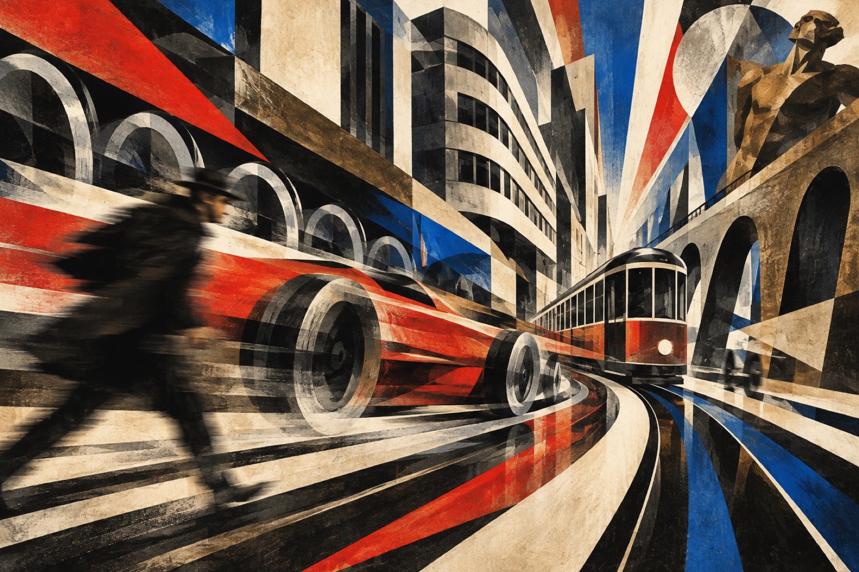
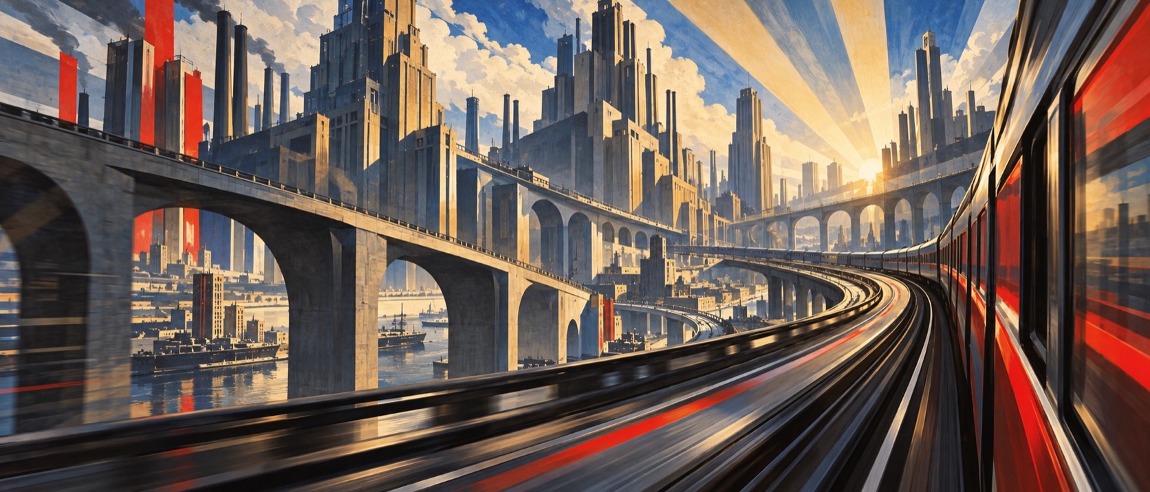
Acceleration painted as repeated form, and the page set off like an engine.

Omoro dossier · 025-FU

Visual markers, Futurism aesthetic visual markers

The visual DNA: what makes it recognisable

typography

See the fonts
  • Words in freedom: type at every size on one page, set along diagonals
  • Onomatopoeia and single words as image, no sentences
  • Heavy grotesques and slab serifs, letters leaning into the direction of motion

grid

  • Force lines radiating or converging, every element aligned to them
  • Repeated and offset forms that read as one thing moving
  • Sharp facets and interpenetrating planes, the figure and its environment fused

materials

  • Motion orange #E4572E, steel blue #1F4E79, engine black #141414
  • Chrome white #EDEDEA and electric yellow #F2C230 as highlights
  • Steel, enamel, printed paper, glass, machine parts

motifs

  • The multiplied figure: a runner, a cyclist, a dog with twenty legs
  • Force lines drawn across the ground and through the subject
  • Machines, trains, cars and the city as an engine
  • Typographic explosions that shout rather than read

Aesthetic profile

8-channel console with the fingerprint on its display. Save the card, or share the page

Aesthetic Profile
Futurism
1909-1920s · Milan, Turin and Rome, announced in a Paris newspaper
Attribute console · 025-FU
leans expressive, maximal, geometric
8 CH
FIG. 1
MaximalMinimalAnalogDigitalExpressiveRestrainedWarmCoolNostalgicFuturisticChaoticStructuredLightDarkGeometricOrganic
01Minimal
Maximal60%
02Analog
Digital40%
03Restrained
Expressive90%
04Cool
Warm30%
05Futuristic
Nostalgic20%
06Structured
Chaotic40%
07Dark
Light10%
08Organic
Geometric60%
ExpressiveMaximalGeometric
Omoro · Attribute console · 025-FU
omoro.io/styles/futurism

Color Palettes, Futurism color palettes and hex codes

The definitive color scheme for this aesthetic

Futurism
#E4572E · #1F4E79 · #141414 · #EDEDEA · #F2C230
An engine at full revs: orange, steel and black, everything already moving
Omoro Palette Pack575 curated palettes across every aesthetic, 5 export formats.
Get the palettes →
03
The direction

How to shoot it, how to prompt it, and how to board it.

Photo Direction

How to shoot this aesthetic

"Photograph speed itself: the figure multiplied by its own motion and the page set off like an engine"

Shot list

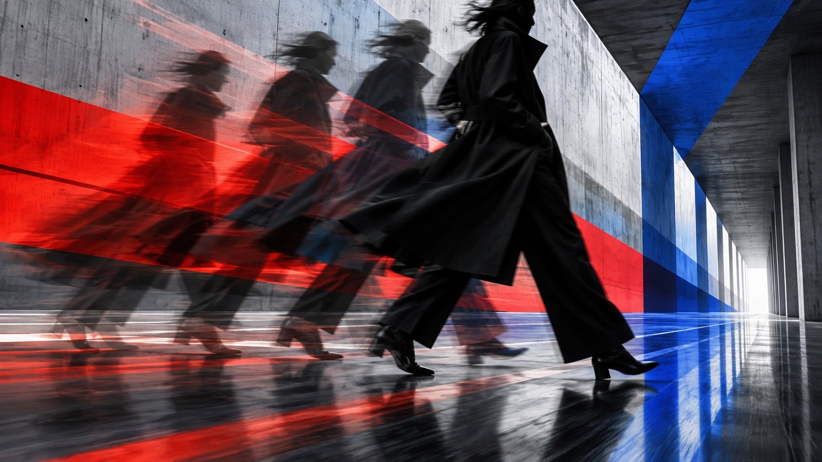
  • Wide shot of a cyclist or runner in motion rendered as five overlapping exposures fanned across the frame, force lines drawn in orange across the ground, an industrial shed behind
  • Frontal shot of a poster wall where a single word explodes across the sheet at every size along diagonal force lines, orange and black on white, no readable sentence
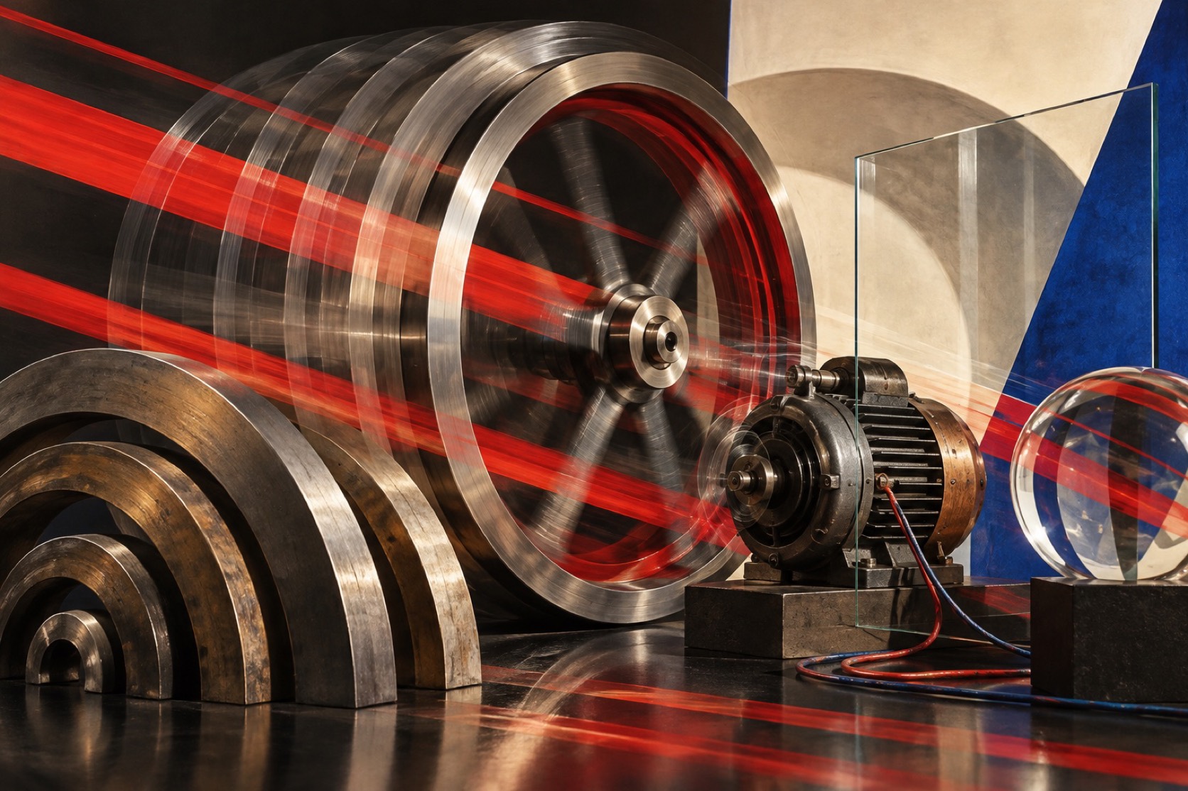
  • Close detail of riveted steel and a spinning flywheel caught at a long exposure so the spokes multiply, a single electric-yellow highlight on chrome

Lighting

Hard, directional light that makes edges multiply: strong side light, long exposures for anything that moves, one specular highlight on metal. Avoid soft or even light; softness kills the force.

Omoro Director's Briefs176 photo shot-lists like this one, ready to shoot from.
Get the briefs →

Generative Prompt

Drop this into Studio to generate in this aesthetic

Italian Futurism, 1909 to 1920s, speed and machinery rendered as repeated forms and force lines, a figure or vehicle multiplied through its own motion, sharp facets, the city as engine, words in freedom typography with type at every size set along diagonals, motion orange, steel blue and engine black, exhilarated and loud, not retrofuturism, not chrome nostalgia

Paste as-is, or append your own subject

Mood Board

A Pro feature: a board generated from the record

A generated board, with membership

Opening soon

04
The judgement

Whether to use it, what it costs to do properly, and where it stands right now.

Creative verdict, Futurism feasibility and strategic recommendation

Two written calls, seven meters, and when to walk away

Creative verdict
Should Futurism be the call?
7 meters
FIG. 2
Assessment

Everything leans forward or nothing does. Put the diagonal in first and multiply every moving edge along it, because a futurist layout with a level horizon is a poster with orange on it. Let type be image: words that explode rather than read. Take the speed and the machines; the manifesto and the politics stay out of the frame.

Verdict

Right when the still frame has to imply velocity and the brand has something real to accelerate: transit, motorsport, machinery, a launch. It carries the heaviest political history in the library after constructivism and should be handled the same way. The mechanics of speed transfer; the manifesto does not, and work that reaches for it has left the brief.

Production cost
Low

Type, ink and a diagonal. Long exposures do the rest.

Creative difficulty
Medium

The kit is documented: force lines, repetition, words in freedom. Choose one to lead.

Execution difficulty
High

Motion has to read from a still; soft light or a static composition kills it instantly.

Risk of misuse
High

The politics are one careless reference away, and the movement had a manifesto and a war.

Prevalence
Rare

Its method is everywhere in motion and sport branding; the name is almost never used.

Longevity
Timeless

Speed on a surface has not stopped working since 1909.

Brand investment
Medium

A diagonal system and one typographic rule carry it across print and motion.

Avoid if
The brand has nothing to accelerate
Force lines on a static proposition look like a costume.
Any reference risks reaching the movement's politics
The manifesto celebrated war and fed fascism. That history is not a style.
Omoro · Creative verdict · 025-FU

Editorial Depth

A Pro feature: origins, practitioners, and pitfalls

Common Misconception
Historical Context
Brands That Accidentally Use This Style
Brands That Perfectly Represent This Style
Psychological Effect

The editorial depth, with membership

Opening soon

05
The index

Neighbours, cross-references, blends, and the questions people ask.

Related concepts

Connected across the creative knowledge graph

Cultural relevance, Futurism cultural relevance today

Where it stands now, and what it costs you to use it

Futurism is the origin of motion as a graphic subject. Any identity that animates a mark, any sports or automotive livery, any poster where the type leans into a diagonal is using its method. It is also the ancestor of kinetic typography and of the force lines every comic artist draws without thinking about where they came from.

It carries the heaviest political history in the library after constructivism, and the two should be handled the same way: the mechanics transfer and the manifesto does not. Speed, machinery, repetition and typographic force are the assets. Glorified violence and the movement's fascism are not part of the style, and work that reaches for them has left the brief.

Cross-references

ConstructivismShares the diagonal and the machine, built for the public wall rather than the racetrackArt DecoFuturism's speed lines, streamlined and made polite for commerceRetrofuturismThe nostalgia for a future that Futurism was busy inventingMotion DesignWhere the still frame's implied velocity finally gets to move

Blend

Mix Futurism with any of the library's 170+ styles

Futurism×
50%50%
85% alike
Futurism referenceConstructivism referenceFuturism 50%Constructivism 50%

Merged palette

#E4572E

#0E0D0B

#1F4E79

#C41E1A

#141414

Leads expressive, geometric, analog

Typography · from Futurism

Oswald over Roboto

Materials

  • Motion orange #E4572E, steel blue #1F4E79, engine black #141414
  • Chrome white #EDEDEA and electric yellow #F2C230 as highlights
  • Signal red #C41E1A, print black #0E0D0B, poster cream #E9E1CF

The calls this blend forces

These two disagree on one thing, and a blend cannot average them: you pick a side. At this mix:

Chaotic or Structured? Futurism is chaotic, Constructivism is structured. This mix lands structured.

Use it

Italian Futurism, 1909 to 1920s, speed and machinery rendered as repeated forms and force lines, a figure or vehicle multiplied through its own motion, sharp facets, the city as engine, words in freedom typography with type at every size set along diagonals, motion orange, steel blue and engine black, exhilarated and loud, not retrofuturism, not chrome nostalgia (50%), infused with Constructivist graphic design, 1920s Russian avant-garde poster language, bold diagonal composition, heavy black bars and circles, red and black on unbleached cream paper with one cobalt accent, letterforms treated as physical shapes, photomontage grain, letterpress bite on rough stock, industrial forms and engineered assembly, urgent and public, no slogans, no flags, no real text, color palette strictly #E4572E #0E0D0B #1F4E79 #C41E1A #141414, leaning chaotic over structured, overall character: expressive, geometric, analog

One-click generation opens with the studio

About this aesthetic

What is Futurism in art and design?

An Italian movement founded in 1909 that painted and printed speed, machinery and modern life as repeated forms, force lines and explosive typography. Its painters included Boccioni, Balla, Carra, Russolo and Severini; its designer was Depero.

How is Futurism different from retrofuturism?

Futurism is the original 1909 movement about the present-day machine age. Retrofuturism is a later nostalgia for how earlier decades imagined the future, chrome fins and space-age optimism. One is acceleration; the other is fondness for an old idea of tomorrow.

What are the key visual techniques of Futurism?

Force lines, the multiplication of a moving form into overlapping repeated edges, sharp interpenetrating facets, the diagonal as the line of energy, and words-in-freedom typography that sets type at every size along those same lines.

Build with the futurism aesthetic

Every style in the library is broken down like this one: the palette, the typography, the materials and the lineage.

Explore the style library →