When to use it
- Streetwear and sportswear launches that need an edge the category recognises
- Music artwork, tour posters and merch
- Campaigns that want to interrupt their own polish
- Reworking existing catalogue photography into something with a voice
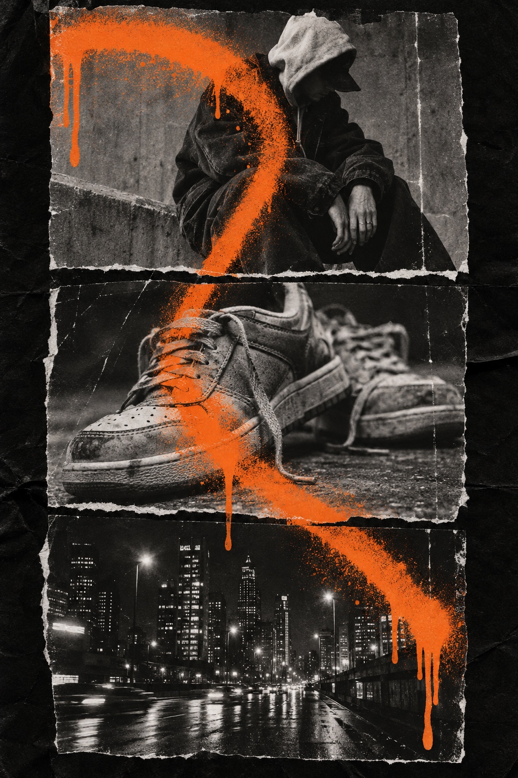
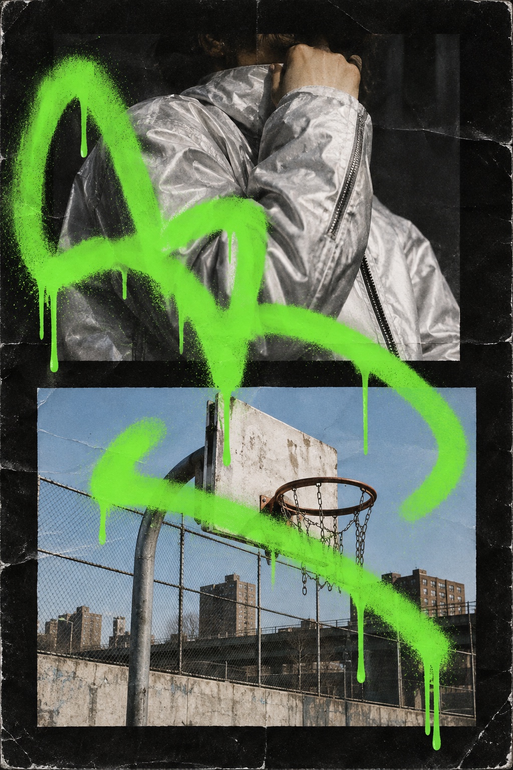
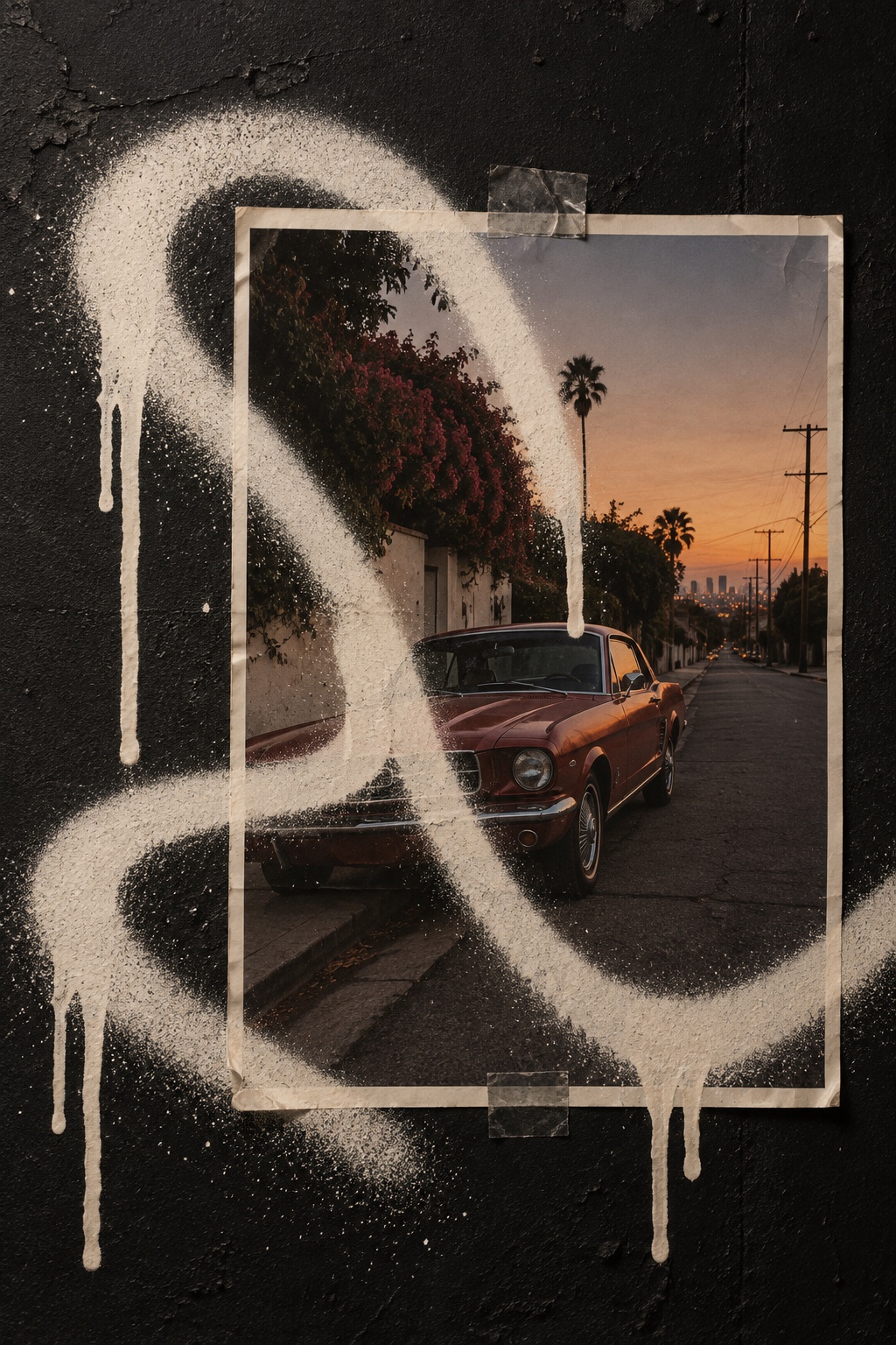
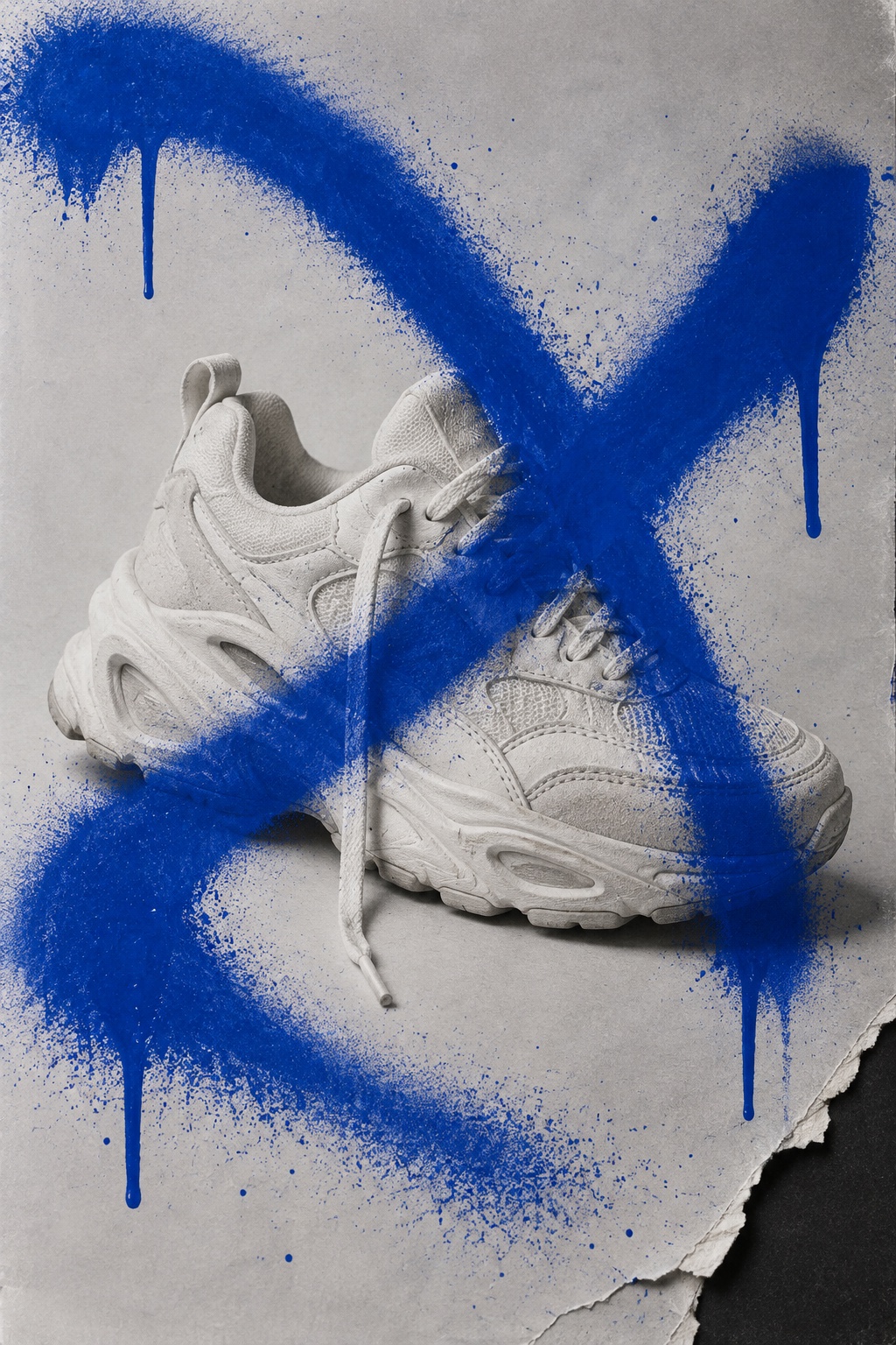
A clean studio shot defaced with one hand-sprayed tag in a single loud colour, drips and all, with the photograph underneath left sharp
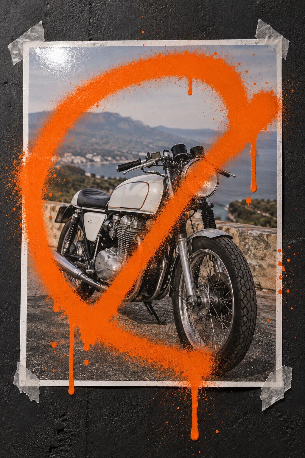
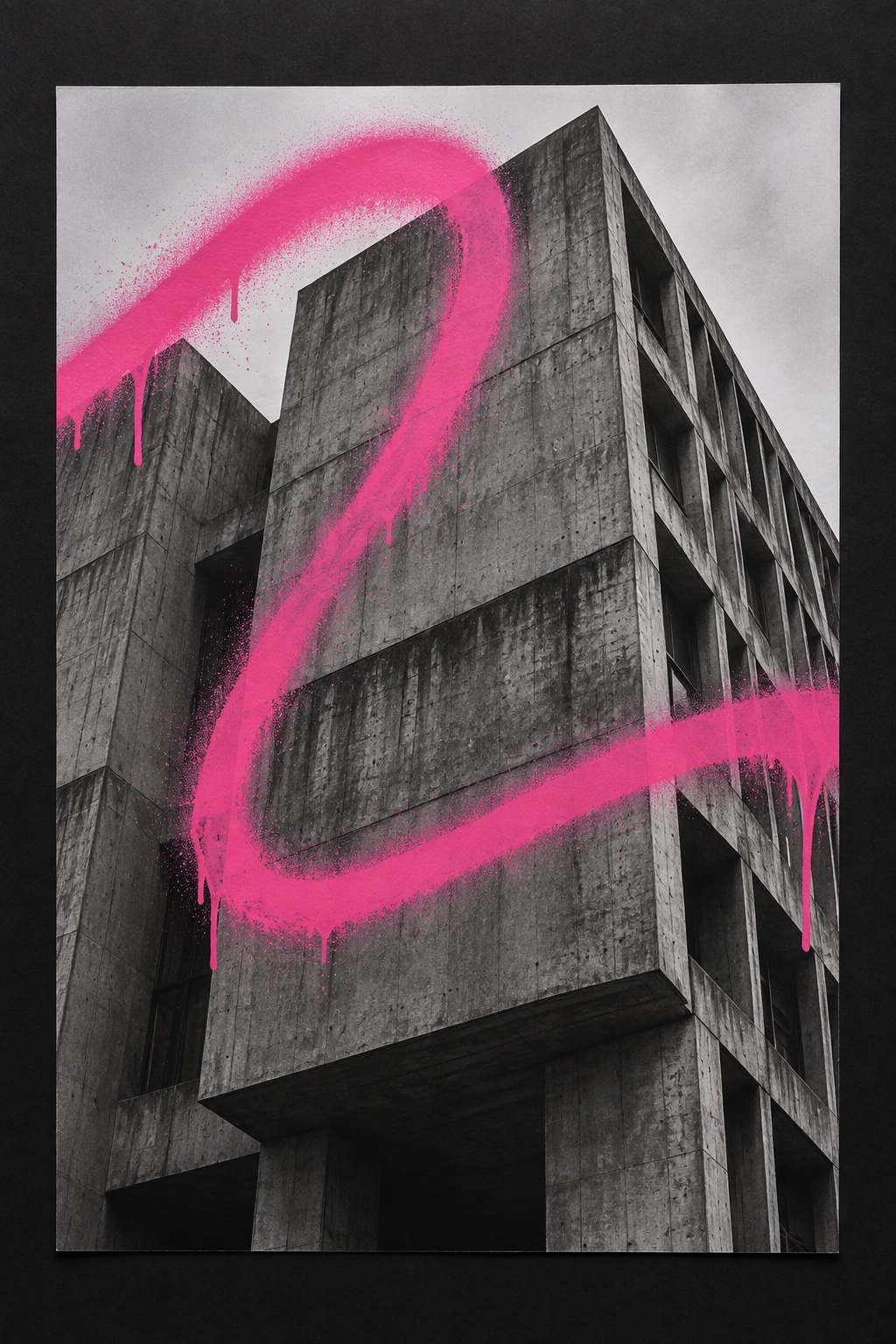
What it is, when it works, who it is for, and where it already exists.
Record 026-GO - when it works, who it is for, what it looks like
Where this aesthetic shows up in the real world · ↗ opens the source site
Where Graffiti Over Photo came from, what makes it recognisable, and the fingerprint it leaves.
1980s to now · New York subway platforms and the altered advertising of culture jamming, absorbed by streetwear and music art direction
In December 1980 Keith Haring began drawing in white chalk on the unused black advertising panels of the New York subway. He called the system his laboratory, and the panels were free space: paper that existed to sell something, standing empty. The crawling baby, the barking dog and the dancing figures that came out of it made him, but the structural idea travelled further than the drawings. The surface that carries an advertisement is a surface you can write on.
Through the 1990s that idea had a name. Mark Dery coined subvertising in 1991 for the practice of spoofing or altering commercial and political advertising, and KAWS, animating by day and writing at night, used a key to open bus shelters and phone booths in New York and then in Paris, London, Berlin and Tokyo, painting his own figures directly onto fashion campaigns. Groups such as Brandalism have since reclaimed advertising space across European cities on the same logic.
Then brands bought the gesture. From the 2010s streetwear, sportswear and music have staged the interruption themselves: shoot the campaign to catalogue standard, print it, and then spray one tag straight across it. The contradiction is the whole tension of the style, and it decides whether a piece works. A real mark by a real hand over something that matters still lands. A brand spraying its own logo onto its own poster reads as fancy dress, and the audience it is aimed at is precisely the audience that can tell.
“A catalogue-clean photograph, interrupted once, by hand, in one colour.
The visual DNA: what makes it recognisable
8-channel console with the fingerprint on its display. Save the card, or share the page

The definitive color scheme for this aesthetic
The colour of the styles sitting closest to this one
How to shoot it, how to prompt it, and how to board it.
How to shoot this aesthetic
"Shoot it properly first. The tag only lands if the picture underneath is clean"
Shot list
Lighting
Light the photograph properly first: even studio light, one clean shadow, catalogue standard. Then light the paint so the wet edge and the drip read. A small hard source at an angle is enough to separate gloss from matte.
Drop this into Studio to generate in this aesthetic
Graffiti over photo, a clean well-lit studio photograph of a person or a product on plain seamless paper, defaced with one hand-sprayed graffiti tag in a single loud colour laid straight across the subject, wet aerosol paint with drips running downward, soft overspray at the edge of each stroke, gloss paint sitting on a matte print, the photograph underneath left sharp and untouched, orange or acid green or ultramarine on paper white, one mark and one colour only, no printed type under the paint
The record applied to your project. The record's kit is free; your brand, references and plates come with membership
01 · Hero application02 · Material and finish03 · Palette in context04 · Photography directionWhether to use it, what it costs to do properly, and where it stands right now.
Two written calls, seven meters, and when to walk away
Get somebody who writes to write it. A confident stroke and a drip that ran on its own are the whole difference, and a digital spray brush with a symmetrical drip fools nobody at full size. Spray a real print, shoot it wet, and cover something that matters: a face, a chest, the product name. A polite tag placed in the empty corner is decoration, and decoration is the opposite of this.
Right when the brand can stand being interrupted: streetwear, music, sport and youth culture. It rewards one real mark by one real hand, and fails the moment it is drawn with a preset or sprays the logo it was meant to deface.
Aerosol and a print; the studio shoot underneath is the only real expense.
Where the mark goes and what it says decides whether it reads as an edge or a gimmick.
A confident tag is a practised hand, and a drip only runs right when the can is loaded right.
A brand spraying its own logo onto its own campaign reads as a costume, not an edge.
Streetwear, music and sportswear have used the gesture for a decade, and the drips now ship as a stock brush.
Writing over an advertisement is as old as advertisements, and it has outlived every wave that borrowed it.
A can of paint and a print, applied to photography the brand already owns.
A Pro feature: origins, practitioners, and pitfalls
Neighbours, cross-references, blends, and the questions people ask.
Connected across the creative knowledge graph
Where it stands now, and what it costs you to use it
The style works because it stages a conflict a viewer can read in a quarter of a second: expensive photograph, cheap gesture, one of them wins. That is why streetwear, music and sport keep returning to it. It says the brand is not precious about its own polish, and it says so without a line of copy.
Its failure mode is permission. The mark has to look unsanctioned, which means it has to cover something the brand would rather you saw. A tag placed politely in the empty corner, or a logo sprayed in its own brand colour, converts an interruption into decoration, and decoration is the opposite of the argument being made.
Mix Graffiti Over Photo with any style in the library
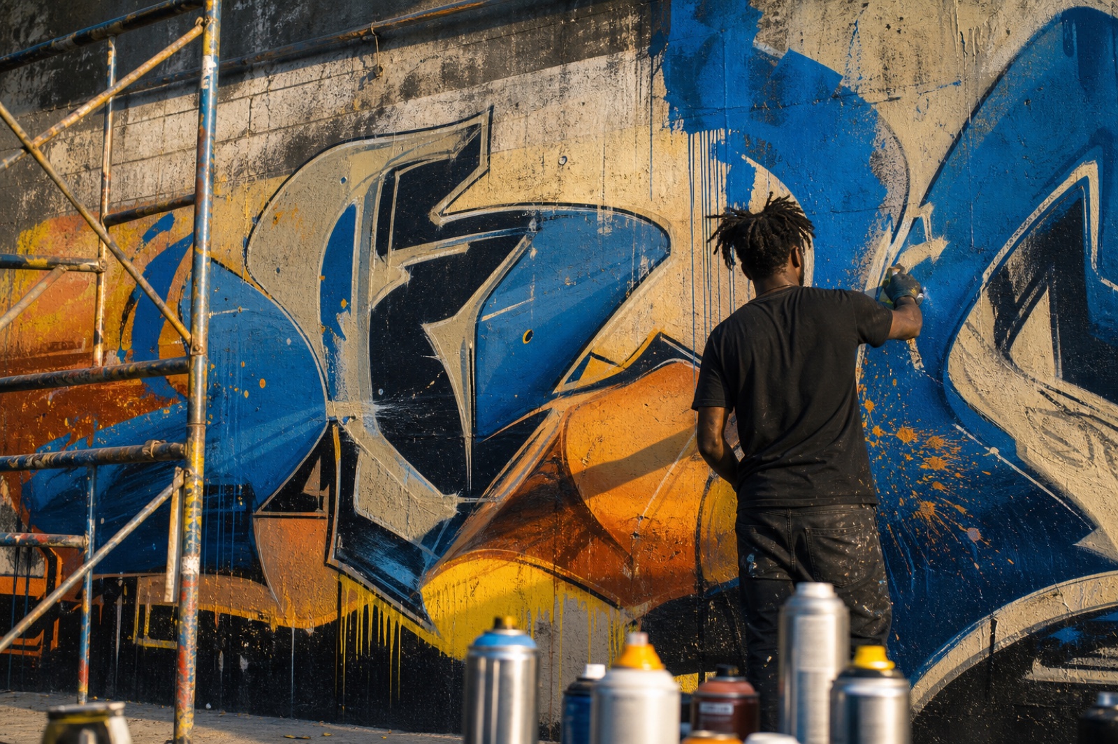 Graffiti Over Photo 50%Graffiti / Street Art 50%
Merged palette
#F4581B
#1A1A1A
#4CE05A
#FF0000
#1F41C8
Leads expressive, chaotic, analog
Typography · from Graffiti Over Photo
Saira Stencil One over Archivo
Materials
Use it
Graffiti over photo, a clean well-lit studio photograph of a person or a product on plain seamless paper, defaced with one hand-sprayed graffiti tag in a single loud colour laid straight across the subject, wet aerosol paint with drips running downward, soft overspray at the edge of each stroke, gloss paint sitting on a matte print, the photograph underneath left sharp and untouched, orange or acid green or ultramarine on paper white, one mark and one colour only, no printed type under the paint (50%), infused with Graffiti and street art aesthetic with bold aerosol spray-paint texture, wildstyle lettering and character work, urban wall and concrete surface texture, drips and overspray as intentional texture, Banksy-style stencil wit or subway-car burner scale, vibrant high-energy spray-can color contrast, color palette strictly #F4581B #1A1A1A #4CE05A #FF0000 #1F41C8, overall character: expressive, chaotic, analog
A clean, well-lit studio photograph that is printed and then defaced with a single hand-sprayed graffiti tag in one loud colour, with real drips. The photograph underneath stays sharp and untouched, so the contrast between the two surfaces carries the whole piece.
Because a drip is a physical event. Real aerosol loads unevenly, runs at its own speed and leaves overspray at the edge of the stroke, while a digital spray brush produces symmetrical drips of even width. At full size the difference is obvious, and the style's only claim is that somebody actually did it.
From Keith Haring's chalk drawings on unused subway advertising panels from 1980, and from the subvertising of the 1990s, when artists including KAWS painted directly onto bus-shelter and phone-booth advertising. Brands began staging the same gesture on their own campaigns in the 2010s.
Graffiti is a whole visual language with its own lettering traditions, walls and history. Graffiti over photo is a single intervention applied to commercial photography: one tag, one colour, one gesture, over a picture that was made to sell something.
Every style in the library is broken down like this one: the palette, the typography, the materials and the lineage.
Explore the style library →