Registrar's index cards on the platen glass - captured by the scanner
1945-1969 · United States (California), Scandinavia, Brazil
Mid-Century Modern architecture was born from postwar optimism and a housing shortage. Millions of returning soldiers needed homes, and architects saw an opportunity to bring Modernist principles to the American middle class. The Case Study House Program, sponsored by Arts & Architecture magazine (1945-1966), commissioned architects including Richard Neutra, Charles and Ray Eames, Pierre Koenig, and Craig Ellwood to design experimental houses that could be built affordably with industrial materials. Case Study House #22 (Pierre Koenig, 1960), photographed by Julius Shulman cantilevered over the Los Angeles basin at night, became the era's defining image.
The style spread beyond California through architectural publications, furniture design, and the general culture of postwar consumer optimism. Eero Saarinen designed corporate campuses (GM Technical Center, 1956) and airports (TWA Terminal, 1962) in a sculptural Modernist idiom. In Scandinavia, Arne Jacobsen and Finn Juhl refined Modernism with organic warmth. In Brazil, Oscar Niemeyer and Lina Bo Bardi created a tropical Modernism of sweeping curves and bold color. The common thread was confidence that modern design could improve daily life.
Mid-Century Modern declined in the late 1960s as cultural upheaval, environmental awareness, and architectural postmodernism challenged its optimistic assumptions. Its revival began in the 1990s and has only intensified: Palm Springs mid-century neighborhoods are now preservation districts, Eames and Saarinen furniture commands premium prices, and the style's open plans, natural light, and indoor-outdoor connections remain the template for aspirational domestic architecture.
The visual DNA: what makes it recognisable
- Clean geometric sans-serifs: Futura, Neutraface, Avenir
- Decorative script faces for casual domesticity: Brush Script, Kaufmann
- Tight lowercase settings with generous line spacing
- Condensed sans-serifs for architectural lettering and signage
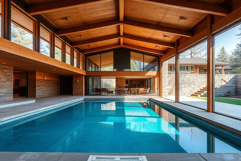
- Post-and-beam structural frames allowing glass curtain walls
- Open floor plans connecting living, dining, and outdoor spaces
- Single-story or split-level massing with flat or low-pitched roofs
- Modular structural bays based on standard lumber and steel dimensions
- Redwood and mahogany: #8B4513, #6B3410, #A0522D
- Flagstone and terrazzo flooring: #B0A890, #A09880
- Glass walls with minimal steel or aluminum frames
- Brick accent walls and fireplaces: #8B5E3C, #7C4E2C
- Floor-to-ceiling glass walls opening to gardens and pools
- Post-and-beam ceilings with exposed structural rhythm
- Indoor-outdoor rooms with sliding glass doors
- Butterfly, folded-plate, or flat roofs with deep overhangs
8-channel console - dominant channels taped & circled by the registrar
Your aesthetic passport - share the fingerprint
The style's primary materials, assembled bottom-up
Tap a stratum for material detail · Full catalog
Modern Movement · 1945–1969 - tap any style to travel
4 color interpretations of this aesthetic
Join waitlist for access
Join the waitlist for full access
Join the waitlistMid-Century Modern: where the language earns its place
Mid-Century Modern is most effective when its visual decisions do useful work. Postwar optimism made domestic - Case Study Houses for a California that believed design could improve every life: Eames plywood and fiberglass, Neutra's steel-frame houses opening to the canyon, and Saarinen's organic plastic furniture for the jet-age family.
The style gives styling, proportion, and image sequencing a clear point of view rather than treating them as decoration.
It can turn atmosphere, material, and spatial pacing into evidence of a distinct experience before a visitor arrives.
It helps a physical or editorial environment feel authored, which raises attention and perceived care.
They recognize the references, proportion, and restraint that make the language feel intentional.
They respond to visible judgment because it reduces the feeling of interchangeable product.
A coherent aesthetic gives them a usable standard for choosing images, objects, and collaborators.
The cost comes from consistent art direction, suitable locations or materials, and time to edit the details that would otherwise undermine the premise.
The challenge is conceptual. It takes visual literacy and a real point of view to avoid borrowing surface cues without their original logic.
Lighting, casting, type, color, material, and retouching must agree. A single weak choice can make the work feel like an imitation.
Mid-Century Modern creates its strongest advantage when it gives a brand a standard of judgment, not merely an attractive finish. It fails when recognizable cues are collected without a governing idea. The difference between average and exceptional execution is usually proportion: how much is shown, what is withheld, and whether every element belongs to the same world. The most capable teams pair an exacting art director with specialists who understand the medium, from photographer and stylist to set designer, editor, and typographer.
Should Mid-Century Modern be the strategic choice?
Surface imitation is easy. The language becomes generic when familiar cues replace proportion, specificity, and a coherent system.
Its visual ingredients appear regularly in contemporary work, but a rigorous execution remains distinguishable from a loose collection of references.
Its strongest principles depend on composition, material, and cultural literacy rather than a short-lived visual effect.
It asks for consistency across photography, typography, motion, environments, and the many details that make a brand feel believable.
Mid-Century Modern deserves serious consideration from brands and institutions that can articulate a real point of view and protect it through execution. It is less suitable for work that needs immediate instructional clarity, broad visual neutrality, or low-cost production flexibility. Its greatest advantage is differentiation through judgment: it can make a product, place, or editorial proposition feel authored rather than merely packaged. Average executions borrow recognizable signals, then lose coherence when type, casting, copy, or materials fail to agree. Exceptional executions understand the visual language as a system of choices, including what not to show. The largest mistake is treating the style as a finish applied after strategy. Adopt it only when the product and organization can carry the same standard of care the imagery proposes.
Join waitlist for access
Join the waitlist for editorial depth
Join the waitlistConnected across the creative knowledge graph