When to use it
- Music, streaming and podcast art that needs a scene and a title
- Publishing, from crime and romance to their parodies
- Bars, events and campaigns that want drama with a wink
- Film and television keys that play with genre
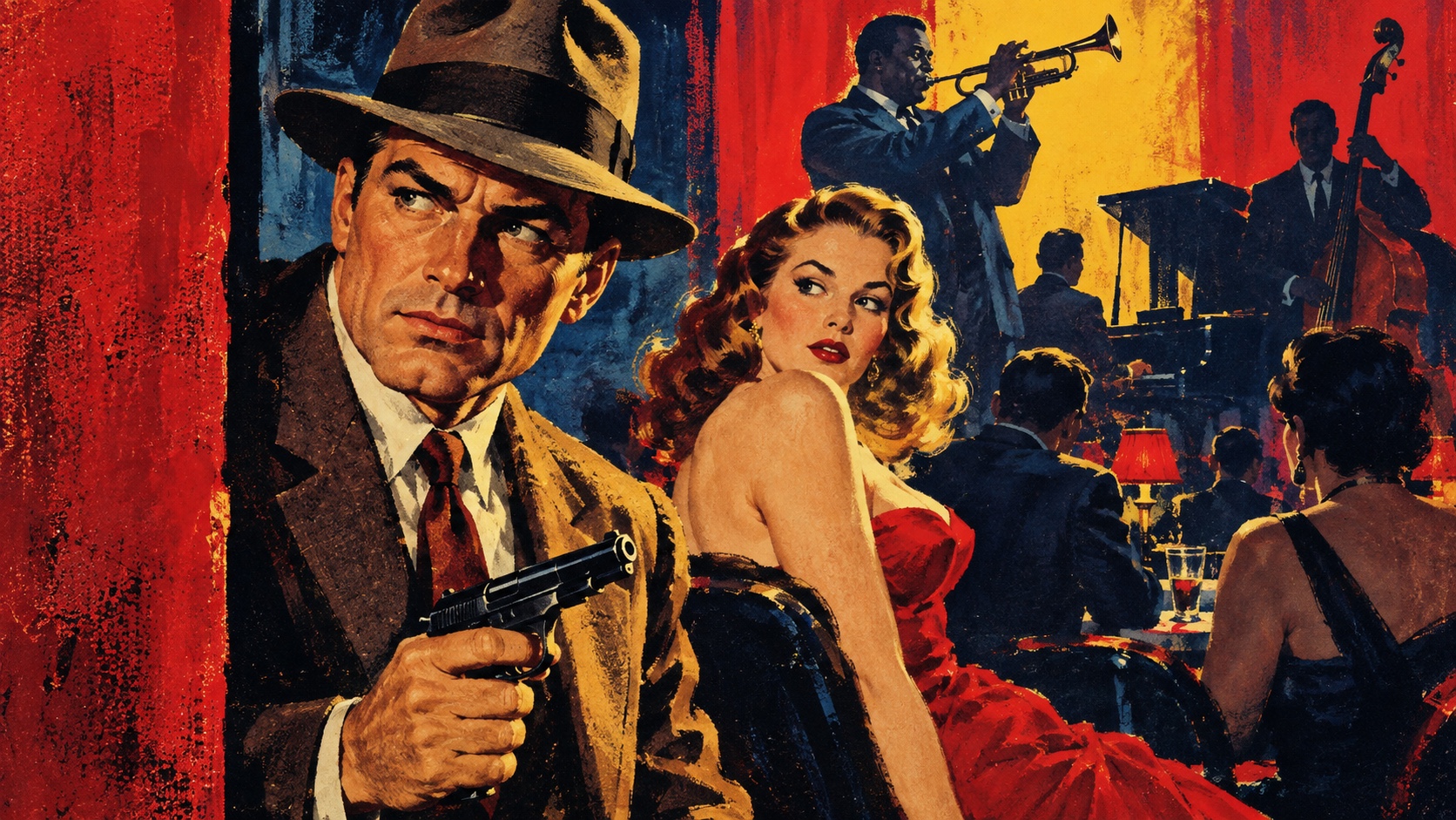
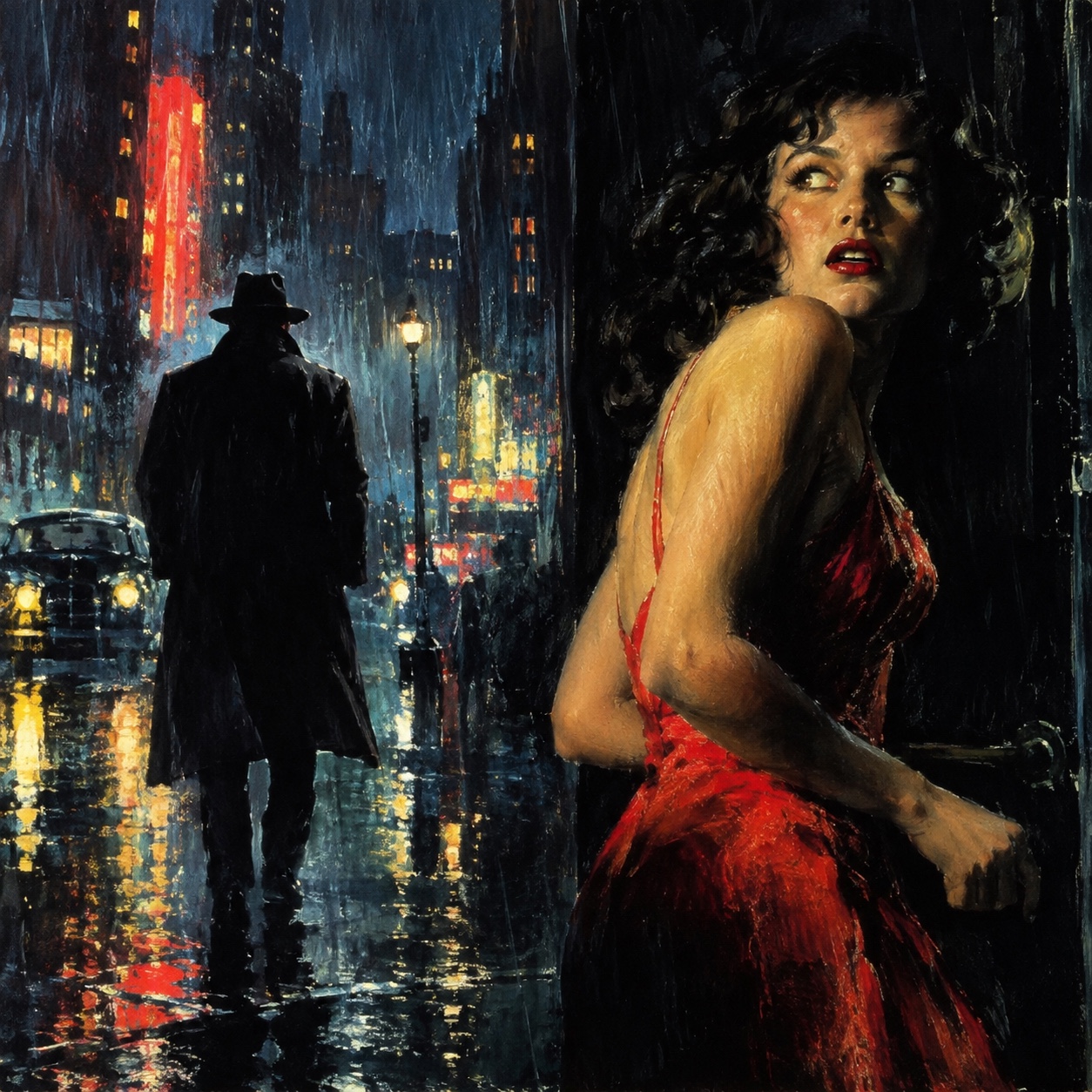
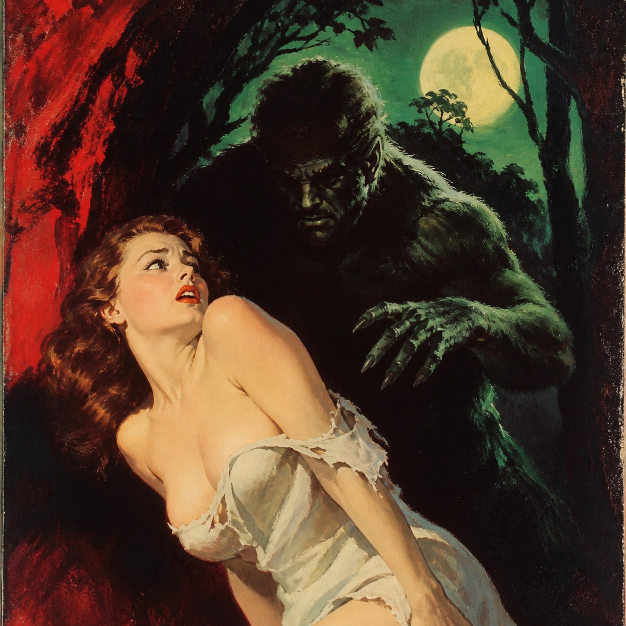
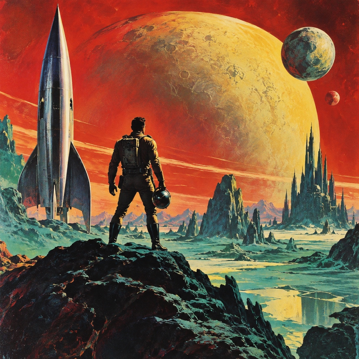
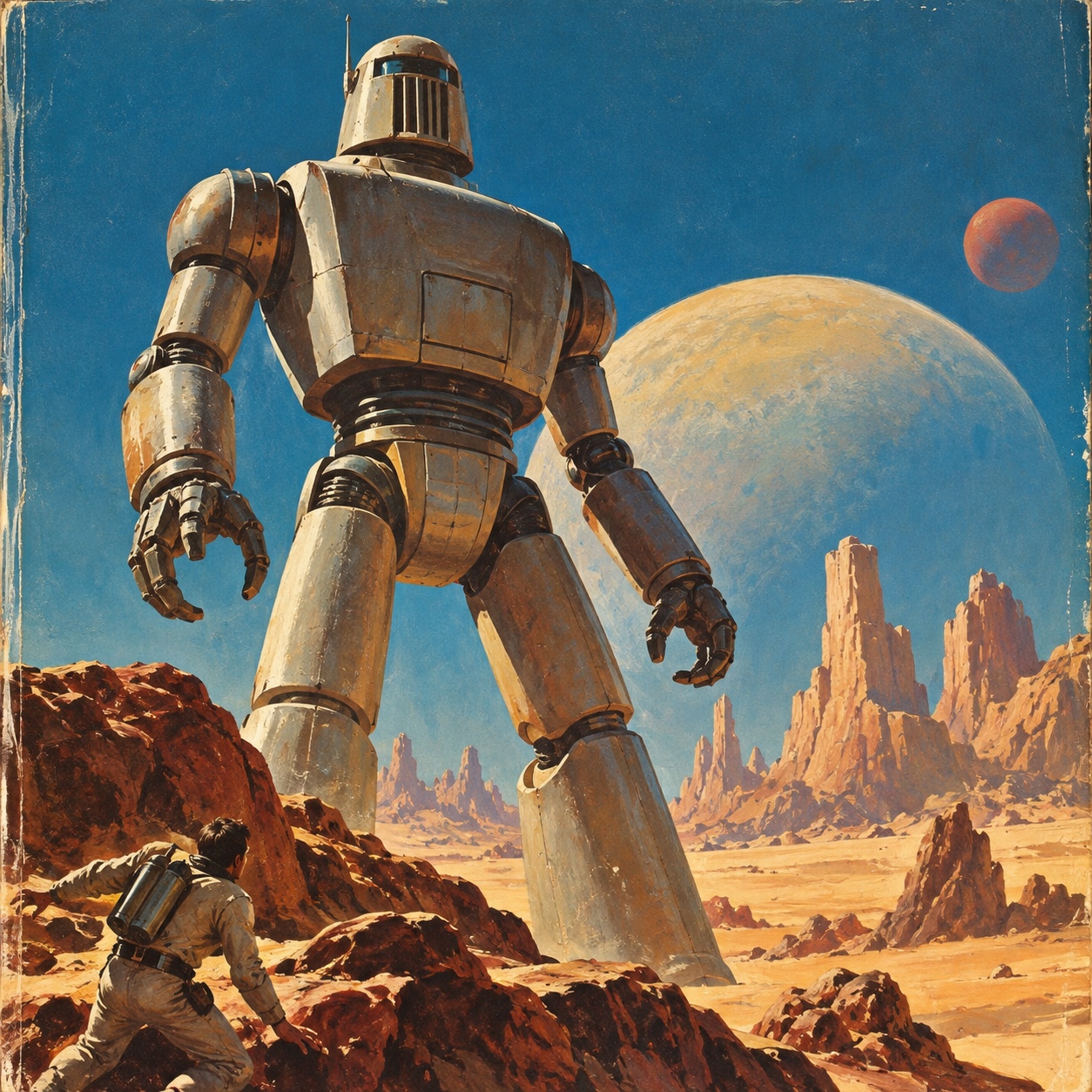
Painted covers made to sell in a second: a figure in danger or desire, a lurid sky, fat title type and a painter's hand in every fold, from the pulps and paperbacks of the 1930s to 1950s

What it is, when it works, who it is for, and where it already exists.
Record 035-PC - when it works, who it is for, what it looks like
Where this aesthetic shows up in the real world · ↗ opens the source site
Where Pulp Cover came from, what makes it recognisable, and the fingerprint it leaves.
1930s-1950s · American pulp magazines and paperback publishers
The pulps were magazines printed on the cheapest paper, sold by the cover. From the 1920s through the 1940s titles in crime, romance, western, horror and science fiction competed at the newsstand with painted covers designed to stop a passer-by in a second: a figure in danger or desire, a lurid sky, a scene caught at its most dramatic instant. Margaret Brundage painted Weird Tales in pastel, Norman Saunders painted for every genre, and publishers pushed the images further to outsell each other.
The paperback took over the trade. In 1939 Robert de Graff launched Pocket Books, the first American mass-market paperback line, and by the late 1940s the painted cover had moved from magazines to books, with the same artists following: Saunders turned to paperbacks as the pulps faded, and Robert McGinnis, from 1958, gave the crime paperback its women. The typography settled into fat slab serifs, brush scripts and yellow title bands, and the printing added halftone, misregistration and a creased spine.
It has never gone away, only changed hosts. Pop Art quoted it, film posters and record sleeves borrowed it, and now streaming series, podcasts, bars and independent presses use it because a painted scene with a title still sells in a second on a phone. The current version keeps the painter's hand, the lurid palette and the drama, and plays the genre knowingly.
“A scene and a title that sell in a second.
The visual DNA: what makes it recognisable
8-channel console with the fingerprint on its display. Save the card, or share the page

The definitive color scheme for this aesthetic
The colour of the styles sitting closest to this one
How to shoot it, how to prompt it, and how to board it.
How to shoot this aesthetic
"Stage one dramatic instant like a painted cover: low angle, lurid colour, a title's worth of empty sky"
Shot list
Lighting
Theatrical and coloured: hard key from a low angle, a coloured rim light, a lurid gel on the background. Deep shadows and hot highlights; nothing natural.
Drop this into Studio to generate in this aesthetic
Pulp cover aesthetic, a 1940s painted magazine cover, a dramatic figure caught at the most dangerous instant, lurid sky in pulp red and canary yellow against night blue, lamplight on a face, visible gouache and oil brushwork, fat slab-serif title band and brush-script line as shapes with no readable words, cheap newsprint texture, halftone and misregistration, a creased spine, urgent and irresistible, no photorealism
The record applied to your project. The record's kit is free; your brand, references and plates come with membership
01 · Hero application02 · Material and finish03 · Palette in context04 · Photography directionWhether to use it, what it costs to do properly, and where it stands right now.
Two written calls, seven meters, and when to walk away
Commission a painting, or work from one, and pick a scene of your own at its most dramatic instant. Fat slab title, a brush-script line, pulp red, canary yellow and night blue, then the print: halftone and a creased spine. Quoting the clichés without a real painting behind them makes a novelty card.
Right when the brand has a story to sell in a second: music, streaming, podcasts, publishing, bars and events. It rewards real painting and a scene of its own, and fails as a card of clichés.
A painter costs time, and a good one costs more; printing is cheap by design.
Choosing the scene, the instant and the title is the whole job.
The painted figure has to be convincing; a weak painting reads as a joke about the style.
It tips into parody easily, and a weak painting exposes the joke.
Streaming, podcasts, bars, events and independent publishing use it regularly.
Ninety years old and still the fastest way to sell a scene with a title.
A painted key image carries a series, a sleeve or a season of covers.
A Pro feature: origins, practitioners, and pitfalls
Neighbours, cross-references, blends, and the questions people ask.
Connected across the creative knowledge graph
Where it stands now, and what it costs you to use it
The pulp cover is a scene and a title in one image, which is what streaming, podcasts and record sleeves need on a small screen. Independent presses, crime and romance publishers, bars and events use it for drama with a wink, and the painted hand reads as warm against generated images.
Its failure mode is the parody. A cover that only quotes the clichés, the swooning woman, the smoking gun, with no painting behind it is a novelty card. The work that lands is painted for real, or looks it, chooses a scene of its own and plays the genre straight enough to feel it.
Mix Pulp Cover with any style in the library
The painted cover art of American pulp magazines and paperbacks from the 1930s to the 1950s: a dramatic figure, a lurid sky, fat slab or brush-script titles and a painter's hand visible in the work, made to sell a magazine in a second at a newsstand. Margaret Brundage, Norman Saunders and Robert McGinnis are its names.
Because it does one job perfectly: a scene and a title that sell at a glance. Streaming tiles, podcast art and record sleeves have the same job on a phone, and the painted image reads as warm and human against generated art.
Mid-century illustration is the wider commercial painting of the period, calm and clean for magazines and advertising. Pulp is its loud, cheap cousin: lurid colour, danger and desire, cheap paper and fat type, sold to a passer-by rather than a subscriber.
Paint it, or work from a painted study, with a real scene of your own at its most dramatic instant. Use pulp red, canary yellow and night blue, a fat slab title and a brush-script line, and add the print: halftone, misregistration, a creased spine. Play the genre straight enough to feel it, not only to mock it.
Every style in the library is broken down like this one: the palette, the typography, the materials and the lineage.
Explore the style library →