Space Age Pop

The decade after Sputnik, furnished: moulded plastic, one-piece optimism, white and orange and silver, the future sold as a lifestyle

Compare Space Age Pop with another style →See the Space Age Pop typefaces →
Record038-SA
AestheticSpace Age Pop
ClassLight / Expressive
StatusINGESTING
Space Age Pop aesthetic archive image
Archive plate · Space Age Pop
Space Age Pop aesthetic: World dossier scene
Dossier sceneWorld · 1/5

How to use it

Record 038-SA - when it works, who it is for, what it looks like

FIELD 01

When to use it

  • Products that want to feel invented rather than assembled
  • Hospitality, retail and event spaces built around one sculptural piece
  • Fashion and beauty with a clean, sporty, slightly alien register
  • Brands trading on optimism about technology without the chrome-and-neon cliches
FIELD 02

Perfect for

  • Consumer electronics and audio
  • Furniture, lighting and objects
  • Eyewear, cosmetics and sportswear
  • Cinemas, lounges and pop-up retail
FIELD 03

What it looks like

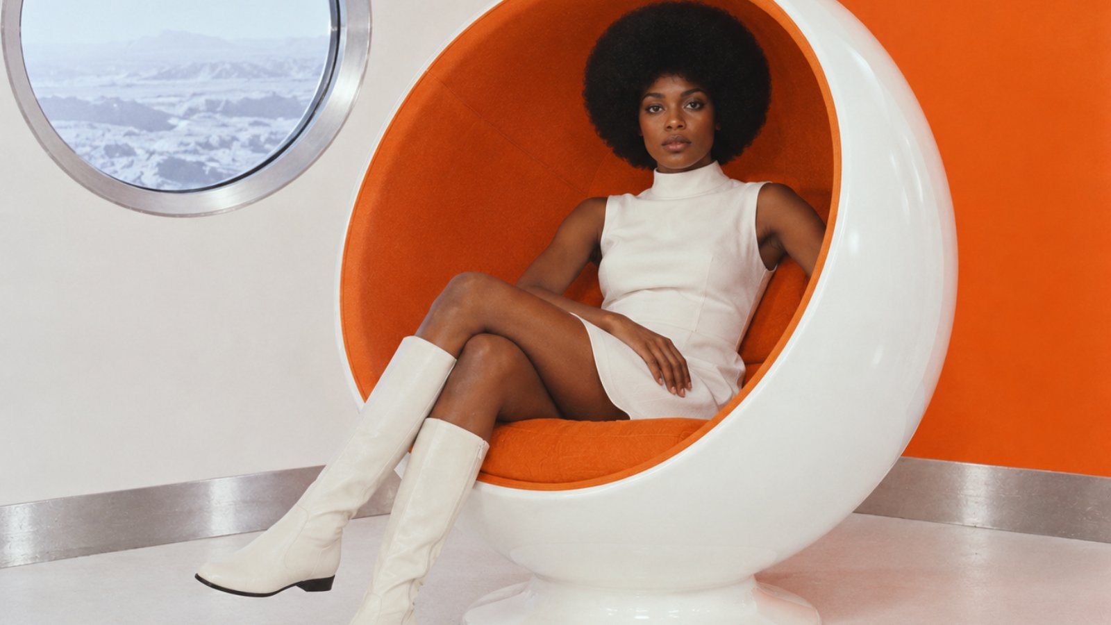
  • A white fibreglass chair that is one continuous shape
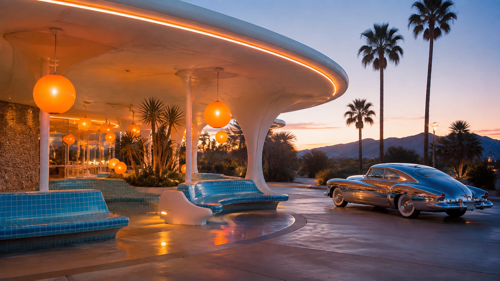
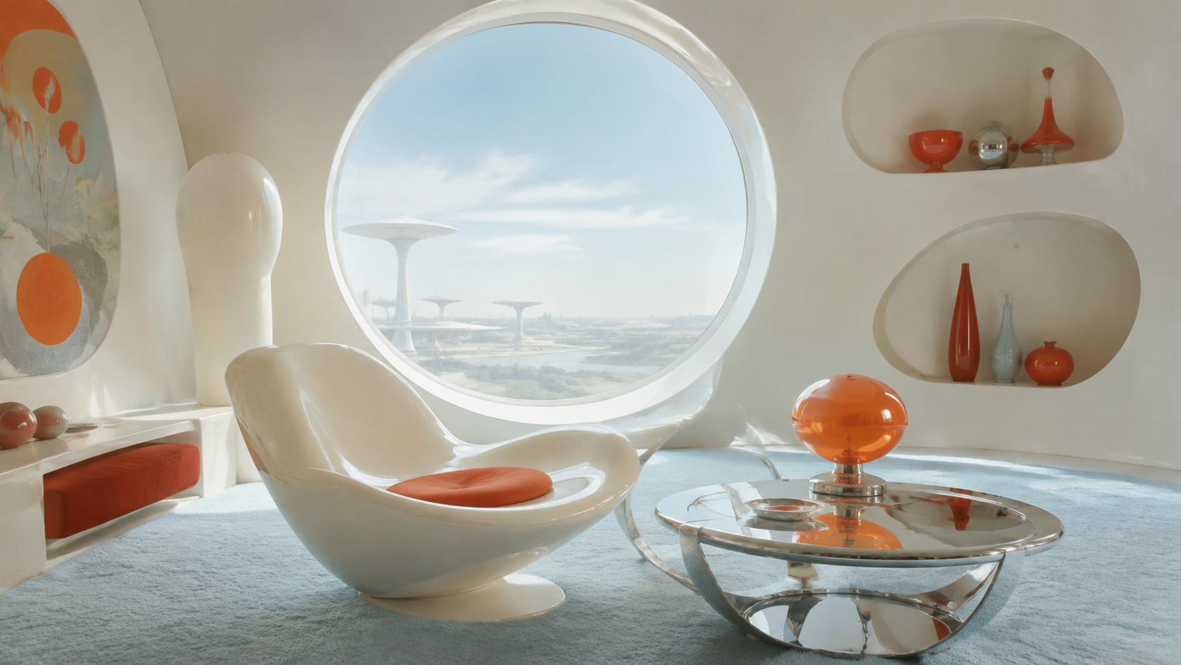
  • Orange, white and silver interiors with round windows
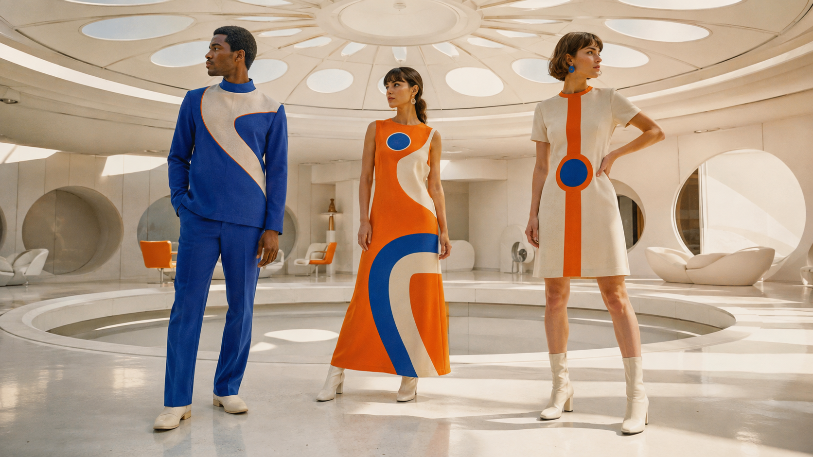
  • A-line dresses, flat boots and helmets from the 1964 collections
  • Rounded, squared-off capitals and inline display type

In the wild, Space Age Pop aesthetic real-world examples

Where this aesthetic shows up in the real world · ↗ opens the source site

Omoro Style Guide170+ aesthetics, every field on this page, in one PDF.
Get the guide →

History, Space Age Pop aesthetic history

1957–1972 · Scandinavia, Italy, France and the United States, in the decade after Sputnik

Sputnik went up in October 1957 and the space race gave a generation of designers a new excuse for shapes they already wanted to make. Plastics had become cheap and mouldable, fibreglass could be cast in one piece, and the client wanted to look like tomorrow. Eero Aarnio's Ball Chair (1963) was a room inside a sphere; Verner Panton's cantilevered plastic chair, in development from 1960 and produced from 1967, was the first chair moulded from a single piece; Joe Colombo's Elda (1963) and Tube chair (1969) treated furniture as equipment. Olivier Mourgue's Djinn chairs furnished the space station in 2001: A Space Odyssey (1968), and Matti Suuronen's Futuro house (1968) was a fibreglass ellipse on legs, delivered by helicopter.

Fashion made the same argument on bodies. In 1964 André Courrèges showed white A-line shifts, flat white boots and goggle-like sunglasses, and Pierre Cardin's Cosmocorps line put helmets and vinyl on the runway. Paco Rabanne's 1966 dresses were made of metal discs. The graphic register followed: rounded, squared-off capitals in the Eurostile family, inline display faces, and packaging in white, orange and silver. Panton's Visiona 2 installation for Bayer in 1970 took the whole vocabulary to its end point, a cave of moulded foam in reds and violets.

The name doubles as a music genre, the exotica and bachelor-pad records of Esquivel and Les Baxter, and the two share an audience: people who like the future when it is cheerful. The oil crisis of 1973 made plastic expensive and the mood turned; by 1975 the same designers were working in wood again. What survives is the idea that a product can be one shape, and that optimism is a finish you can specify.
Visual markers, Space Age Pop aesthetic visual markers

The visual DNA: what makes it recognisable

typography

See the fonts
  • Squared-off rounded capitals: Eurostile Extended, Microgramma, and their descendants
  • Inline and outline display faces for product names
  • Lowercase geometric sans set wide with generous letterspacing
  • Numbers and model codes treated as decoration

grid

  • One sculptural object centred in a room that has been cleared for it
  • Circles and ellipses as windows, doors, mirrors and frames
  • Continuous surfaces: floor becomes seat becomes wall
  • Symmetry broken by a single bright accent

materials

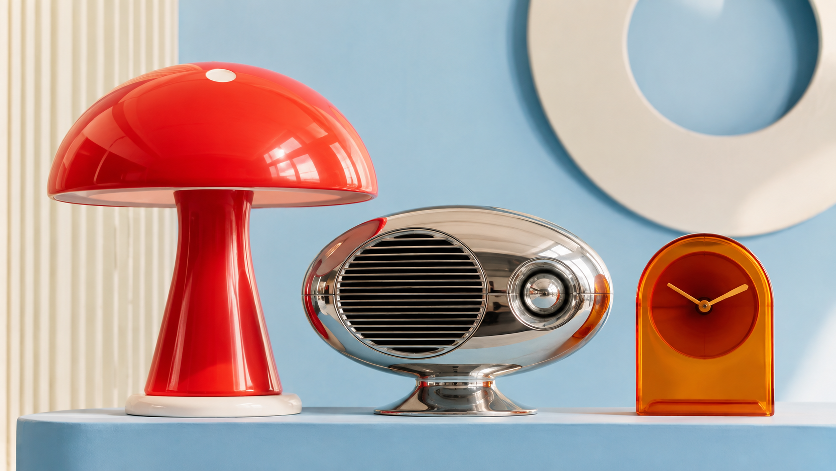
  • Glossy fibreglass and moulded ABS in white, orange or red
  • Vinyl, PVC and clear acrylic
  • Brushed aluminium, chrome and mirror
  • Shag pile and moulded foam in one saturated colour

motifs

  • Spheres, pods and capsules with a person inside
  • Round windows and porthole doors
  • Helmets, goggles and visors on ordinary bodies
  • Orbit lines, satellites and starbursts used sparingly

Aesthetic profile

8-channel console with the fingerprint on its display. Save the card, or share the page

Aesthetic Profile
Space Age Pop
1957–1972 · Scandinavia, Italy, France and the United States, in the decade after Sputnik
Attribute console · 038-SA
leans light, expressive, warm
8 CH
FIG. 1
MaximalMinimalAnalogDigitalExpressiveRestrainedWarmCoolNostalgicFuturisticStructuredChaoticLightDarkGeometricOrganic
01Minimal
Maximal20%
02Analog
Digital20%
03Restrained
Expressive50%
04Cool
Warm30%
05Futuristic
Nostalgic10%
06Structured
Chaotic30%
07Dark
Light70%
08Organic
Geometric20%
LightExpressiveWarm
Omoro · Attribute console · 038-SA
omoro.io/styles/space-age-pop

Color Palettes, Space Age Pop color palettes and hex codes

The definitive color scheme for this aesthetic

Space Age Pop
#F2431F · #F7F7F5 · #FFC400 · #1E63E9 · #C9CACC
White fibreglass, one orange, one silver: the future as a clean living room
Omoro Palette Pack575 curated palettes across every aesthetic, 5 export formats.
Get the palettes →
Playfulness

Photo Direction

How to shoot this aesthetic

"The future as a clean room with one orange chair in it"

Shot list

  • Wide shot of a white room with a single fibreglass pod chair, one person inside it in a white shift and flat boots, a round window behind
  • Close crop of glossy moulded plastic meeting brushed aluminium, a fingerprint-free surface, one reflection of an orange wall
  • Medium shot of a model in a visor and A-line dress standing in a continuous moulded interior, floor curving up into seat

Lighting

Even, shadowless studio light or flat overcast daylight, so the moulded surfaces read as one continuous form. Highlights should be broad and soft; no hard specular hits and no coloured gels.

Omoro Director's Briefs170 photo shot-lists like this one, ready to shoot from.
Get the briefs →

Generative Prompt

Drop this into Studio to generate in this aesthetic

Space Age design of 1957 to 1972, one-piece moulded fibreglass furniture, spheres and pods with a person inside, white and orange and brushed aluminium, round porthole windows, vinyl and clear acrylic, Verner Panton and Eero Aarnio and Courrèges register, cheerful sporty optimism about the future, clean and spare, no neon and no chrome cliches

Paste as-is, or append your own subject

Mood Board

Join waitlist for access

Join the waitlist for full access

Join the waitlist
Creative Application Analysis

Space Age Pop: where the language earns its place

Space Age Pop is most effective when its visual decisions do useful work. The decade after Sputnik, furnished: moulded plastic, one-piece optimism, white and orange and silver, the future sold as a lifestyle

Best industries
Consumer electronics and audio
Furniture, lighting and objects
Eyewear, cosmetics and sportswear
Cinemas, lounges and pop-up retail
Real-world use
Products that want to feel invented rather than assembled
Hospitality, retail and event spaces built around one sculptural piece
Fashion and beauty with a clean, sporty, slightly alien register
Brands trading on optimism about technology without the chrome-and-neon cliches
What it looks like
A white fibreglass chair that is one continuous shape
Orange, white and silver interiors with round windows
A-line dresses, flat boots and helmets from the 1964 collections
Rounded, squared-off capitals and inline display type
Creative feasibility
Production costMedium

Original pieces are collectible; reproductions and rendering are affordable.

Creative difficultyMedium

The vocabulary is fixed and well documented; the skill is restraint.

Execution difficultyMedium

One moulded object in a clean room is easy to stage and easy to overdo.

Overall creative assessment

Cheap to gesture at and expensive to do properly, because the originals were manufactured objects. A single authentic piece, Aarnio or Panton or a licensed reproduction, does more than a room of props, and the room around it should be white. Rendering handles the one-piece form well. Keep the type to squared rounded capitals and the palette to three colours, and stop before the silver jumpsuit.

Strategic Recommendation

Should Space Age Pop be the strategic choice?

Best for
Consumer electronics and audio
Furniture, lighting and objects
Products that want to feel invented rather than assembled
Hospitality, retail and event spaces built around one sculptural piece
Avoid if
The brief wants warmth, craft or heritageThis is a moulded, sporty, slightly alien register; it does not do cosy.
The set will be dressed with more than one period propThe originals were spare. Three props and it is a theme party.
The palette cannot be held to three coloursWhite, one bright and one metallic. Neon and chrome belong to other futures.
Risk of misuseMedium

The theme-party version: pod chair, silver jumpsuit and lava lamp in one frame.

Contemporary prevalenceEmerging

Fashion houses and furniture reissues are mining the 1960s archive again.

LongevityEnduring

Sixty years old and the chairs are still in production.

Brand investmentMedium

One authentic piece and a white room; originals are collectible.

Creative verdict

Right for products and spaces that want to feel invented rather than assembled, and for fashion with a clean, sporty, slightly alien register. It is the retro-future that aged best because it was made of real objects, not renderings. Wrong when the brief wants warmth or heritage. Keep it spare: the originals had one moulded piece and a lot of white, and every added prop turns it into a costume.

Editorial Depth

Join waitlist for access

Common Misconception
Historical Context
Brands That Accidentally Use This Style
Brands That Perfectly Represent This Style
Psychological Effect

Join the waitlist for editorial depth

Join the waitlist

Related concepts

Connected across the creative knowledge graph

Cultural relevance, Space Age Pop cultural relevance today

Where it stands now, and what it costs you to use it

Space Age Pop is what people reach for when they want retro-futurism without the neon. It has aged better than most futures because it was made of real objects rather than renderings: the chairs are still in production, and Courrèges and Cardin are still houses.

The failure mode is the theme party: a globe chair, a silver jumpsuit and a lava lamp in the same frame. The originals were spare. One moulded piece, one colour, and a lot of white.

It is being reread now through product design, where the one-piece object is technically easy again, and through fashion houses mining their 1960s archives. The register is clean, sporty and slightly alien, and it photographs like nothing else.

Cross-references

GoogieGoogie is the roadside architecture of the same optimism; Space Age Pop is its furniture, fashion and objectsPop ArtBoth use saturated flat colour and the language of consumer goods, but Pop Art comments on them and Space Age Pop simply is oneY2KY2K is the second time the future was made of glossy translucent plasticMid-Century IllustrationThe illustration of the same years shares the atomic motifs and the optimism, on paper rather than in fibreglass

Blend

Mix Space Age Pop with any of the library's 170+ styles

Space Age Pop×
50%50%
78% alike
Space Age Pop referenceGoogie referenceSpace Age Pop 50%Googie 50%

Merged palette

#F2431F

#E65100

#F7F7F5

#42A5F5

#FFC400

Leads expressive, light, maximal

Typography · from Space Age Pop

Raleway over Merriweather

Materials

  • Glossy fibreglass and moulded ABS in white, orange or red
  • Vinyl, PVC and clear acrylic
  • Turquoise: #40B0B8, #30A8B0: the primary Googie color

The calls this blend forces

These two disagree on one thing, and a blend cannot average them: you pick a side. At this mix:

Geometric or Organic? Space Age Pop is geometric, Googie is organic. This mix lands organic.

Use it

Space Age design of 1957 to 1972, one-piece moulded fibreglass furniture, spheres and pods with a person inside, white and orange and brushed aluminium, round porthole windows, vinyl and clear acrylic, Verner Panton and Eero Aarnio and Courrèges register, cheerful sporty optimism about the future, clean and spare, no neon and no chrome cliches (50%), infused with Googie architecture with space-age atomic-era optimism, upswept boomerang rooflines and starburst motifs, cantilevered dramatic angles, 1950s American diner and motel signage, futuristic populist mid-century exuberance, color palette strictly #F2431F #E65100 #F7F7F5 #42A5F5 #FFC400, leaning geometric over organic, overall character: expressive, light, maximal

One-click generation opens with the studio

About this aesthetic

What is Space Age design?

Space Age design is the furniture, fashion, product and interior language of roughly 1957 to 1972, shaped by the space race and by new plastics. Its hallmarks are one-piece moulded forms, spheres and pods, white and orange and silver palettes, round windows, and a cheerful, sporty idea of the future.

How is it different from Googie?

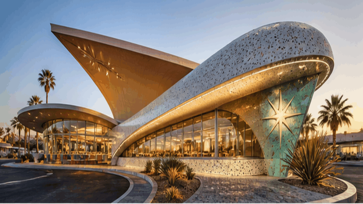
Googie is the roadside commercial architecture of the same optimism: coffee shops, motels and signs with cantilevered roofs and starbursts, designed to be read from a car. Space Age Pop is the interior, product and fashion side, made of moulded plastic and worn on bodies. They share a mood and a decade, not a scale.

Which designers define it?

Verner Panton, Eero Aarnio, Joe Colombo, Olivier Mourgue and Matti Suuronen in furniture and architecture; André Courrèges, Pierre Cardin and Paco Rabanne in fashion. Stanley Kubrick's 2001: A Space Odyssey (1968) is the film that gathered the whole vocabulary in one place.

Is Space Age Pop the same as the music genre?

The name is shared. Space Age Pop, or space age bachelor pad music, is the exotica and lounge of Esquivel, Les Baxter and Martin Denny from the same years. The design language and the records belong to the same optimistic living room, which is why the term stuck to both.

Build with the space age pop aesthetic

Omoro turns aesthetic references into on-brand visuals. Generate, compose and publish from one studio.

Join the waitlist