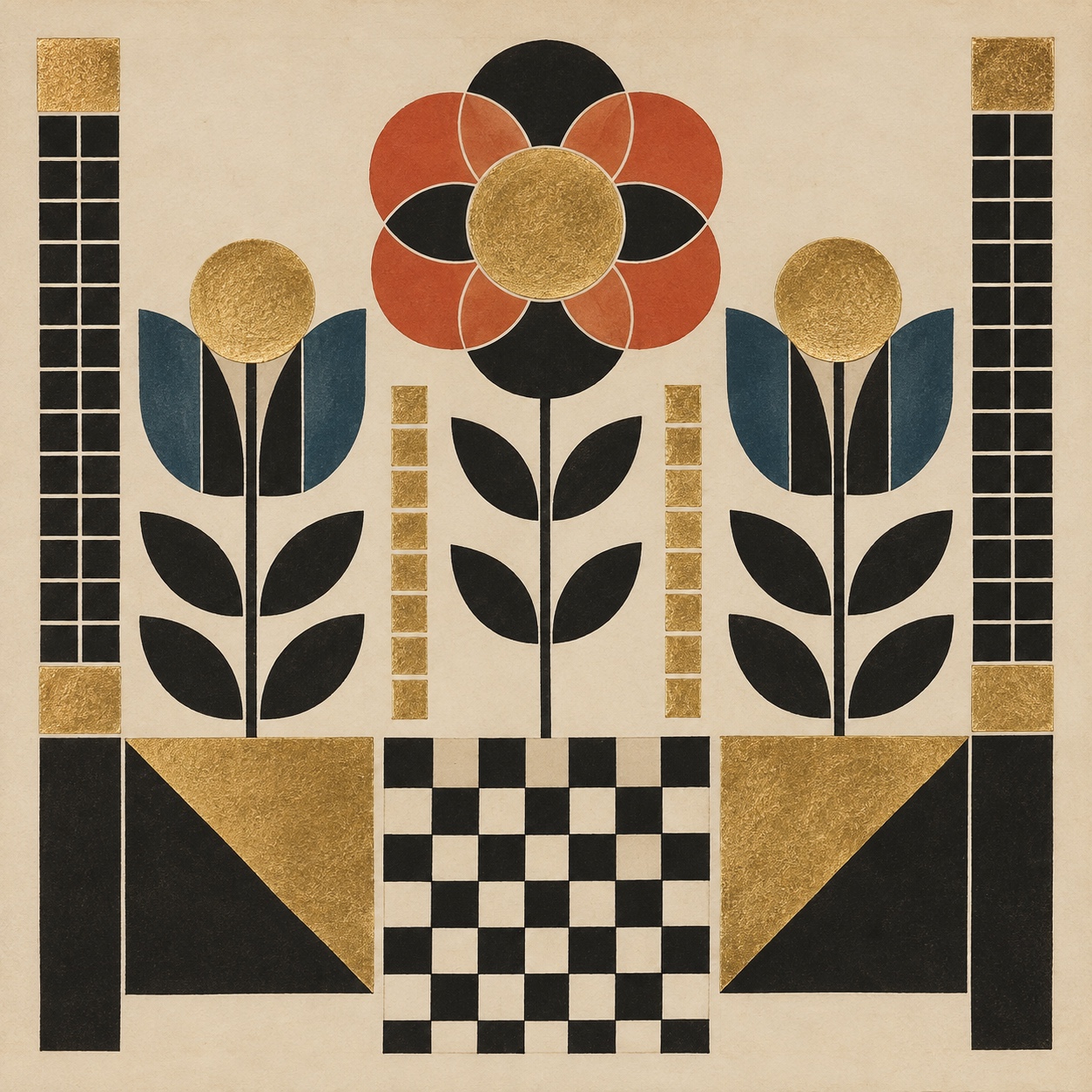
Wiener Werkstätte

Vienna's geometric luxury craft: black-and-white checkerboards, grids of squares, gilded metalwork and stylised florals, from the building to the cutlery

Compare Wiener Werkstätte with another style →See the Wiener Werkstätte typefaces →
Record042-WW
AestheticWiener Werkstätte
ClassStructured / Analog
StatusINGESTING
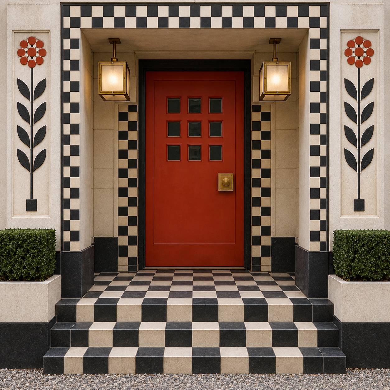
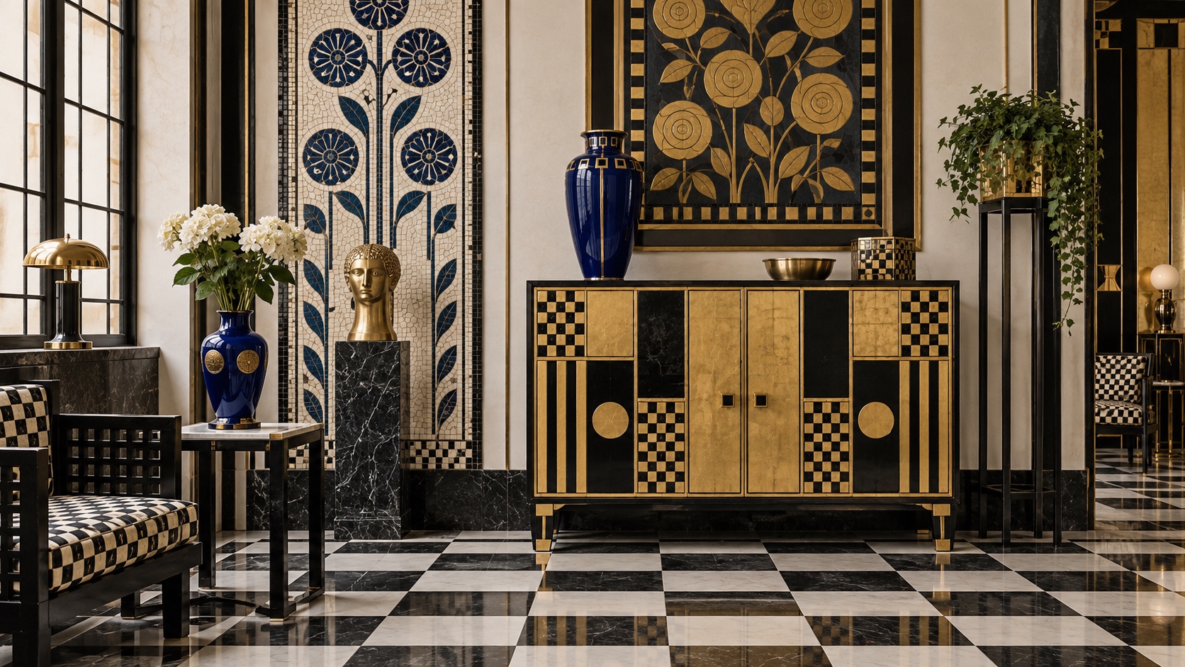
A black-and-white checkerboard interior with a gilded cabinet, a cobalt vase and stylised flower panels.
Archive plate · Wiener Werkstätte
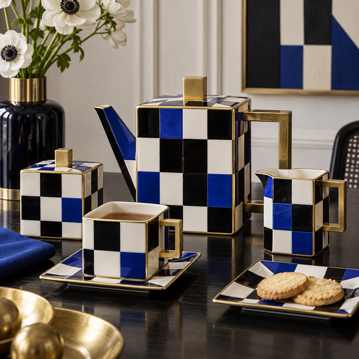
A checkerboard coffee set in black, white and cobalt with gold edges on a dark table, with anemones in a vase.
Dossier sceneTableware · 1/5
01
The record

What it is, when it works, who it is for, and where it already exists.

How to use it

Record 042-WW - when it works, who it is for, what it looks like

FIELD 01

When to use it

  • Luxury brands that want geometry with warmth and craft
  • Hospitality, restaurants and bars that need a total interior language
  • Fashion, jewellery and accessories built on a repeat pattern
  • Identities that can live as a monogram, a grid and a checkerboard
FIELD 02

Perfect for

  • Jewellery, silver and tableware
  • Hotels, cafés and cocktail bars
  • Fashion and textile houses
  • Stationery, publishing and luxury packaging
FIELD 03

What it looks like

  • Founded by Josef Hoffmann, Koloman Moser and Fritz Waerndorfer, Vienna, 1903
  • Hoffmann's Palais Stoclet, Brussels, 1905 to 1911, with Klimt's dining-room frieze
  • Cabaret Fledermaus, 1907, a bar designed down to the tiles and the programmes
  • The workshops' closure in 1932

In the wild, Wiener Werkstätte aesthetic real-world examples

Where this aesthetic shows up in the real world · ↗ opens the source site

Omoro Style GuideEvery aesthetic, every field on this page, in one PDF.
Get the guide →
02
The anatomy

Where Wiener Werkstätte came from, what makes it recognisable, and the fingerprint it leaves.

History, Wiener Werkstätte aesthetic history

1903-1932 · Vienna

The Wiener Werkstätte was founded in Vienna in 1903 by the architect Josef Hoffmann, the designer Koloman Moser and the financier Fritz Waerndorfer, inspired by William Morris's Arts and Crafts and the belief that a modern city deserved objects made by hand to one design. Out of the Vienna Secession's curves they made something squarer: grids of small squares, black-and-white checkerboards, pierced and hammered silver, enamel and gilt, and stylised flowers held inside geometry.

The workshops designed everything. Hoffmann's Palais Stoclet in Brussels, built between 1905 and 1911, was a total work with Gustav Klimt's mosaic frieze in the dining room and Werkstätte silver on the table; the Cabaret Fledermaus of 1907 was a bar designed down to its tiles, glasses and programmes. Textiles, wallpaper, postcards, fashion and bookbinding followed, sold in shops in Vienna, Zurich and New York.

Luxury craft could not survive the century. The workshops went bankrupt and closed in 1932, and the Bauhaus took the idea of total design and gave it to the machine. What returned is the pattern: the checkerboard and the grid came back through Memphis in the 1980s and through fashion and hospitality since, and the whole vocabulary, geometry with warmth, gold and enamel, a monogram that becomes a repeat, is one of the least mined sources in luxury branding.

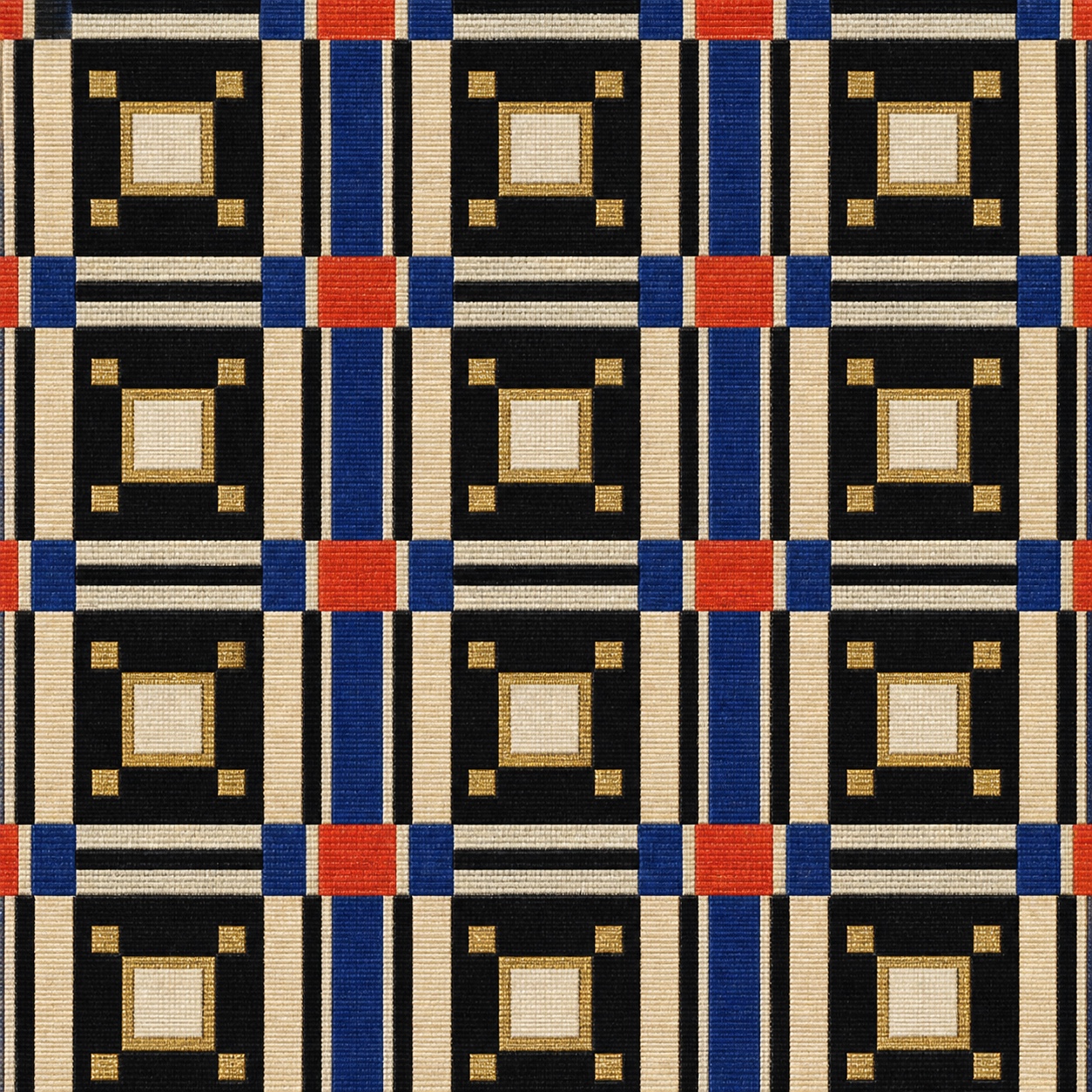
Vienna's square: luxury craft built on one unit, from the building to the cutlery.

Omoro dossier · 042-WW

Visual markers, Wiener Werkstätte aesthetic visual markers

The visual DNA: what makes it recognisable

typography

See the fonts
  • Geometric capitals set inside square frames
  • Secession lettering with squared counters
  • Monograms built on a grid and repeated as pattern
  • Black type on white, occasionally gold

grid

  • The square as the unit of everything: tiles, textiles, cutlery, letters
  • Checkerboards and dense grids alternating with plain white
  • Borders and frames of small squares around a field
  • Symmetry and repeat across every surface of an interior

materials

  • Black #0D0E12 and chalk cream #D8C4A2 as the structure
  • Gold #B69050, vermilion #BE3E23 and cobalt #17275E as accents
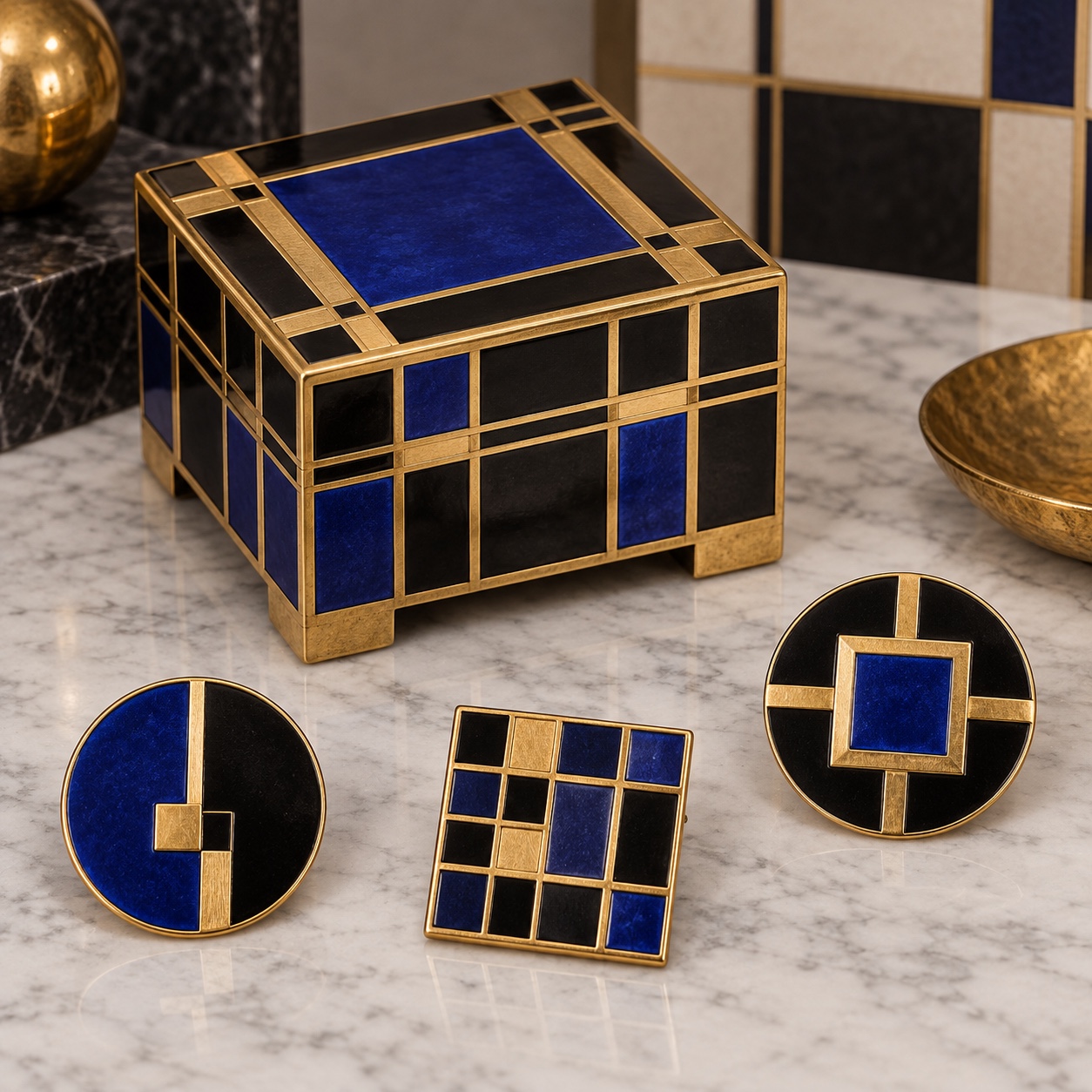
  • Silver, brass and enamel, ebonised wood, printed silk, leather and glass

motifs

  • Checkerboards and square grids
  • Pierced silver baskets and vases
  • Stylised rose, leaf and heart in a lattice
  • Monograms and marks inside squares

Aesthetic profile

8-channel console with the fingerprint on its display. Save the card, or share the page

Aesthetic Profile
Wiener Werkstätte
1903-1932 · Vienna
Attribute console · 042-WW
leans structured, analog, nostalgic
8 CH
FIG. 1
MaximalMinimalAnalogDigitalExpressiveRestrainedWarmCoolNostalgicFuturisticStructuredChaoticLightDarkGeometricOrganic
01Minimal
Maximal30%
02Analog
Digital70%
03Restrained
ExpressiveEVEN
04Cool
Warm10%
05Futuristic
Nostalgic70%
06Structured
Chaotic80%
07Dark
Light20%
08Organic
Geometric70%
StructuredAnalogNostalgic
Omoro · Attribute console · 042-WW
omoro.io/styles/wiener-werkstatte

Color Palettes, Wiener Werkstätte color palettes and hex codes

The definitive color scheme for this aesthetic

Wiener Werkstätte
#0D0E12 · #D8C4A2 · #B69050 · #BE3E23 · #17275E
A Viennese cabaret in 1907: black and white checkerboard, gilt, one wall of vermilion and a cobalt glass
Omoro Palette Pack575 curated palettes across every aesthetic, 5 export formats.
Get the palettes →

Adjacent Palettes, styles related to Wiener Werkstätte

The colour of the styles sitting closest to this one

Art Nouveau
Bauhaus
Art Deco
Memphis
03
The direction

How to shoot it, how to prompt it, and how to board it.

Photo Direction

How to shoot this aesthetic

"Shoot the system, not the pattern: the same square in the tile, the silver, the menu and the dress"

Shot list

  • A cocktail bar with checkerboard tiles, a pierced silver vase and a cobalt glass on a black table
  • A model in a black-and-white grid dress against a chalk-white wall, gold earrings
  • A place setting: hammered silver, an enamel dish and a menu card with a square monogram

Lighting

Crisp, even and slightly cool: soft daylight or a large key with gentle fill, so black and white stay clean and metal reads as metal. Avoid warm colour casts; gold should be gold against neutral white.

Omoro Director's Briefs212 photo shot-lists like this one, ready to shoot from.
Get the briefs →

Generative Prompt

Drop this into Studio to generate in this aesthetic

Wiener Werkstatte aesthetic, Vienna 1907, black-and-white checkerboard tiles and grids of small squares, pierced and hammered silver, gilt and enamel, stylised roses and leaves held in a lattice, black lacquered wood and chalk-white walls, one vermilion accent and a cobalt glass, geometric capitals in square frames as pattern with no readable words, total design from the room to the cutlery, precise and luxurious, crisp even light, no Art Nouveau curves, no gradients

Paste as-is, or append your own subject

Mood Board

The record applied to your project. The record's kit is free; your brand, references and plates come with membership

Mood board
The Wiener Werkstätte board
8 frames · 4 selected
FIG. 4
Werkstätte Black0D0E12Chalk CreamD8C4A2GoldB69050VermilionBE3E23Cobalt17275E
Brand and references
IdleBrand and references open with membership
With membership: the brand's own facts and colours in every prompt, references carried into every frame, and the plates generated.
01 · Hero application
02 · Material and finish
03 · Palette in context
04 · Photography direction
05 · Pattern plate
06 · Object
07 · Environment
08 · Digital presence
Demo kit free, the rest with membershipThe record as a demo kit, free. Name a project and it is written for that
Omoro · Mood board · 042-WW
04
The judgement

Whether to use it, what it costs to do properly, and where it stands right now.

Creative verdict, Wiener Werkstätte feasibility and strategic recommendation

Two written calls, seven meters, and when to walk away

Creative verdict
Should Wiener Werkstätte be the call?
7 meters
FIG. 2
Assessment

Pick the square and build the whole system on it: mark, type frame, tile, textile and menu to one unit. Black and white carry the structure; gold and one colour carry the warmth; one stylised motif lives inside the grid. A checkerboard on its own is a pattern, not the style.

Verdict

Right when a luxury brand wants geometry with warmth and a total language: jewellery and tableware, hotels and bars, fashion houses and publishers. It rewards designing everything to one square, and fails as a check on a tote bag.

Production cost
High

Silver, enamel, lacquer and printed silk are expensive to make well, and total design multiplies the surfaces.

Creative difficulty
Medium

The square gives a system at once; the design is what lives inside it.

Execution difficulty
High

Grids show every misalignment, and gilt and enamel need real craft.

Risk of misuse
Medium

Reduced to a black-and-white check it becomes generic; the style needs the whole system.

Prevalence
Rare

Fashion and interiors use its checkerboards constantly but almost never name or mine the source.

Longevity
Enduring

The square-based system has held since 1903 and returns with every geometric revival.

Brand investment
High

Real metalwork, lacquer and textiles cost; the system then covers everything a brand touches.

Avoid if
The brand only needs a logo
The style is a system across objects and rooms; on one surface it is a pattern.
The materials will be printed imitations
Gilt, enamel and lacquer are the warmth; printed gold and faux silver read as costume.
The brand needs softness or informality
Grids and checkerboards are precise and urbane; they do not relax.
Omoro · Creative verdict · 042-WW

Editorial Depth

A Pro feature: origins, practitioners, and pitfalls

Editorial depth
The Wiener Werkstätte file
14 sections
FIG. 3
Context02Brands02Perception04Use04Index02
01Common MisconceptionThe principle beneath the surface
02Historical ContextOrigins, cultural moment, and reaction
03Brands That Accidentally Use This StyleNatural alignment, not category claims
04Brands That Perfectly Represent This StyleExceptional execution
05Psychological EffectHow visual decisions change perception
06Visual ChecklistInclude and avoid
07Creative FormulaThe visual system reduced to essentials
08Recognition SignalsHow to recognize it in two seconds
09When To Use This StyleContexts where the language performs
10Common Creative MistakesWhere imitation weakens the signal
11Best Brand ApplicationsIndustries with a natural advantage
12Creative Application AnalysisFit, feasibility, and production reality
13Related StylesClose languages and the key distinction
14Visual DNA SummaryThe sentence to remember
The editorial depth, with membershipOpening soon
Omoro · Editorial depth · 042-WW
05
The index

Neighbours, cross-references, blends, and the questions people ask.

Related concepts

Connected across the creative knowledge graph

Cultural relevance, Wiener Werkstätte cultural relevance today

Where it stands now, and what it costs you to use it

The Wiener Werkstätte is a source waiting to be used. The checkerboard is back in fashion and interiors, the grid monogram is how luxury houses build repeats, and hospitality wants total interiors again, yet almost nobody names Vienna. Its vocabulary, geometry with gold, enamel and warmth, sits exactly between the minimalism brands are leaving and the ornament they want.

Its failure mode is the chessboard. A black-and-white check on its own is a pattern, not the style; the Werkstätte look needs the whole system, the grid running through type, object and room, with gilt and one strong colour inside it. The work that lands designs everything to one square.

Cross-references

Art NouveauThe curves it straightened into squaresBauhausThe school that took its total design and removed the luxuryArt DecoThe 1920s glamour that inherited its geometryMemphisThe 1980s that brought its checkerboards back

Blend

Mix Wiener Werkstätte with any style in the library

Wiener Werkstätte×
50%50%
56% alike

Merged palette

#0D0E12

#5C6E4B

#D8C4A2

#8B7355

#B69050

Leads analog, nostalgic, maximal

Typography · from Wiener Werkstätte

IBM Plex Sans over IBM Plex Mono

Materials

  • Black #0D0E12 and chalk cream #D8C4A2 as the structure
  • Gold #B69050, vermilion #BE3E23 and cobalt #17275E as accents
  • Jewel tones: emerald #006B3C, sapphire #003580, amethyst #6B3FA0, ruby #8B0000

The calls this blend forces

These two disagree on 2 things, and a blend cannot average them: you pick a side. At this mix:

Geometric or Organic? Wiener Werkstätte is geometric, Art Nouveau is organic. This mix lands organic.

Structured or Chaotic? Wiener Werkstätte is structured, Art Nouveau is chaotic. This mix lands structured.

Use it

Wiener Werkstatte aesthetic, Vienna 1907, black-and-white checkerboard tiles and grids of small squares, pierced and hammered silver, gilt and enamel, stylised roses and leaves held in a lattice, black lacquered wood and chalk-white walls, one vermilion accent and a cobalt glass, geometric capitals in square frames as pattern with no readable words, total design from the room to the cutlery, precise and luxurious, crisp even light, no Art Nouveau curves, no gradients (50%), infused with Art Nouveau aesthetic with sinuous organic curves, whiplash lines, floral ornamentation, Gaudí and Horta lineage, handcrafted detail, color palette strictly #0D0E12 #5C6E4B #D8C4A2 #8B7355 #B69050, leaning geometric over organic, structured over chaotic, overall character: analog, nostalgic, maximal

One-click generation opens with the studio

About this aesthetic

What was the Wiener Werkstätte?

A Vienna workshop cooperative founded in 1903 by Josef Hoffmann, Koloman Moser and Fritz Waerndorfer to make modern objects by hand: silver, furniture, textiles, wallpaper, fashion, graphics and whole interiors, in a geometric language of squares, checkerboards, gilt and stylised florals. It closed in 1932.

How is it different from Art Nouveau and Bauhaus?

Art Nouveau curves; the Werkstätte straightened those curves into grids and squares while keeping the luxury and the hand. The Bauhaus, which came later, kept the total design and the geometry but handed production to the machine and dropped the gold.

Why does it suit luxury branding now?

Because it is geometry with warmth: a grid that can hold a monogram, a checkerboard that can become a repeat, gilt and enamel that read as craft, and a total-design habit that runs from a building to a menu. It answers the move away from flat minimalism without going baroque.

How do you use it without copying?

Choose a square and build everything on it: the mark, the type frame, the tile, the textile repeat. Use black and white as the structure, one strong colour and gold as accents, and let one stylised natural motif live inside the grid. Design the smallest object as carefully as the room.

Build with the wiener werkstätte aesthetic

Every style in the library is broken down like this one: the palette, the typography, the materials and the lineage.

Explore the style library →