Utilitarian Design

Function on show and nothing decorative: tools, labels, fastenings and honest materials, from Braun and Muji to army surplus and workwear
Collect references in this style →Compare Utilitarian Design with another style →See the Utilitarian Design typefaces →On the timeline · 1920s
Record040-UD
AestheticUtilitarian Design
ClassRestrained / Structured
StatusINGESTING
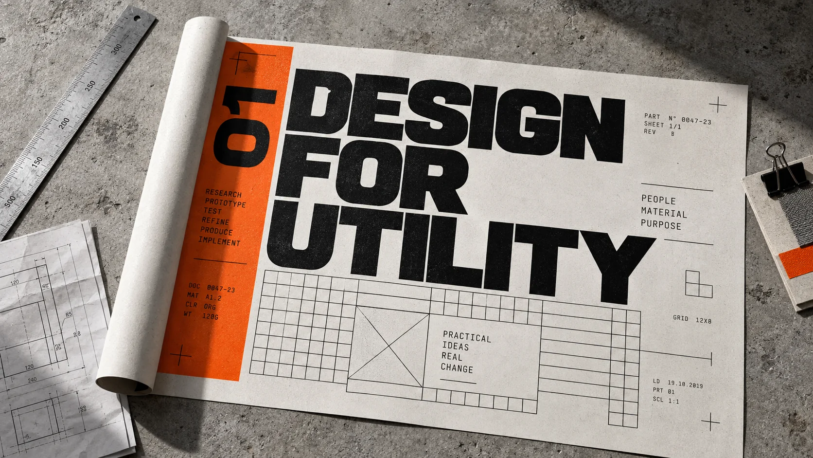
A printed manual open on a concrete floor, its cover reading Design for Utility in black and safety orange, a knife and a tape beside it.
Archive plate · Utilitarian Design
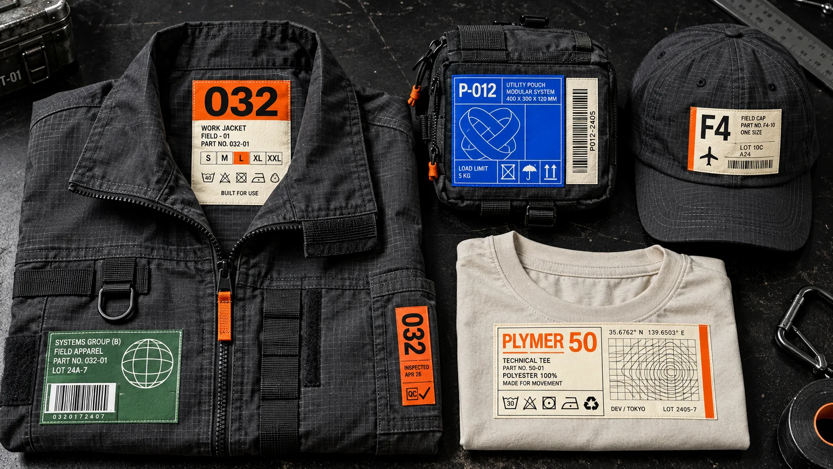
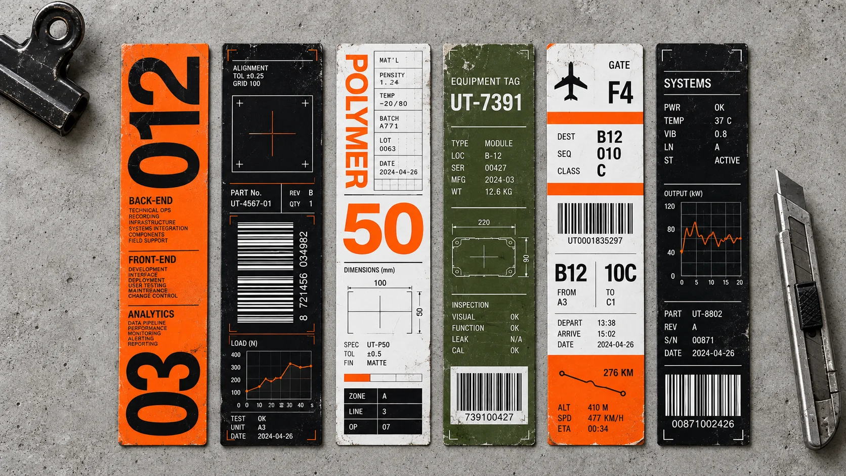
Five equipment labels in orange, black, olive and white, each with a part number, a barcode and a stamped code, laid on steel.
Dossier sceneLabels · 1/5
01
The record

What it is, when it works, who it is for, and where it already exists.

How to use it

Record 040-UD - when it works, who it is for, what it looks like

FIELD 01

When to use it

  • Products and tools whose usefulness is the whole promise
  • Workwear, outdoor and equipment brands
  • Packaging that should feel like supplies rather than gifts
  • Software and interfaces that want to feel like an instrument
FIELD 02

Perfect for

  • Tool, hardware and equipment makers
  • Workwear and outdoor labels
  • Stationery and household goods
  • Developer and productivity software
FIELD 03

What it looks like

  • Dieter Rams's work for Braun, from the SK 4 record player of 1956 onward
  • Jean Prouvé's Standard chair, 1934
  • Muji, founded in 1980 as "no-brand quality goods"
  • Carhartt's duck canvas chore coat and the surplus store rail

In the wild, Utilitarian Design aesthetic real-world examples

Where this aesthetic shows up in the real world · ↗ opens the source site

FurnitureJean Prouvé, Standard chair1934
Product designDieter Rams for Braun, SK 4 radiogram1956
Design philosophyDieter Rams, ten principles for good design
Retail and product designMuji, no-brand quality goods1980
WorkwearCarhartt chore coat
Omoro Style GuideEvery aesthetic, every field on this page, in one PDF.
$8Get the guide →
02
The anatomy

Where Utilitarian Design came from, what makes it recognisable, and the fingerprint it leaves.

History, Utilitarian Design aesthetic history

1920s–present · Industrial production, the workshop and the military store

Utility came before it was a style. Workwear, army kit and factory furniture were designed to a job and a budget, and their look was a by-product: rivets where the stress is, pockets where the tools go, paint where the rust would be. Jean Prouvé's Standard chair of 1934 put its strength in the back legs because that is where a sitter's weight falls, and it looks the way it does for that reason alone.

In the middle of the century designers turned that honesty into a philosophy. At Braun from the mid-1950s, Dieter Rams and his team stripped radios, shavers and calculators to their controls, and his ten principles for good design, with "as little design as possible" at the end, became the creed of the movement. Britain's wartime Utility scheme had already shown that rationed furniture could be plain and good.

Muji, founded in Japan in 1980 as "no-brand quality goods", sold the idea to everyday shoppers: unbleached, unlabelled, priced by what it cost to make. Since the 2010s the look has run through workwear revivals, outdoor kit, tool brands and software that wants to feel like an instrument, all trading on the same promise: what you see is what it does.

Nothing that does not do a job.

Omoro dossier · 040-UD

Visual markers, Utilitarian Design aesthetic visual markers

The visual DNA: what makes it recognisable

typography

See the fonts
  • Plain grotesques: Helvetica, Akzidenz, Univers
  • Stencil and stamped lettering
  • Monospace part numbers and quantities
  • Labels that name the contents

grid

  • Objects laid out one to a cell
  • Spec-sheet layouts: image, parts list, dimensions
  • Strong margins, no ornament
  • Everything aligned to the object, not the page

materials

  • Steel, aluminium and galvanised metal
  • Canvas, ripstop and webbing
  • Plywood, rubber and enamel
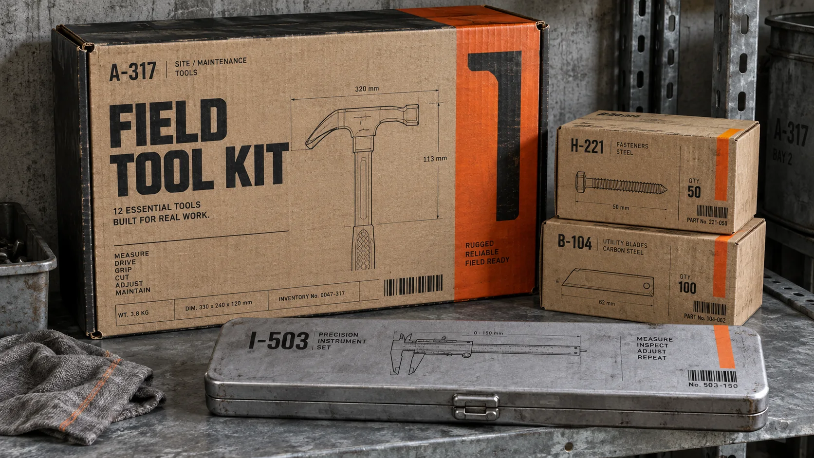
  • Kraft and corrugated card

motifs

  • Exposed fastenings and stitching
  • Safety colour used once, as a signal
  • Part numbers and printed contents lists
  • Objects shown in quantity, like stock

Aesthetic profile

8-channel console with the fingerprint on its display. Save the card, or share the page

Aesthetic Profile
Utilitarian Design
1920s–present · Industrial production, the workshop and the military store
Attribute console · 040-UD
leans restrained, structured, minimal
8 CH
FIG. 1
MinimalMaximalAnalogDigitalRestrainedExpressiveCoolWarmNostalgicFuturisticStructuredChaoticLightDarkGeometricOrganic
01Minimal
Maximal60%
02Analog
Digital30%
03Restrained
Expressive70%
04Cool
Warm10%
05Futuristic
Nostalgic10%
06Structured
Chaotic70%
07Dark
Light10%
08Organic
Geometric40%
RestrainedStructuredMinimal
Omoro · Attribute console · 040-UD
omoro.io/styles/utilitarian-design

Materials

Named in this style's material notes, 2 materials the library documents

Anodized AluminumMetalBirch PlywoodTimber

Color Palettes, Utilitarian Design color palettes and hex codes

The definitive color scheme for this aesthetic

Utilitarian Design
#E8E2D3 · #4A5A3C · #8C9196 · #F26A1B · #1E1F1D
Khaki, galvanised steel and one safety orange, on unbleached canvas
Omoro Palette Pack575 curated palettes across every aesthetic, 5 export formats.
$8Get the palettes →

Adjacent Palettes, styles related to Utilitarian Design

The colour of the styles sitting closest to this one

Soft Utility
Industrial Loft
Swiss / International
Normcore
03
The direction

How to shoot it, how to prompt it, and how to board it.

Photo Direction

How to shoot this aesthetic

"Photograph the thing as if for the manual"

Shot list

  • The object flat on grey card, seen square-on, every fastening visible
  • A hand using the tool, the grip and the mechanism in focus
  • A detail of the label, the stitching or the stamped part number

Lighting

Even, shadowless studio light for the record shots; a single hard source for the details so texture reads. No warm grading, no bloom.

Omoro Director's Briefs151 photo shot-lists like this one, ready to shoot from.
$8Get the briefs →

Generative Prompt

Drop this into Studio to generate in this aesthetic

Utilitarian design: a functional object shown plainly, exposed fastenings and stitching, olive drab and galvanised grey with one safety orange detail, unbleached canvas and brushed aluminium, a printed label with a part number in plain grotesque type, even studio light, no styling beyond what the object needs

Paste as-is, or append your own subject

Use as skill

The whole record as a portable skill for Claude, ChatGPT, Gemini, image and video models, or a human brief

The whole record, compiled into a skill another system can work inside: lineage, axes, palettes, type, materials, photography, verdicts and a critique checklist. Nothing is generated; it is the dossier, restructured.

Mood Board

The record applied to your project. The record's kit is free; your brand, references and plates come with membership

Mood board
The Utilitarian Design board
8 frames · 4 selected
FIG. 4
CanvasE8E2D3Olive Drab4A5A3CGalvanised8C9196Safety OrangeF26A1BMatte Black1E1F1D
Brand and references
IdleBrand and references open with membership
With membership: the brand's own facts and colours in every prompt, references carried into every frame, and the plates generated.
01 · Hero application
02 · Material and finish
03 · Palette in context
04 · Photography direction
05 · Pattern plate
06 · Object
07 · Environment
08 · Digital presence
Demo kit free, the rest with membershipThe record as a demo kit, free. Name a project and it is written for that
Omoro · Mood board · 040-UD
04
The judgement

Whether to use it, what it costs to do properly, and where it stands right now.

Creative verdict, Utilitarian Design feasibility and strategic recommendation

Two written calls, seven meters, and when to walk away

Creative verdict
Should Utilitarian Design be the call?
7 meters
FIG. 2
Assessment

Set the name, the contents and the part number in a plain grotesque. Photograph flat, square-on, on grey. One safety colour for the one control that matters. If a detail does not do a job, take it out.

Verdict

Right for anything whose promise is that it works: tools, kit, workwear, supplies, instruments. Show the function, label the contents, use one safety colour, and stop. Add decoration and the whole claim collapses.

Production cost
Low

Plain type, kraft, card and studio light; no illustration, no styling budget.

Creative difficulty
Medium

Restraint is the skill; the temptation is always to add.

Execution difficulty
Low

Photograph the object plainly and set the label honestly.

Risk of misuse
Medium

Fake rivets, decorative stencils and 'workwear' that has never worked are the giveaway; the style only holds when the function is real.

Prevalence
Common

Tool brands, outdoor labels and half of independent stationery use it.

Longevity
Timeless

Honest function has looked right for a century and does not date.

Brand investment
Low

Plain type, kraft and grey card are cheap; the cost is discipline.

Avoid if
The product is about pleasure, luxury or fantasy
Plainness reads as supplies. A fragrance or a resort dressed as army kit sends the wrong signal.
The function is not actually good
The style makes a claim about how well a thing works; if it does not, the honesty turns on you.
Omoro · Creative verdict · 040-UD

Editorial Depth

A Pro feature: origins, practitioners, and pitfalls

Editorial depth
The Utilitarian Design file
14 sections
FIG. 3
Context02Brands02Perception04Use04Index02
01Common MisconceptionThe principle beneath the surface
02Historical ContextOrigins, cultural moment, and reaction
03Brands That Accidentally Use This StyleNatural alignment, not category claims
04Brands That Perfectly Represent This StyleExceptional execution
05Psychological EffectHow visual decisions change perception
06Visual ChecklistInclude and avoid
07Creative FormulaThe visual system reduced to essentials
08Recognition SignalsHow to recognize it in two seconds
09When To Use This StyleContexts where the language performs
10Common Creative MistakesWhere imitation weakens the signal
11Best Brand ApplicationsIndustries with a natural advantage
12Creative Application AnalysisFit, feasibility, and production reality
13Related StylesClose languages and the key distinction
14Visual DNA SummaryThe sentence to remember
The editorial depth, with membershipOpening soon
Omoro · Editorial depth · 040-UD
05
The index

Neighbours, cross-references, blends, and the questions people ask.

Related concepts

Connected across the creative knowledge graph

Cultural relevance, Utilitarian Design cultural relevance today

Where it stands now, and what it costs you to use it

Utilitarian design is the visual language of trust: tools, workwear and kit that look like they will last because they show how they are made.

In a market of decorated products, plainness itself now signals quality. The unbranded object reads as more honest than the branded one.

Cross-references

Soft UtilityThe same function-first idea, warmed up for softwareIndustrial LoftFactory materials and structure left on show, at room scaleSwiss / InternationalThe typographic system utilitarian labels borrow from

Blend

Mix Utilitarian Design with any style in the library
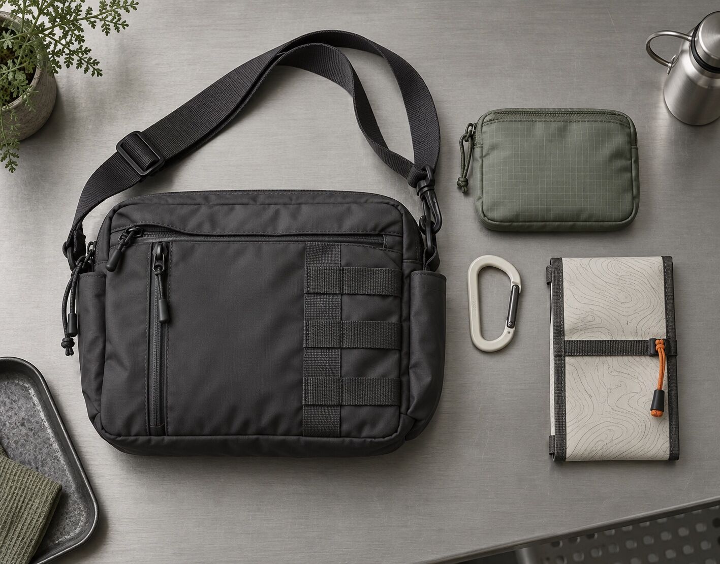
Utilitarian Design×
50%50%
84% alike
Utilitarian Design referenceSoft Utility referenceUtilitarian Design 50%Soft Utility 50%

Merged palette

#E8E2D3

#4A4A48

#4A5A3C

#7D8B6E

#8C9196

Leads restrained, structured, minimal

Typography · from Utilitarian Design

Space Grotesk over Inter

Materials

  • Steel, aluminium and galvanised metal
  • Canvas, ripstop and webbing
  • Muted earth tones: warm sand #E8DCC8, sage #A3B18A, soft clay #C8A882

Use it

Utilitarian design: a functional object shown plainly, exposed fastenings and stitching, olive drab and galvanised grey with one safety orange detail, unbleached canvas and brushed aluminium, a printed label with a part number in plain grotesque type, even studio light, no styling beyond what the object needs (50%), infused with Functional interface design rendered warm, rounded input fields in muted earth tones, paper and linen textures, hand-drawn icon details, quiet humanist sans-serif type, cream and sage and clay palette, utility software dressed in natural materials, no sharp corners, no cold steel, color palette strictly #E8E2D3 #4A4A48 #4A5A3C #7D8B6E #8C9196, overall character: restrained, structured, minimal

One-click generation opens with the studio

About this aesthetic

What is utilitarian design?

Design where every element serves a use and nothing is added for decoration. Materials are shown as they are, fastenings and joins stay visible, and type is used to name and number rather than to persuade. Braun's products under Dieter Rams, Muji's household goods and classic workwear are the reference points.

How is utilitarian different from minimalism?

Minimalism removes things for the look of emptiness. Utilitarian design keeps everything that works and removes only what does not, so it can be quite busy: pockets, straps, labels, rivets. The test is usefulness, not sparseness.

Build with the utilitarian design aesthetic

Every style in the library is broken down like this one: the palette, the typography, the materials and the lineage.

Explore the style library →