Registrar's index cards on the platen glass - captured by the scanner
1950s-1970s (peak); ongoing revival · Post-war Britain and France
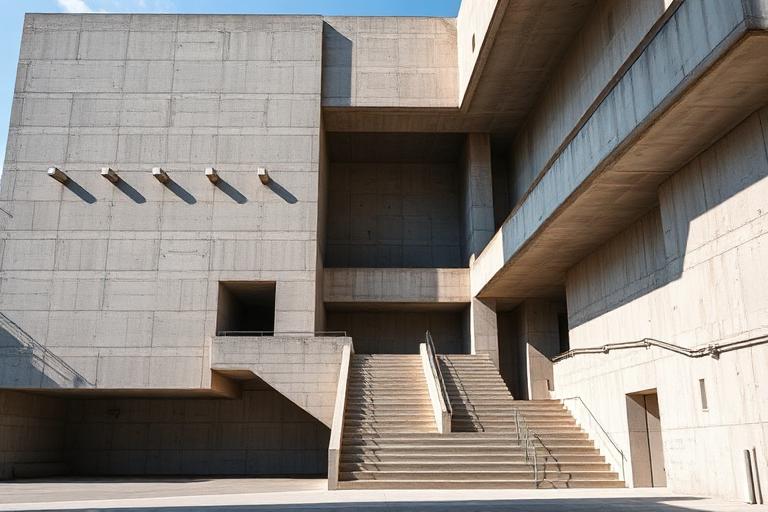
Brutalism takes its name from the French beton brut (raw concrete), a term Le Corbusier used to describe the board-marked finish of his Unite d'Habitation in Marseille (1952). The style emerged from post-war necessity and socialist idealism: governments needed to rebuild quickly and cheaply, and a generation of architects believed that honest materials and visible structure could embody democratic values. The Smithsons' Hunstanton School (1954), with its exposed steel frame and visible services, announced the movement in Britain.
Through the 1960s and 1970s, Brutalism produced some of the most ambitious public architecture ever built. Denys Lasdun's National Theatre in London (1976), Moshe Safdie's Habitat 67 in Montreal, Erno Goldfinger's Trellick Tower, and Boston City Hall by Kallmann, McKinnell & Knowles all shared the conviction that a building's structure was its ornament. The Barbican Estate in London (1969-1982) remains the most complete Brutalist urban vision: housing, arts center, schools, and gardens unified by a continuous concrete megastructure.
Public opinion turned against Brutalism in the 1980s as concrete aged badly, maintenance budgets shrank, and postmodernism offered a more populist alternative. Many Brutalist buildings were demolished or threatened. The 21st-century revival reframed the movement: Instagram discovered Brutalism's photogenic geometry, preservation campaigns saved key buildings, and a new generation of architects like Grafton Architects and Adjaye Associates returned to exposed concrete with better technology and detailing. Brutalism is no longer a period style but a living position about material honesty.
The visual DNA: what makes it recognisable
- Heavy geometric sans-serifs: Eurostile, Bank Gothic, DIN
- Uppercase with wide tracking, echoing inscribed concrete lettering
- Monospaced alternatives for utilitarian identity systems
- Minimal type hierarchy: one weight, one size, maximum impact
- Modular repetition of structural bays
- Strong horizontal and vertical rhythms from floor slabs and columns
- Setbacks and cantilevers creating deep shadow patterns
- Elevated podiums and pilotis separating building from ground
- Board-marked concrete showing formwork grain: #8A8682, #A09C98
- Weathered concrete with water staining: #6E6A66, #7A7672
- Exposed aggregate surfaces: #948F8A, #B0ACA8
- Accent colors from services and signage: signal red, safety yellow
- Deeply recessed windows creating shadow grids
- Cantilevered volumes defying apparent structural logic
- Exposed mechanical services as visual elements
- Monumental entrance sequences through compressed-to-expanded space
8-channel console - dominant channels taped & circled by the registrar
Your aesthetic passport - share the fingerprint
The style's primary materials, assembled bottom-up
Tap a stratum for material detail · Full catalog
Postwar · 1950–1979 - tap any style to travel
4 color interpretations of this aesthetic
Join waitlist for access
Join the waitlist for full access
Join the waitlistBrutalism: where the language earns its place
Brutalism is most effective when its visual decisions do useful work. Raw concrete as conviction - Brutalism treated exposed béton brut as an honest material statement, from Paul Rudolph's corrugated towers to Moshe Safdie's Habitat 67 stacked modules and Marcel Breuer's Whitney Museum.
The style gives styling, proportion, and image sequencing a clear point of view rather than treating them as decoration.
It can turn atmosphere, material, and spatial pacing into evidence of a distinct experience before a visitor arrives.
It helps a physical or editorial environment feel authored, which raises attention and perceived care.
They recognize the references, proportion, and restraint that make the language feel intentional.
They respond to visible judgment because it reduces the feeling of interchangeable product.
A coherent aesthetic gives them a usable standard for choosing images, objects, and collaborators.
The cost comes from consistent art direction, suitable locations or materials, and time to edit the details that would otherwise undermine the premise.
The challenge is conceptual. It takes visual literacy and a real point of view to avoid borrowing surface cues without their original logic.
Lighting, casting, type, color, material, and retouching must agree. A single weak choice can make the work feel like an imitation.
Brutalism creates its strongest advantage when it gives a brand a standard of judgment, not merely an attractive finish. It fails when recognizable cues are collected without a governing idea. The difference between average and exceptional execution is usually proportion: how much is shown, what is withheld, and whether every element belongs to the same world. The most capable teams pair an exacting art director with specialists who understand the medium, from photographer and stylist to set designer, editor, and typographer.
Should Brutalism be the strategic choice?
Surface imitation is easy. The language becomes generic when familiar cues replace proportion, specificity, and a coherent system.
Its visual ingredients appear regularly in contemporary work, but a rigorous execution remains distinguishable from a loose collection of references.
Its strongest principles depend on composition, material, and cultural literacy rather than a short-lived visual effect.
It asks for consistency across photography, typography, motion, environments, and the many details that make a brand feel believable.
Brutalism deserves serious consideration from brands and institutions that can articulate a real point of view and protect it through execution. It is less suitable for work that needs immediate instructional clarity, broad visual neutrality, or low-cost production flexibility. Its greatest advantage is differentiation through judgment: it can make a product, place, or editorial proposition feel authored rather than merely packaged. Average executions borrow recognizable signals, then lose coherence when type, casting, copy, or materials fail to agree. Exceptional executions understand the visual language as a system of choices, including what not to show. The largest mistake is treating the style as a finish applied after strategy. Adopt it only when the product and organization can carry the same standard of care the imagery proposes.
Join waitlist for access
Join the waitlist for editorial depth
Join the waitlistConnected across the creative knowledge graph