When to use it
- Distinctive digital products
- Graphic retail environments
- High-contrast wayfinding
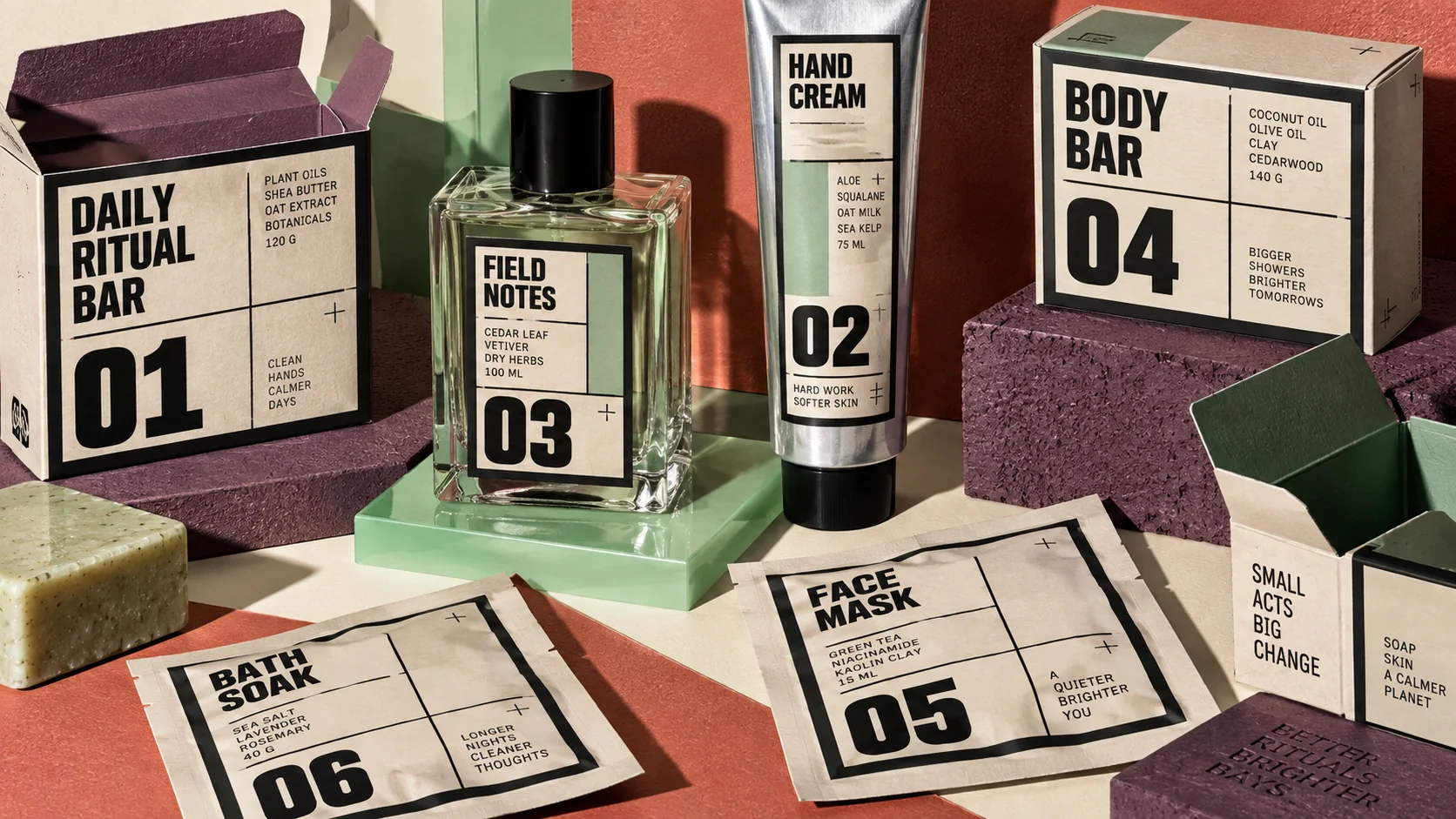
- Packaging with visible structure
Visible structure, hard outlines, flat color and blunt type across interfaces, products and real-world systems
Part of the Energy & Excitement mood, alongside Synthwave and Pop Art. Began in the 2020s, on the style timeline.
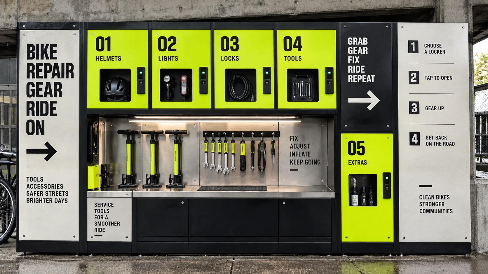
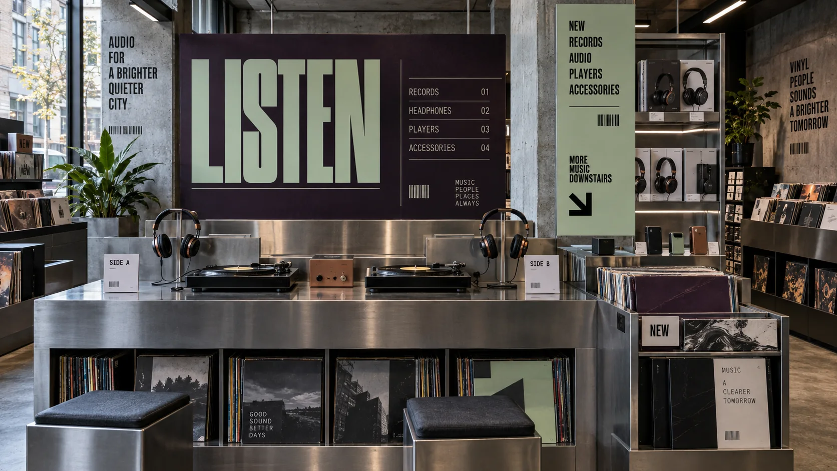
What it is, when it works, who it is for, and where it already exists.
Record 033-NB - when it works, who it is for, what it looks like
Where this aesthetic shows up in the real world · ↗ opens the source site
Where Neo-Brutalism came from, what makes it recognisable, and the fingerprint it leaves.
2020–present · Web design, internet; roots in 1950s architectural Brutalism
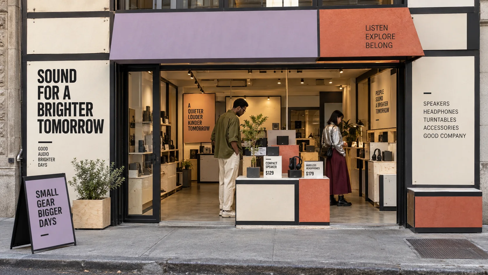
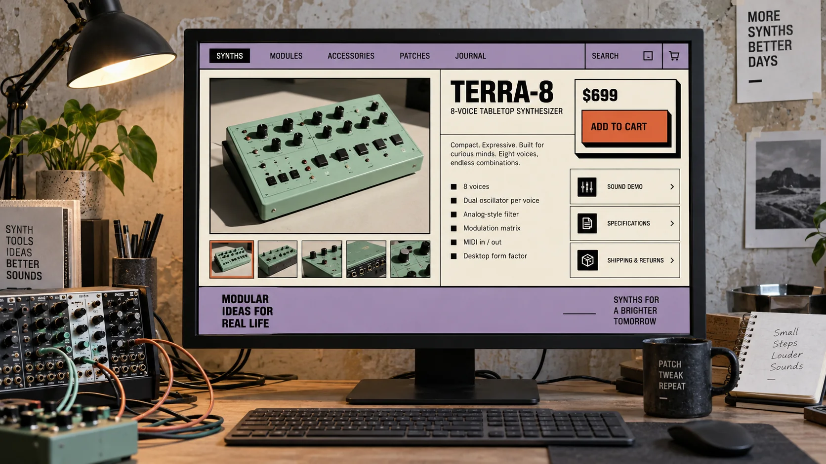
Neo-Brutalism (also styled 'New Brutalism' in design contexts) emerged around 2020–2022 as a UI and graphic design aesthetic that rejected the refined, shadow-free design language of Google Material Design and Apple Human Interface Guidelines. Its signature is visible structure: heavy outlines, flat unmodulated color, blunt typography, explicit grids, and deliberately hard offset shadows. The approach now extends beyond screens into packaging, retail systems, product graphics, wayfinding, and campaign design.
The architectural Brutalism of the 1950s–1970s (Le Corbusier's Unité d'Habitation, Paul Rudolph's Art + Architecture Building) is a loose ancestor: both share an honest-materials aesthetic that refuses to hide structure behind cladding. But Neo-Brutalism's more immediate parents are flat design's backlash, the zine aesthetic of 1990s punk graphic design, and the anti-polish ethos of early internet web design. The Gumroad redesign (2021) and the Figma community around 2022 popularized the style for product design audiences.
Neo-Brutalism's appeal lies in its contrast to the homogenizing 'good taste' of Scandinavian-influenced startup design. Its ugliness is deliberate and communicative: 'we are not trying to hide anything,' 'we are not polished corporate,' 'we are raw and confident.' The style also solves an accessibility problem implicitly: black borders on white or pale-colored elements have very high contrast, and the flat drop-shadow makes click targets obvious.
“Visible structure, translated from screens into objects and space.
The visual DNA: what makes it recognisable
8-channel console with the fingerprint on its display. Save the card, or share the page

5 color interpretations of this aesthetic
The colour of the styles sitting closest to this one
How to shoot it, how to prompt it, and how to board it.
How to shoot this aesthetic
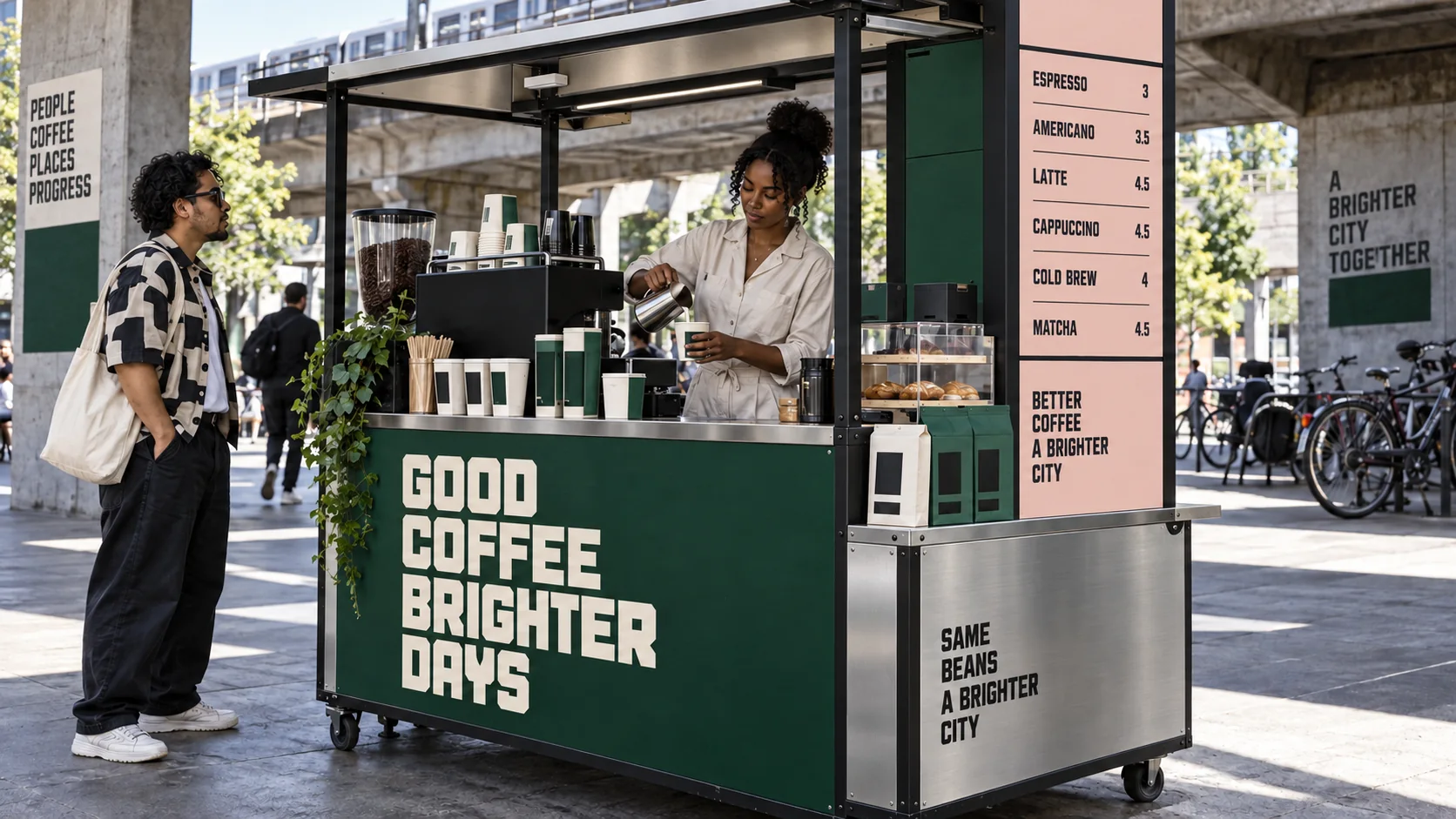
"Structure left showing: hard outlines, flat color and blunt type, from the screen out into the street"
Shot list
Lighting
Even, frontal daylight or a large soft source, bright enough that flat color reads flat; let hard objects throw one crisp shadow, never a gradient or glow
Drop this into Studio to generate in this aesthetic
Neo-Brutalism aesthetic with visible structure, hard black outlines, flat unshaded color blocks, blunt bold sans-serif type, hard offset shadows with no blur, a near-black and bone base with controlled flat accents of olive, lilac and burnt coral
Neo-Brutalism aesthetic with visible structure, hard black outlines, flat unshaded color blocks, blunt bold sans-serif type, hard offset shadows with no blur, a near-black and bone base with controlled flat accents of olive, lilac and burnt coral. Photograph: a neo-brutalist storefront shot straight on: flat painted panels, heavy black outlines, oversized bold signage and visible fixings. Set in street kiosk, market stall or coffee cart. Shot wide, the whole scene with room around it, even, frontal daylight or a large soft source, bright enough that flat color reads flat; let hard objects throw one crisp shadow, never a gradient or glow. Keep flat painted panels in one accent color each, with no gradient or gloss in the frame. Colour palette #111111 #F3EBDD #6B7F52 #A990C5 #D36B4F. Where a person appears: workwear or plain garments in one flat accent color against black or bone, simple geometric cuts, nothing glossy or patterned. Photographic, not an illustration. No text, no logos, no watermark.
The whole record as a portable skill for Claude, ChatGPT, Gemini, image and video models, or a human brief
The whole record, compiled into a skill another system can work inside: lineage, axes, palettes, type, materials, photography, verdicts and a critique checklist. Nothing is generated; it is the dossier, restructured.
The record applied to your project. The record's kit is free; your brand, references and plates come with membership
01 · Hero application02 · Material and finish03 · Palette in context04 · Photography directionWhether to use it, what it costs to do properly, and where it stands right now.
Two written calls, seven meters, and when to walk away
Deliberate crudeness still requires precise construction. Hard shadows have to sit at a consistent offset and angle, or the page reads as broken rather than blunt, and the same goes for border weights. Pick a system and hold it everywhere. The bar is contrast: high-saturation blocks are easy, but keeping them accessible against black type is the actual work.
Use it to say online and current, which is a short-dated claim. It arrived as a correct reaction to a decade of soft, rounded, indistinguishable SaaS interfaces; the open question is whether it is still a reaction or now just the new default, and it is already saturated in startup and portfolio work. Architects find the borrowed name careless, since it shares thick borders with concrete brutalism and almost nothing else.
Digital interface work only.
The 'ugly on purpose' move is well-known. Conviction is what sells it.
Deliberately raw. Genuinely forgiving of imperfection.
Ugly on purpose without conviction just looks like a mistake.
Extremely common in startup and product design right now.
A specific reaction to the smooth SaaS look. It will pass too.
Interface work only.
A Pro feature: origins, practitioners, and pitfalls
Neighbours, cross-references, blends, and the questions people ask.
Connected across the creative knowledge graph
Where it stands now, and what it costs you to use it
Neo-Brutalism is a web aesthetic that borrowed a building name, and architects mostly find the borrowing careless. It shares thick borders and hard shadows with concrete brutalism and almost nothing else.
It arrived as a reaction to a decade of soft, rounded, indistinguishable SaaS interfaces, and the reaction was correct. Whether it is still a reaction or now just the new default is the open question.
It is already saturated in the startup and portfolio space. If you use it, it says you are online and current, which is a short-dated claim.
Mix Neo-Brutalism with any style in the library, or see the pairs worth trying
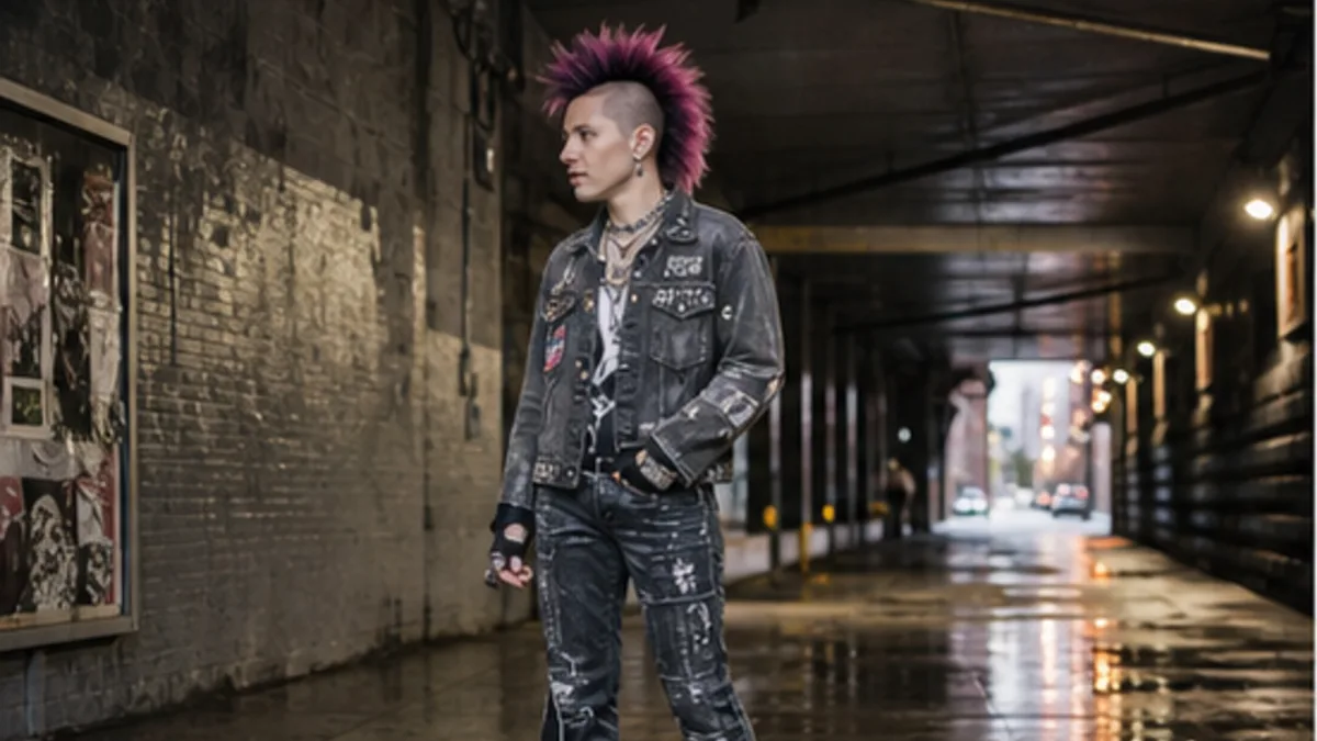 Neo-Brutalism 50%Punk 50%
Merged palette
#111111
#F3EBDD
#FF0000
#6B7F52
#4B0082
Leads expressive, maximal, chaotic
Typography · from Neo-Brutalism
IBM Plex Sans over IBM Plex Mono
Materials
The calls this blend forces
These two disagree on 3 things, and a blend cannot average them: you pick a side. At this mix:
Digital or Analog? Neo-Brutalism is digital, Punk is analog. This mix lands analog.
Structured or Chaotic? Neo-Brutalism is structured, Punk is chaotic. This mix lands chaotic.
Geometric or Organic? Neo-Brutalism is geometric, Punk is organic. This mix lands geometric.
Use it
Neo-Brutalism aesthetic with visible structure, hard black outlines, flat unshaded color blocks, blunt bold sans-serif type, hard offset shadows with no blur, a near-black and bone base with controlled flat accents of olive, lilac and burnt coral (50%), infused with Punk aesthetic with DIY anti-establishment rawness, Vivienne Westwood and Sex Pistols-era London street style, aggressive high-contrast color-clash energy, rebellious anti-polish attitude, color palette strictly #111111 #F3EBDD #FF0000 #6B7F52 #4B0082, leaning digital over analog, structured over chaotic, geometric over organic, overall character: expressive, maximal, chaotic
Neo-Brutalism is a graphic and UI design aesthetic defined by heavy black borders, flat unmodulated colors, and a crude solid-color drop shadow (no blur). It deliberately rejects the polished refinement of mainstream UX design trends in favor of raw, grid-visible, high-contrast layouts that read as honest and unfiltered.
Neo-Brutalism usually anchors its palette with a dark structural color and a light ground, then adds one or more flat accents. Those accents can be vivid or muted. Recognition comes from hard separation, visible outlines, blunt hierarchy, and confident contrast rather than a fixed trio of primary colors.
Web brutalism (mid-2010s) was truly anti-design: intentionally ugly, HTML-default typography, no styling whatsoever. Neo-Brutalism (2020s) is a refined aesthetic that uses the visual signals of raw or unfinished design while still being carefully composed. It looks crude but is deliberate: Neo-Brutalism is styled brutalism.
Every style in the library is broken down like this one: the palette, the typography, the materials and the lineage.
Explore the style library →