Registrar's index cards on the platen glass - captured by the scanner
1960s-present (as conscious practice) · Global, with early examples in the US and UK
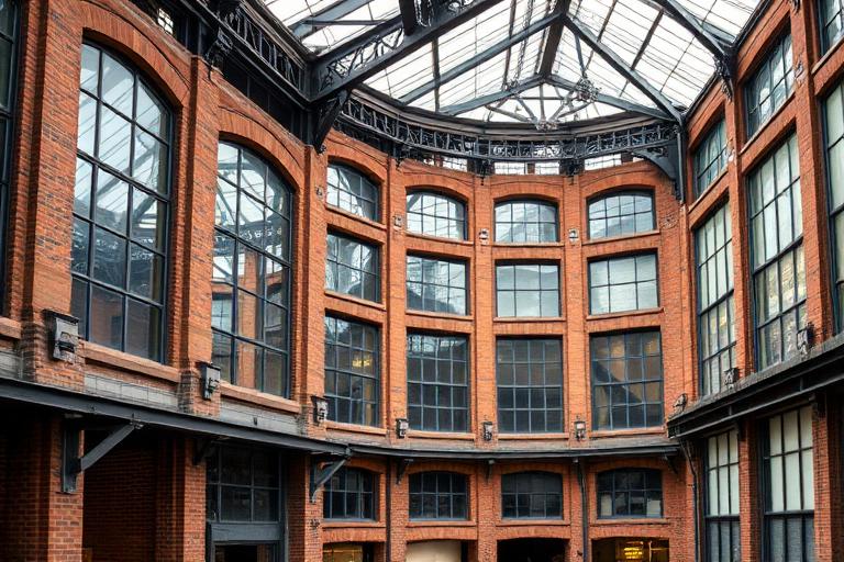
Adaptive reuse as a conscious architectural strategy emerged in the 1960s when artists and architects began occupying abandoned industrial buildings in lower Manhattan. The SoHo cast-iron loft, originally designed for light manufacturing, became the prototype: high ceilings, generous floor plates, large windows, and raw materials that artists found more inspiring than purpose-built studios. By the 1970s, the loft conversion had become a recognized typology, and cities began updating zoning codes to permit residential use of former industrial districts.
The practice expanded from individual buildings to urban infrastructure. The conversion of London's Bankside Power Station into Tate Modern (Herzog & de Meuron, 2000) demonstrated that adaptive reuse could operate at institutional scale and produce architecture of the highest ambition. The High Line in New York (2009), transforming an elevated freight railway into a public park, showed that infrastructure itself could be repurposed. Each project proved that existing structures carry qualities (spatial generosity, material patina, urban memory) that new construction cannot replicate.
Sustainability has made adaptive reuse not just aesthetically appealing but ecologically necessary. Buildings embody enormous quantities of carbon in their structure and materials. Lacaton & Vassal, winners of the 2021 Pritzker Prize, built their entire practice on the principle of 'never demolish, never remove, always add': their transformation of social housing towers in Bordeaux (2017) added winter gardens and balconies to existing structures rather than tearing them down. Adaptive reuse is now recognized as architecture's most potent tool for reducing embodied carbon.
The visual DNA: what makes it recognisable
- Mix of industrial heritage type (stencil, sans-serif) and contemporary refinement
- Preserved painted signage and ghost lettering as design features
- Wayfinding systems that distinguish new interventions from original fabric
- Monospaced or industrial faces: Consolas, Pitch, Atlas Typewriter
- New elements inserted within existing structural grids
- Contrast between original heavy structure and light new additions
- Preserved spatial sequences (entry halls, stairwells, loading bays)
- Mezzanines and insertions exploiting existing ceiling heights
- Exposed original brick: #8B4513, #A0522D, #6B3410
- Weathered steel and cast iron: #5C5C5C, #707070
- New interventions in contrasting materials: white steel, glass, timber
- Polished or sealed original concrete floors: #A0A0A0, #B0B0B0
- Visible boundary between old and new construction
- Retained industrial artifacts (cranes, hoists, machinery) as sculpture
- Original windows preserved or selectively replaced
- Patina and weathering celebrated rather than concealed
8-channel console - dominant channels taped & circled by the registrar
Your aesthetic passport - share the fingerprint
The style's primary materials, assembled bottom-up
Tap a stratum for material detail · Full catalog
Contemporary · 1970–present - tap any style to travel
4 color interpretations of this aesthetic
Join waitlist for access
Join the waitlist for full access
Join the waitlistAdaptive Reuse: where the language earns its place
Adaptive Reuse is most effective when its visual decisions do useful work. The highest form of sustainability is using what already exists - Tate Modern read a decommissioned Bankside power station as a turbine hall gallery, the High Line saw an elevated freight rail as a park, and Lacaton & Vassal transformed Grand Parc housing without moving a single tenant.
The style gives styling, proportion, and image sequencing a clear point of view rather than treating them as decoration.
It can turn atmosphere, material, and spatial pacing into evidence of a distinct experience before a visitor arrives.
It helps a physical or editorial environment feel authored, which raises attention and perceived care.
They recognize the references, proportion, and restraint that make the language feel intentional.
They respond to visible judgment because it reduces the feeling of interchangeable product.
A coherent aesthetic gives them a usable standard for choosing images, objects, and collaborators.
The cost comes from consistent art direction, suitable locations or materials, and time to edit the details that would otherwise undermine the premise.
The challenge is conceptual. It takes visual literacy and a real point of view to avoid borrowing surface cues without their original logic.
Lighting, casting, type, color, material, and retouching must agree. A single weak choice can make the work feel like an imitation.
Adaptive Reuse creates its strongest advantage when it gives a brand a standard of judgment, not merely an attractive finish. It fails when recognizable cues are collected without a governing idea. The difference between average and exceptional execution is usually proportion: how much is shown, what is withheld, and whether every element belongs to the same world. The most capable teams pair an exacting art director with specialists who understand the medium, from photographer and stylist to set designer, editor, and typographer.
Should Adaptive Reuse be the strategic choice?
Surface imitation is easy. The language becomes generic when familiar cues replace proportion, specificity, and a coherent system.
Its visual ingredients appear regularly in contemporary work, but a rigorous execution remains distinguishable from a loose collection of references.
Its strongest principles depend on composition, material, and cultural literacy rather than a short-lived visual effect.
It asks for consistency across photography, typography, motion, environments, and the many details that make a brand feel believable.
Adaptive Reuse deserves serious consideration from brands and institutions that can articulate a real point of view and protect it through execution. It is less suitable for work that needs immediate instructional clarity, broad visual neutrality, or low-cost production flexibility. Its greatest advantage is differentiation through judgment: it can make a product, place, or editorial proposition feel authored rather than merely packaged. Average executions borrow recognizable signals, then lose coherence when type, casting, copy, or materials fail to agree. Exceptional executions understand the visual language as a system of choices, including what not to show. The largest mistake is treating the style as a finish applied after strategy. Adopt it only when the product and organization can carry the same standard of care the imagery proposes.
Join waitlist for access
Join the waitlist for editorial depth
Join the waitlistConnected across the creative knowledge graph