Registrar's index cards on the platen glass - captured by the scanner
1930-1950 · United States, with global influence
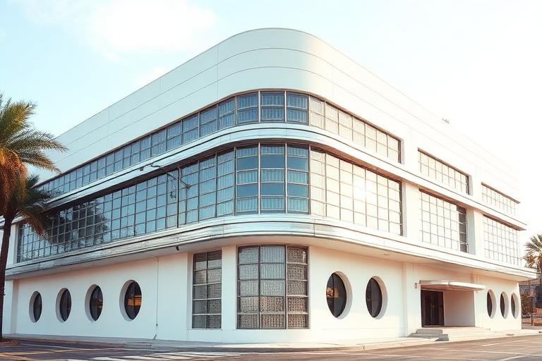
Streamline Moderne emerged in the early 1930s as Art Deco's ornamental exuberance gave way to the aerodynamic optimism of the Machine Age. Industrial designers like Raymond Loewy, Norman Bel Geddes, and Henry Dreyfuss were streamlining everything from locomotives to pencil sharpeners, and architecture followed. Buildings adopted rounded corners, horizontal speed lines (racing stripes of chrome or contrasting material), porthole windows, and smooth, continuous surfaces that suggested motion even in objects that would never move.
The style was democratic in a way Art Deco's luxury was not. Streamline Moderne appeared in diners, gas stations, bus terminals, movie theaters, and apartment buildings across the United States. The Coca-Cola Building in Los Angeles (Robert V. Derrah, 1939), shaped like an ocean liner complete with porthole windows and a ship's bridge, captures the style's playful literalism. Greyhound bus terminals by W.S. Arrasmith used curved walls, glass block, and chrome detailing to make long-distance bus travel feel modern and glamorous.
World War II and postwar Modernism ended the Streamline era. The style's curves and chrome were replaced by the International Style's flat planes and minimal structure. But Streamline Moderne left a lasting mark on popular culture: its visual language became shorthand for 'the future' in mid-century science fiction, and its surviving buildings (diners, gas stations, movie palaces) are now valued as cultural landmarks of American optimism.
The visual DNA: what makes it recognisable
- Rounded sans-serifs: Bernhard Gothic, Twentieth Century, Kabel
- Speed-line lettering with horizontal emphasis
- Neon signage in script and sans-serif faces
- Chrome-plated and backlit dimensional letters
- Rounded corners replacing right angles at building edges
- Horizontal banding (speed lines) across facades
- Wrap-around windows at curved corners
- Flat roofs with curved parapets and eyebrow canopies
- Smooth stucco in white and cream: #F5F0E8, #EEECE8
- Chrome and stainless steel trim: #C0C8D0, #D8DDE0
- Glass block for curves and light diffusion: #D0D8E0, #C0C8D0
- Vitrolite (colored structural glass) panels: #C8E0D0, #D0C0B0
- Porthole windows (oculi) referencing ship design
- Horizontal racing stripes in contrasting material or color
- Curved canopies and eyebrow overhangs
- Ship and aviation-inspired details: railings, masts, fins
8-channel console - dominant channels taped & circled by the registrar
Your aesthetic passport - share the fingerprint
The style's primary materials, assembled bottom-up
Tap a stratum for material detail · Full catalog
Modern Movement · 1930–1945 - tap any style to travel
Join waitlist for access
Join the waitlist for full access
Join the waitlistStreamline Moderne: where the language earns its place
Streamline Moderne is most effective when its visual decisions do useful work. Art Deco put through a wind tunnel - Streamline Moderne stripped the ornament and rounded every corner into aerodynamic speed, with horizontal banding, porthole windows, and gleaming chrome, from ocean liners to roadside diners.
The style gives styling, proportion, and image sequencing a clear point of view rather than treating them as decoration.
It can turn atmosphere, material, and spatial pacing into evidence of a distinct experience before a visitor arrives.
It helps a physical or editorial environment feel authored, which raises attention and perceived care.
They recognize the references, proportion, and restraint that make the language feel intentional.
They respond to visible judgment because it reduces the feeling of interchangeable product.
A coherent aesthetic gives them a usable standard for choosing images, objects, and collaborators.
The cost comes from consistent art direction, suitable locations or materials, and time to edit the details that would otherwise undermine the premise.
The challenge is conceptual. It takes visual literacy and a real point of view to avoid borrowing surface cues without their original logic.
Lighting, casting, type, color, material, and retouching must agree. A single weak choice can make the work feel like an imitation.
Streamline Moderne creates its strongest advantage when it gives a brand a standard of judgment, not merely an attractive finish. It fails when recognizable cues are collected without a governing idea. The difference between average and exceptional execution is usually proportion: how much is shown, what is withheld, and whether every element belongs to the same world. The most capable teams pair an exacting art director with specialists who understand the medium, from photographer and stylist to set designer, editor, and typographer.
Should Streamline Moderne be the strategic choice?
Surface imitation is easy. The language becomes generic when familiar cues replace proportion, specificity, and a coherent system.
Its visual ingredients appear regularly in contemporary work, but a rigorous execution remains distinguishable from a loose collection of references.
Its strongest principles depend on composition, material, and cultural literacy rather than a short-lived visual effect.
It asks for consistency across photography, typography, motion, environments, and the many details that make a brand feel believable.
Streamline Moderne deserves serious consideration from brands and institutions that can articulate a real point of view and protect it through execution. It is less suitable for work that needs immediate instructional clarity, broad visual neutrality, or low-cost production flexibility. Its greatest advantage is differentiation through judgment: it can make a product, place, or editorial proposition feel authored rather than merely packaged. Average executions borrow recognizable signals, then lose coherence when type, casting, copy, or materials fail to agree. Exceptional executions understand the visual language as a system of choices, including what not to show. The largest mistake is treating the style as a finish applied after strategy. Adopt it only when the product and organization can carry the same standard of care the imagery proposes.
Join waitlist for access
Join the waitlist for editorial depth
Join the waitlistConnected across the creative knowledge graph