Registrar's index cards on the platen glass - captured by the scanner
2010s-present · Scandinavia and Belgium
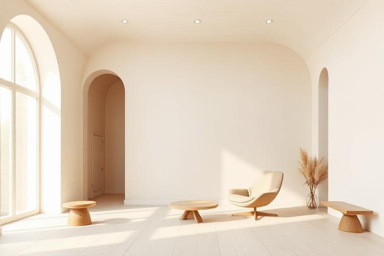
Soft Minimalism emerged as a corrective to the austerity of 1990s and 2000s Minimalism. While John Pawson and Claudio Silvestrin had demonstrated the power of radical reduction, their work could feel monastically severe. A new generation of designers, particularly in Copenhagen and Antwerp, asked whether emptiness had to mean coldness. Norm Architects in Denmark and Vincent Van Duysen in Belgium became the movement's defining voices, producing spaces that were visually restrained but sensorially rich.
The key shift was material. Where hard Minimalism favored polished concrete, steel, and glass, Soft Minimalism chose rough-sawn oak, limestone with visible fossil marks, plaster with trowel texture, linen curtains, and ceramics with irregular glazes. The palette warmed from grey-white to cream-terracotta. Furniture by Menu, Audo Copenhagen, and Boffi softened geometric forms with rounded edges and natural finishes. The result was rooms that photographed as minimal but felt, when inhabited, as enveloping.
The style became commercially dominant in hospitality and residential design from the mid-2010s. Boutique hotels (Kinfolk's Copenhagen headquarters, the Audo concept space, Hotel The Exchange), high-end residential projects, and direct-to-consumer furniture brands all adopted the vocabulary. Critics note that Soft Minimalism can become as formulaic as any style when reduced to a palette (warm white, oak, linen, ceramic), but at its best it represents a genuine synthesis of visual restraint and sensory generosity.
The visual DNA: what makes it recognisable
- Refined sans-serifs: Cera Pro, Circular, GT Super Display (for warmth)
- Light and book weights only, never bold
- Generous tracking on uppercase, tight on lowercase
- Serif accents for editorial warmth: Freight, Chronicle, Canela
- Symmetry and asymmetry in studied balance
- Rooms organized around a single focal object or view
- Generous negative space but with textured surfaces preventing emptiness
- Low horizontal furniture proportions grounding the space
- Warm white and cream plaster: #F5F0E8, #EDE6D8, #E8E0D0
- Light oak and ash: #C4A87C, #D4C4A8, #B8A080
- Limestone and travertine: #D8D0C0, #C8C0B0, #E0D8C8
- Undyed linen and raw cotton: #EDE6D8, #E0D8C8
- Rounded edges on furniture and architectural elements
- Handmade ceramics with visible making marks
- Linen and natural textiles layered for depth
- Single sculptural object in an otherwise spare room
8-channel console - dominant channels taped & circled by the registrar
Your aesthetic passport - share the fingerprint
The style's primary materials, assembled bottom-up
Tap a stratum for material detail · Full catalog
Contemporary · 2000–present - tap any style to travel
4 color interpretations of this aesthetic
Join waitlist for access
Join the waitlist for full access
Join the waitlistSoft Minimalism: where the language earns its place
Soft Minimalism is most effective when its visual decisions do useful work. Minimalism without the cold - Norm Architects' tactile linen-and-limestone interiors, Vincent Van Duysen's Belgian warmth, the deliberate choice of rough-sawn oak over polished concrete when the room must breathe.
The style gives styling, proportion, and image sequencing a clear point of view rather than treating them as decoration.
It can turn atmosphere, material, and spatial pacing into evidence of a distinct experience before a visitor arrives.
It helps a physical or editorial environment feel authored, which raises attention and perceived care.
They recognize the references, proportion, and restraint that make the language feel intentional.
They respond to visible judgment because it reduces the feeling of interchangeable product.
A coherent aesthetic gives them a usable standard for choosing images, objects, and collaborators.
The cost comes from consistent art direction, suitable locations or materials, and time to edit the details that would otherwise undermine the premise.
The challenge is conceptual. It takes visual literacy and a real point of view to avoid borrowing surface cues without their original logic.
Lighting, casting, type, color, material, and retouching must agree. A single weak choice can make the work feel like an imitation.
Soft Minimalism creates its strongest advantage when it gives a brand a standard of judgment, not merely an attractive finish. It fails when recognizable cues are collected without a governing idea. The difference between average and exceptional execution is usually proportion: how much is shown, what is withheld, and whether every element belongs to the same world. The most capable teams pair an exacting art director with specialists who understand the medium, from photographer and stylist to set designer, editor, and typographer.
Should Soft Minimalism be the strategic choice?
Surface imitation is easy. The language becomes generic when familiar cues replace proportion, specificity, and a coherent system.
Its visual ingredients appear regularly in contemporary work, but a rigorous execution remains distinguishable from a loose collection of references.
Its strongest principles depend on composition, material, and cultural literacy rather than a short-lived visual effect.
It asks for consistency across photography, typography, motion, environments, and the many details that make a brand feel believable.
Soft Minimalism deserves serious consideration from brands and institutions that can articulate a real point of view and protect it through execution. It is less suitable for work that needs immediate instructional clarity, broad visual neutrality, or low-cost production flexibility. Its greatest advantage is differentiation through judgment: it can make a product, place, or editorial proposition feel authored rather than merely packaged. Average executions borrow recognizable signals, then lose coherence when type, casting, copy, or materials fail to agree. Exceptional executions understand the visual language as a system of choices, including what not to show. The largest mistake is treating the style as a finish applied after strategy. Adopt it only when the product and organization can carry the same standard of care the imagery proposes.
Join waitlist for access
Join the waitlist for editorial depth
Join the waitlistConnected across the creative knowledge graph