Registrar's index cards on the platen glass - captured by the scanner
1950s-present · South and Southeast Asia, West Africa, Brazil
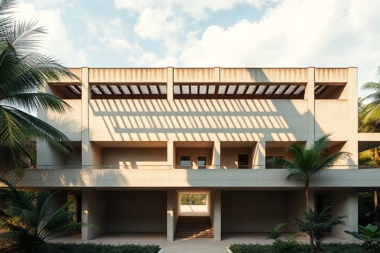
Tropical Modernism emerged when architects in post-colonial nations adapted Modernist principles to hot, humid climates that European Modernism had never addressed. Geoffrey Bawa in Sri Lanka, Balkrishna Doshi in India, and the partnership of Maxwell Fry and Jane Drew in West Africa were pioneers, developing strategies for shade, ventilation, and rain management that the International Style's glass curtain walls could never provide. Their buildings breathed: louvered walls, deep overhangs, courtyards, and cross-ventilation replaced the sealed, air-conditioned box.
Bawa's Parliament of Sri Lanka (1982), set on an island in a lake, and his Kandalama Hotel (1994), carved into a hillside and gradually consumed by jungle, demonstrated that Modernist spatial ambitions and tropical climate response were not only compatible but could produce architecture of extraordinary power. Doshi's Indian Institute of Management Bangalore (1992) and his own studio, Sangath (1981), used vaulted roofs, water channels, and garden courtyards to create naturally cooled working environments in one of the world's hottest climates.
Tropical Modernism has experienced a critical reassessment in recent years. The V&A mounted a major exhibition in 2023. Contemporary architects including Studio Mumbai (India), WOHA (Singapore), and Francis Kere (Burkina Faso/Germany) continue to develop architecture that responds to tropical conditions with modern means. As air conditioning's carbon cost becomes untenable, Tropical Modernism's passive strategies are recognized as essential knowledge rather than regional curiosities.
The visual DNA: what makes it recognisable
- Humanist sans-serifs: Gill Sans, Calibre, Source Sans
- Light weights reflecting visual lightness of brise-soleil
- Bilingual text reflecting post-colonial cultural contexts
- Generous spacing reflecting architectural openness
- Deep overhangs and verandas creating shaded transition zones
- Cross-ventilated plans with openings on opposing walls
- Courtyards as climate-moderating organizing elements
- Elevated ground floors for air circulation beneath the building
- Exposed laterite and local stone: #B87840, #A06830, #C88850
- Fair-faced concrete with tropical aggregate: #B0A898, #A09888
- Timber louvers and screens: #8C6840, #7C5830
- Terracotta tile roofing and flooring: #C87050, #B86040
- Brise-soleil (sun-breaking louvers) on sun-facing facades
- Perforated concrete screens (jaali) filtering light and air
- Water features for evaporative cooling
- Planted roofs and living walls merging building with jungle
8-channel console - dominant channels taped & circled by the registrar
Your aesthetic passport - share the fingerprint
The style's primary materials, assembled bottom-up
Tap a stratum for material detail · Full catalog
Postwar · 1950–1975 - tap any style to travel
4 color interpretations of this aesthetic
Join waitlist for access
Join the waitlist for full access
Join the waitlistTropical Modernism: where the language earns its place
Tropical Modernism is most effective when its visual decisions do useful work. Modernism rewritten by monsoon - Geoffrey Bawa's Sri Lankan courtyard bungalows dissolving into garden, Correa's tube houses pulling breeze through section, Niemeyer's Brasília swooping under the cerrado sky: Modernism learned to sweat.
The style gives styling, proportion, and image sequencing a clear point of view rather than treating them as decoration.
It can turn atmosphere, material, and spatial pacing into evidence of a distinct experience before a visitor arrives.
It helps a physical or editorial environment feel authored, which raises attention and perceived care.
They recognize the references, proportion, and restraint that make the language feel intentional.
They respond to visible judgment because it reduces the feeling of interchangeable product.
A coherent aesthetic gives them a usable standard for choosing images, objects, and collaborators.
The cost comes from consistent art direction, suitable locations or materials, and time to edit the details that would otherwise undermine the premise.
The challenge is conceptual. It takes visual literacy and a real point of view to avoid borrowing surface cues without their original logic.
Lighting, casting, type, color, material, and retouching must agree. A single weak choice can make the work feel like an imitation.
Tropical Modernism creates its strongest advantage when it gives a brand a standard of judgment, not merely an attractive finish. It fails when recognizable cues are collected without a governing idea. The difference between average and exceptional execution is usually proportion: how much is shown, what is withheld, and whether every element belongs to the same world. The most capable teams pair an exacting art director with specialists who understand the medium, from photographer and stylist to set designer, editor, and typographer.
Should Tropical Modernism be the strategic choice?
Surface imitation is easy. The language becomes generic when familiar cues replace proportion, specificity, and a coherent system.
Its visual ingredients appear regularly in contemporary work, but a rigorous execution remains distinguishable from a loose collection of references.
Its strongest principles depend on composition, material, and cultural literacy rather than a short-lived visual effect.
It asks for consistency across photography, typography, motion, environments, and the many details that make a brand feel believable.
Tropical Modernism deserves serious consideration from brands and institutions that can articulate a real point of view and protect it through execution. It is less suitable for work that needs immediate instructional clarity, broad visual neutrality, or low-cost production flexibility. Its greatest advantage is differentiation through judgment: it can make a product, place, or editorial proposition feel authored rather than merely packaged. Average executions borrow recognizable signals, then lose coherence when type, casting, copy, or materials fail to agree. Exceptional executions understand the visual language as a system of choices, including what not to show. The largest mistake is treating the style as a finish applied after strategy. Adopt it only when the product and organization can carry the same standard of care the imagery proposes.
Join waitlist for access
Join the waitlist for editorial depth
Join the waitlistConnected across the creative knowledge graph