Registrar's index cards on the platen glass - captured by the scanner
Prehistoric to present · Every inhabited region on earth
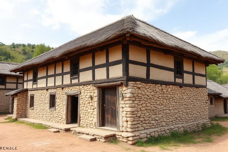
Vernacular architecture is building shaped by place rather than by professional design. Before architects existed as a profession, communities developed construction methods through generations of trial and error, responding to local climate, available materials, and cultural practices. The result was an extraordinary diversity of form: the thick-walled adobe compounds of the Sahel, the stilted longhouses of Southeast Asia, the sod-roofed turf houses of Iceland, the courtyard houses of the Middle East. Each solution was optimized for its specific conditions.
The study of vernacular architecture became serious in the twentieth century. Bernard Rudofsky's 'Architecture Without Architects' exhibition at MoMA (1964) presented anonymous building traditions as sophisticated design achievements. Hassan Fathy's 'Architecture for the Poor' (1973) argued that vernacular techniques in Egypt (mud brick, wind catchers, courtyard plans) outperformed imported Western Modernism for climate comfort and social appropriateness. The book influenced a generation of architects working in developing countries.
Contemporary architecture increasingly draws from vernacular intelligence. Passive cooling strategies from Middle Eastern courtyard houses inform sustainable design. Rammed earth construction has been refined for contemporary use. Diebedo Francis Kere integrates Burkinabe building traditions with modern engineering. The vernacular is no longer seen as primitive but as accumulated environmental knowledge that formal architecture is only beginning to rediscover.
The visual DNA: what makes it recognisable
- Hand-lettered or painted signage traditions
- Humanist typefaces reflecting craft: Jenson, Centaur, Bembo
- Irregular baselines and organic letter forms
- Regional script traditions integrated into architectural surfaces
- Organic settlement patterns following topography
- Courtyard plans organizing rooms around a central open space
- Additive construction: rooms and wings added over generations
- Orientation driven by prevailing wind and sun angles
- Mud brick and adobe: #C4A87C, #B89868, #A08858
- Whitewash and lime render: #F5F0E8, #EEECE8
- Local stone in dry-stack or mortar: #8A8478, #9C9488
- Thatch, timber, and woven materials: #B8A080, #8C7460
- Thick walls with deep window reveals for thermal mass
- Wind catchers and ventilation towers
- Projecting upper floors for shade (mashrabiya screens)
- Painted or carved decorative elements unique to each region
8-channel console - dominant channels taped & circled by the registrar
Your aesthetic passport - share the fingerprint
The style's primary materials, assembled bottom-up
Tap a stratum for material detail · Full catalog
Vernacular · 1600–present - tap any style to travel
4 color interpretations of this aesthetic
Join waitlist for access
Join the waitlist for full access
Join the waitlistVernacular Architecture: where the language earns its place
Vernacular Architecture is most effective when its visual decisions do useful work. Building without architects - the Cycladic whitewash village, the Malian mud mosque, the Norwegian stave church: forms that evolved over centuries in direct response to climate, material, and community without a single drafting table.
The style gives styling, proportion, and image sequencing a clear point of view rather than treating them as decoration.
It can turn atmosphere, material, and spatial pacing into evidence of a distinct experience before a visitor arrives.
It helps a physical or editorial environment feel authored, which raises attention and perceived care.
They recognize the references, proportion, and restraint that make the language feel intentional.
They respond to visible judgment because it reduces the feeling of interchangeable product.
A coherent aesthetic gives them a usable standard for choosing images, objects, and collaborators.
The cost comes from consistent art direction, suitable locations or materials, and time to edit the details that would otherwise undermine the premise.
The challenge is conceptual. It takes visual literacy and a real point of view to avoid borrowing surface cues without their original logic.
Lighting, casting, type, color, material, and retouching must agree. A single weak choice can make the work feel like an imitation.
Vernacular Architecture creates its strongest advantage when it gives a brand a standard of judgment, not merely an attractive finish. It fails when recognizable cues are collected without a governing idea. The difference between average and exceptional execution is usually proportion: how much is shown, what is withheld, and whether every element belongs to the same world. The most capable teams pair an exacting art director with specialists who understand the medium, from photographer and stylist to set designer, editor, and typographer.
Should Vernacular Architecture be the strategic choice?
Surface imitation is easy. The language becomes generic when familiar cues replace proportion, specificity, and a coherent system.
Its visual ingredients appear regularly in contemporary work, but a rigorous execution remains distinguishable from a loose collection of references.
Its strongest principles depend on composition, material, and cultural literacy rather than a short-lived visual effect.
It asks for consistency across photography, typography, motion, environments, and the many details that make a brand feel believable.
Vernacular Architecture deserves serious consideration from brands and institutions that can articulate a real point of view and protect it through execution. It is less suitable for work that needs immediate instructional clarity, broad visual neutrality, or low-cost production flexibility. Its greatest advantage is differentiation through judgment: it can make a product, place, or editorial proposition feel authored rather than merely packaged. Average executions borrow recognizable signals, then lose coherence when type, casting, copy, or materials fail to agree. Exceptional executions understand the visual language as a system of choices, including what not to show. The largest mistake is treating the style as a finish applied after strategy. Adopt it only when the product and organization can carry the same standard of care the imagery proposes.
Join waitlist for access
Join the waitlist for editorial depth
Join the waitlistConnected across the creative knowledge graph