Registrar's index cards on the platen glass - captured by the scanner
1980s-present · Japan and Western Europe
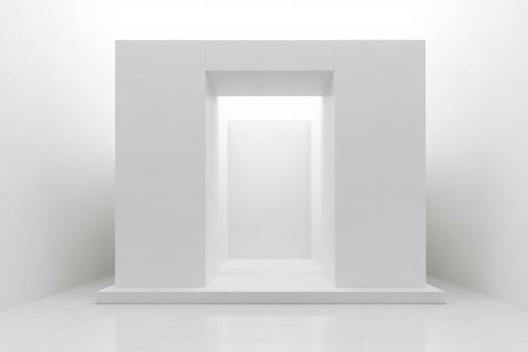
Architectural Minimalism crystallized in the 1980s when two distinct traditions converged. In Japan, Tadao Ando was building concrete meditation spaces where light, water, and bare material replaced ornament entirely. The Church of the Light in Osaka (1989), with its cruciform slit cutting through a concrete wall, demonstrated that subtraction could be more powerful than addition. In Europe, John Pawson was stripping domestic and retail spaces to their structural essence, influenced by his time living in a Japanese monastery.
The movement drew from multiple sources: Mies van der Rohe's 'less is more' (itself borrowed from Peter Behrens), Japanese concepts of ma (negative space) and wabi-sabi (beauty in imperfection), and Donald Judd's sculptural installations in Marfa, Texas. What distinguished Minimalist architecture from simply austere Modernism was intentionality: every joint, every material transition, every light condition was deliberated. Peter Zumthor's Therme Vals (1996), carved from local quartzite, became a pilgrimage site for the movement.
Contemporary Minimalism has expanded beyond concrete and white plaster. Alberto Campo Baeza works with light as primary material. SANAA (Sejima and Nishizawa) dissolves boundaries between interior and landscape with transparent and translucent surfaces. Vincent Van Duysen and John Pawson demonstrate that minimalism and warmth are not contradictions. The common thread remains: nothing is present that does not earn its place.
The visual DNA: what makes it recognisable
- Thin-weight sans-serifs: Helvetica Neue Light, Avenir, Gotham Thin
- Extreme restraint: one typeface, one or two weights
- Generous whitespace around text blocks
- Type as quiet information, never as decoration
- Single-material surfaces extending uninterrupted across large planes
- Concealed junctions: shadow gaps replace visible trim
- Precise proportional relationships between openings and walls
- Rooms defined by light conditions rather than by walls
- Poured concrete with controlled formwork: #A09C98, #8A8682
- White plaster and lime wash: #F8F6F2, #EEECE8
- Natural stone in monolithic slabs: #C8C4BC, #B0ACA4
- Warm wood as counterpoint: oak, walnut, hinoki cypress
- Slots and apertures framing specific views or light conditions
- Water as reflective surface and spatial boundary
- Flush doors and handleless cabinetry
- Single sculptural staircase as the room's only event
8-channel console - dominant channels taped & circled by the registrar
Your aesthetic passport - share the fingerprint
The style's primary materials, assembled bottom-up
Tap a stratum for material detail · Full catalog
Contemporary · 1960–present - tap any style to travel
5 color interpretations of this aesthetic
Join waitlist for access
Join the waitlist for full access
Join the waitlistArchitectural Minimalism: where the language earns its place
Architectural Minimalism is most effective when its visual decisions do useful work. Every element justified, nothing added - Tadao Ando's concrete walls cut by a single shaft of light, John Pawson's Calvin Klein store that made emptiness a selling environment, Peter Zumthor's thermal baths at Vals.
The style gives styling, proportion, and image sequencing a clear point of view rather than treating them as decoration.
It can turn atmosphere, material, and spatial pacing into evidence of a distinct experience before a visitor arrives.
It helps a physical or editorial environment feel authored, which raises attention and perceived care.
They recognize the references, proportion, and restraint that make the language feel intentional.
They respond to visible judgment because it reduces the feeling of interchangeable product.
A coherent aesthetic gives them a usable standard for choosing images, objects, and collaborators.
The cost comes from consistent art direction, suitable locations or materials, and time to edit the details that would otherwise undermine the premise.
The challenge is conceptual. It takes visual literacy and a real point of view to avoid borrowing surface cues without their original logic.
Lighting, casting, type, color, material, and retouching must agree. A single weak choice can make the work feel like an imitation.
Architectural Minimalism creates its strongest advantage when it gives a brand a standard of judgment, not merely an attractive finish. It fails when recognizable cues are collected without a governing idea. The difference between average and exceptional execution is usually proportion: how much is shown, what is withheld, and whether every element belongs to the same world. The most capable teams pair an exacting art director with specialists who understand the medium, from photographer and stylist to set designer, editor, and typographer.
Should Architectural Minimalism be the strategic choice?
Surface imitation is easy. The language becomes generic when familiar cues replace proportion, specificity, and a coherent system.
Its visual ingredients appear regularly in contemporary work, but a rigorous execution remains distinguishable from a loose collection of references.
Its strongest principles depend on composition, material, and cultural literacy rather than a short-lived visual effect.
It asks for consistency across photography, typography, motion, environments, and the many details that make a brand feel believable.
Architectural Minimalism deserves serious consideration from brands and institutions that can articulate a real point of view and protect it through execution. It is less suitable for work that needs immediate instructional clarity, broad visual neutrality, or low-cost production flexibility. Its greatest advantage is differentiation through judgment: it can make a product, place, or editorial proposition feel authored rather than merely packaged. Average executions borrow recognizable signals, then lose coherence when type, casting, copy, or materials fail to agree. Exceptional executions understand the visual language as a system of choices, including what not to show. The largest mistake is treating the style as a finish applied after strategy. Adopt it only when the product and organization can carry the same standard of care the imagery proposes.
Join waitlist for access
Join the waitlist for editorial depth
Join the waitlistConnected across the creative knowledge graph