Registrar's index cards on the platen glass - captured by the scanner
Traditional roots; contemporary practice 1970s-present · Japan
Japanese architectural minimalism is rooted in concepts that predate Western minimalism by centuries. Ma refers to the interval, the space between things that gives them meaning. Wabi-sabi embraces imperfection, impermanence, and incompleteness as essential qualities of beauty. The traditional Japanese tea room (chashitsu) embodied these principles: a small space of bare walls, natural materials, and a single flower arrangement, designed to focus attention on the ceremony and the guests rather than on the architecture itself.
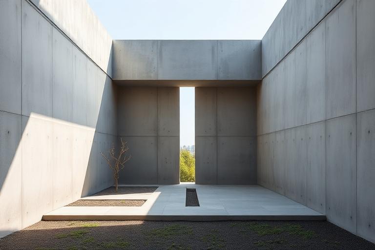
Modern Japanese minimalism emerged when these traditional sensibilities met Western Modernism. Tadao Ando, self-taught and influenced by both Le Corbusier and traditional Japanese spatial concepts, created a synthesis that was entirely new. His Row House in Sumiyoshi (1976) placed a small courtyard at the center of a narrow concrete house, forcing inhabitants to cross an open-air space in rain or shine to move between rooms. The inconvenience was the point: the house insisted on awareness of weather, light, and the passage of time.
Contemporary Japanese minimalism includes architects like Kazuyo Sejima and Ryue Nishizawa (SANAA), Jun Aoki, and Sou Fujimoto. SANAA's buildings approach transparency and dematerialization, with glass and thin white steel dissolving the boundary between building and surroundings. Fujimoto's House NA (2011) stacked transparent platforms without conventional rooms, making domestic life a continuous negotiation with openness. The tradition continues to prioritize experience, sensation, and awareness over formal expression.
The visual DNA: what makes it recognisable
- Thin-weight sans-serifs: Helvetica Neue Thin, Avenir Light
- Japanese type traditions: vertical setting, brush-influenced forms
- Extreme whitespace and minimal text presence
- Type as whisper rather than statement
- Tatami-module proportions (roughly 1:2 ratio) governing room dimensions
- Sliding partitions (fusuma, shoji) replacing fixed walls
- Engawa (transitional veranda) blurring inside and outside
- Plans organized around voids and courtyards rather than around rooms
- Smooth concrete: #C4C0B8, #B4B0A8, #A4A098
- Cypress and hinoki wood: #D8C8A8, #C8B898
- Washi paper and shoji screens: #F0ECE4, #E8E4DC
- Stone and gravel garden surfaces: #C0BCA8, #B0AC98
- Interior courtyards and light wells as the building's heart
- Flush surfaces with concealed junctions
- Single carefully placed objects (ikebana, a stone, a ceramic)
- Framed views of sky, garden, or a single tree
8-channel console - dominant channels taped & circled by the registrar
Your aesthetic passport - share the fingerprint
The style's primary materials, assembled bottom-up
Tap a stratum for material detail · Full catalog
Contemporary · 1980–present - tap any style to travel
4 color interpretations of this aesthetic
Join waitlist for access
Join the waitlist for full access
Join the waitlistJapanese Minimalism: where the language earns its place
Japanese Minimalism is most effective when its visual decisions do useful work. Ma - the charged void between elements - and wabi-sabi's embrace of impermanence and asymmetry: Ando's shadow-precise concrete, SANAA's dissolved glass boundaries, Kuma's natural material grids that absorb rather than impose.
The style gives styling, proportion, and image sequencing a clear point of view rather than treating them as decoration.
It can turn atmosphere, material, and spatial pacing into evidence of a distinct experience before a visitor arrives.
It helps a physical or editorial environment feel authored, which raises attention and perceived care.
They recognize the references, proportion, and restraint that make the language feel intentional.
They respond to visible judgment because it reduces the feeling of interchangeable product.
A coherent aesthetic gives them a usable standard for choosing images, objects, and collaborators.
The cost comes from consistent art direction, suitable locations or materials, and time to edit the details that would otherwise undermine the premise.
The challenge is conceptual. It takes visual literacy and a real point of view to avoid borrowing surface cues without their original logic.
Lighting, casting, type, color, material, and retouching must agree. A single weak choice can make the work feel like an imitation.
Japanese Minimalism creates its strongest advantage when it gives a brand a standard of judgment, not merely an attractive finish. It fails when recognizable cues are collected without a governing idea. The difference between average and exceptional execution is usually proportion: how much is shown, what is withheld, and whether every element belongs to the same world. The most capable teams pair an exacting art director with specialists who understand the medium, from photographer and stylist to set designer, editor, and typographer.
Should Japanese Minimalism be the strategic choice?
Surface imitation is easy. The language becomes generic when familiar cues replace proportion, specificity, and a coherent system.
Its visual ingredients appear regularly in contemporary work, but a rigorous execution remains distinguishable from a loose collection of references.
Its strongest principles depend on composition, material, and cultural literacy rather than a short-lived visual effect.
It asks for consistency across photography, typography, motion, environments, and the many details that make a brand feel believable.
Japanese Minimalism deserves serious consideration from brands and institutions that can articulate a real point of view and protect it through execution. It is less suitable for work that needs immediate instructional clarity, broad visual neutrality, or low-cost production flexibility. Its greatest advantage is differentiation through judgment: it can make a product, place, or editorial proposition feel authored rather than merely packaged. Average executions borrow recognizable signals, then lose coherence when type, casting, copy, or materials fail to agree. Exceptional executions understand the visual language as a system of choices, including what not to show. The largest mistake is treating the style as a finish applied after strategy. Adopt it only when the product and organization can carry the same standard of care the imagery proposes.
Join waitlist for access
Join the waitlist for editorial depth
Join the waitlistConnected across the creative knowledge graph