Registrar's index cards on the platen glass - captured by the scanner
1960s-present · Global, with centers in Spain, Iraq/UK, and the Gulf states
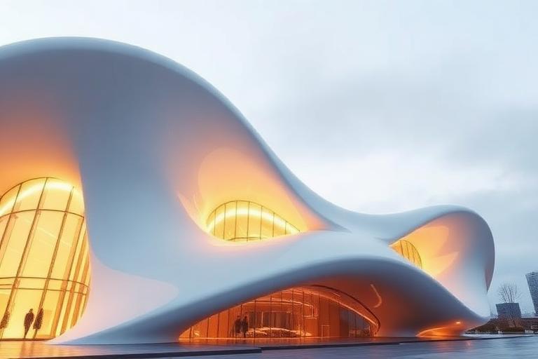
Neo-Futurism revived the early Italian Futurists' fascination with speed and dynamism but replaced their paper manifestos with real engineering. The term gained currency in the 1960s with Eero Saarinen's TWA Terminal at JFK (1962), whose swooping concrete shells made an airport feel like flight itself. Saarinen proved that expressive structure was not incompatible with function, and the building remained the movement's touchstone until Santiago Calatrava and Zaha Hadid expanded the vocabulary in the 1990s.
Calatrava, trained as both architect and structural engineer, developed a language of skeletal, kinetic forms: bridges that resemble spines, train stations that open like bird wings, and towers that twist as they rise. His City of Arts and Sciences in Valencia (1998-2005) is a Neo-Futurist city quarter. Hadid, working from a different direction, used parametric software to generate flowing, landscape-like forms: the Heydar Aliyev Center in Baku (2012), the London Aquatics Centre (2011), and the Guangzhou Opera House (2010) all demonstrate architecture freed from orthogonal constraint.
The Gulf states became Neo-Futurism's primary laboratory in the 2000s, with oil wealth funding landmark buildings in Dubai, Abu Dhabi, and Doha. The style has faced criticism for spectacular form disconnected from context and sustainability, but its engineering innovations in shell structures, parametric modeling, and construction technology have permanently expanded architecture's formal possibilities.
The visual DNA: what makes it recognisable
- Streamlined sans-serifs: Gotham, Proxima Nova, Calibre
- Thin or ultralight weights suggesting structural tension
- Curved or custom letterforms echoing architectural forms
- Dynamic text layouts with angled or flowing baselines
- Freeform curves replacing orthogonal structure
- Ribbed structural systems creating rhythmic repetition along curves
- Asymmetric silhouettes designed for dramatic approach sequences
- Ground planes that flow upward into building surfaces
- White concrete and GRC (glass-reinforced concrete): #F0EEEA, #E4E2DE
- Structural steel exposed and painted white: #EBEBEB, #D8D8D8
- Glass in complex curved panels: #C0D0E0, #B0C0D0
- Titanium and aluminum cladding: #C8CCD0, #B8BCC0
- Ribbed or skeletal structures suggesting organic growth
- Kinetic elements: operable facades, retractable roofs
- Continuous surfaces flowing from ground to wall to roof
- Dramatic cantilevers and spans at structural limits
8-channel console - dominant channels taped & circled by the registrar
Your aesthetic passport - share the fingerprint
The style's primary materials, assembled bottom-up
Tap a stratum for material detail · Full catalog
Future-Facing · 2000–present - tap any style to travel
4 color interpretations of this aesthetic
Join waitlist for access
Join the waitlist for full access
Join the waitlistNeo-Futurism: where the language earns its place
Neo-Futurism is most effective when its visual decisions do useful work. Computation-enabled structural spectacle - Calatrava's bone-white cable-stayed bridges, Hadid's fluid ground planes, BIG's hedonistic pragmatism - buildings that perform the idea of the future for cities that can afford to commission it.
The style gives styling, proportion, and image sequencing a clear point of view rather than treating them as decoration.
It can turn atmosphere, material, and spatial pacing into evidence of a distinct experience before a visitor arrives.
It helps a physical or editorial environment feel authored, which raises attention and perceived care.
They recognize the references, proportion, and restraint that make the language feel intentional.
They respond to visible judgment because it reduces the feeling of interchangeable product.
A coherent aesthetic gives them a usable standard for choosing images, objects, and collaborators.
The cost comes from consistent art direction, suitable locations or materials, and time to edit the details that would otherwise undermine the premise.
The challenge is conceptual. It takes visual literacy and a real point of view to avoid borrowing surface cues without their original logic.
Lighting, casting, type, color, material, and retouching must agree. A single weak choice can make the work feel like an imitation.
Neo-Futurism creates its strongest advantage when it gives a brand a standard of judgment, not merely an attractive finish. It fails when recognizable cues are collected without a governing idea. The difference between average and exceptional execution is usually proportion: how much is shown, what is withheld, and whether every element belongs to the same world. The most capable teams pair an exacting art director with specialists who understand the medium, from photographer and stylist to set designer, editor, and typographer.
Should Neo-Futurism be the strategic choice?
Surface imitation is easy. The language becomes generic when familiar cues replace proportion, specificity, and a coherent system.
Its visual ingredients appear regularly in contemporary work, but a rigorous execution remains distinguishable from a loose collection of references.
Its strongest principles depend on composition, material, and cultural literacy rather than a short-lived visual effect.
It asks for consistency across photography, typography, motion, environments, and the many details that make a brand feel believable.
Neo-Futurism deserves serious consideration from brands and institutions that can articulate a real point of view and protect it through execution. It is less suitable for work that needs immediate instructional clarity, broad visual neutrality, or low-cost production flexibility. Its greatest advantage is differentiation through judgment: it can make a product, place, or editorial proposition feel authored rather than merely packaged. Average executions borrow recognizable signals, then lose coherence when type, casting, copy, or materials fail to agree. Exceptional executions understand the visual language as a system of choices, including what not to show. The largest mistake is treating the style as a finish applied after strategy. Adopt it only when the product and organization can carry the same standard of care the imagery proposes.
Join waitlist for access
Join the waitlist for editorial depth
Join the waitlistConnected across the creative knowledge graph