Registrar's index cards on the platen glass - captured by the scanner
1919-1933 (school); influence ongoing · Weimar, Dessau, and Berlin, Germany
Walter Gropius founded the Bauhaus in Weimar in 1919 with a radical manifesto: art and craft should reunite under architecture. The school brought painters (Kandinsky, Klee, Moholy-Nagy), craftspeople, and architects under one roof, requiring every student to pass through foundation courses in color, form, and material before specializing. Architecture was always the stated goal, though the school initially had no architecture department. The early Bauhaus was expressionist and craft-oriented, producing handmade ceramics, textiles, and metalwork.
The move to Dessau in 1925 marked the shift toward industrial rationalism. Gropius designed the new Bauhaus building as a manifesto: glass curtain walls wrapping around reinforced concrete, a bridge connecting workshop and classroom blocks, flat roofs, and no ornament. The Masters' Houses nearby showed the domestic application. Hannes Meyer succeeded Gropius as director in 1928 and pushed toward social housing and scientific functionalism. Mies van der Rohe took over in 1930 and depoliticized the school, but the Nazis closed it in 1933.
The diaspora was the movement's amplifier. Gropius went to Harvard, Mies to IIT Chicago, Moholy-Nagy founded the New Bauhaus (later IIT Institute of Design). Josef and Anni Albers went to Black Mountain College. They carried the pedagogical method and design principles worldwide, establishing the foundation for modern design education. The Bauhaus building in Dessau, restored and now a UNESCO World Heritage Site, remains the clearest single statement of the school's architectural vision.
The visual DNA: what makes it recognisable
- Geometric sans-serifs: Futura, Bauhaus, ITC Bauhaus
- Lowercase-only as ideological statement (Herbert Bayer)
- Bold weight contrasts for hierarchy
- Type integrated with geometric compositions
- Asymmetric compositions balanced by visual weight
- Interlocking rectangular volumes
- Pinwheel plans with wings extending from a central core
- Floor plans as abstract compositions legible from above
- White rendered walls: #F5F5F0, #EBEBEB
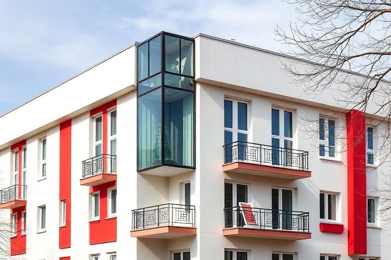
- Glass curtain walls and corner windows
- Primary color accents: #E4002B, #FFD100, #0057B8
- Industrial steel and concrete left visible
- Corner windows dissolving the junction between walls
- Cantilevered balconies with tubular steel railings
- Flat roofs used as terraces
- Color-coded wayfinding: each function a different primary
8-channel console - dominant channels taped & circled by the registrar
Your aesthetic passport - share the fingerprint
The style's primary materials, assembled bottom-up
Tap a stratum for material detail · Full catalog
Early Modern · 1919–1933 - tap any style to travel
4 color interpretations of this aesthetic
Join waitlist for access
Join the waitlist for full access
Join the waitlistBauhaus Architecture: where the language earns its place
Bauhaus Architecture is most effective when its visual decisions do useful work. Gropius's school that lasted fourteen years and changed everything - where painting, weaving, typography, and building shared a single workshop belief that honest design could reform industrial society.
The style gives styling, proportion, and image sequencing a clear point of view rather than treating them as decoration.
It can turn atmosphere, material, and spatial pacing into evidence of a distinct experience before a visitor arrives.
It helps a physical or editorial environment feel authored, which raises attention and perceived care.
They recognize the references, proportion, and restraint that make the language feel intentional.
They respond to visible judgment because it reduces the feeling of interchangeable product.
A coherent aesthetic gives them a usable standard for choosing images, objects, and collaborators.
The cost comes from consistent art direction, suitable locations or materials, and time to edit the details that would otherwise undermine the premise.
The challenge is conceptual. It takes visual literacy and a real point of view to avoid borrowing surface cues without their original logic.
Lighting, casting, type, color, material, and retouching must agree. A single weak choice can make the work feel like an imitation.
Bauhaus Architecture creates its strongest advantage when it gives a brand a standard of judgment, not merely an attractive finish. It fails when recognizable cues are collected without a governing idea. The difference between average and exceptional execution is usually proportion: how much is shown, what is withheld, and whether every element belongs to the same world. The most capable teams pair an exacting art director with specialists who understand the medium, from photographer and stylist to set designer, editor, and typographer.
Should Bauhaus Architecture be the strategic choice?
Surface imitation is easy. The language becomes generic when familiar cues replace proportion, specificity, and a coherent system.
Its visual ingredients appear regularly in contemporary work, but a rigorous execution remains distinguishable from a loose collection of references.
Its strongest principles depend on composition, material, and cultural literacy rather than a short-lived visual effect.
It asks for consistency across photography, typography, motion, environments, and the many details that make a brand feel believable.
Bauhaus Architecture deserves serious consideration from brands and institutions that can articulate a real point of view and protect it through execution. It is less suitable for work that needs immediate instructional clarity, broad visual neutrality, or low-cost production flexibility. Its greatest advantage is differentiation through judgment: it can make a product, place, or editorial proposition feel authored rather than merely packaged. Average executions borrow recognizable signals, then lose coherence when type, casting, copy, or materials fail to agree. Exceptional executions understand the visual language as a system of choices, including what not to show. The largest mistake is treating the style as a finish applied after strategy. Adopt it only when the product and organization can carry the same standard of care the imagery proposes.
Join waitlist for access
Join the waitlist for editorial depth
Join the waitlistConnected across the creative knowledge graph