Registrar's index cards on the platen glass - captured by the scanner
1910-1925 (historical); ongoing influence · Germany, Netherlands, and Central Europe
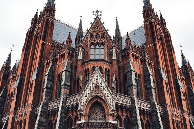
Expressionist architecture emerged alongside Expressionism in painting and cinema in the years surrounding World War I. Where Modernism would later insist on rational function and structural logic, Expressionism sought emotional impact through distorted forms, unusual materials, and visionary spatial experiences. Erich Mendelsohn's Einstein Tower in Potsdam (1921) was designed as a flowing, organic sculpture in concrete, though construction limitations forced compromises with brick and stucco.
The movement produced two distinct strands. The visionary strand (Bruno Taut's Alpine Architecture drawings, Hermann Finsterlin's organic fantasies, Rudolf Steiner's Goetheanum in Dornach) imagined buildings as crystalline, organic, or cosmic forms that transcended conventional function. The built strand (Mendelsohn's commercial buildings, Fritz Hoger's Chilehaus in Hamburg, Michel de Klerk's housing in Amsterdam) applied expressive form to real programs, producing buildings that combined practical function with sculptural power.
Expressionism was largely absorbed into the International Style by the mid-1920s, as Mendelsohn and others moderated their formal experiments. But its influence persisted in the organic architecture of Aalto and Scharoun, the sculptural concrete of Le Corbusier's late work (Ronchamp, 1955), the Deconstructivist movement of the 1980s, and contemporary architects like Frank Gehry whose work prioritizes emotional and sensory impact over systematic rationality.
The visual DNA: what makes it recognisable
- Angular, hand-drawn, and expressionistic lettering
- Blackletter and fractured type forms
- Irregular baselines and organic letter spacing
- Display faces with dramatic contrast and sharp terminals
- Distorted geometries: acute angles, curved walls, tilted planes
- Pointed and faceted rooflines creating crystalline silhouettes
- Plans driven by sculptural intention rather than functional efficiency
- Vertical emphasis with soaring interior volumes
- Brick in expressive bonding patterns: #8B4513, #A0522D, #6B3410
- Sculpted concrete and stucco: #B0ACA4, #9C9890
- Colored and stained glass: deep blues, ambers, rubies
- Glazed tile and ceramic in vivid colors: #2255AA, #AA3322, #DDAA22
- Crystalline and faceted roof forms
- Pointed arches and parabolic curves
- Towers and spires reaching dramatically upward
- Sculpted facade surfaces with deep relief patterns
8-channel console - dominant channels taped & circled by the registrar
Your aesthetic passport - share the fingerprint
The style's primary materials, assembled bottom-up
Tap a stratum for material detail · Full catalog
Early Modern · 1910–1925 - tap any style to travel
4 color interpretations of this aesthetic
Join waitlist for access
Join the waitlist for full access
Join the waitlistArchitectural Expressionism: where the language earns its place
Architectural Expressionism is most effective when its visual decisions do useful work. Buildings as psychic projection - Mendelsohn's Einstein Tower sculpted from concrete intuition, Gaudí's Sagrada Família growing from stone and faith, Poelzig's Grosses Schauspielhaus as a cave of stalactites: emotion precedes structure.
The style gives styling, proportion, and image sequencing a clear point of view rather than treating them as decoration.
It can turn atmosphere, material, and spatial pacing into evidence of a distinct experience before a visitor arrives.
It helps a physical or editorial environment feel authored, which raises attention and perceived care.
They recognize the references, proportion, and restraint that make the language feel intentional.
They respond to visible judgment because it reduces the feeling of interchangeable product.
A coherent aesthetic gives them a usable standard for choosing images, objects, and collaborators.
The cost comes from consistent art direction, suitable locations or materials, and time to edit the details that would otherwise undermine the premise.
The challenge is conceptual. It takes visual literacy and a real point of view to avoid borrowing surface cues without their original logic.
Lighting, casting, type, color, material, and retouching must agree. A single weak choice can make the work feel like an imitation.
Architectural Expressionism creates its strongest advantage when it gives a brand a standard of judgment, not merely an attractive finish. It fails when recognizable cues are collected without a governing idea. The difference between average and exceptional execution is usually proportion: how much is shown, what is withheld, and whether every element belongs to the same world. The most capable teams pair an exacting art director with specialists who understand the medium, from photographer and stylist to set designer, editor, and typographer.
Should Architectural Expressionism be the strategic choice?
Surface imitation is easy. The language becomes generic when familiar cues replace proportion, specificity, and a coherent system.
Its visual ingredients appear regularly in contemporary work, but a rigorous execution remains distinguishable from a loose collection of references.
Its strongest principles depend on composition, material, and cultural literacy rather than a short-lived visual effect.
It asks for consistency across photography, typography, motion, environments, and the many details that make a brand feel believable.
Architectural Expressionism deserves serious consideration from brands and institutions that can articulate a real point of view and protect it through execution. It is less suitable for work that needs immediate instructional clarity, broad visual neutrality, or low-cost production flexibility. Its greatest advantage is differentiation through judgment: it can make a product, place, or editorial proposition feel authored rather than merely packaged. Average executions borrow recognizable signals, then lose coherence when type, casting, copy, or materials fail to agree. Exceptional executions understand the visual language as a system of choices, including what not to show. The largest mistake is treating the style as a finish applied after strategy. Adopt it only when the product and organization can carry the same standard of care the imagery proposes.
Join waitlist for access
Join the waitlist for editorial depth
Join the waitlistConnected across the creative knowledge graph