Registrar's index cards on the platen glass - captured by the scanner
12th-16th centuries (historical); Gothic Revival 18th-19th centuries · Ile-de-France, expanding across Europe
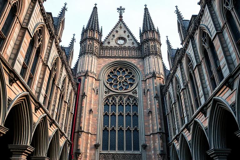
Gothic architecture began with a structural innovation. Abbot Suger's renovation of the Abbey of Saint-Denis near Paris (1140-1144) combined three existing elements (pointed arch, ribbed vault, flying buttress) into a new structural system that transferred the weight of stone roofs outward through buttresses rather than through massive walls. The result was revolutionary: walls could be opened up with enormous windows filled with stained glass, flooding interiors with colored light. Notre-Dame de Paris (begun 1163), Chartres Cathedral (1194), and Sainte-Chapelle (1248) each pushed the system further.
The style spread across Europe, adapting to regional materials and traditions: English Perpendicular Gothic (King's College Chapel, Cambridge), French Rayonnant (Sainte-Chapelle), German Hallenkirche (hall churches with equal-height aisles), and Italian Gothic (which retained broader walls and more surface decoration). Each variant shared the fundamental ambition: to create soaring interior spaces that dissolved the boundary between structure and light. Gothic cathedrals remain the largest enclosed spaces built before the industrial revolution.
Gothic Revival in the eighteenth and nineteenth centuries (Pugin, Viollet-le-Duc, the Palace of Westminster) reinterpreted Gothic forms with contemporary materials and methods. The movement argued that Gothic was not a historical curiosity but a living system of design principles (structural honesty, material expression, ornament derived from construction). This argument directly influenced the Arts and Crafts movement and, through it, early Modernism.
The visual DNA: what makes it recognisable
- Blackletter and Gothic script: Fraktur, Textura, Schwabacher
- Uncial and insular letterforms for display
- Carved stone inscriptions with serifs derived from chisel technique
- Illuminated manuscript traditions influencing color and decoration
- Nave-aisle-transept cruciform plans
- Vertical emphasis: height-to-width ratios of 3:1 or higher
- Bay system of alternating piers and arches creating rhythmic procession
- West facade composition: twin towers flanking rose window and portals
- Cut limestone and sandstone: #E0DCD4, #D0CCC4, #C8C4BC
- Stained glass: deep blue, ruby red, gold, emerald
- Lead came and iron armatures for glazing
- Polychrome stone and painted interior surfaces
- Pointed arches (ogival arches) as primary structural and decorative element
- Flying buttresses transferring roof loads outward
- Rose windows with radiating stone tracery
- Gargoyles and grotesques as water spouts and protective symbols
8-channel console - dominant channels taped & circled by the registrar
Your aesthetic passport - share the fingerprint
The style's primary materials, assembled bottom-up
Tap a stratum for material detail · Full catalog
Medieval · 1140–1500 - tap any style to travel
4 color interpretations of this aesthetic
Join waitlist for access
Join the waitlist for full access
Join the waitlistGothic Architecture: where the language earns its place
Gothic Architecture is most effective when its visual decisions do useful work. The medieval engineering miracle that made stone weightless - pointed arch, flying buttress, and ribbed vault working together to dissolve walls into stained glass at Chartres, and reaching its delirious chromatic limit at Sainte-Chapelle.
The style gives styling, proportion, and image sequencing a clear point of view rather than treating them as decoration.
It can turn atmosphere, material, and spatial pacing into evidence of a distinct experience before a visitor arrives.
It helps a physical or editorial environment feel authored, which raises attention and perceived care.
They recognize the references, proportion, and restraint that make the language feel intentional.
They respond to visible judgment because it reduces the feeling of interchangeable product.
A coherent aesthetic gives them a usable standard for choosing images, objects, and collaborators.
The cost comes from consistent art direction, suitable locations or materials, and time to edit the details that would otherwise undermine the premise.
The challenge is conceptual. It takes visual literacy and a real point of view to avoid borrowing surface cues without their original logic.
Lighting, casting, type, color, material, and retouching must agree. A single weak choice can make the work feel like an imitation.
Gothic Architecture creates its strongest advantage when it gives a brand a standard of judgment, not merely an attractive finish. It fails when recognizable cues are collected without a governing idea. The difference between average and exceptional execution is usually proportion: how much is shown, what is withheld, and whether every element belongs to the same world. The most capable teams pair an exacting art director with specialists who understand the medium, from photographer and stylist to set designer, editor, and typographer.
Should Gothic Architecture be the strategic choice?
Surface imitation is easy. The language becomes generic when familiar cues replace proportion, specificity, and a coherent system.
Its visual ingredients appear regularly in contemporary work, but a rigorous execution remains distinguishable from a loose collection of references.
Its strongest principles depend on composition, material, and cultural literacy rather than a short-lived visual effect.
It asks for consistency across photography, typography, motion, environments, and the many details that make a brand feel believable.
Gothic Architecture deserves serious consideration from brands and institutions that can articulate a real point of view and protect it through execution. It is less suitable for work that needs immediate instructional clarity, broad visual neutrality, or low-cost production flexibility. Its greatest advantage is differentiation through judgment: it can make a product, place, or editorial proposition feel authored rather than merely packaged. Average executions borrow recognizable signals, then lose coherence when type, casting, copy, or materials fail to agree. Exceptional executions understand the visual language as a system of choices, including what not to show. The largest mistake is treating the style as a finish applied after strategy. Adopt it only when the product and organization can carry the same standard of care the imagery proposes.
Join waitlist for access
Join the waitlist for editorial depth
Join the waitlistConnected across the creative knowledge graph