Registrar's index cards on the platen glass - captured by the scanner
1990s-present · Switzerland, with global adoption
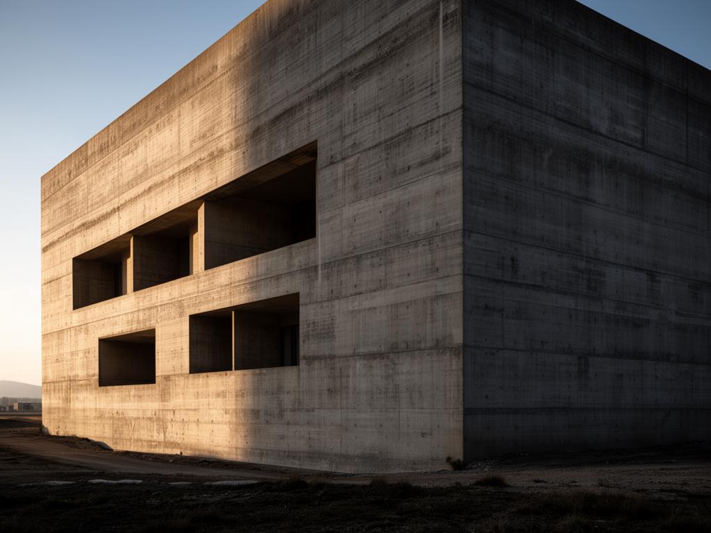
Monolithic architecture treats the building as a single sculpted mass rather than an assembly of parts. Where most contemporary architecture celebrates the joint, the connection, and the layered facade, monolithic buildings present continuous surfaces of a single material, as if carved from solid stone or cast in one pour. The Swiss tradition produced its most articulate practitioners: Peter Zumthor's Bruder Klaus Chapel (2007), a concrete shell formed by burning out a timber interior mold, is literally monolithic. Valerio Olgiati's Atelier Bardill (2007), a concrete house inserted into a Graubunden village, reads as a single red concrete block with rooms carved from its mass.
The monolithic impulse has historical roots in ancient architecture (Egyptian temples, Nabataean tombs carved from living rock) and in twentieth-century precedents (Louis Kahn's massive brick and concrete buildings at Dhaka and Ahmedabad). What distinguishes contemporary monolithic practice is its self-consciousness: these architects choose mass in an era when technology makes lightness and transparency easy. The heaviness is a deliberate aesthetic and philosophical position.
The approach demands material mastery. A monolithic building cannot hide imperfections behind cladding or behind a second material. The concrete mix, the formwork, the pouring sequence, and the curing conditions all become visible on the finished surface. This is architecture that takes its craft as seriously as its concept, producing buildings that reward prolonged attention: each surface tells the story of its making.
The visual DNA: what makes it recognisable
- Heavy-weight sans-serifs: Founders Grotesk, Graphik, Suisse Int'l
- Single typeface, single weight: no hierarchy through variety
- Uppercase with deliberate mass and presence
- Type that feels carved or stamped rather than printed
- Single-material volumes with rooms subtracted from the mass
- Few or no visible joints, connections, or material transitions
- Small windows punched into thick walls
- Plans as excavations within a solid, not assemblies of walls
- Pigmented concrete in earth tones: #8C7C6C, #7C6C5C, #6C5C4C
- Rammed earth and compressed soil: #B89878, #A08868
- Solid stone (limestone, sandstone, basalt): #9C9488, #8C8478
- Monochrome brick in stack bond: #A08070, #907060
- Deep window reveals emphasizing wall thickness
- Entrances as carved openings rather than applied doors
- Continuous material wrapping from ground to wall to roof
- Rough or board-marked surfaces showing construction process
8-channel console - dominant channels taped & circled by the registrar
Your aesthetic passport - share the fingerprint
The style's primary materials, assembled bottom-up
Tap a stratum for material detail · Full catalog
Postwar · 1960–present - tap any style to travel
4 color interpretations of this aesthetic
Join waitlist for access
Join the waitlist for full access
Join the waitlistMonolithic Architecture: where the language earns its place
Monolithic Architecture is most effective when its visual decisions do useful work. Mass as the only argument - Valerio Olgiati's Plantahof Auditorium carved from a single white volume, Aires Mateus's Portuguese houses closed to the road and open to the sky, Peter Zumthor's Bruder Klaus chapel lit by a single oculus.
The style gives styling, proportion, and image sequencing a clear point of view rather than treating them as decoration.
It can turn atmosphere, material, and spatial pacing into evidence of a distinct experience before a visitor arrives.
It helps a physical or editorial environment feel authored, which raises attention and perceived care.
They recognize the references, proportion, and restraint that make the language feel intentional.
They respond to visible judgment because it reduces the feeling of interchangeable product.
A coherent aesthetic gives them a usable standard for choosing images, objects, and collaborators.
The cost comes from consistent art direction, suitable locations or materials, and time to edit the details that would otherwise undermine the premise.
The challenge is conceptual. It takes visual literacy and a real point of view to avoid borrowing surface cues without their original logic.
Lighting, casting, type, color, material, and retouching must agree. A single weak choice can make the work feel like an imitation.
Monolithic Architecture creates its strongest advantage when it gives a brand a standard of judgment, not merely an attractive finish. It fails when recognizable cues are collected without a governing idea. The difference between average and exceptional execution is usually proportion: how much is shown, what is withheld, and whether every element belongs to the same world. The most capable teams pair an exacting art director with specialists who understand the medium, from photographer and stylist to set designer, editor, and typographer.
Should Monolithic Architecture be the strategic choice?
Surface imitation is easy. The language becomes generic when familiar cues replace proportion, specificity, and a coherent system.
Its visual ingredients appear regularly in contemporary work, but a rigorous execution remains distinguishable from a loose collection of references.
Its strongest principles depend on composition, material, and cultural literacy rather than a short-lived visual effect.
It asks for consistency across photography, typography, motion, environments, and the many details that make a brand feel believable.
Monolithic Architecture deserves serious consideration from brands and institutions that can articulate a real point of view and protect it through execution. It is less suitable for work that needs immediate instructional clarity, broad visual neutrality, or low-cost production flexibility. Its greatest advantage is differentiation through judgment: it can make a product, place, or editorial proposition feel authored rather than merely packaged. Average executions borrow recognizable signals, then lose coherence when type, casting, copy, or materials fail to agree. Exceptional executions understand the visual language as a system of choices, including what not to show. The largest mistake is treating the style as a finish applied after strategy. Adopt it only when the product and organization can carry the same standard of care the imagery proposes.
Join waitlist for access
Join the waitlist for editorial depth
Join the waitlistConnected across the creative knowledge graph