Registrar's index cards on the platen glass - captured by the scanner
5th century BCE-present · Ancient Greece, codified by Rome, revived repeatedly
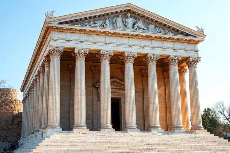
Classical architecture begins with the Greek temple. The Parthenon (447-432 BCE) established principles that would govern Western building for two and a half millennia: the column as structural and expressive element, the entablature it supports, the pediment that crowns the composition, and the system of proportional relationships binding them together. The three Greek orders (Doric, Ionic, Corinthian) provided a vocabulary of increasing elaboration, each with specific ratios of column diameter to height, capital decoration, and entablature detail.
Rome adopted and expanded the Greek system, adding the Tuscan and Composite orders, developing the arch and vault (which the Greeks largely avoided), and deploying classical language at imperial scale. The Colosseum stacked all three Greek orders on its facade. Roman concrete enabled the Pantheon's unsupported dome. When Vitruvius wrote 'De Architectura' (c. 30 BCE), he codified the principles of firmitas, utilitas, and venustas (firmness, commodity, and delight) that remain architecture's foundational triad.
The Renaissance rediscovered Vitruvius and the ruins. Brunelleschi, Alberti, Palladio, and their successors studied Roman buildings with measuring tapes and sketchbooks, producing treatises that standardized classical proportion for the modern world. Palladio's 'Four Books of Architecture' (1570) became the most influential architectural text ever written, shaping everything from English country houses to the American Capitol. Classical architecture never truly stopped being built; even Modernism's rejection of it was framed in its terms.
The visual DNA: what makes it recognisable
- Roman capitals: Trajan, Optima, Centaur
- Inscriptional letter-spacing with serifs derived from chisel marks
- Symmetrical title-page layouts
- Uppercase for monumental inscriptions, mixed case for text
- Symmetry about a central axis
- Tripartite vertical division: base (stylobate), column (shaft), top (entablature)
- Intercolumniation ratios governing facade rhythm
- Golden section and root-2 rectangles in plan and elevation
- White marble and limestone: #F0EDE8, #E8E4DC, #D8D4CC
- Warm stone tones: #C8BC9C, #B8AC90, #D0C4A8
- Patinated bronze and copper: #6B7C5C, #7C8C6C
- Terra cotta and brick under stucco: #C8A888, #B89878
- Column orders: Doric (plain), Ionic (scrolled), Corinthian (acanthus leaf)
- Pediments (triangular gable ends) over porticos
- Coffered ceilings and barrel vaults
- Acanthus leaf, egg-and-dart, and dentil moldings
8-channel console - dominant channels taped & circled by the registrar
Your aesthetic passport - share the fingerprint
The style's primary materials, assembled bottom-up
Tap a stratum for material detail · Full catalog
Antiquity · 700 BCE–400 - tap any style to travel
4 color interpretations of this aesthetic
Join waitlist for access
Join the waitlist for full access
Join the waitlistClassical Architecture: where the language earns its place
Classical Architecture is most effective when its visual decisions do useful work. The grammar of the Western built world - column orders, tripartite elevation, and the Parthenon's optical corrections have been the foundation of architectural education from Vitruvius through the Beaux-Arts.
The style gives styling, proportion, and image sequencing a clear point of view rather than treating them as decoration.
It can turn atmosphere, material, and spatial pacing into evidence of a distinct experience before a visitor arrives.
It helps a physical or editorial environment feel authored, which raises attention and perceived care.
They recognize the references, proportion, and restraint that make the language feel intentional.
They respond to visible judgment because it reduces the feeling of interchangeable product.
A coherent aesthetic gives them a usable standard for choosing images, objects, and collaborators.
The cost comes from consistent art direction, suitable locations or materials, and time to edit the details that would otherwise undermine the premise.
The challenge is conceptual. It takes visual literacy and a real point of view to avoid borrowing surface cues without their original logic.
Lighting, casting, type, color, material, and retouching must agree. A single weak choice can make the work feel like an imitation.
Classical Architecture creates its strongest advantage when it gives a brand a standard of judgment, not merely an attractive finish. It fails when recognizable cues are collected without a governing idea. The difference between average and exceptional execution is usually proportion: how much is shown, what is withheld, and whether every element belongs to the same world. The most capable teams pair an exacting art director with specialists who understand the medium, from photographer and stylist to set designer, editor, and typographer.
Should Classical Architecture be the strategic choice?
Surface imitation is easy. The language becomes generic when familiar cues replace proportion, specificity, and a coherent system.
Its visual ingredients appear regularly in contemporary work, but a rigorous execution remains distinguishable from a loose collection of references.
Its strongest principles depend on composition, material, and cultural literacy rather than a short-lived visual effect.
It asks for consistency across photography, typography, motion, environments, and the many details that make a brand feel believable.
Classical Architecture deserves serious consideration from brands and institutions that can articulate a real point of view and protect it through execution. It is less suitable for work that needs immediate instructional clarity, broad visual neutrality, or low-cost production flexibility. Its greatest advantage is differentiation through judgment: it can make a product, place, or editorial proposition feel authored rather than merely packaged. Average executions borrow recognizable signals, then lose coherence when type, casting, copy, or materials fail to agree. Exceptional executions understand the visual language as a system of choices, including what not to show. The largest mistake is treating the style as a finish applied after strategy. Adopt it only when the product and organization can carry the same standard of care the imagery proposes.
Join waitlist for access
Join the waitlist for editorial depth
Join the waitlistConnected across the creative knowledge graph