Registrar's index cards on the platen glass - captured by the scanner
1925-1940 · France (named at 1925 Paris exposition); global adoption
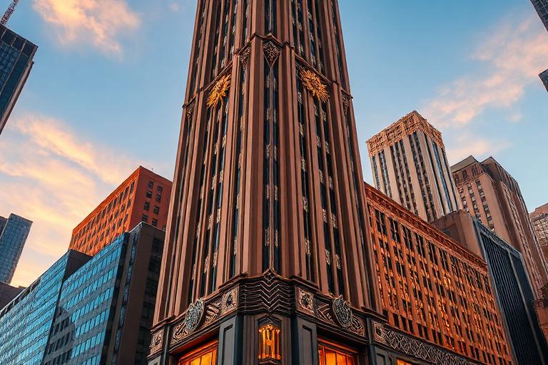
Art Deco architecture emerged from the 1925 Exposition Internationale des Arts Decoratifs et Industriels Modernes in Paris, which gave the style its name. It was not a unified movement but a shared sensibility: the conviction that modern life deserved modern ornament. Where the avant-garde wanted to eliminate decoration entirely, Art Deco abstracted historical and natural motifs into geometric patterns compatible with machine production. Zigzags, sunbursts, chevrons, and stylized flora replaced the flowing curves of Art Nouveau.
The style found its fullest expression in American skyscrapers. William Van Alen's Chrysler Building in New York (1930), with its stainless steel eagles, radiator-cap gargoyles, and needle spire, is architecture as jewelry. The Empire State Building (1931), though more restrained, shares the Art Deco vocabulary of setbacks and geometric ornament. In Miami Beach, a different strand of Art Deco developed: pastel-colored, horizontally banded, and nautically themed, creating the largest concentration of Art Deco buildings in the world.
Art Deco was a genuinely global style. The Marine Building in Vancouver, the Peace Hotel in Shanghai, the Palacio de Bellas Artes in Mexico City, and the Anshun Bridge in Chengdu all speak the language with local accents. The style declined during World War II as austerity made ornament untenable, and post-war Modernism rejected decoration entirely. Art Deco's rehabilitation began in the 1960s with preservation campaigns in Miami Beach and New York, and it remains one of the most popular and recognizable architectural styles worldwide.
The visual DNA: what makes it recognisable
- Geometric display faces: Broadway, Parisian, Futura Display
- Condensed sans-serifs with high contrast: Kabel, Neutraface
- Gold-leaf and metallic lettering on dark backgrounds
- Zigzag and stepped letterforms echoing architectural ornament
- Stepped-back massing (wedding cake silhouette) per zoning laws
- Strong vertical emphasis with clustered piers and mullions
- Symmetrical facades with elaborated entrance bays
- Ground-floor lobbies as showcase for ornamental program
- Polished metal (stainless steel, chrome, nickel): #C0C0C0, #D0D0D0
- Gilded terracotta and bronze: #C8A028, #D4B040, #8B7355
- Black granite and marble: #1A1A1A, #2C2C2C
- Pastel stucco (Miami Deco): #F0C0A0, #B0D8D0, #D0C0E0
- Sunburst and fan patterns radiating from entrance points
- Zigzag and chevron ornamental bands
- Stylized eagles, gazelles, and geometric flora
- Stepped pyramidal forms and setback silhouettes
8-channel console - dominant channels taped & circled by the registrar
Your aesthetic passport - share the fingerprint
The style's primary materials, assembled bottom-up
Tap a stratum for material detail · Full catalog
Early Modern · 1920–1940 - tap any style to travel
4 color interpretations of this aesthetic
Join waitlist for access
Join the waitlist for full access
Join the waitlistArt Deco Architecture: where the language earns its place
Art Deco Architecture is most effective when its visual decisions do useful work. Jazz-age optimism in stainless steel and gilded terracotta - the Chrysler Building's eagle gargoyles, Rockefeller Center's gilded Prometheus, and the setback zigzag tower that defined the American city between the wars.
The style gives styling, proportion, and image sequencing a clear point of view rather than treating them as decoration.
It can turn atmosphere, material, and spatial pacing into evidence of a distinct experience before a visitor arrives.
It helps a physical or editorial environment feel authored, which raises attention and perceived care.
They recognize the references, proportion, and restraint that make the language feel intentional.
They respond to visible judgment because it reduces the feeling of interchangeable product.
A coherent aesthetic gives them a usable standard for choosing images, objects, and collaborators.
The cost comes from consistent art direction, suitable locations or materials, and time to edit the details that would otherwise undermine the premise.
The challenge is conceptual. It takes visual literacy and a real point of view to avoid borrowing surface cues without their original logic.
Lighting, casting, type, color, material, and retouching must agree. A single weak choice can make the work feel like an imitation.
Art Deco Architecture creates its strongest advantage when it gives a brand a standard of judgment, not merely an attractive finish. It fails when recognizable cues are collected without a governing idea. The difference between average and exceptional execution is usually proportion: how much is shown, what is withheld, and whether every element belongs to the same world. The most capable teams pair an exacting art director with specialists who understand the medium, from photographer and stylist to set designer, editor, and typographer.
Should Art Deco Architecture be the strategic choice?
Surface imitation is easy. The language becomes generic when familiar cues replace proportion, specificity, and a coherent system.
Its visual ingredients appear regularly in contemporary work, but a rigorous execution remains distinguishable from a loose collection of references.
Its strongest principles depend on composition, material, and cultural literacy rather than a short-lived visual effect.
It asks for consistency across photography, typography, motion, environments, and the many details that make a brand feel believable.
Art Deco Architecture deserves serious consideration from brands and institutions that can articulate a real point of view and protect it through execution. It is less suitable for work that needs immediate instructional clarity, broad visual neutrality, or low-cost production flexibility. Its greatest advantage is differentiation through judgment: it can make a product, place, or editorial proposition feel authored rather than merely packaged. Average executions borrow recognizable signals, then lose coherence when type, casting, copy, or materials fail to agree. Exceptional executions understand the visual language as a system of choices, including what not to show. The largest mistake is treating the style as a finish applied after strategy. Adopt it only when the product and organization can carry the same standard of care the imagery proposes.
Join waitlist for access
Join the waitlist for editorial depth
Join the waitlistConnected across the creative knowledge graph