Registrar's index cards on the platen glass - captured by the scanner
1930s-present · Denmark, Sweden, Finland, Norway
Scandinavian architecture developed as a regional interpretation of Modernism that rejected the International Style's cold universalism. Alvar Aalto in Finland led the departure: his Paimio Sanatorium (1933) and Villa Mairea (1939) used Modernist spatial concepts but wrapped them in warm materials (wood, brick, copper) and organic curves. Aalto argued that architecture must engage the full range of human sensation, not just the eye. His undulating wooden ceiling at the Viipuri Library (1935) was both acoustic solution and spatial poetry.
Danish architecture took a different path through Arne Jacobsen and Jorn Utzon. Jacobsen's SAS Royal Hotel in Copenhagen (1960) was total design from building to cutlery, demonstrating Scandinavian architecture's tendency to think at every scale. Utzon's Sydney Opera House (1973), though built in Australia, is fundamentally Nordic in its ambition to make structure poetic. In Norway, Sverre Fehn developed a minimalist approach that set precise concrete and wood structures against dramatic natural landscapes, most powerfully at the Hedmark Museum (1973).
Contemporary Scandinavian architecture maintains the tradition's core values: material warmth, democratic access, and engagement with extreme climate and light conditions. Firms like BIG (Bjarke Ingels Group), Snohetta, and Henning Larsen design buildings that are functionally generous, materially honest, and environmentally responsive. The tradition of social housing remains stronger in Scandinavia than anywhere else in the world, keeping architecture connected to everyday life rather than retreating into luxury commissions.
The visual DNA: what makes it recognisable
- Humanist sans-serifs: Akzidenz-Grotesk, GT Walsheim, Soehne
- Light to medium weights for approachable tone
- Clean hierarchy with generous line spacing
- Minimal punctuation and understated capitalization
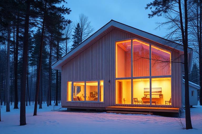
- Open plans maximizing daylight penetration
- Gentle curves and organic deviations from strict geometry
- Window placement optimized for low-angle northern light
- Indoor-outdoor transitions through covered terraces and loggias
- Pale wood: birch, pine, ash: #D4C4A8, #C8B898, #E0D4C0
- White plaster and lime wash: #F5F0E8, #EEECE8
- Red and dark-stained timber: #8B4513, #6B3410
- Copper and bronze aging to verdigris: #6B8C6C, #4A7C5C
- Skylights and clerestories capturing low-angle light
- Timber cladding in horizontal or vertical board patterns
- Green roofs blending buildings into landscapes
- Generous communal spaces: lobbies, courtyards, shared gardens
8-channel console - dominant channels taped & circled by the registrar
Your aesthetic passport - share the fingerprint
The style's primary materials, assembled bottom-up
Tap a stratum for material detail · Full catalog
Contemporary · 1930–present - tap any style to travel
4 color interpretations of this aesthetic
Join waitlist for access
Join the waitlist for full access
Join the waitlistScandinavian Architecture: where the language earns its place
Scandinavian Architecture is most effective when its visual decisions do useful work. Dark winters taught Scandinavian architects to worship light - Aalto's undulating birch forms catching every lumen, Utzon's Bagsværd Church roof curving to reflect diffuse Nordic sky, and the Swedish functionalist tradition that made austerity generous.
The style gives styling, proportion, and image sequencing a clear point of view rather than treating them as decoration.
It can turn atmosphere, material, and spatial pacing into evidence of a distinct experience before a visitor arrives.
It helps a physical or editorial environment feel authored, which raises attention and perceived care.
They recognize the references, proportion, and restraint that make the language feel intentional.
They respond to visible judgment because it reduces the feeling of interchangeable product.
A coherent aesthetic gives them a usable standard for choosing images, objects, and collaborators.
The cost comes from consistent art direction, suitable locations or materials, and time to edit the details that would otherwise undermine the premise.
The challenge is conceptual. It takes visual literacy and a real point of view to avoid borrowing surface cues without their original logic.
Lighting, casting, type, color, material, and retouching must agree. A single weak choice can make the work feel like an imitation.
Scandinavian Architecture creates its strongest advantage when it gives a brand a standard of judgment, not merely an attractive finish. It fails when recognizable cues are collected without a governing idea. The difference between average and exceptional execution is usually proportion: how much is shown, what is withheld, and whether every element belongs to the same world. The most capable teams pair an exacting art director with specialists who understand the medium, from photographer and stylist to set designer, editor, and typographer.
Should Scandinavian Architecture be the strategic choice?
Surface imitation is easy. The language becomes generic when familiar cues replace proportion, specificity, and a coherent system.
Its visual ingredients appear regularly in contemporary work, but a rigorous execution remains distinguishable from a loose collection of references.
Its strongest principles depend on composition, material, and cultural literacy rather than a short-lived visual effect.
It asks for consistency across photography, typography, motion, environments, and the many details that make a brand feel believable.
Scandinavian Architecture deserves serious consideration from brands and institutions that can articulate a real point of view and protect it through execution. It is less suitable for work that needs immediate instructional clarity, broad visual neutrality, or low-cost production flexibility. Its greatest advantage is differentiation through judgment: it can make a product, place, or editorial proposition feel authored rather than merely packaged. Average executions borrow recognizable signals, then lose coherence when type, casting, copy, or materials fail to agree. Exceptional executions understand the visual language as a system of choices, including what not to show. The largest mistake is treating the style as a finish applied after strategy. Adopt it only when the product and organization can carry the same standard of care the imagery proposes.
Join waitlist for access
Join the waitlist for editorial depth
Join the waitlistConnected across the creative knowledge graph