Registrar's index cards on the platen glass - captured by the scanner
1908-present · United States, expanding globally
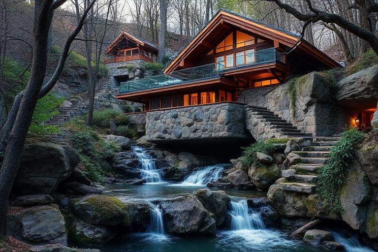
Organic architecture begins with Frank Lloyd Wright, who used the term from 1908 onward to describe buildings that grew from their sites as naturally as a tree from the ground. Fallingwater (1935), cantilevered over a Pennsylvania waterfall with local stone walls anchoring it to the hillside, remains the movement's defining image. Wright's principle was not imitation of nature but analogy: a building should relate to its landscape the way an organism relates to its environment, with structure, material, and space unified into a single integrated system.
Wright's Usonian houses of the 1930s-1950s demonstrated that organic principles could work at modest scales: concrete slab floors with radiant heating, walls of local materials, flat or gently sloping roofs, and plans that opened living spaces to private gardens. The Guggenheim Museum in New York (1959), with its continuous spiral ramp, showed organic thinking applied to an urban institution. After Wright, architects like Bruce Goff and Bart Prince pushed organic architecture toward more expressionist forms, while Alvar Aalto in Finland developed a parallel organic tradition rooted in Nordic landscapes.
Contemporary organic architecture has been transformed by computation. Parametric tools allow designers to generate forms that follow natural growth patterns, structural optimizations, and site-responsive geometries that Wright could only approximate by intuition. Architects like Kengo Kuma and Renzo Piano pursue organic integration through material transparency and landscape continuity rather than through sculptural form.
The visual DNA: what makes it recognisable
- Wright's own lettering: geometric, compressed, with strong horizontal emphasis
- Humanist sans-serifs: Gill Sans, Optima, Cronos
- Horizontal orientation echoing prairie proportions
- Custom letterforms integrated into building ornament
- Plans generated from geometric modules (hexagons, circles, triangles)
- Horizontal emphasis with deep overhanging eaves
- Interpenetration of interior and exterior spaces
- Radial or spiral plans as alternatives to rectilinear grids
- Local stone in rough-cut or rubble walls: #8A7C6C, #A09080, #7C6E5E
- Warm wood: cypress, redwood, oak: #9C7C58, #B89468
- Concrete tinted to match earth tones: #A89880, #908070
- Copper and bronze for hardware: #8B7355, #6B5C4C
- Cantilevers extending the building into the landscape
- Deep overhanging eaves creating sheltered transition zones
- Corner windows dissolving the boundary between inside and out
- Built-in furniture integrated with architectural structure
8-channel console - dominant channels taped & circled by the registrar
Your aesthetic passport - share the fingerprint
The style's primary materials, assembled bottom-up
Tap a stratum for material detail · Full catalog
Postwar · 1935–present - tap any style to travel
4 color interpretations of this aesthetic
Join waitlist for access
Join the waitlist for full access
Join the waitlistOrganic Architecture: where the language earns its place
Organic Architecture is most effective when its visual decisions do useful work. Wright's insistence that buildings must grow from their sites like trees from soil - Fallingwater cantilevered over Bear Run creek, the Guggenheim's inverted ziggurat spiral, and the principle that nature has never made a straight line.
The style gives styling, proportion, and image sequencing a clear point of view rather than treating them as decoration.
It can turn atmosphere, material, and spatial pacing into evidence of a distinct experience before a visitor arrives.
It helps a physical or editorial environment feel authored, which raises attention and perceived care.
They recognize the references, proportion, and restraint that make the language feel intentional.
They respond to visible judgment because it reduces the feeling of interchangeable product.
A coherent aesthetic gives them a usable standard for choosing images, objects, and collaborators.
The cost comes from consistent art direction, suitable locations or materials, and time to edit the details that would otherwise undermine the premise.
The challenge is conceptual. It takes visual literacy and a real point of view to avoid borrowing surface cues without their original logic.
Lighting, casting, type, color, material, and retouching must agree. A single weak choice can make the work feel like an imitation.
Organic Architecture creates its strongest advantage when it gives a brand a standard of judgment, not merely an attractive finish. It fails when recognizable cues are collected without a governing idea. The difference between average and exceptional execution is usually proportion: how much is shown, what is withheld, and whether every element belongs to the same world. The most capable teams pair an exacting art director with specialists who understand the medium, from photographer and stylist to set designer, editor, and typographer.
Should Organic Architecture be the strategic choice?
Surface imitation is easy. The language becomes generic when familiar cues replace proportion, specificity, and a coherent system.
Its visual ingredients appear regularly in contemporary work, but a rigorous execution remains distinguishable from a loose collection of references.
Its strongest principles depend on composition, material, and cultural literacy rather than a short-lived visual effect.
It asks for consistency across photography, typography, motion, environments, and the many details that make a brand feel believable.
Organic Architecture deserves serious consideration from brands and institutions that can articulate a real point of view and protect it through execution. It is less suitable for work that needs immediate instructional clarity, broad visual neutrality, or low-cost production flexibility. Its greatest advantage is differentiation through judgment: it can make a product, place, or editorial proposition feel authored rather than merely packaged. Average executions borrow recognizable signals, then lose coherence when type, casting, copy, or materials fail to agree. Exceptional executions understand the visual language as a system of choices, including what not to show. The largest mistake is treating the style as a finish applied after strategy. Adopt it only when the product and organization can carry the same standard of care the imagery proposes.
Join waitlist for access
Join the waitlist for editorial depth
Join the waitlistConnected across the creative knowledge graph