Registrar's index cards on the platen glass - captured by the scanner
1920-1932 · Soviet Union
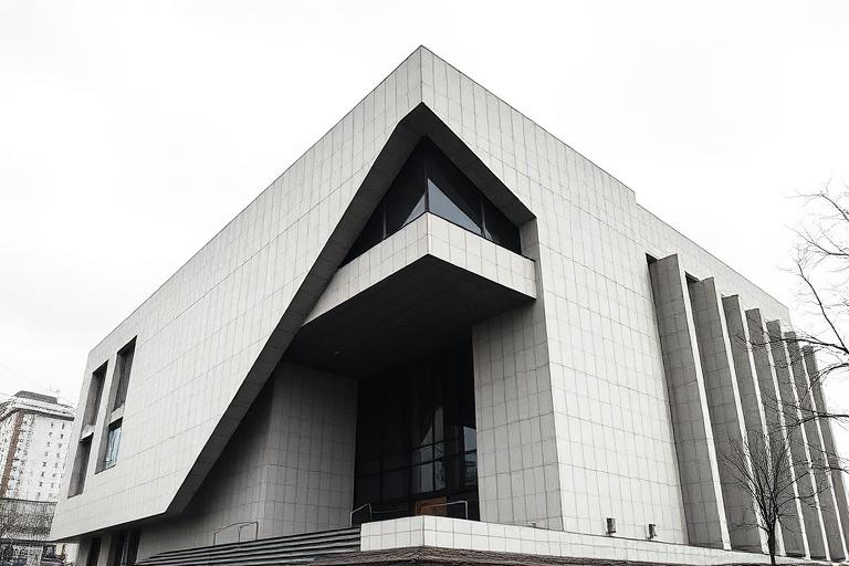
Constructivist architecture was the Soviet Union's contribution to the interwar avant-garde. While Bauhaus pursued the unity of art and industry and De Stijl explored abstract composition, the Constructivists saw architecture as a direct instrument of social transformation. Konstantin Melnikov's workers' clubs in Moscow (1927-1929) used radical geometry to create collective spaces for the new proletarian culture. Each club had a different formal strategy: the Rusakov Club's cantilevered auditorium sections, the Kauchuk Club's cylindrical volumes, the Burevestnik Club's interlocking triangular plans.
Vladimir Tatlin's Monument to the Third International (1920), though never built, became the movement's icon: a spiraling steel tower taller than the Eiffel Tower, containing rotating glass volumes for the Comintern's legislative, executive, and information functions. Its impossibility was part of its power. The Vesnin brothers, Moisei Ginzburg, and Ivan Leonidov produced designs that ranged from buildable social housing (Ginzburg's Narkomfin Building, 1930) to visionary proposals for entire socialist cities.
Stalin's turn toward Socialist Realism in the early 1930s effectively killed Constructivism. The Palace of the Soviets competition (1931-1933) rejected Le Corbusier's and the Constructivists' entries in favor of Boris Iofan's neoclassical tower. Many Constructivist architects were marginalized or persecuted. Their buildings, neglected for decades, are now being recognized as some of the twentieth century's most radical architectural achievements. The Narkomfin Building was restored in 2020.
The visual DNA: what makes it recognisable
- Bold geometric sans-serifs and Cyrillic display faces
- Diagonal and rotated text creating dynamic composition
- Red and black two-color printing traditions
- Propaganda poster typography: bold, condensed, urgent
- Dynamic diagonal compositions and asymmetric massing
- Interlocking geometric volumes (cylinders, cubes, wedges)
- Elevated walkways and bridges connecting building masses
- Plans generated by circulation diagrams and program relationships
- Rendered and painted concrete in white and grey: #D8D4CC, #C0BCB4
- Red brick and painted accents: #B84040, #C85050
- Steel frame and industrial glazing: #6B6B6B, #808080
- Glass in horizontal strip windows and curtain walls
- Cantilevered volumes projecting beyond the structural grid
- Cylindrical stair towers and rotunda forms
- Ribbon windows wrapping around corners
- Rooftop terraces and communal facilities
8-channel console - dominant channels taped & circled by the registrar
Your aesthetic passport - share the fingerprint
The style's primary materials, assembled bottom-up
Tap a stratum for material detail · Full catalog
Early Modern · 1920–1932 - tap any style to travel
4 color interpretations of this aesthetic
Join waitlist for access
Join the waitlist for full access
Join the waitlistConstructivism: where the language earns its place
Constructivism is most effective when its visual decisions do useful work. The Soviet avant-garde weaponized architecture - Melnikov's rotating cylindrical house, Tatlin's spiraling tower to the Third International, Leonidov's crystalline social condensers: ideology made material and diagonal.
The style gives styling, proportion, and image sequencing a clear point of view rather than treating them as decoration.
It can turn atmosphere, material, and spatial pacing into evidence of a distinct experience before a visitor arrives.
It helps a physical or editorial environment feel authored, which raises attention and perceived care.
They recognize the references, proportion, and restraint that make the language feel intentional.
They respond to visible judgment because it reduces the feeling of interchangeable product.
A coherent aesthetic gives them a usable standard for choosing images, objects, and collaborators.
The cost comes from consistent art direction, suitable locations or materials, and time to edit the details that would otherwise undermine the premise.
The challenge is conceptual. It takes visual literacy and a real point of view to avoid borrowing surface cues without their original logic.
Lighting, casting, type, color, material, and retouching must agree. A single weak choice can make the work feel like an imitation.
Constructivism creates its strongest advantage when it gives a brand a standard of judgment, not merely an attractive finish. It fails when recognizable cues are collected without a governing idea. The difference between average and exceptional execution is usually proportion: how much is shown, what is withheld, and whether every element belongs to the same world. The most capable teams pair an exacting art director with specialists who understand the medium, from photographer and stylist to set designer, editor, and typographer.
Should Constructivism be the strategic choice?
Surface imitation is easy. The language becomes generic when familiar cues replace proportion, specificity, and a coherent system.
Its visual ingredients appear regularly in contemporary work, but a rigorous execution remains distinguishable from a loose collection of references.
Its strongest principles depend on composition, material, and cultural literacy rather than a short-lived visual effect.
It asks for consistency across photography, typography, motion, environments, and the many details that make a brand feel believable.
Constructivism deserves serious consideration from brands and institutions that can articulate a real point of view and protect it through execution. It is less suitable for work that needs immediate instructional clarity, broad visual neutrality, or low-cost production flexibility. Its greatest advantage is differentiation through judgment: it can make a product, place, or editorial proposition feel authored rather than merely packaged. Average executions borrow recognizable signals, then lose coherence when type, casting, copy, or materials fail to agree. Exceptional executions understand the visual language as a system of choices, including what not to show. The largest mistake is treating the style as a finish applied after strategy. Adopt it only when the product and organization can carry the same standard of care the imagery proposes.
Join waitlist for access
Join the waitlist for editorial depth
Join the waitlistConnected across the creative knowledge graph