Registrar's index cards on the platen glass - captured by the scanner
1900s-present (as revival); adobe tradition is centuries old · New Mexico, American Southwest
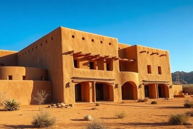
Pueblo Revival architecture draws from the building traditions of the Puebloan peoples of the American Southwest, who have constructed multi-story adobe communities for over a thousand years. Taos Pueblo, continuously inhabited since at least 1000 CE, demonstrates the tradition's core principles: thick adobe walls providing thermal mass against extreme temperature swings, stepped massing creating terraces and shade, flat roofs with projecting vigas (roof beams), and an organic relationship between building and desert landscape.
The Revival style formalized as a conscious architectural movement in the early twentieth century. The Palace of the Governors reconstruction in Santa Fe (1909-1913) established the vocabulary that would define New Mexican architecture: rounded parapets, protruding vigas, deep-set windows in thick walls, and earthen plaster finishes in tones ranging from warm tan to deep terracotta. Santa Fe adopted building codes in 1957 requiring Pueblo Revival styling in its historic district, making it one of the few American cities with an architecturally unified character.
Contemporary Pueblo Revival ranges from literal reproduction of historical forms to interpretive work that engages with adobe's thermal performance, local material sourcing, and desert aesthetics without copying historical details. Antoine Predock, the most prominent architect working in this tradition, developed a powerful synthesis of Pueblo forms with Modernist spatial concepts. The style's emphasis on thermal mass, earth construction, and site integration makes it newly relevant to sustainable design in arid climates.
The visual DNA: what makes it recognisable
- Warm serif faces: Adobe Caslon, Chaparral, Minion
- Hand-lettered and carved signage traditions
- Earthy, rustic display faces: Birch, Rosewood, Juniper
- Text set in warm browns and terracotta rather than black
- Stepped massing creating terraces at each level
- Thick walls with deep window and door reveals
- Rounded corners and parapets (no sharp edges)
- Enclosed courtyards (placitas) as central organizing spaces
- Adobe and earth plaster: #C8A878, #B89868, #A08050
- Warm terracotta tones: #C87850, #B86840, #D89060
- Rough-hewn timber vigas and latillas: #8C6840, #7C5830
- Turquoise accents on doors and trim: #40A0B0, #308090
- Projecting vigas (round roof beams) through exterior walls
- Canales (scupper drains) projecting from parapets
- Banco seating (built-in adobe benches) along walls
- Kiva fireplaces in rounded corners
8-channel console - dominant channels taped & circled by the registrar
Your aesthetic passport - share the fingerprint
The style's primary materials, assembled bottom-up
Tap a stratum for material detail · Full catalog
Vernacular · 1900–1940 - tap any style to travel
4 color interpretations of this aesthetic
Join waitlist for access
Join the waitlist for full access
Join the waitlistPueblo Revival: where the language earns its place
Pueblo Revival is most effective when its visual decisions do useful work. New Mexico's synthesis of Ancestral Puebloan adobe mass and Spanish mission tradition - rounded parapets, projecting vigas, interior kiva fireplaces, and John Gaw Meem's University of New Mexico campus as the definitive regional modern.
The style gives styling, proportion, and image sequencing a clear point of view rather than treating them as decoration.
It can turn atmosphere, material, and spatial pacing into evidence of a distinct experience before a visitor arrives.
It helps a physical or editorial environment feel authored, which raises attention and perceived care.
They recognize the references, proportion, and restraint that make the language feel intentional.
They respond to visible judgment because it reduces the feeling of interchangeable product.
A coherent aesthetic gives them a usable standard for choosing images, objects, and collaborators.
The cost comes from consistent art direction, suitable locations or materials, and time to edit the details that would otherwise undermine the premise.
The challenge is conceptual. It takes visual literacy and a real point of view to avoid borrowing surface cues without their original logic.
Lighting, casting, type, color, material, and retouching must agree. A single weak choice can make the work feel like an imitation.
Pueblo Revival creates its strongest advantage when it gives a brand a standard of judgment, not merely an attractive finish. It fails when recognizable cues are collected without a governing idea. The difference between average and exceptional execution is usually proportion: how much is shown, what is withheld, and whether every element belongs to the same world. The most capable teams pair an exacting art director with specialists who understand the medium, from photographer and stylist to set designer, editor, and typographer.
Should Pueblo Revival be the strategic choice?
Surface imitation is easy. The language becomes generic when familiar cues replace proportion, specificity, and a coherent system.
Its visual ingredients appear regularly in contemporary work, but a rigorous execution remains distinguishable from a loose collection of references.
Its strongest principles depend on composition, material, and cultural literacy rather than a short-lived visual effect.
It asks for consistency across photography, typography, motion, environments, and the many details that make a brand feel believable.
Pueblo Revival deserves serious consideration from brands and institutions that can articulate a real point of view and protect it through execution. It is less suitable for work that needs immediate instructional clarity, broad visual neutrality, or low-cost production flexibility. Its greatest advantage is differentiation through judgment: it can make a product, place, or editorial proposition feel authored rather than merely packaged. Average executions borrow recognizable signals, then lose coherence when type, casting, copy, or materials fail to agree. Exceptional executions understand the visual language as a system of choices, including what not to show. The largest mistake is treating the style as a finish applied after strategy. Adopt it only when the product and organization can carry the same standard of care the imagery proposes.
Join waitlist for access
Join the waitlist for editorial depth
Join the waitlistConnected across the creative knowledge graph