Registrar's index cards on the platen glass - captured by the scanner
1955-1991 · Soviet Union, Eastern Bloc nations, Yugoslavia, Cuba
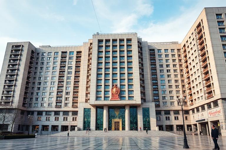
Socialist Modernism emerged after Stalin's death in 1953, when Khrushchev denounced the excesses of Stalinist architecture (ornate neoclassical facades applied to shoddy construction) and called for industrialized, efficient building. The result was a massive wave of prefabricated concrete panel housing that transformed the urban landscapes of the Soviet Union, East Germany, Poland, Czechoslovakia, Hungary, Bulgaria, and Yugoslavia. The Plattenbau in Germany, the Panelak in Czechoslovakia, and the Khrushchyovka in the Soviet Union housed hundreds of millions of people in buildings assembled from factory-produced concrete panels.
Beyond mass housing, Socialist Modernism produced remarkable public architecture. Each Eastern Bloc nation developed its own interpretation: Yugoslavia's spomenik monuments (abstract concrete war memorials), Bulgaria's Buzludzha monument, East Germany's Fernsehturm television tower, and Romania's Palace of the Parliament all pushed Modernist forms toward monumental, often surreal scales. Cultural buildings (cinemas, community centers, sports halls) used expressive concrete forms that Western Modernism's commercial constraints rarely permitted.
After the fall of communism in 1989-1991, Socialist Modernist buildings were widely despised as symbols of oppression and neglect. Many were demolished or re-clad. In the 2010s, a reassessment began: photographers, architects, and historians recognized the formal ambition and social idealism embedded in these structures, even as they acknowledged the human costs of the systems that built them. The debate over preservation versus demolition continues in every former Eastern Bloc nation.
The visual DNA: what makes it recognisable
- State-designed typefaces: Pragmatica, Baltica, TextBook
- Bold sans-serifs for slogans and monumental inscriptions
- Cyrillic and Latin in standardized state-approved faces
- Propaganda poster aesthetics: condensed, urgent, uppercase
- Repetitive modular facades from prefabricated panel systems
- Microrayon (micro-district) urban planning: towers in landscape
- Monumental axes and ceremonial public spaces
- Standardized floor plans repeated across entire nations
- Precast concrete panels: #A0A0A0, #909090, #B0B0B0
- Exposed aggregate concrete: #8C8880, #9C9890
- Mosaic and relief murals on gable walls: polychrome
- Aluminum and anodized metal accents: #C0C0C0, #808080
- Prefabricated panel joints as involuntary facade pattern
- Ground-floor commercial or community spaces
- Monumental sculptural elements at building entrances
- Abstract geometric murals and mosaics on blank walls
8-channel console - dominant channels taped & circled by the registrar
Your aesthetic passport - share the fingerprint
The style's primary materials, assembled bottom-up
Tap a stratum for material detail · Full catalog
Postwar · 1955–1991 - tap any style to travel
4 color interpretations of this aesthetic
Join waitlist for access
Join the waitlist for full access
Join the waitlistSocialist Modernism: where the language earns its place
Socialist Modernism is most effective when its visual decisions do useful work. The Eastern Bloc's own Modernism - prefab Plattenbau housing estates, heroic mosaic friezes, the Buzludzha monument's brutalized saucer on a Bulgarian mountain peak - collective ideology at maximum material scale.
The style gives styling, proportion, and image sequencing a clear point of view rather than treating them as decoration.
It can turn atmosphere, material, and spatial pacing into evidence of a distinct experience before a visitor arrives.
It helps a physical or editorial environment feel authored, which raises attention and perceived care.
They recognize the references, proportion, and restraint that make the language feel intentional.
They respond to visible judgment because it reduces the feeling of interchangeable product.
A coherent aesthetic gives them a usable standard for choosing images, objects, and collaborators.
The cost comes from consistent art direction, suitable locations or materials, and time to edit the details that would otherwise undermine the premise.
The challenge is conceptual. It takes visual literacy and a real point of view to avoid borrowing surface cues without their original logic.
Lighting, casting, type, color, material, and retouching must agree. A single weak choice can make the work feel like an imitation.
Socialist Modernism creates its strongest advantage when it gives a brand a standard of judgment, not merely an attractive finish. It fails when recognizable cues are collected without a governing idea. The difference between average and exceptional execution is usually proportion: how much is shown, what is withheld, and whether every element belongs to the same world. The most capable teams pair an exacting art director with specialists who understand the medium, from photographer and stylist to set designer, editor, and typographer.
Should Socialist Modernism be the strategic choice?
Surface imitation is easy. The language becomes generic when familiar cues replace proportion, specificity, and a coherent system.
Its visual ingredients appear regularly in contemporary work, but a rigorous execution remains distinguishable from a loose collection of references.
Its strongest principles depend on composition, material, and cultural literacy rather than a short-lived visual effect.
It asks for consistency across photography, typography, motion, environments, and the many details that make a brand feel believable.
Socialist Modernism deserves serious consideration from brands and institutions that can articulate a real point of view and protect it through execution. It is less suitable for work that needs immediate instructional clarity, broad visual neutrality, or low-cost production flexibility. Its greatest advantage is differentiation through judgment: it can make a product, place, or editorial proposition feel authored rather than merely packaged. Average executions borrow recognizable signals, then lose coherence when type, casting, copy, or materials fail to agree. Exceptional executions understand the visual language as a system of choices, including what not to show. The largest mistake is treating the style as a finish applied after strategy. Adopt it only when the product and organization can carry the same standard of care the imagery proposes.
Join waitlist for access
Join the waitlist for editorial depth
Join the waitlistConnected across the creative knowledge graph