Registrar's index cards on the platen glass - captured by the scanner
1990s-present · Western Europe and Japan
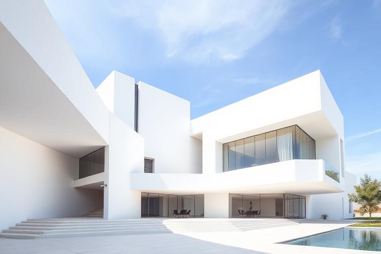
Neo-Modernism emerged in the 1990s when a generation of architects concluded that Postmodernism's irony and Deconstructivism's spectacle had exhausted themselves without solving the problems Modernism had originally posed. David Chipperfield, in London and Berlin, demonstrated that Modernist principles of material honesty, structural clarity, and spatial restraint could produce buildings of extraordinary refinement. His Neues Museum reconstruction in Berlin (2009) inserted precise new concrete and brick into a bombed-out neoclassical shell, proving that Modernist intervention and historical preservation were not opposites.
The movement was less a manifesto than a quiet return to rigor. In Switzerland, Peter Markli and Christian Kerez explored abstract composition with the precision of Mies but without his universal pretensions. In Portugal, Alvaro Siza and Eduardo Souto de Moura (both Pritzker laureates) had never abandoned Modernism's core principles but inflected them with Mediterranean light, local stone, and site-specific geometry. In Japan, SANAA's transparent, diagram-like buildings at Kanazawa and Lausanne refined Modernism toward an almost immaterial minimalism.
Neo-Modernism differs from its predecessor in key ways: it engages with context rather than imposing universal solutions, it embraces material warmth alongside intellectual rigor, and it acknowledges rather than erases the buildings and landscapes it inhabits. The result is architecture that looks spare but feels generous, that is disciplined but not doctrinaire.
The visual DNA: what makes it recognisable
- Neutral sans-serifs: Akkurat, Atlas Grotesk, Neue Haas Grotesk
- Extreme weight restraint: regular or light weights only
- Generous margins and minimal text density
- Type as information infrastructure, never as expression
- Structural grids refined to extreme precision
- Facade rhythms derived from structural logic, not decorative pattern
- Plans that are diagrammatically clear when drawn
- Material transitions as deliberate architectural events
- Fair-faced concrete with refined formwork: #C4C0B8, #B4B0A8
- Brick in precise bonds with minimal mortar joints: #A08870, #B89878
- Natural stone cladding in large format: #D8D4CC, #C8C4BC
- Timber cladding and screens: #A08C70, #8C7858
- Deep window reveals creating shadow depth
- Material continuity from exterior to interior
- Roof profiles that engage with skyline context
- Ground floors that mediate between city and building
8-channel console - dominant channels taped & circled by the registrar
Your aesthetic passport - share the fingerprint
The style's primary materials, assembled bottom-up
Tap a stratum for material detail · Full catalog
Contemporary · 1990–present - tap any style to travel
4 color interpretations of this aesthetic
Join waitlist for access
Join the waitlist for full access
Join the waitlistNeo-Modernism: where the language earns its place
Neo-Modernism is most effective when its visual decisions do useful work. Modernism returned to - not as nostalgia but as unfinished business: David Chipperfield's immaculate civic precision, Annabelle Selldorf's cultural institutions, Johnston Marklee's material exactness, all recovering what postmodernism abandoned.
The style gives styling, proportion, and image sequencing a clear point of view rather than treating them as decoration.
It can turn atmosphere, material, and spatial pacing into evidence of a distinct experience before a visitor arrives.
It helps a physical or editorial environment feel authored, which raises attention and perceived care.
They recognize the references, proportion, and restraint that make the language feel intentional.
They respond to visible judgment because it reduces the feeling of interchangeable product.
A coherent aesthetic gives them a usable standard for choosing images, objects, and collaborators.
The cost comes from consistent art direction, suitable locations or materials, and time to edit the details that would otherwise undermine the premise.
The challenge is conceptual. It takes visual literacy and a real point of view to avoid borrowing surface cues without their original logic.
Lighting, casting, type, color, material, and retouching must agree. A single weak choice can make the work feel like an imitation.
Neo-Modernism creates its strongest advantage when it gives a brand a standard of judgment, not merely an attractive finish. It fails when recognizable cues are collected without a governing idea. The difference between average and exceptional execution is usually proportion: how much is shown, what is withheld, and whether every element belongs to the same world. The most capable teams pair an exacting art director with specialists who understand the medium, from photographer and stylist to set designer, editor, and typographer.
Should Neo-Modernism be the strategic choice?
Surface imitation is easy. The language becomes generic when familiar cues replace proportion, specificity, and a coherent system.
Its visual ingredients appear regularly in contemporary work, but a rigorous execution remains distinguishable from a loose collection of references.
Its strongest principles depend on composition, material, and cultural literacy rather than a short-lived visual effect.
It asks for consistency across photography, typography, motion, environments, and the many details that make a brand feel believable.
Neo-Modernism deserves serious consideration from brands and institutions that can articulate a real point of view and protect it through execution. It is less suitable for work that needs immediate instructional clarity, broad visual neutrality, or low-cost production flexibility. Its greatest advantage is differentiation through judgment: it can make a product, place, or editorial proposition feel authored rather than merely packaged. Average executions borrow recognizable signals, then lose coherence when type, casting, copy, or materials fail to agree. Exceptional executions understand the visual language as a system of choices, including what not to show. The largest mistake is treating the style as a finish applied after strategy. Adopt it only when the product and organization can carry the same standard of care the imagery proposes.
Join waitlist for access
Join the waitlist for editorial depth
Join the waitlistConnected across the creative knowledge graph