Registrar's index cards on the platen glass - captured by the scanner
1988-present · Named at MoMA exhibition (New York); practiced globally
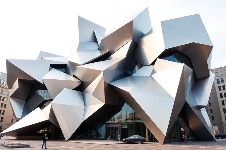
Deconstructivism entered architectural discourse through Philip Johnson and Mark Wigley's 1988 exhibition at MoMA, 'Deconstructivist Architecture,' which presented the work of seven architects: Frank Gehry, Daniel Libeskind, Rem Koolhaas, Peter Eisenman, Zaha Hadid, Coop Himmelb(l)au, and Bernard Tschumi. The curators argued that these architects shared an approach that disrupted conventional architectural harmony: walls tilted, volumes collided, grids warped, and buildings looked as if frozen in the process of coming apart.
The philosophical backing came from Jacques Derrida's literary deconstruction, which questioned the stability of meaning in texts. Eisenman and Tschumi engaged most directly with Derrida's ideas, designing buildings that challenged the assumption that architecture must express stability, order, and functional clarity. Tschumi's Parc de la Villette in Paris (1987) and Eisenman's Wexner Center (1989) applied deconstructive strategies to building programs, producing spaces of deliberate disorientation and formal complexity.
Gehry's Guggenheim Museum Bilbao (1997) brought Deconstructivism to global celebrity, demonstrating that fragmented, sculptural architecture could attract tourists and regenerate cities. Libeskind's Jewish Museum Berlin (2001), with its zinc-clad zigzag plan and voids, showed that deconstructed form could carry profound emotional meaning. The movement has since diffused: its techniques (tilted planes, non-orthogonal geometry, colliding volumes) are now standard tools rather than provocations, absorbed into the mainstream of contemporary architecture.
The visual DNA: what makes it recognisable
- Fragmented and deconstructed letterforms: Emigre, experimental type
- Overlapping, layered text compositions
- Tilted and rotated text blocks
- Conflicting grids and deliberately unstable layouts
- Tilted walls and non-orthogonal planes
- Colliding volumes interpenetrating at unexpected angles
- Warped or folded grids replacing conventional structural order
- Deliberate disorientation through spatial complexity
- Titanium and zinc cladding: #C0C8D0, #A8B0B8, #B8BCC0
- Raw steel and weathering steel (Corten): #8B4513, #6B3410
- Concrete in angular, fractured forms: #A0A0A0, #909090
- Glass at unusual angles creating unexpected reflections
- Sharp angular forms suggesting collision or explosion
- Void spaces and cuts through building volumes
- Facades that appear to peel, fold, or fragment
- Buildings that reject front/back and top/bottom conventions
8-channel console - dominant channels taped & circled by the registrar
Your aesthetic passport - share the fingerprint
The style's primary materials, assembled bottom-up
Tap a stratum for material detail · Full catalog
Postmodern · 1982–2000 - tap any style to travel
Join waitlist for access
Join the waitlist for full access
Join the waitlistDeconstructivism: where the language earns its place
Deconstructivism is most effective when its visual decisions do useful work. Fragmentation as architecture - Deconstructivism shattered the box into colliding planes, skewed angles, and controlled chaos, rejecting the right angle, from Gehry's titanium folds to Zaha Hadid's flying geometries and Libeskind's fractured voids.
The style gives styling, proportion, and image sequencing a clear point of view rather than treating them as decoration.
It can turn atmosphere, material, and spatial pacing into evidence of a distinct experience before a visitor arrives.
It helps a physical or editorial environment feel authored, which raises attention and perceived care.
They recognize the references, proportion, and restraint that make the language feel intentional.
They respond to visible judgment because it reduces the feeling of interchangeable product.
A coherent aesthetic gives them a usable standard for choosing images, objects, and collaborators.
The cost comes from consistent art direction, suitable locations or materials, and time to edit the details that would otherwise undermine the premise.
The challenge is conceptual. It takes visual literacy and a real point of view to avoid borrowing surface cues without their original logic.
Lighting, casting, type, color, material, and retouching must agree. A single weak choice can make the work feel like an imitation.
Deconstructivism creates its strongest advantage when it gives a brand a standard of judgment, not merely an attractive finish. It fails when recognizable cues are collected without a governing idea. The difference between average and exceptional execution is usually proportion: how much is shown, what is withheld, and whether every element belongs to the same world. The most capable teams pair an exacting art director with specialists who understand the medium, from photographer and stylist to set designer, editor, and typographer.
Should Deconstructivism be the strategic choice?
Surface imitation is easy. The language becomes generic when familiar cues replace proportion, specificity, and a coherent system.
Its visual ingredients appear regularly in contemporary work, but a rigorous execution remains distinguishable from a loose collection of references.
Its strongest principles depend on composition, material, and cultural literacy rather than a short-lived visual effect.
It asks for consistency across photography, typography, motion, environments, and the many details that make a brand feel believable.
Deconstructivism deserves serious consideration from brands and institutions that can articulate a real point of view and protect it through execution. It is less suitable for work that needs immediate instructional clarity, broad visual neutrality, or low-cost production flexibility. Its greatest advantage is differentiation through judgment: it can make a product, place, or editorial proposition feel authored rather than merely packaged. Average executions borrow recognizable signals, then lose coherence when type, casting, copy, or materials fail to agree. Exceptional executions understand the visual language as a system of choices, including what not to show. The largest mistake is treating the style as a finish applied after strategy. Adopt it only when the product and organization can carry the same standard of care the imagery proposes.
Join waitlist for access
Join the waitlist for editorial depth
Join the waitlistConnected across the creative knowledge graph